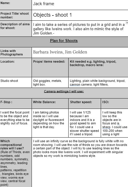
statement of intent
My chosen theme is objects because there is a lot of images you can create with them. This theme can be used in so many different ways and can be portrayed in different ways from the colours you use to the objects you use. You can use a specific order of how you place the objects in the image to make a different way of seeing it. I can explore different locations to explore my theme in depth and use it well. I will be learning how to use the camera more professionally and use skills to make my work better. The objects I use could be personal to have a better effect on the pictures.
I intend to research different photographers that use objects well in their images such as Jim Golden. He uses different colours in his images but lays them out specifically to where they need to be. He uses the background of his images to show different colours that are not in the objects. He uses a wide range of objects which can make the image seem flooded but he does it really well which I intend to mimic. He uses lighting to his advantage so he has shadows on all of the images yet the whole image is bright and visible.
The photoshoots I plan to do could be setting out a plain background and getting objects with the same specific colours and lay them out like Jim Golden has his. For these images I would need a camera, lighting, a plain background, objects of a specific colour, and filters for the light to change the colours. I also plan to do a shoot with an outdoor background like bushes or a brick wall, I could use more outdoor objects for these images and then compare an indoor view against an outdoor view of objects.
From these images I could put them into photoshop and develop them. In photoshop I could change the exposure to enhance the image, I could change the colours on the image to stand out more. I have researched Jim Golden and Barbara Iweins. Jim Golden gets many objects and lays them out in the same image with similar colours and themes. Iweins takes them separately with a white background and many different colours, then puts them into a grid so they are grouped. I intend to try both artists styles and see which one I will continue to do. I have researched specific images from the two. For Jim Golden I have chosen to mimic
Still Life 1 series. For Barbara Iweins I have decided to mimic her gallery called Katalog.
I would like to use a studio to create my images because I need a birds eye view and good lighting for my images. I intend to use a birds eye view to capture the objects from above as that is a good effect to use and wont create any shadows. I intend to have a light shining down onto the objects so there are no shadows on the image and it is all clear and visible. I might use different colour backgrounds so that the objects can blend with a similar colour background. I will make the objects more vibrant on photoshop so it catches your eye more and stands out. I want to experiment with different composition techniques so that the pictures are layed out in a better way and are more appealing. I will experiment with canva and use the different filters they have as this could improve my work. I will use a different range of lighting such as colour lighting and natural lighting. I can experiment with the white balance like if I was doing metal objects I can use tungsten lighting.
In this project I hope to learn more about camera techniques and different studio setups I can use to make the picture better. I want to learn how to use a studio to make my pictures seem more professional. Doing this will help my gallery look better and well made. I want to learn how to look at objects in a way that can be creative and used well in my work. I want to progress with best and worst by creating more of them so I know what work I need to make. I need to progress with shoots made with a shoot plan so I know exactly what I need to be doing and what pictures I need to take. I could progress with independent learning by going to more locations with different objects that I would not see normally. I can progress with composition techniques so that my pictures are all laid out with multiple objects in one image or just one object in the center. I hope to do more shoots so that I can find exactly what I need to take pictures of for my project.
I hope to learn more about composition from doing this project as composition really helps to build a picture and can help to catch an eye from the viewer. I would also like to learn more about lighting because In my current photos you can see shadows that are unintentional which make it worse, from learning about lighting more I can remove the unwanted shadows and make the pictures how they are supposed to be like.
I see my final format as being
What do you see your final format as being?
moodboard


Mindmap
I have been researching into these types of objects and I have decided to focus on personal objects and broken as they have the most potential for good outcomes. They are both easily found and can be seen in different ways.
research

context
I have been researching about photographers that do well with objects. After looking I have decided to focus on Jim Golden. What he does is he lays out the objects specifically, thinking about where they will go and what colours they are. This is interesting because colours can really change a picture and this shows that how you organise colours can help build an image. He uses a wide range of objects in his images which makes it seem like he really thought about where they will go and what they are.
This image is called Still Life 1 series. It was made by Jim Golden in New York. Jim Golden learned about his style in the competitive world of New York advertising, where he spent several years working as a high end compositor and visual effects specialist. He now lives in Portland, Oregon where he strives to capture the essence of his subjects rather than impose a conventional standard of beauty. This work has no relation to social or political history of the time which shows it is his own work with no meaning to make it.
This image is called Still Life 1 series. It was made by Jim Golden in New York. Jim Golden learned about his style in the competitive world of New York advertising, where he spent several years working as a high end compositor and visual effects specialist. He now lives in Portland, Oregon where he strives to capture the essence of his subjects rather than impose a conventional standard of beauty. This work has no relation to social or political history of the time which shows it is his own work with no meaning to make it.
contentThis image contains red and yellow objects on a light blue background. The objects are all lined up in rows with many different objects together. This effect builds the image as you know it was organised and had thought about where each object would go in the image. It seems he is trying not to put the same colour next to each other. It is a landscape image which tells us he was trying to fit more into the image and have a wider view. The photographer has called this image still life 1 series. The title does not change the way I view this image as it is a basic name with no meaning behind it. This is a realistic image as they are real objects laid out. The image has been cropped so that all the objects fit inside the image with an area of background surrounding them. The vibrancy of this image looks to be increased as the colours really pop and stand out. The theme of this image seems to be objects as it is the focus of the image. All the objects are in the foreground which tells us that we are supposed to focus on all of the objects in focus and this was done on purpose.
compositionThe white balance in this image seems to be on auto for the camera which can tell us it was taken inside as a studio shoot. He has used a birds eye view to capture this image, the effect of a birds eye view is good because it shows us different angles we would not normally see ourselves. Therefore he would have had to higher himself to get the image. This shot is not framed which shows it was not a part of his plan and his theme. All of the objects are in the foreground of this image, we know this because there are no other objects behind them or no other objects that can be seen to us. The vibrance of this image seems to be increased because all the colours on the objects are popping out and standing out more. The effect of this makes us focus onto the objects more as we are drawn towards the colours that stand out. Everything in this image is in focus which tells us that Jim Golden spent time on this image to perfect it and make it come out as best as possible. There are lots of leading lines in this image which help to get our focus. There are contrasting colours in this image as blue is the opposite of yellow so that helps get our focus in the image. The sweet spot seems to be the red chair because there is a light shining of it, it is in a third grid and is the biggest object there.
commentI like this image because of the way he uses colours. He lays out the objects to be in colour order which makes it seem more professional. He does not order the objects by size which makes it seem unorganized but for this image it seems to fit well. All of the objects are in focus and in frame which tells us he spent time to perfect this image. In this image all of the objects seem to have a purpose in the picture and all fit in well. The image has a type of nostalgic view to it which makes the viewer think of the past.
|
Barbara Iweins

Context
Iweins began her photographic practice in 2009, focusing largely on portraiture. The decision to turn her camera onto herself emerged in 2015, during a period of uncertainty, she said, following a divorce and a move from Amsterdam, where she had lived for a decade, back to her native Brussels. (Information from news.artnet.com/art-world/barbara-iweins-katalog-photographed-all-her-belongings-2345812 )
Content
These are images of objects that the artist has decided to take photographs of, she is capturing her possessions and memories and has created a gallery of images which is now seen as a piece of art. The images are about having a memory of objects because Iweins is afraid of loosing it all if something like a fire would happen. All of these objects mean something to her so she has used them in her work and has a great meaning behind it all. The images are the same size squares and have been put into a grid to display all of them together. This work represents her whole life and everything she has collected in her life, it is something to keep as a memory if she lost all of them and to see them all. The images are named after the object in focus which shows she did not care to name the images like something to be displayed. These images are realistic as they are still life objects with a white background behind them. The theme of the work is her life and everything she has wanted and collects. These have all been individually taken as one still image but put together for this final piece. The project is called Katalog and has 12,795 photos.
Composition
Each image would have its own composition and focus point however looking at it all together as one piece a few of the images catch your eye because the grid is square but she has positioned the objects to be diagonal which is a good effect to add to these images. The colours that have been used catch your eye because they are vibrant and pop. The primary colours stick out the most to me which are red, yellow and blue. From a distance you cannot see what they are but when you zoom in you can see the objects clearly and what they represent. You are also drawn to the block colours in this grid as they are bright and stand out. These pictures must have been taken in a studio and a tripod must have been used because they have been taken from a birds eye view because the images have no shadows which tells us that it was thought through about how to make it perfect. All of the objects have been centered which shows us that it has been organized and set out to be like this for all of the objects. The grids of the white lines create leading lines making your eye naturally wonder up and down the grid observing the objects in the squares.
Comment
I like this image because it shows a variety of objects but as one piece. I like this idea as my theme of objects. I was inspired by this because I saw that you can take pictures of everyday objects, but display it as interesting and still making it into a piece of art. It is simple to do but still effective.
Objects


For these pictures I will try to use this tutorial in photoshop to make the images better and fit into the gallery.
https://www.youtube.com/watch?v=9F6HHt7hQbw
https://www.youtube.com/watch?v=9F6HHt7hQbw
BestThis is my best because
|
WorstThis is my worst because
|


personal objects


photoshop


|


|
To create these images I have used saturation to change the colour of the sky, I had to select which colour I felt worked best with my image.
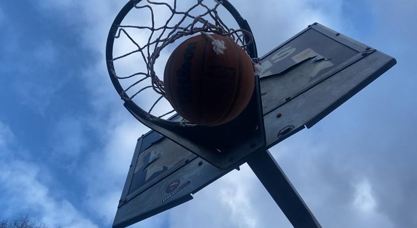
Sports equipment
For this shoot I have taken the inspiration from my photographer Jim Golden as I like sports I wanted to use sports equipment as a starting point and play around with composition of the objects and the way I angle the camera and frame them before I take the picture. I have used a birds eye view for most of my images as this is how Jim Golden has captured his work.


This is something I have edited to see how I can make these better. Something with this style would look good for the photo.


original

photoshop


final outcome


Best
|
Worst
|
|
This is my best because the lighting is minimal but still effective, the balls all have dark black shadows which add to the picture, the shadows are all different sizes and the torch is not in frame. there is no people in the frame or light that is not needed. The light fades from black on the edges to a grey in the middle.
|
This is my worst because the angle seems wrong. You can see people in the background and other objects that were not needed. The shadows are barely visible and add nothing to the picture. All of the balls are not in frame and one of them seems to be hidden behind other balls. You can see parts of dirt on the floor in this picture which takes away from it.
|


Best
This is my best image because the bottle was still and not moving. There is a slight blue light coming off the bottle which adds a good effect to it. In all of the curves on the bottle you can see a light going through them which makes it even better. In the lettering it has a gradient from grey to white because of the the lighting which makes it even better. As this is an opaque bottle you should not be able to see inside it, but because of the lighting you feel like you can see the liquid inside which adds towards the outcome.
|
Worst
This is my worst because the bottle was rolling and would not stay still. It is a clear bottle so there is no light to focus on the bottle. To improve it I need to put something on the bottle to make it stay still. The light is a little dark and the metal is also dark so the lighting took away from this. You can see shadows on the inside of the bottle which takes away from what I wanted it to come out like.
|


