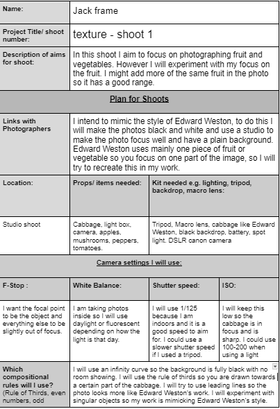
statement of intent
what is my theme
My theme is texture so I will take photos of natural texture such as vegetables, fruits, trees, leaves, and then I will look at manmade texture such as buildings, metals, bricks as I feel these will give a good effect for photographs.
I will aim at showing my creative skills, development and reflection based on the theme texture while researching I came across a photographer's work who had used the style double exposure. This style caught my attention and this is something I may use in my work. At the end of this I will present my best images in a final gallery. Throughout my project I will create a best and worst image from my gallery as this will help me to know what to do to improve and which shoots I need to focus on next.
I will aim at showing my creative skills, development and reflection based on the theme texture while researching I came across a photographer's work who had used the style double exposure. This style caught my attention and this is something I may use in my work. At the end of this I will present my best images in a final gallery. Throughout my project I will create a best and worst image from my gallery as this will help me to know what to do to improve and which shoots I need to focus on next.
research
For my initial research I will be looking at Edward Weston who did black and white images. I could use black and white to show contrast, detail in the fruits, and life in the fruit if it is light. His work is possible to mimic because it is something anyone can do. I would get a fruit or vegetable and create a studio setup, then change to black and white in photoshop.
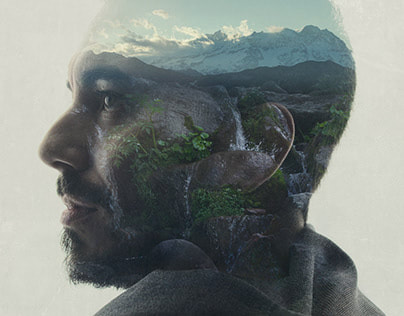
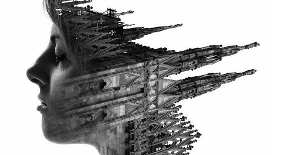
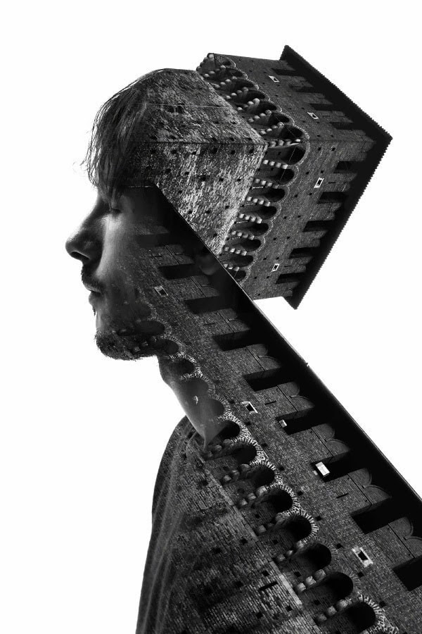
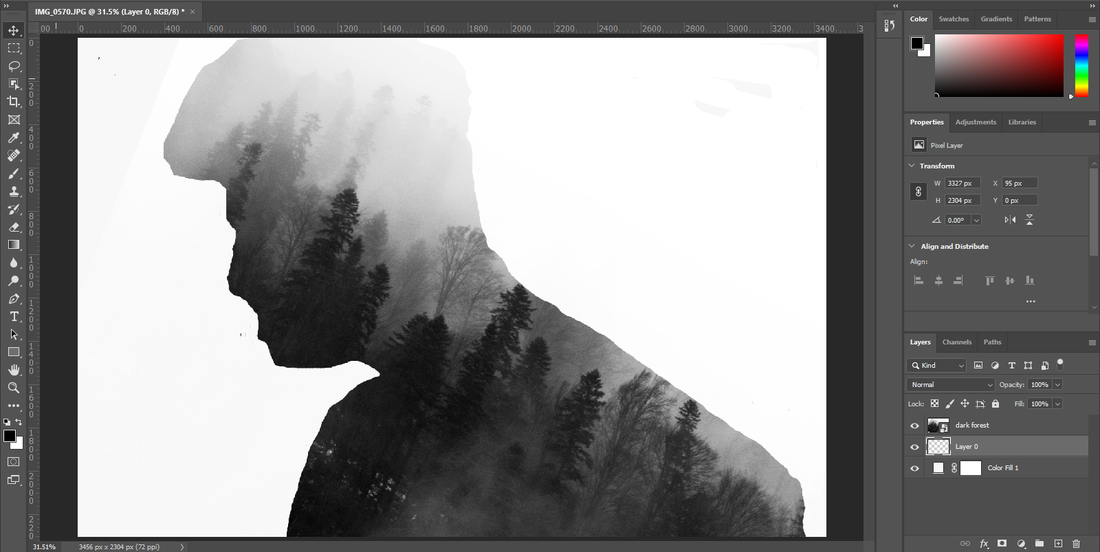
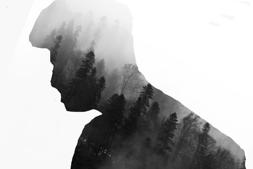
Christoffer Relander is a photographer who does double exposure photographs. I am looking at his work because it is similar to what I would want to do with objects coming off the body to make it seem as if it is part of the body. Christoffer Relander's work will inspire my work because he gets side shots of heads which I would need to do for a better result. He uses black and white on some of his work which makes it blend with the background in a nice way, which I will intend to mimic in my photos. He uses texture which I will also be taking photos of to make the double exposure seem as if it is coming to life. His work comes off as presenting and striking which I like so I will look into it to make my work better.
Christoffer Relander is a photographer who does double exposure photographs. I am looking at his work because it is similar to what I would want to do with objects coming off the body to make it seem as if it is part of the body. Christoffer Relander's work will inspire my work because he gets side shots of heads which I would need to do for a better result. He uses black and white on some of his work which makes it blend with the background in a nice way, which I will intend to mimic in my photos. He uses texture which I will also be taking photos of to make the double exposure seem as if it is coming to life. His work comes off as presenting and striking which I like so I will look into it to make my work better.
first steps
The first thing I am going to do is to take pictures of vegetables and fruits because it will link to Edward Weston. Then I will go around school and look for textures. I am going to go to Manchester to take photos of texture and manmade texture. When I chose this theme, I thought of textures as fruit, leaves, plants and more. After thinking about the project I realise there are textures we don't see everyday or look at everyday such as the patterns in building or floors, patterns on plants, lampposts, glasses. Everything is texture and we don't think of it when asked about what is texture. In this project I will take images of textures not really noticed like the patterns in everyday objects and buildings. Once I have got a collection of images I will put them into best and worst to define my images, then I will put them into photoshop and use a tutorial to learn how to use the techniques. Then experiment with different techniques such as black and white to begin with, double exposure then into a final gallery.
photoshoots i intend to do
The first shoot I plan to do is take images of fruit and vegetables in the style of Edward Weston. I will use a black or white background to add an infinity curve. I will experiment with the amount of vegetables in the picture at once. I will use different white balances to see which has the best look on the vegetables. I will see if light or dark looks better on the image in photoshop.
experimentation
I will experiment with the images in photoshop using different techniques to see what makes it look the best. I will plan to use double exposure with some of the images and put them onto people which shows I need to take pictures of people. I will be experimenting with different textures in the image such as ice or water. When I have all of the images I will put them into photoshop and try different colours with the image to see if a vibrant image would look good on vegetables.
showing progress
I have aimed to complete my initial research within 3 weeks so that I can go out and use the camera. I will spend around 4 weeks experimenting with the camera so that I can get the images I need for photoshop and that I have the right ones I need. When I have completed this I will select the best ones and display them in my final gallary.
what i hope to learn and final results
I will mainly go to peers and teachers for advice as I am looking to improve onto a new level. I plan to watch tutorials to help me understand what i need to do and what skills to demonstrate and develop on. I will reflect on the images and know how to improve on them in the future. I will improve my knowledge on photoshop so I can make the photos have a different view and meaning. I will write a final evaluation on the project as a whole, reflecting on what I did well and how to improve in the future.
first shoot plan
mind map of ideas
research
context
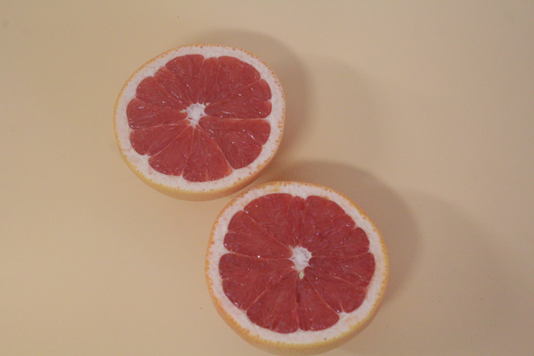
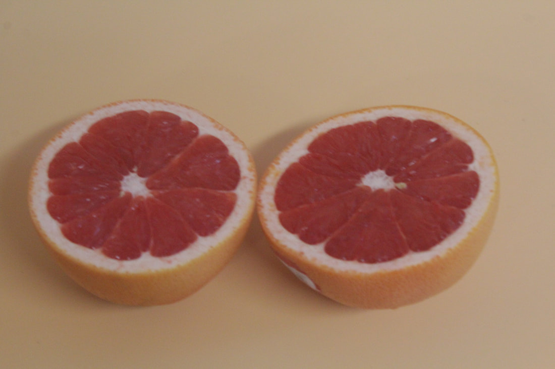
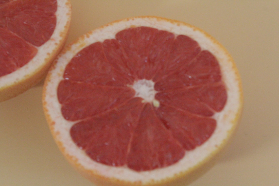
I have been researching into fruit and vegetables and have found these websites about appropriate photographers for fruit. https://henryhargreaves.com/ and another photographer
https://skylerburtphotography.com/5my0geboylsbm5xdiyun7szgl9kbiq
These images show the style of photos that are based on fruit and how they should be portrayed in a photo.
https://skylerburtphotography.com/5my0geboylsbm5xdiyun7szgl9kbiq
These images show the style of photos that are based on fruit and how they should be portrayed in a photo.
composition
these photographers have not used a studio setup as it has been used in a kitchen, restaurants etc. They have also used the rule of thirds as your eyes are drawn towards the fruit on an angle around the corners. There is a lot of objects to focus on in this photo including a knife, board, cloth, bowl. The image is in a perfect quality and the lighting with darkness can help develop a meaning to the image. There are speckles of wood all over the table which makes you think it has been there for a while and has been used for a lot. You can see the age on the fruit with the different colours and blending. There are patterns of paint on the plate which makes you think it has been around and used for a while. You can see holes in the wood which then you know that it was not factory made and it was old. The picture has highlights around the middle so that your eyes are focused towards the main part. The shadows around the pumpkins can show the seasons. With the colours red and orange they can show that it is more chilled and relaxed.
connections
I think this links to my work of texture because I developed on fruit and vegetables with a full gallery to show my work around it. It links to images I took in Manchester because of its close up texture and vibrant colours. I have used mainly darker colours which links to this as it uses darker colours. I have been learning to use skills like these in my images with the colours and the angles.
comment
I personally like the picture because it has used similar skills to what I want to use with my fruit and vegetables project. It uses the sweet spot well with the plate on the right hand side. I like the way the image has been angled and the colours. I plan to use the same colours in my work related to fruit so that it can have the same effect as this image. Compared to Edward Weston's images this is a lot better in my opinion because Weston's is plain and just a cabbage where as this has a lot more to focus on and more colours which I like about this image.
edward weston
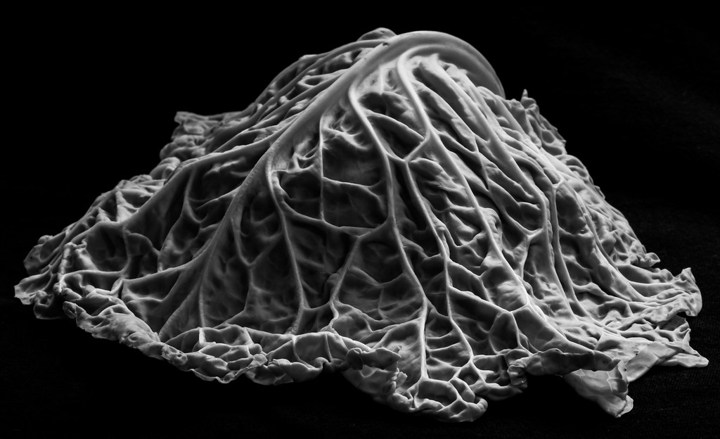
context
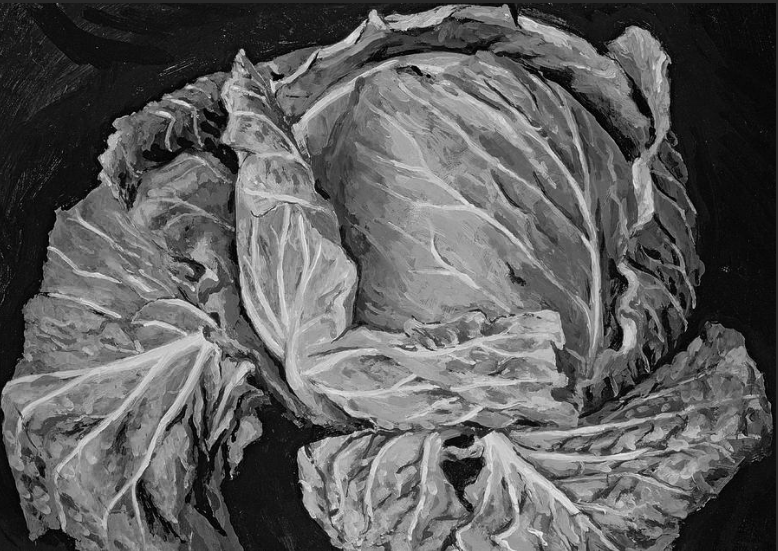
I have researched Edward Weston and found some background details about his work. "Weston started making a series of monumental close-ups of seashells, peppers, and cabbages, showing their sculptural forms through photographic means during the late 1920s. These particular photographs demonstrate Weston’s extraordinary sense of the texture of surfaces, which he depicted with a superb richness of varying black-and-white tones". I also found something about his presentation of work. "Even though Weston believed in presentation and not interpretation as being of artistic concern to him, it is his exquisite compositions of natural objects that frequently enthrall viewers because they evoke ambivalent interpretations by associations of forms. " information sourced from https://www.holdenluntz.com/magazine/new-arrivals/edward-weston-cabbage-leaf/
composition
This picture was taken on a film camera as digital technology had not been invented during Weston's life time. This means that the lighting, focus, iso, white balance etc would have to be done manually and through the camera lens) This picture has had 0 editing which can show how good the camera work is.
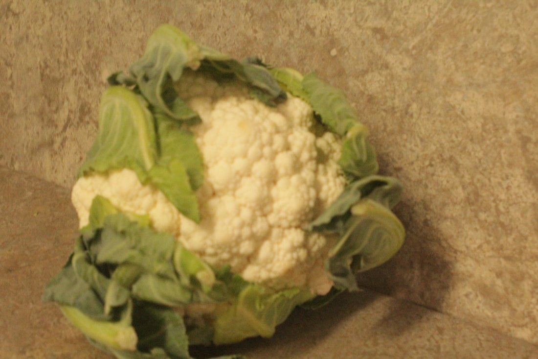
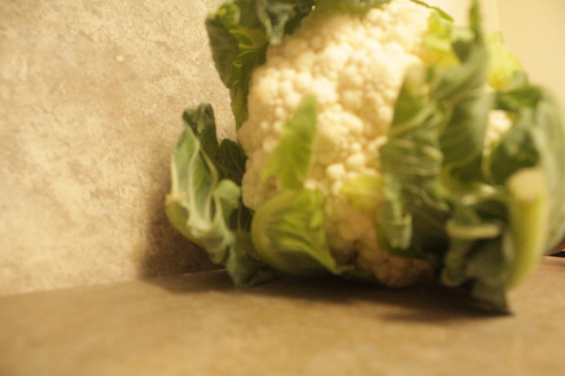
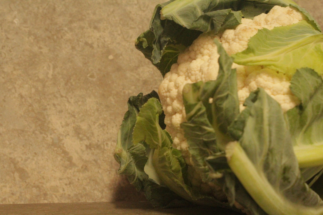
This is a still life image as it is an image that depicts inanimate objects. It has been taken in a studio, a tripod would have been used to allow the position of the camera to be still and adjusted slightly when needed. The setup used is a black infinity curve background. The curve of the black background allows there to be no separation of the base that the object is placed on and the wall behind allowing no visual distraction,the viewer is only focused on the object that has been shown. The black background goes with the composition of the cabbage and the lighting because the colours are contrasting light and dark. The studio light is coming from the right hand side which creates a lovely contrast between the white of the veins and the black of the background. The light shines onto the veins so they are highlighted on the picture they become leading lines and draw your eye to them. The cabbage is positioned so your eyes are drawn towards the top vein curving. The rule of thirds has been used in the top right corner which is known as the ‘sweet spot’ and helps to position This picture has been cropped and has a shadow depth so it appears closer then it actually is. it is as though you could reach out and touch it. The cabbage looks fresh and alive because of the colours used and how it is reacting with the light. This picture has been taken at a high standard as it shows the talent and knowledge of the photographer.to help the audience feel engaged. I personally don't like the picture because the subject is not interesting where as outside images of architecture could have been better for the audience as there is a lot to focus on architecture. The rule of thirds has been used so your eyes are drawn towards the top of the cabbage where the stem curves round from the middle. An infinity curve has been used so the background looks pitch black and the cabbage is white. I can see that the picture has been taken professionally and most likely a studio shot. Weston has used a variety of skills in this picture including a highlight on the veins of the cabbage. The leading lines have been placed exceptionally with the close up of the cabbage. The way it is close up really makes you think about how detailed this can be if you get the right parts of it. The colour black is commonly used with his work as you can see from this one so he has used his normal colour pallet to make this piece fit into his gallery . The darkness of the background is almost like a dark is in the image. This picture feels like it has been taken in the night sky upon the darkness on the sky. You really think about what time this was taken at or if it was a studio image. Weston could have used a zoom lens to get close up in high quality. The way he has used white on the cabbage shows how alive it is and that it is fresh. You can see that only a small part of cabbage has been used, this could be so an audience can focus more on one part of the cabbage.
This is a still life image as it is an image that depicts inanimate objects. It has been taken in a studio, a tripod would have been used to allow the position of the camera to be still and adjusted slightly when needed. The setup used is a black infinity curve background. The curve of the black background allows there to be no separation of the base that the object is placed on and the wall behind allowing no visual distraction,the viewer is only focused on the object that has been shown. The black background goes with the composition of the cabbage and the lighting because the colours are contrasting light and dark. The studio light is coming from the right hand side which creates a lovely contrast between the white of the veins and the black of the background. The light shines onto the veins so they are highlighted on the picture they become leading lines and draw your eye to them. The cabbage is positioned so your eyes are drawn towards the top vein curving. The rule of thirds has been used in the top right corner which is known as the ‘sweet spot’ and helps to position This picture has been cropped and has a shadow depth so it appears closer then it actually is. it is as though you could reach out and touch it. The cabbage looks fresh and alive because of the colours used and how it is reacting with the light. This picture has been taken at a high standard as it shows the talent and knowledge of the photographer.to help the audience feel engaged. I personally don't like the picture because the subject is not interesting where as outside images of architecture could have been better for the audience as there is a lot to focus on architecture. The rule of thirds has been used so your eyes are drawn towards the top of the cabbage where the stem curves round from the middle. An infinity curve has been used so the background looks pitch black and the cabbage is white. I can see that the picture has been taken professionally and most likely a studio shot. Weston has used a variety of skills in this picture including a highlight on the veins of the cabbage. The leading lines have been placed exceptionally with the close up of the cabbage. The way it is close up really makes you think about how detailed this can be if you get the right parts of it. The colour black is commonly used with his work as you can see from this one so he has used his normal colour pallet to make this piece fit into his gallery . The darkness of the background is almost like a dark is in the image. This picture feels like it has been taken in the night sky upon the darkness on the sky. You really think about what time this was taken at or if it was a studio image. Weston could have used a zoom lens to get close up in high quality. The way he has used white on the cabbage shows how alive it is and that it is fresh. You can see that only a small part of cabbage has been used, this could be so an audience can focus more on one part of the cabbage.
connections
In my opinion this picture is relevant to my work because the image has depth texture and there is a lot to focus on. He has used a studio style of image which is how I will take them for my texture work. Edward Weston took pictures of fruit and vegetables so I might choose this as my starting point. The way he used the rule of thirds can inspire me to recreate it into my work and take inspiration from his work. This picture is simple and something I can do for my work. He used an infinity curve on the image to add a shadow depth to the image and it is all black. His image is black and white so I might take my images in colour then revert it to black and white in photoshop. the lighting in this image is immaculate because it really shows how dark the background is but the subject of the cabbage is luminous so I will include this into my work. By using the rule of thirds your eye runs down the veins so I will include this into my images. The leading lines are exceptional where they have been placed with the positioning on the cabbage shows you how detailed it really is close up I will take the idea of cropping the image and use close up in my work.
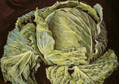
Original Vincent Yorke |
Edited on Photoshop |
Edward Weston's work can be connected to this still life painting of a cabbage by Vincent Yorke it looks very similar to his work. The way the artist has focused on the texture and detail reminds me of how Edward captured the detail but in black and white using the camera. Here I have changed the painting to black and white and it is not as detailed as Edward Weston's black and white. The concept of capturing texture and detail using still life is defiantly something I will consider.
|
comment
I personally do not like the picture because the subject is not interesting, whereas outside images of architecture could have been better for the audience as there is a lot to focus on architecture. All though I do not like this image I do admire the skills Edward Weston is demonstrating this might be something I could be inspired by. The way he used the rule of thirds really draws me to the stem of the cabbage. He used the sweet spot well on the stem too so even though I don't like it I do admire it. I like the way he used an infinity curve on the background so it looks like a void is in the image. I like the way it looks like something is on the inside of the cabbage to hold it up. The leaves are sticking out which makes it seem like it is growing which I like about it. The black pigments on the white veins gives it an altruistic effect on the cabbage.
natural texture

|
|
BEST Worst
|
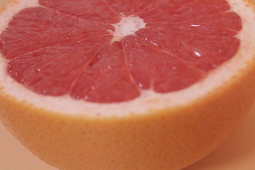
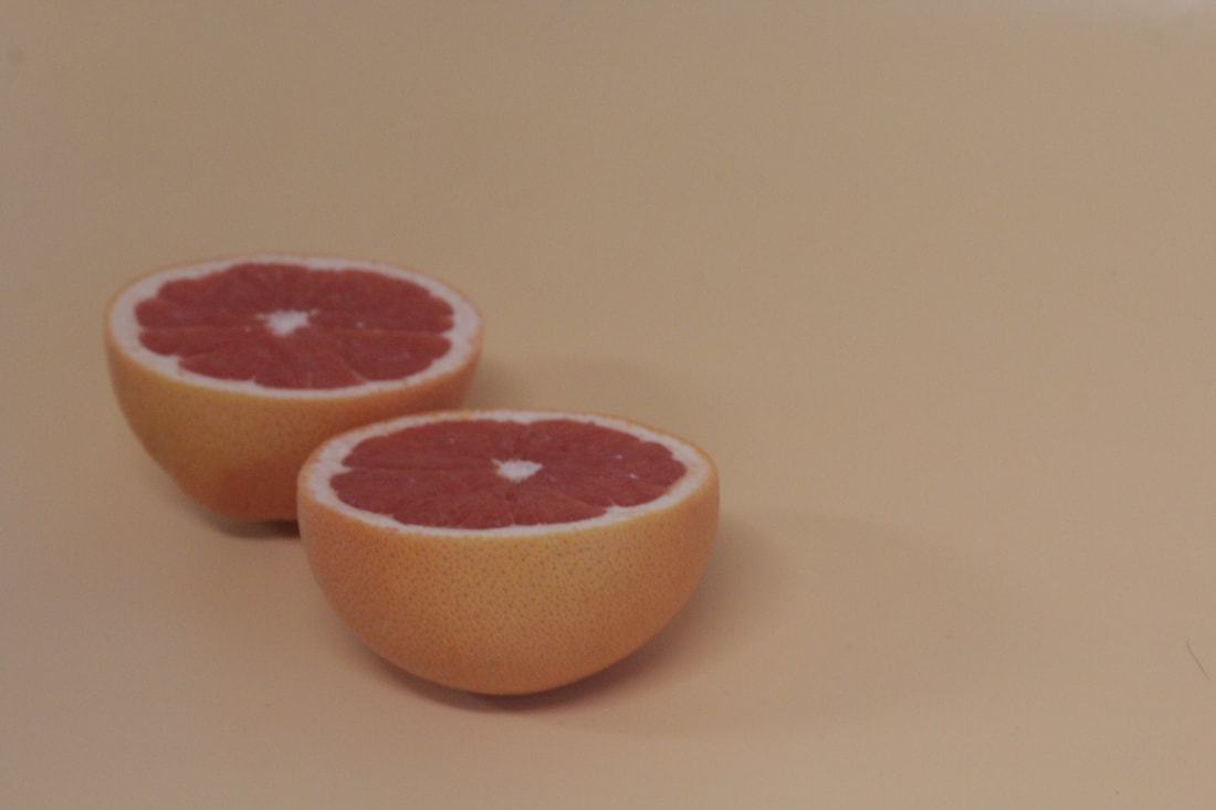
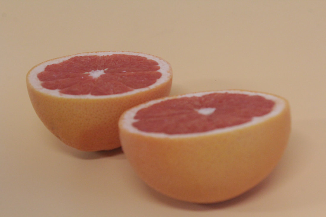
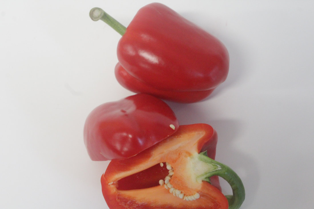
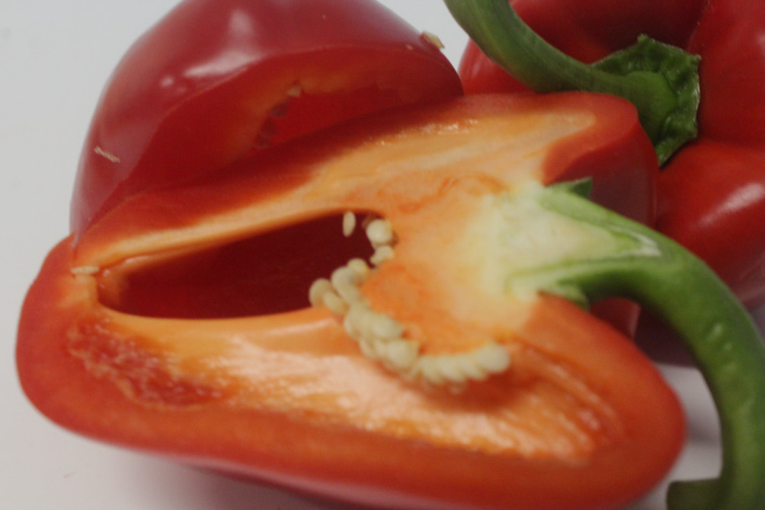
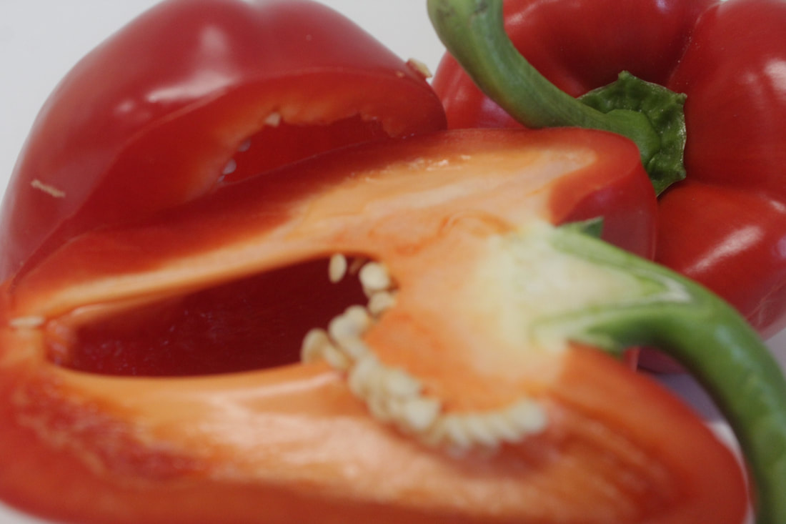
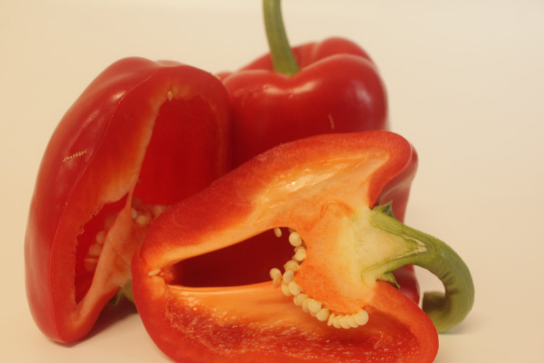
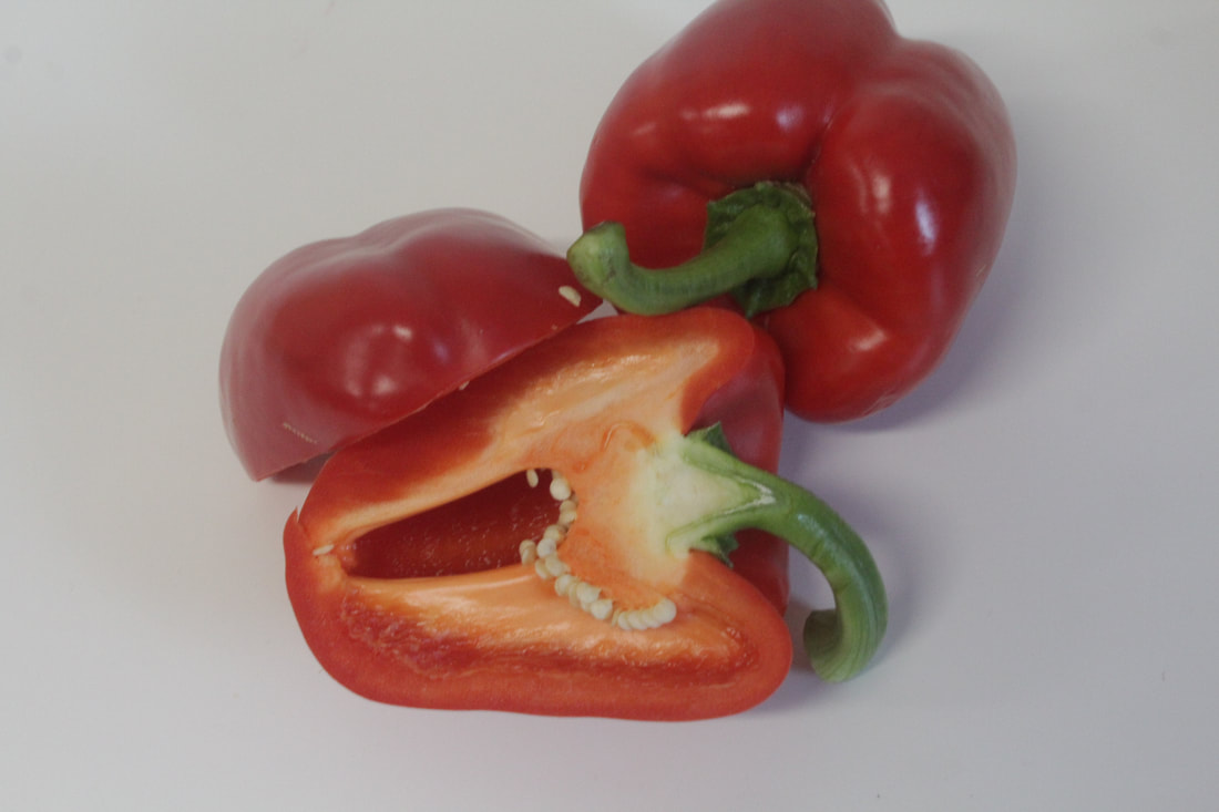
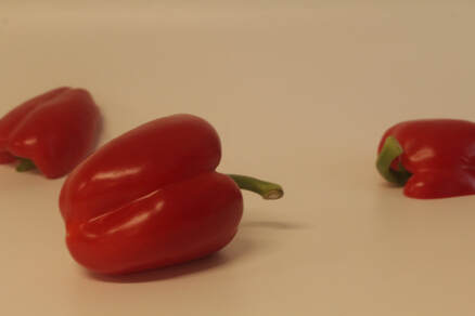
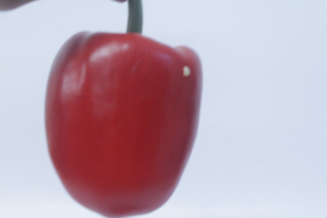
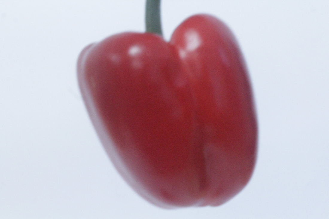
This is my best because the colours are vibrant and is clear and in focus, the lighting has created highlights on the pepper, your eyes are drawn towards the middle of the pepper at the front as this is in the foreground of the image, I have selected 3 peppers as I know visually 3 works well as a composition it helps to balance the picture. I have a mid depth of field as everything is in focus. I have placed the peppers in the middle of the picture as this is the focus point of the picture. The white background helps show the tones of red and the green stem two contrasting colours stand out.
|
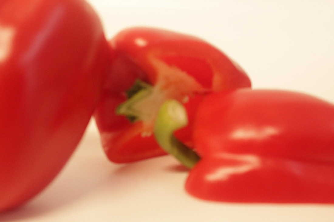
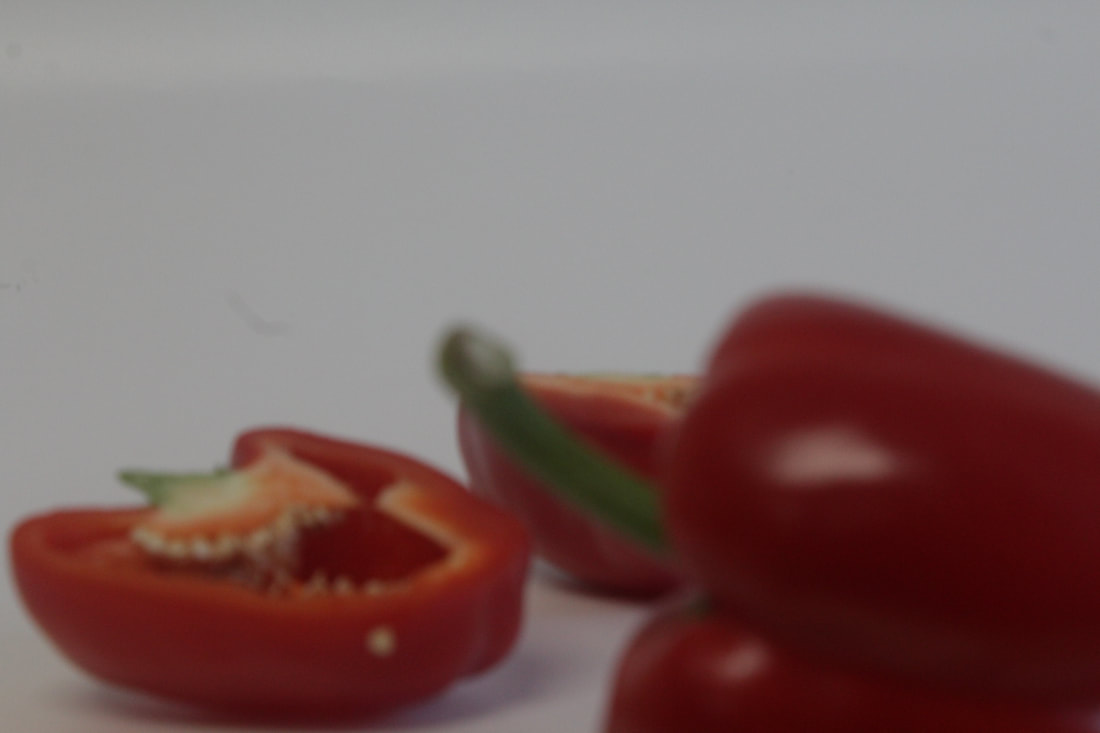
This is my worst photo because it is dark and the colours are not bright as my camera settings were not correctly set. Because of the lighting in the room I should have set my white balance to automatic. The composition is not strong because everything is scattered around making it hard to know what to look at, This is because I did not create a focus point. the peppers have a bright shadow so you can see part of the background clearly. I used the 3 peppers again but visually it does not look at pleasing as my best picture.
|
|
|
|
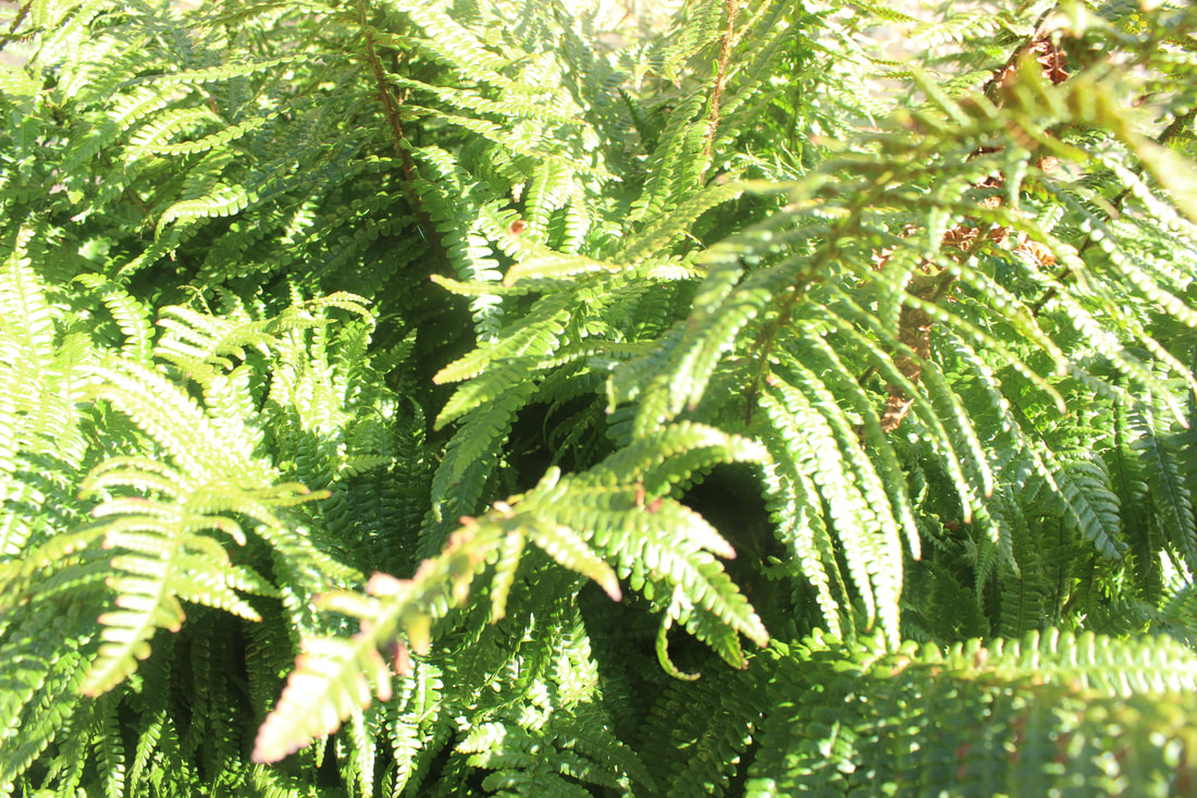
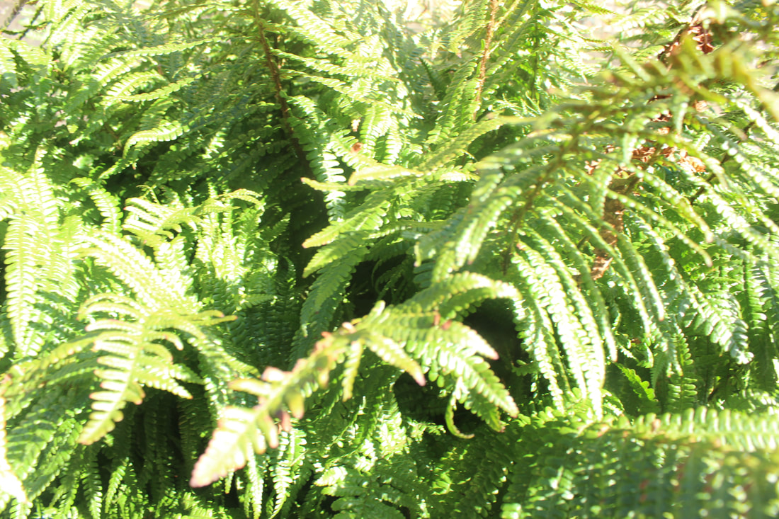
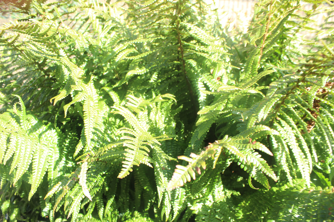
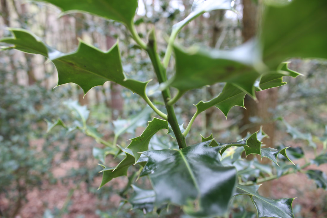
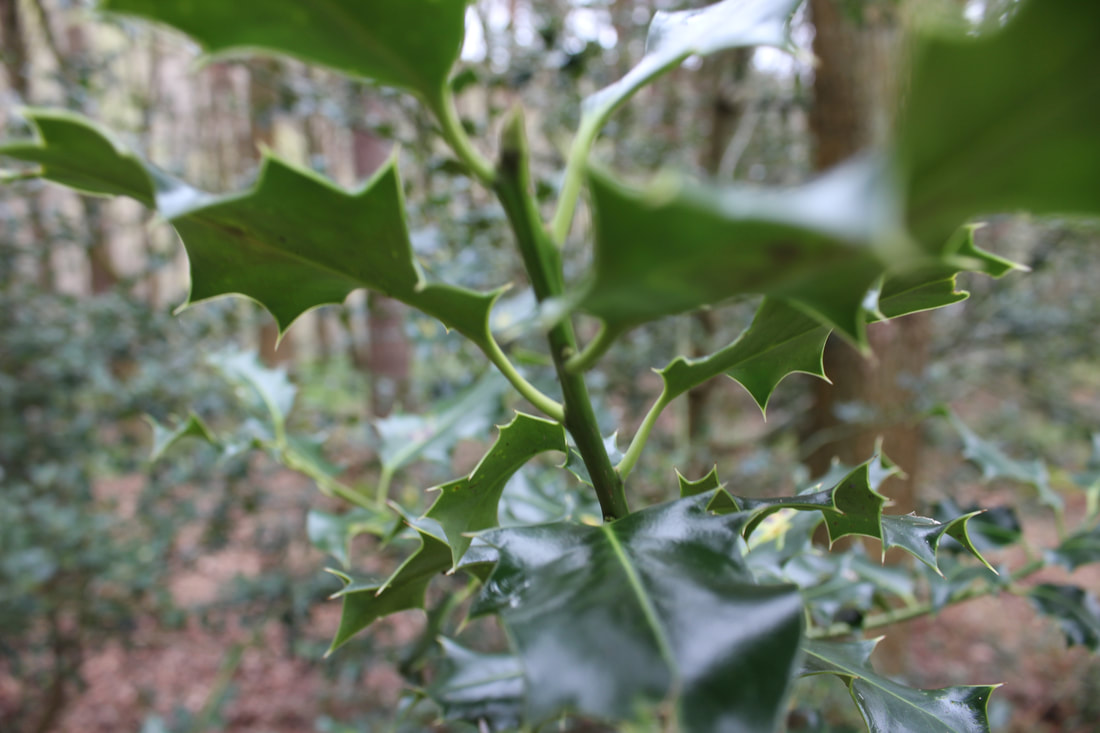
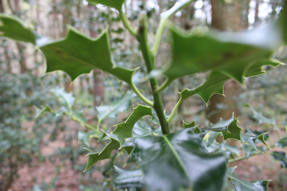
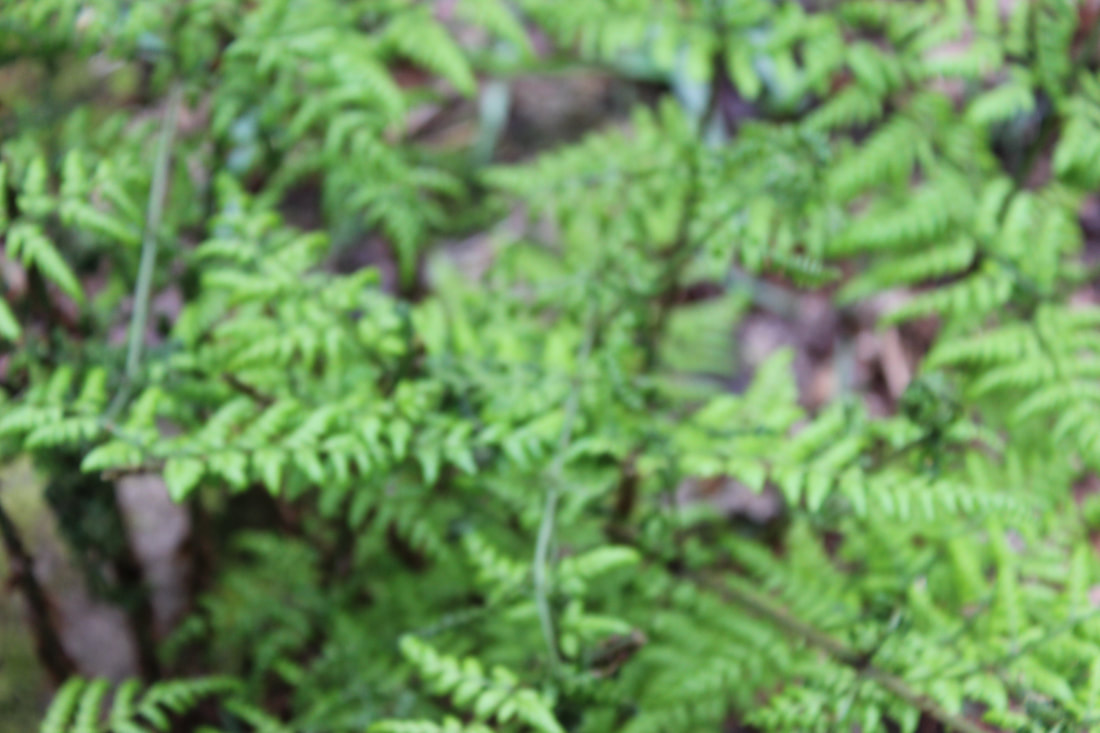
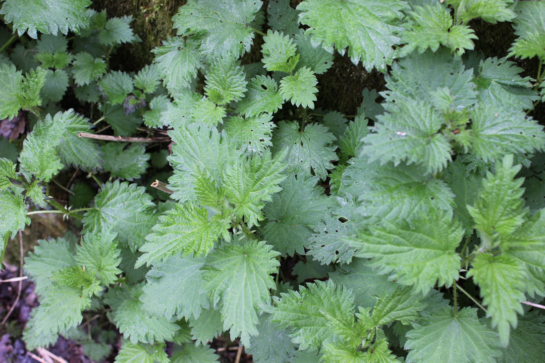
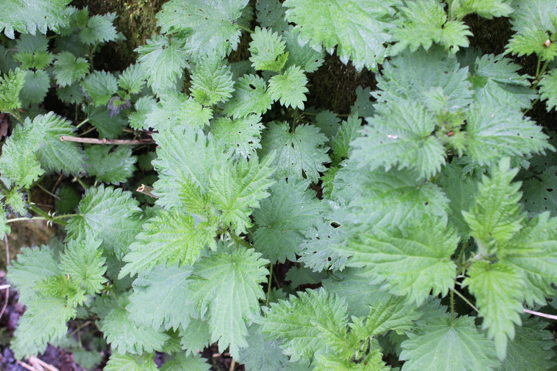
BEST
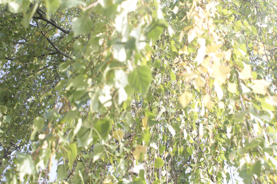
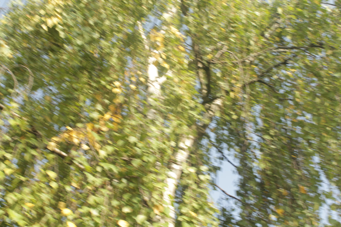
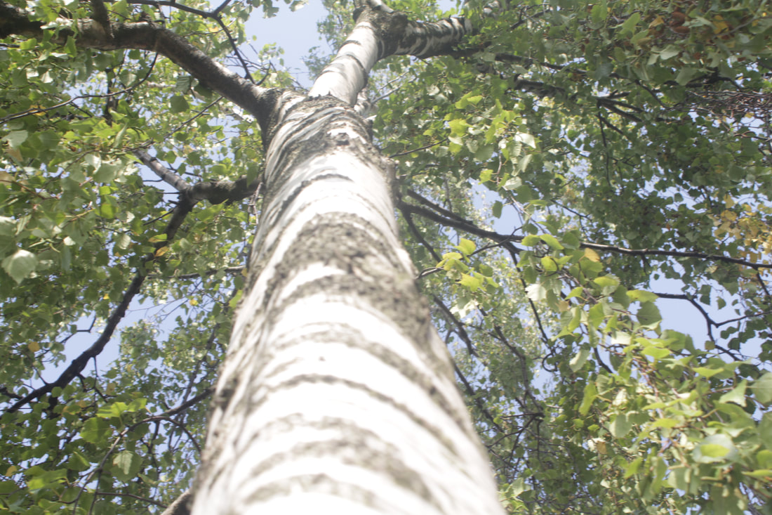
This is my best picture because I used the rule of thirds really well with the leaf. Your eyes are drawn towards the leaf as it is the sweet spot of the photo. The light is shining through the leaves which adds a shine onto the leaf which has been used in a way where it looks wet and fresh. The whole photo is in focus, The lighting has created a highlight on the leaves. The leaf looks crisp and crumpled where as the emerald green leaves are alive and fresh which can show the difference between young and aged in a way.
|
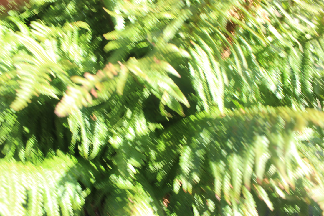
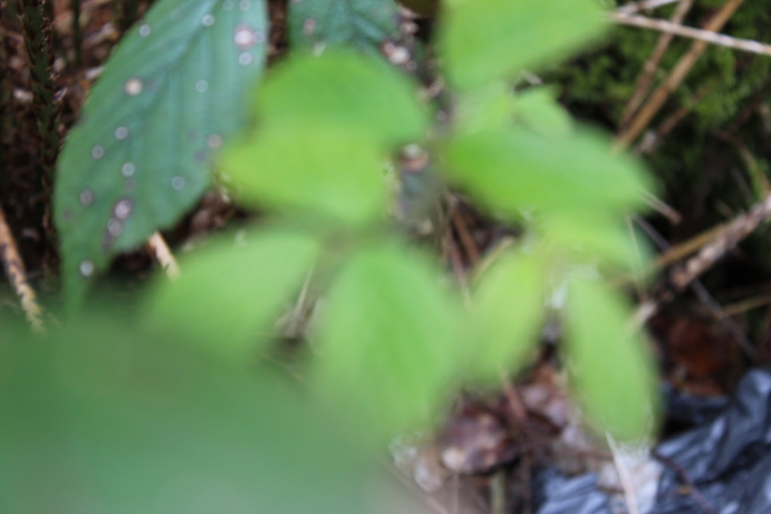
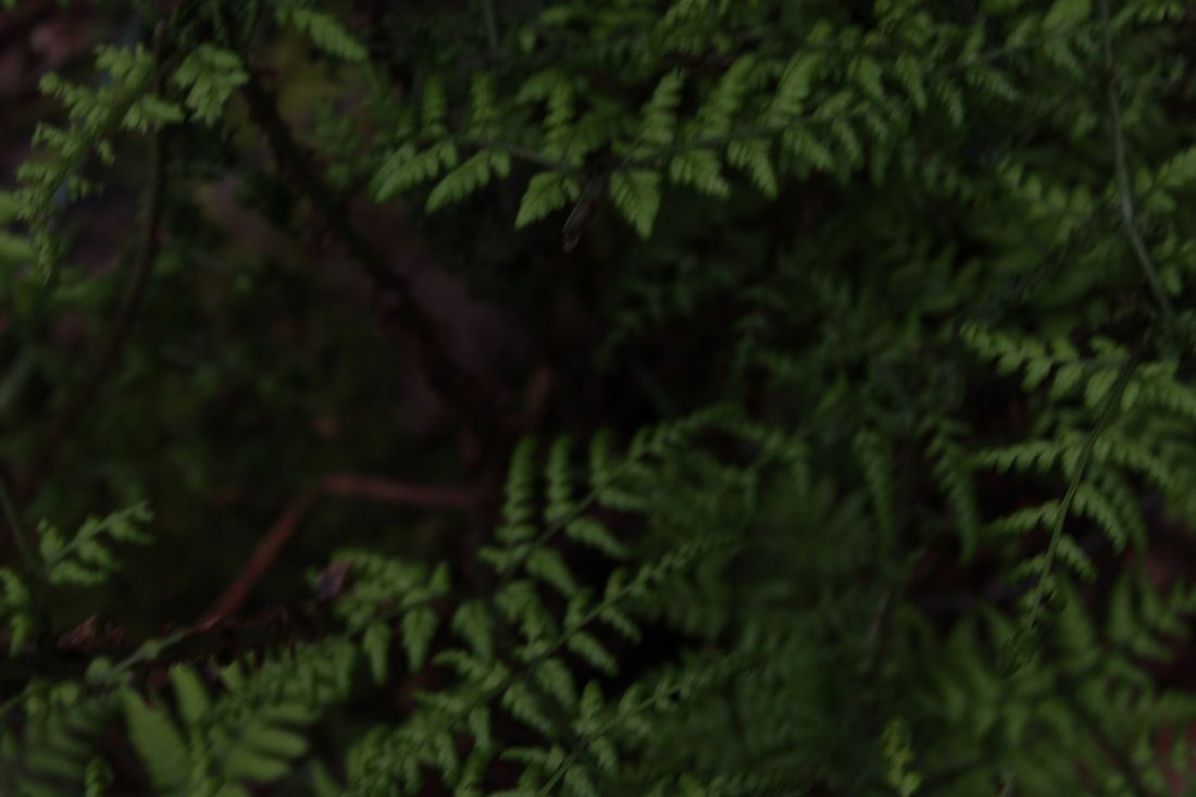
WORST
This is my worst photo because I did not use the white balance well as the photo is dark. There is nothing to focus on as I did not get close up to anything unlike the best photo. As you get towards the middle of the photo everything begins to have a slight blur which takes away from the quality of it. Some parts of the photo are very dark so you cant see part of the branch.
you cant see how green the leaves are so it looks dull and blank. |
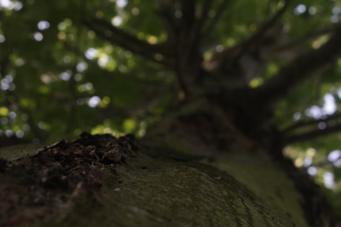
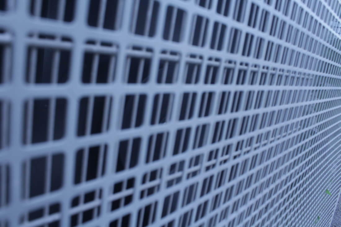
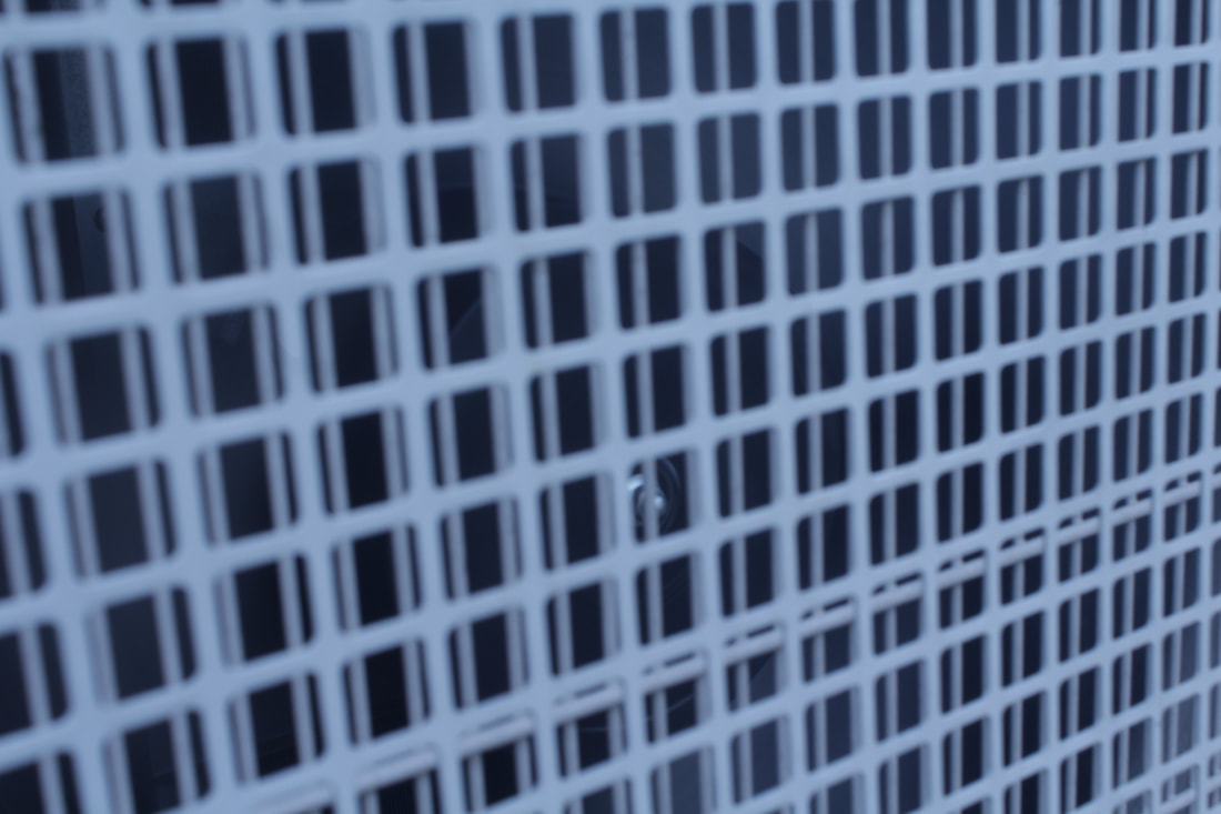
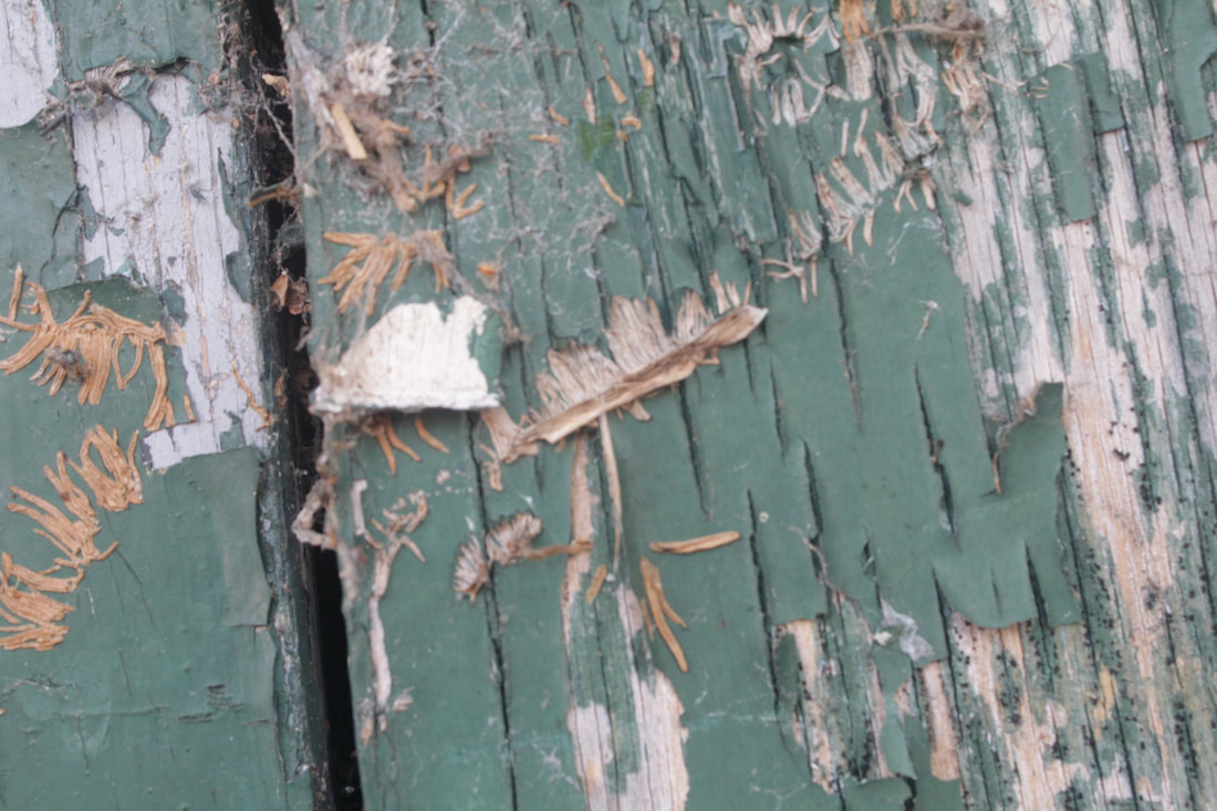
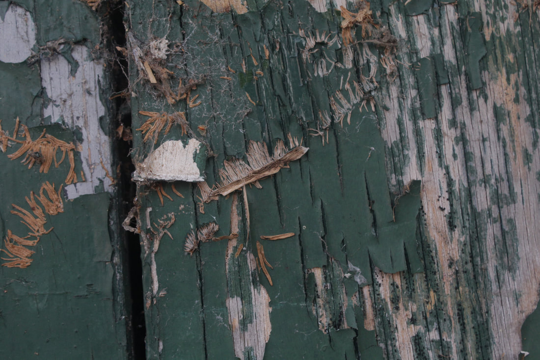
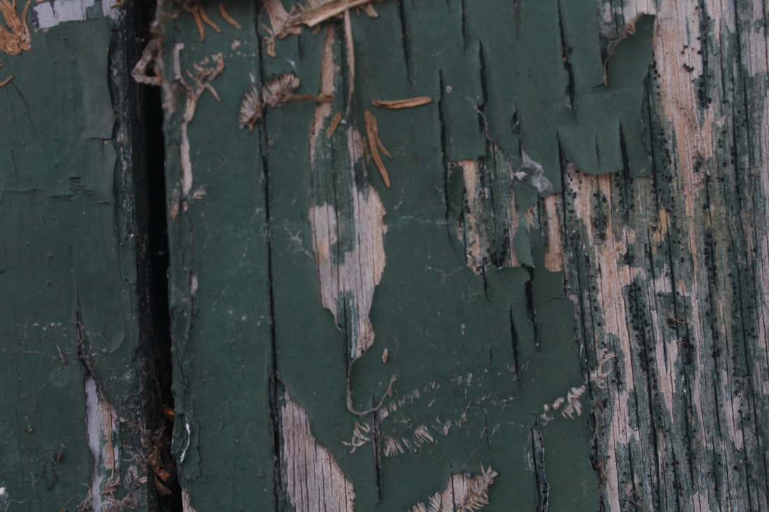
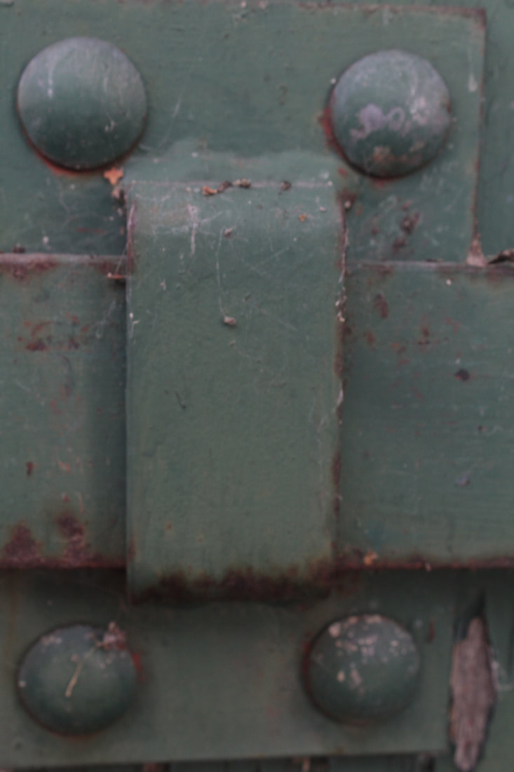
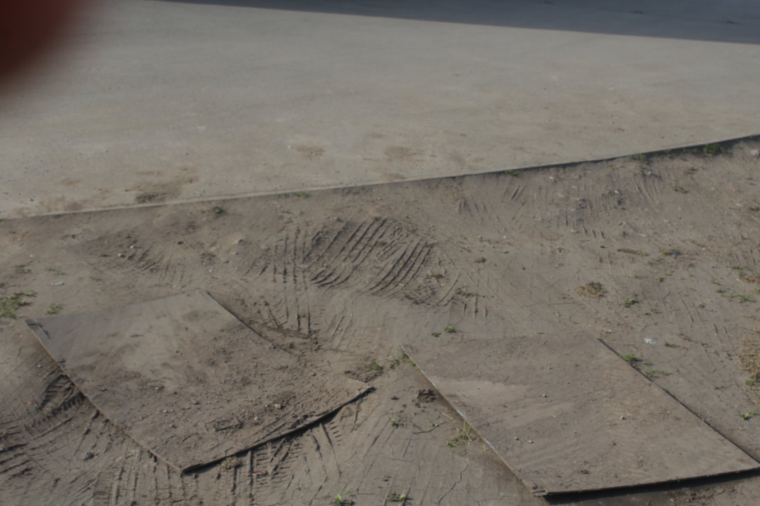
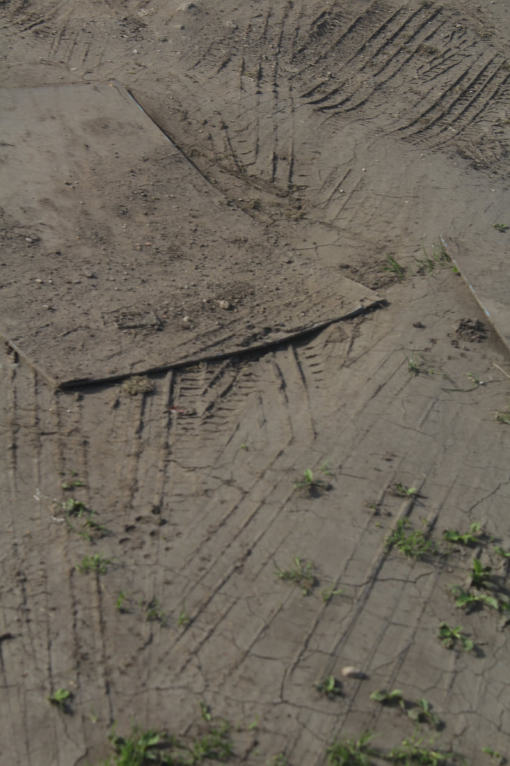
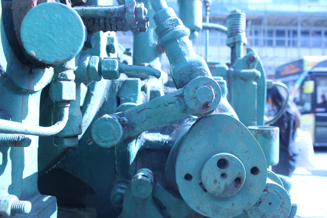
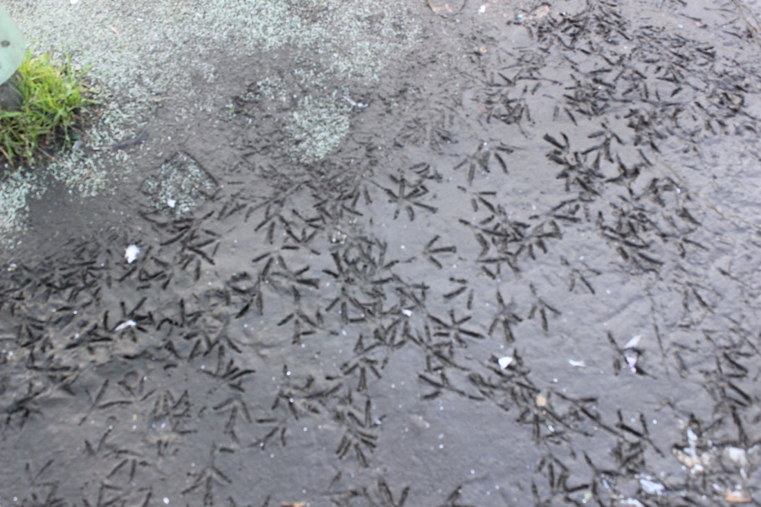
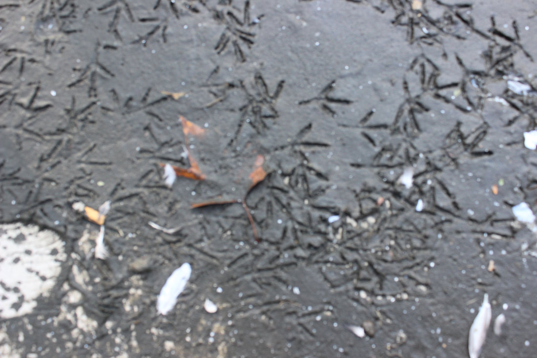
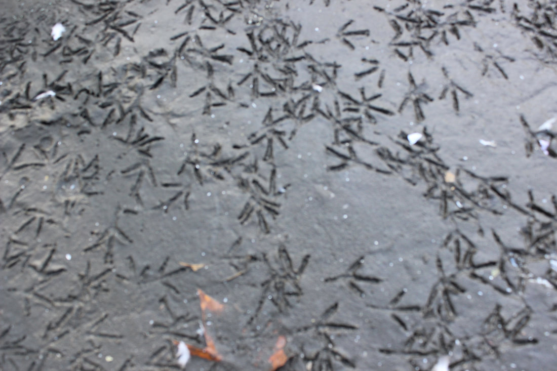
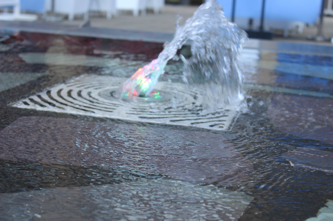
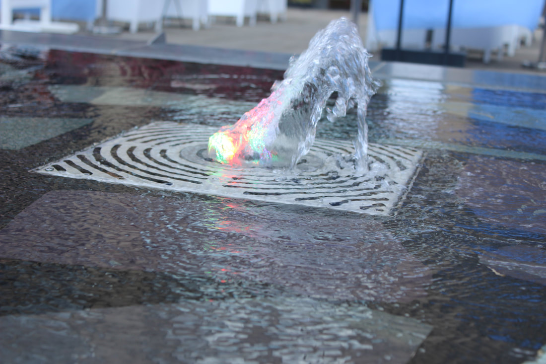
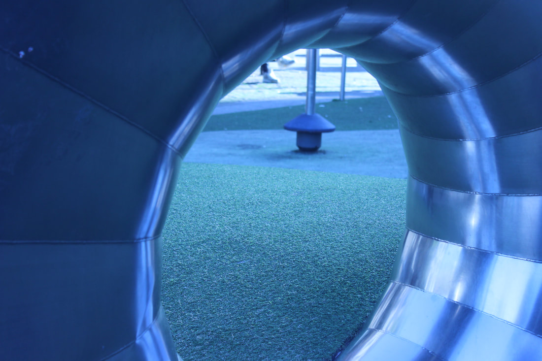
man made texture
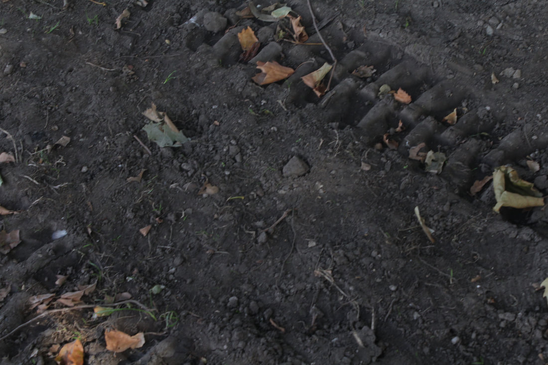
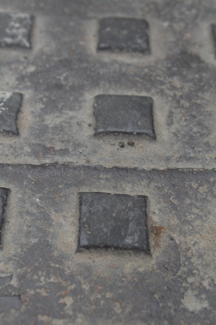
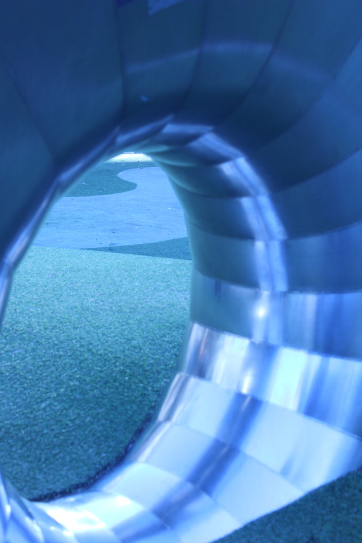
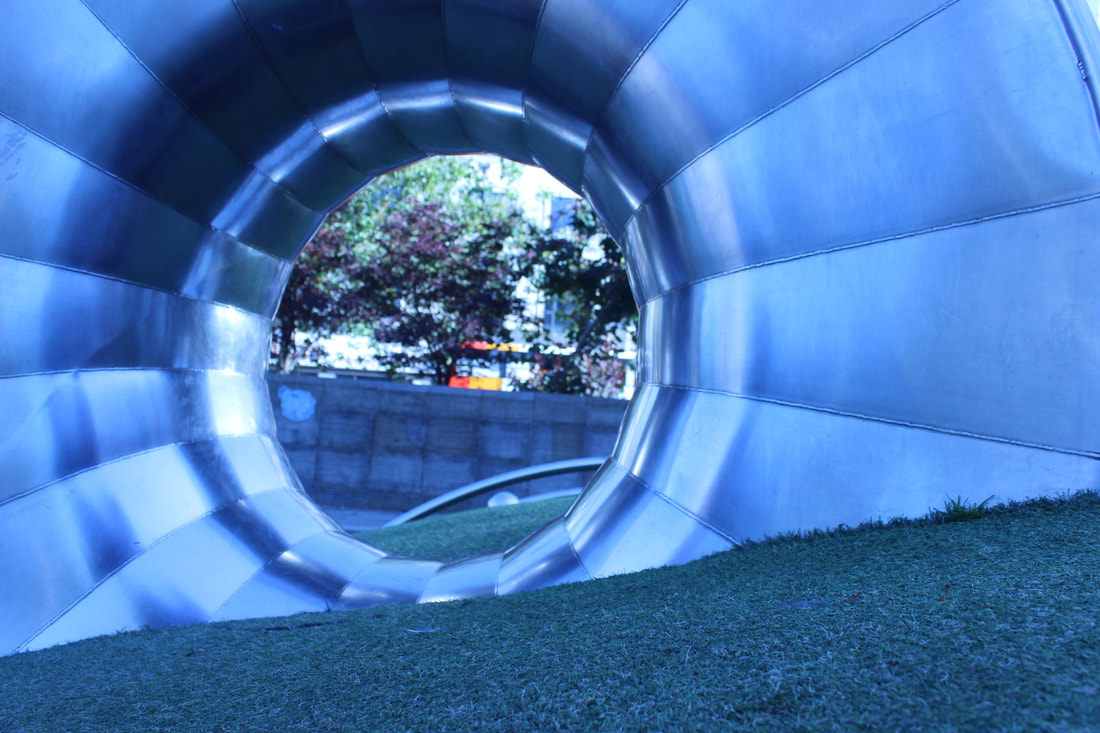
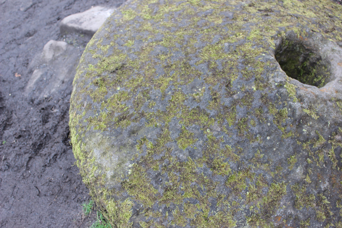
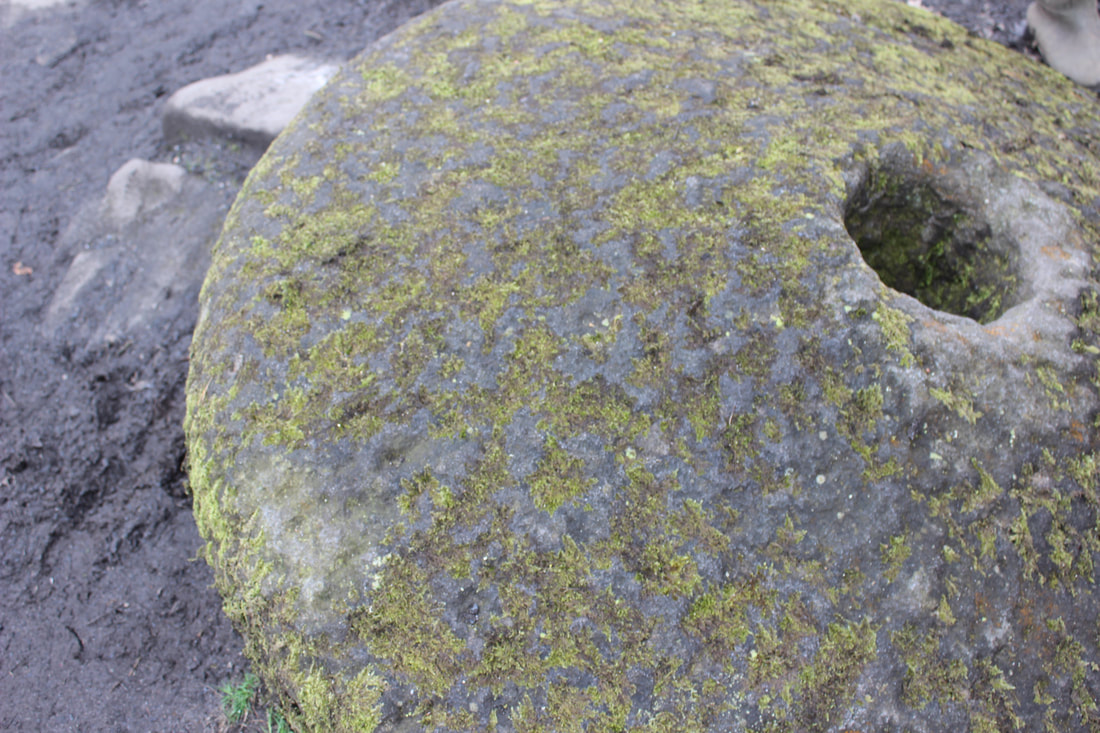
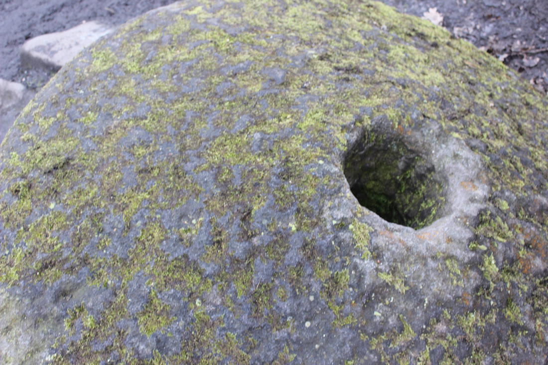
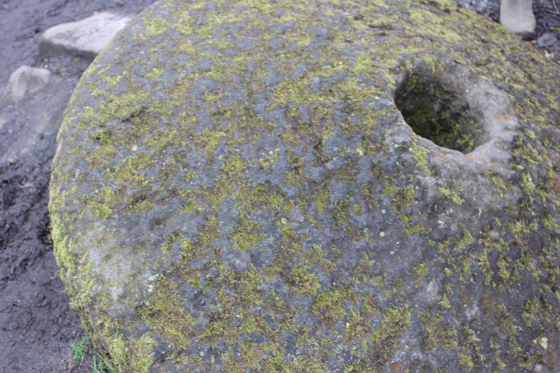
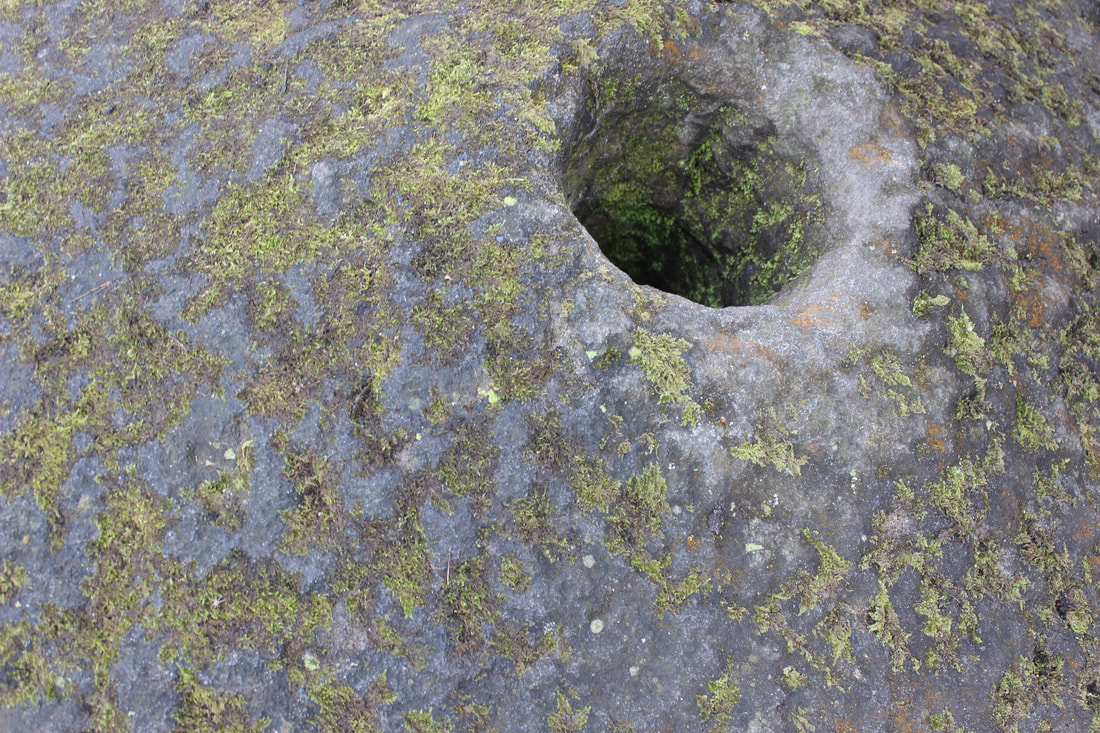
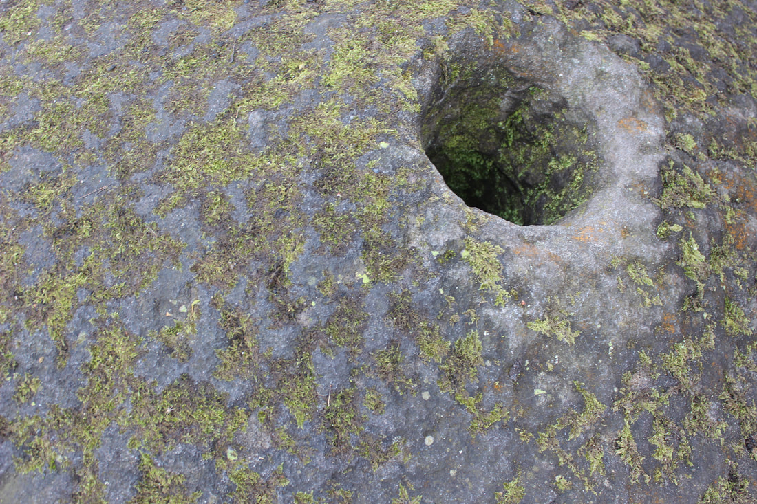
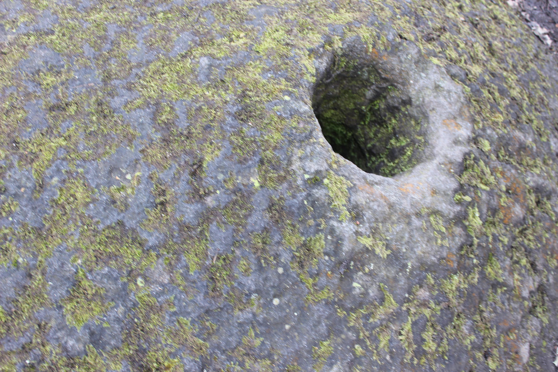
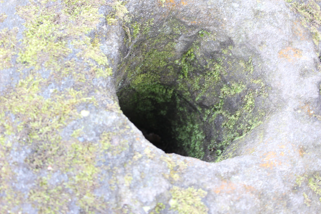
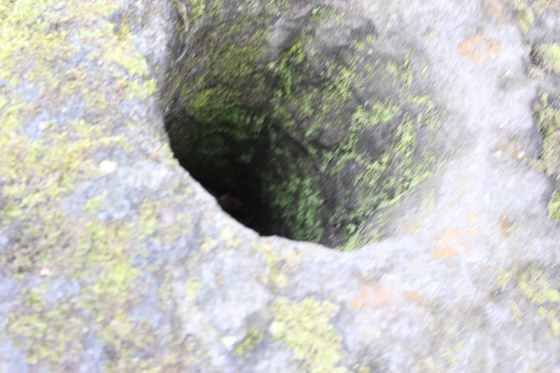
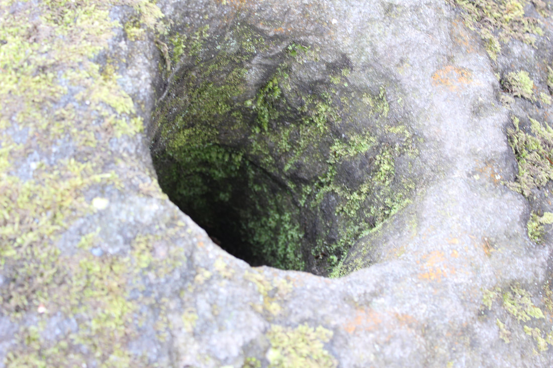
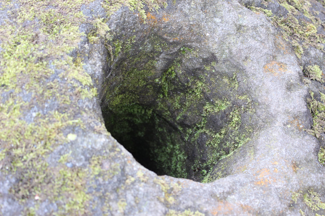
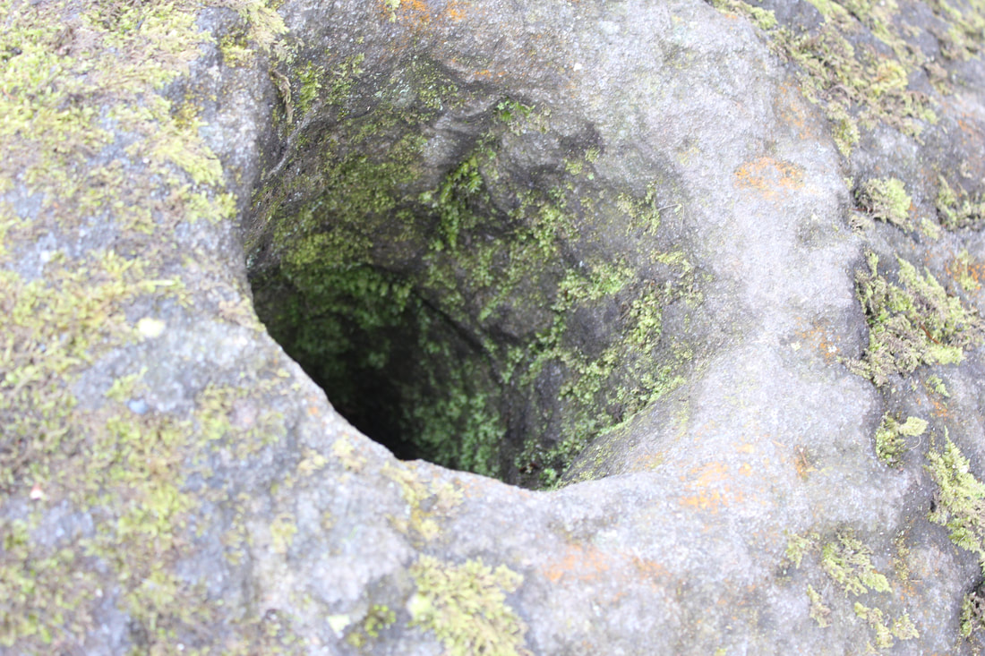
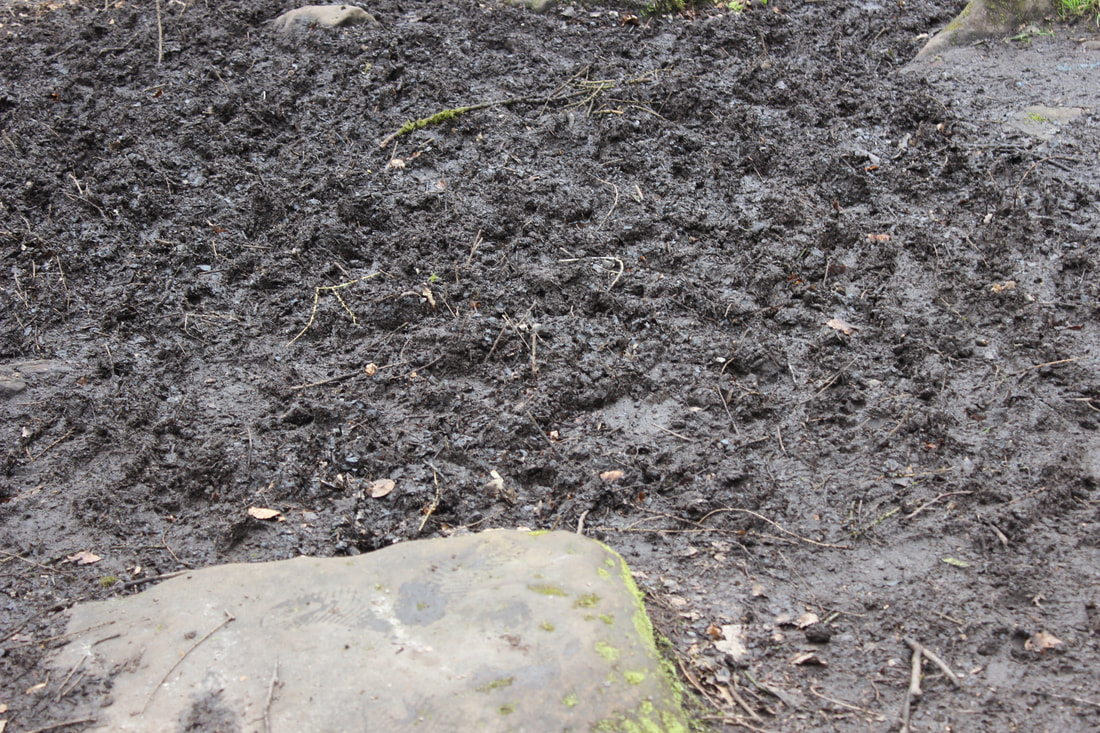
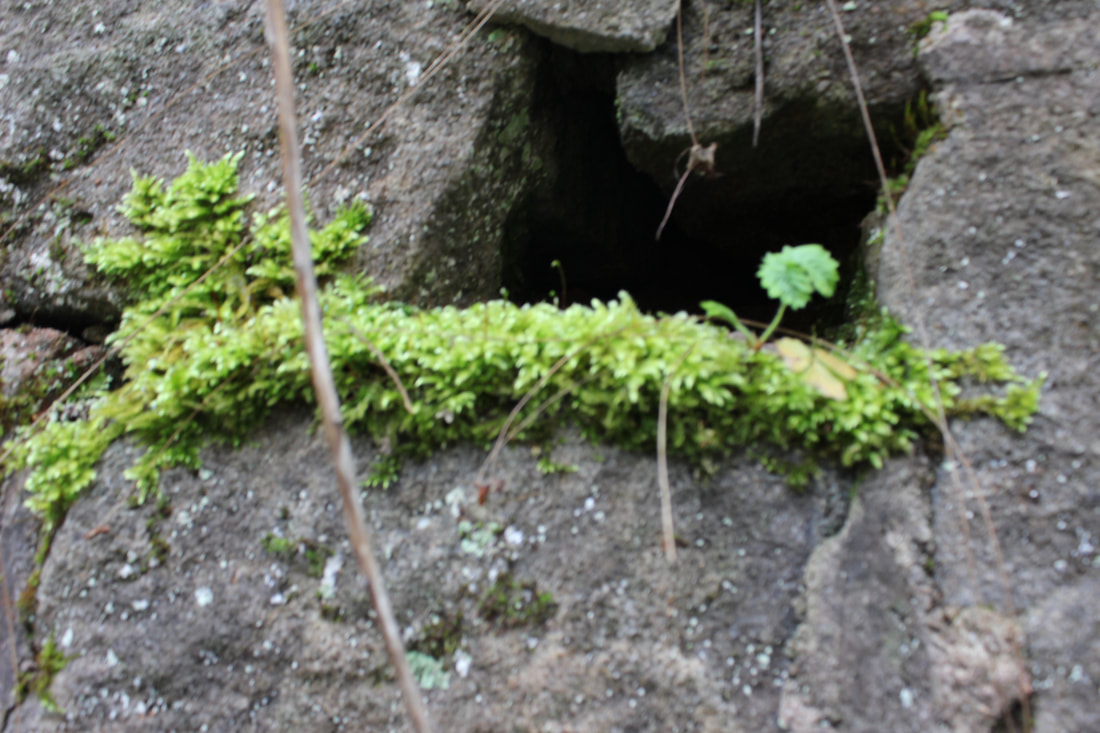
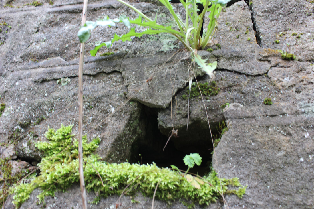
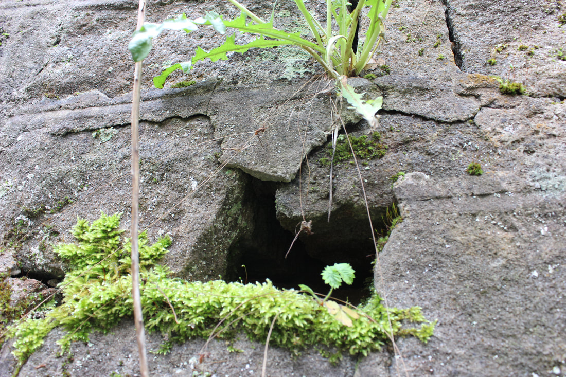
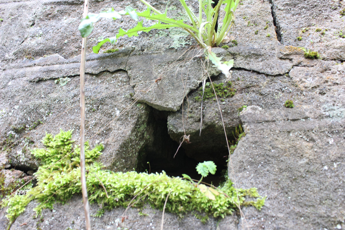
BEST
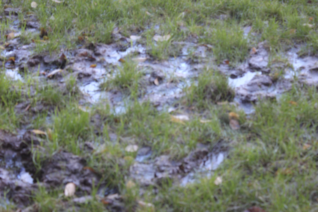
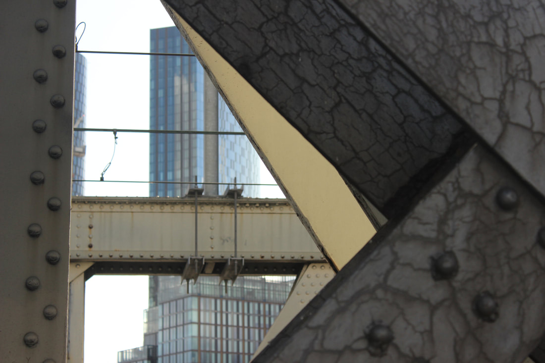
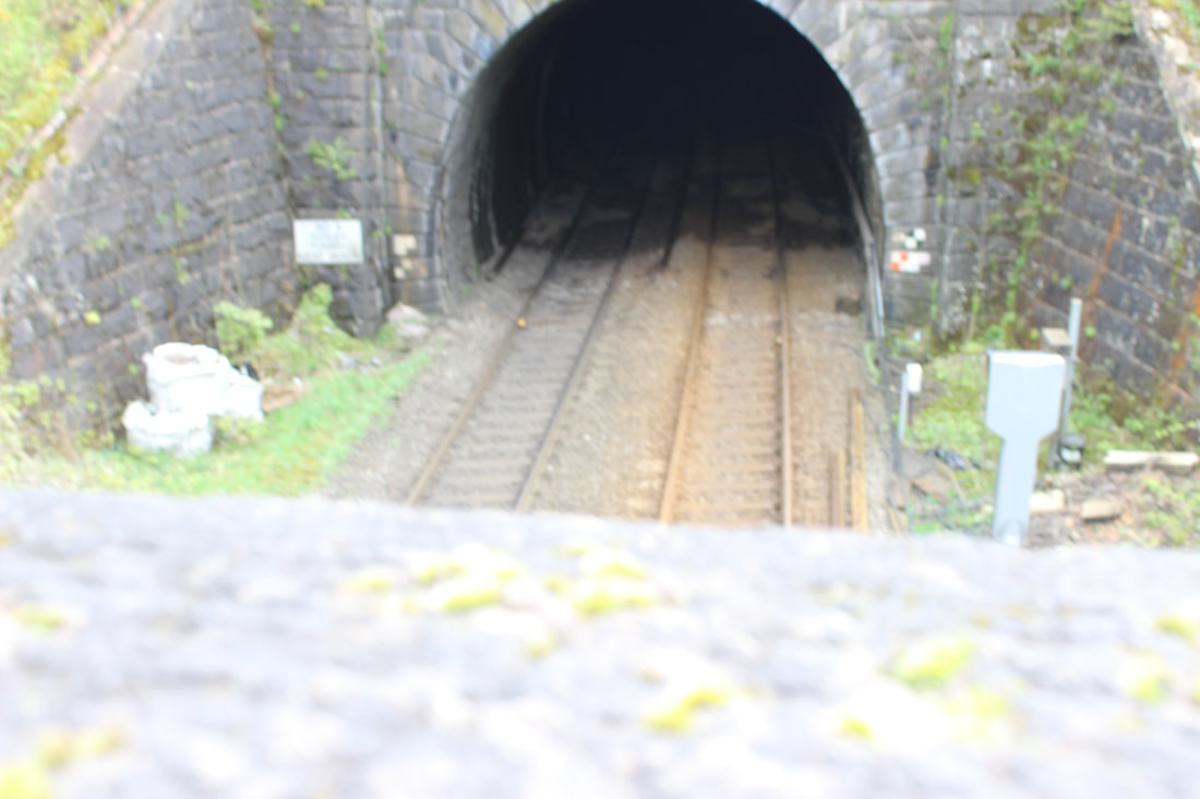
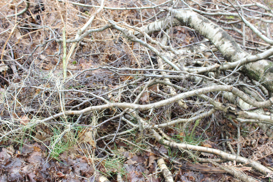
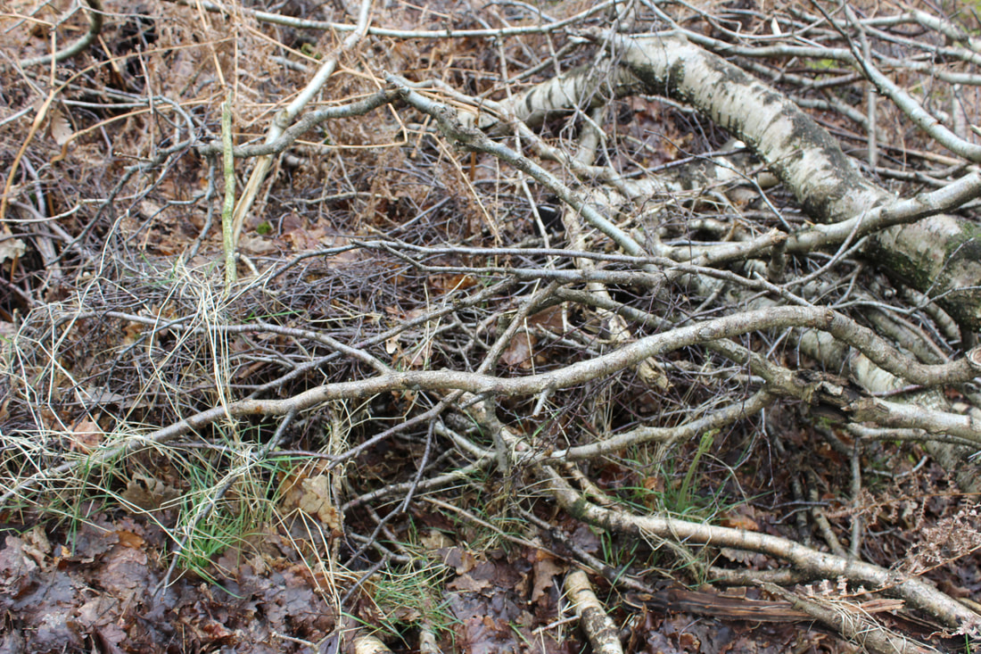
This is my best because at the start it is clear and close but as it gets further away it goes blurrier which I like about it. It seems like a road and it keeps going and you don't know when it ends which is an exquisite effect. The rule of thirds has been used in the hole on the bottom right as your eyes are drawn to it wondering what is in the hole.
|
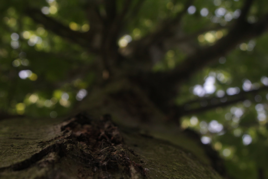
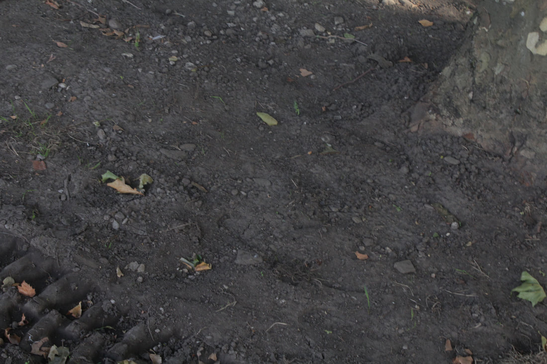
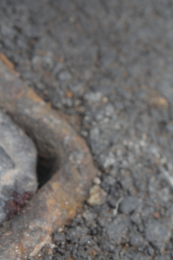
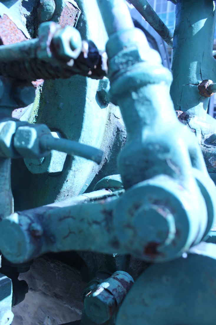
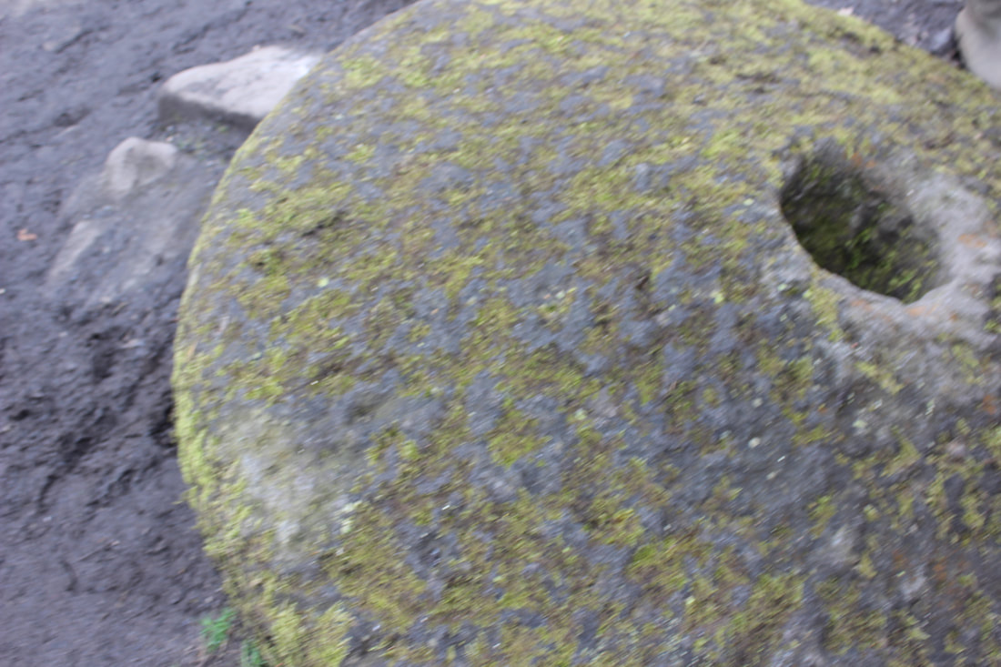
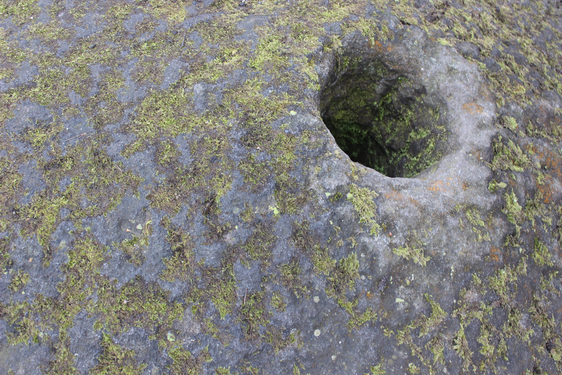
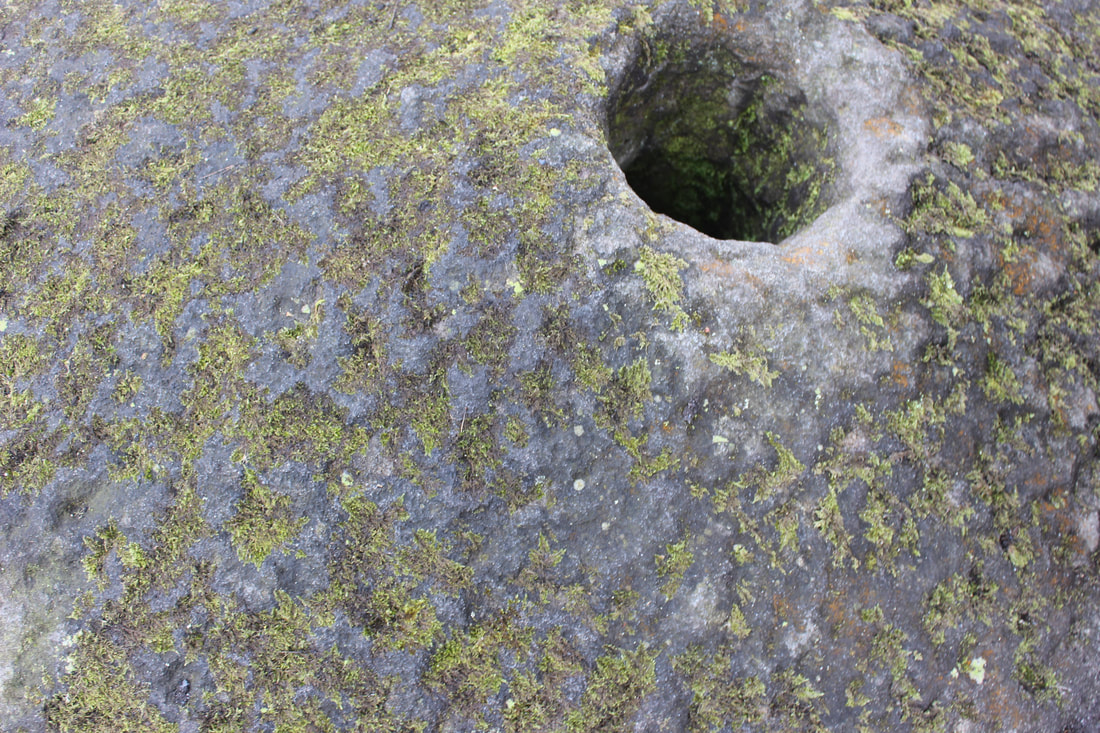
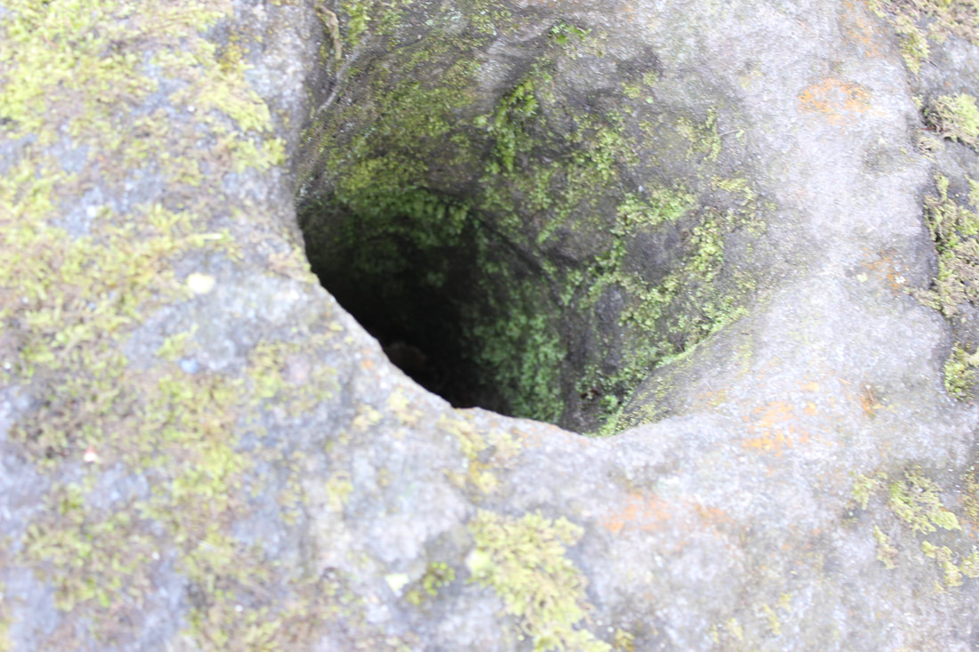
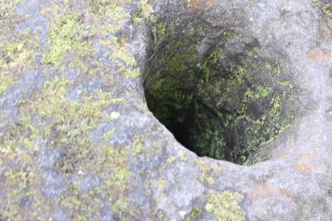
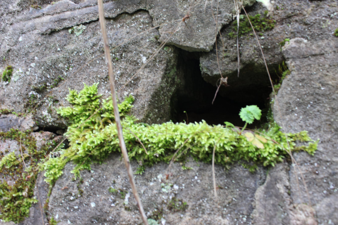
WORST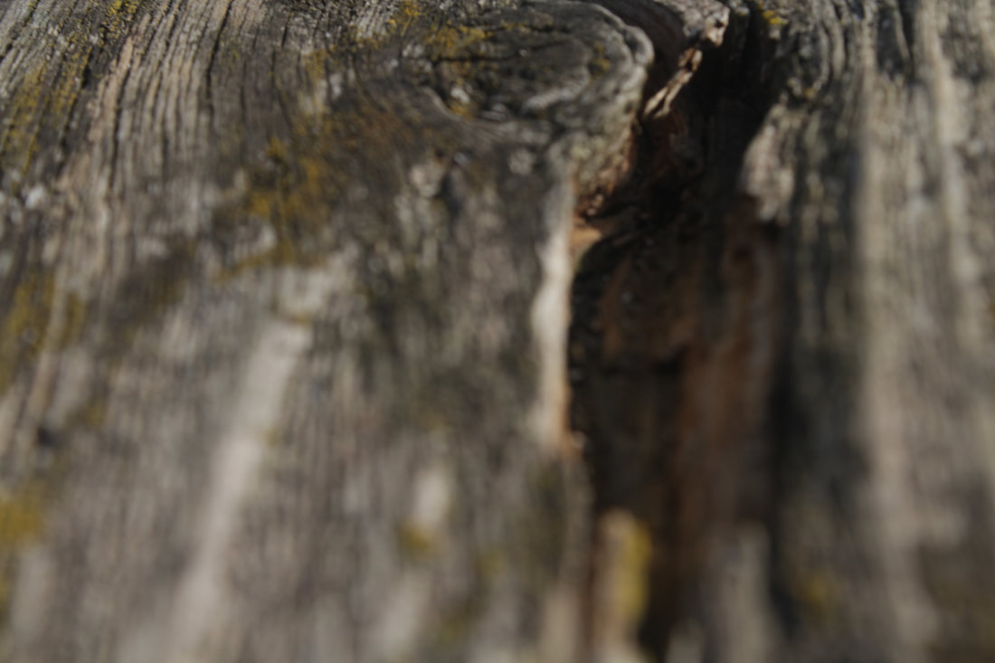
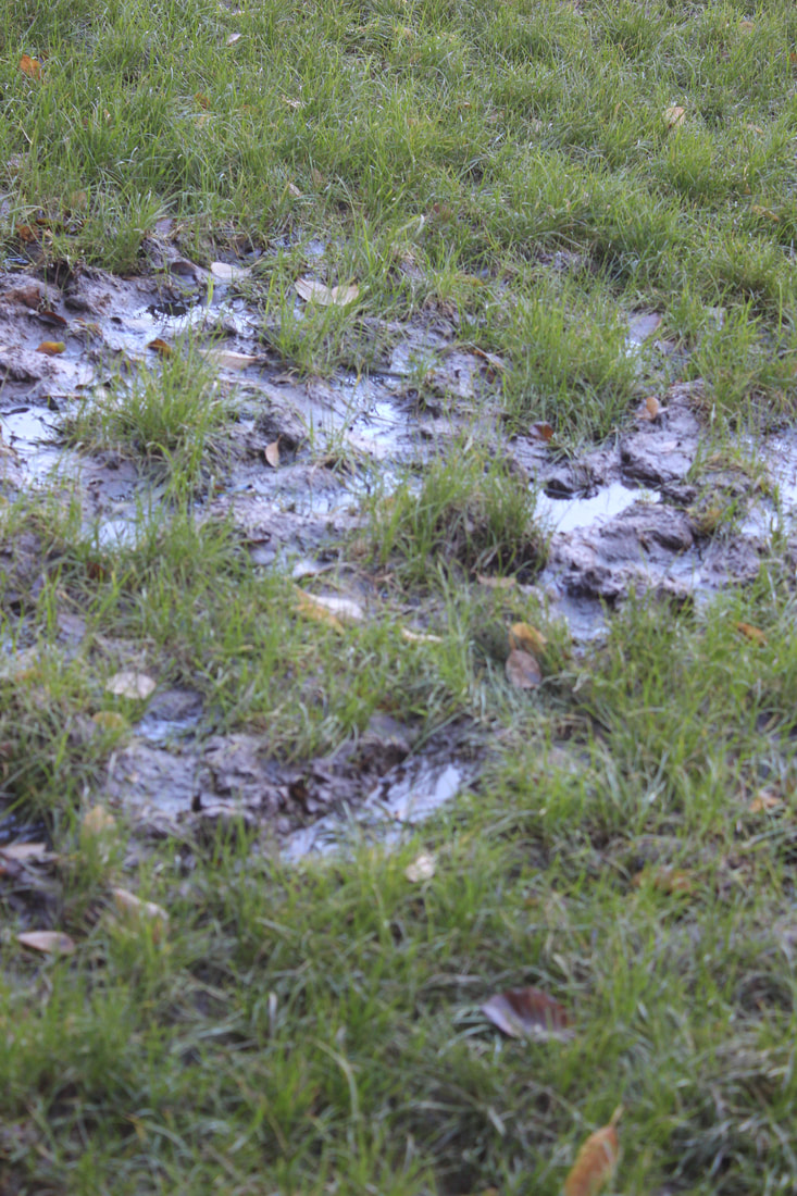
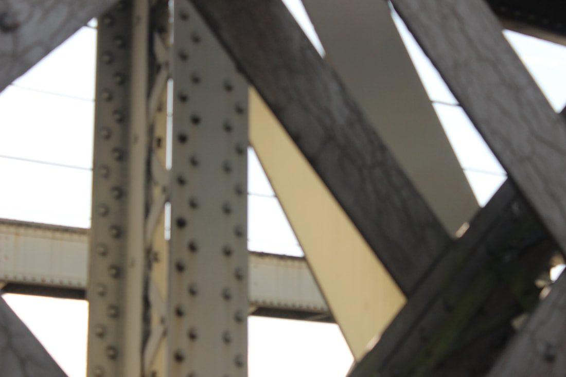
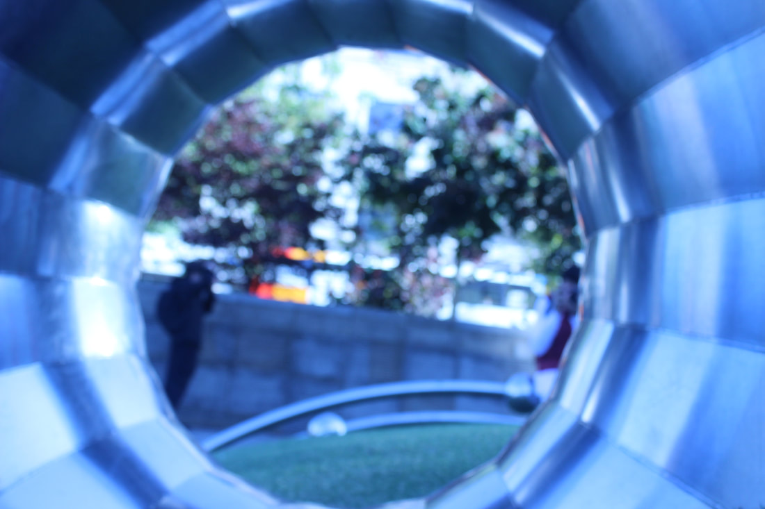
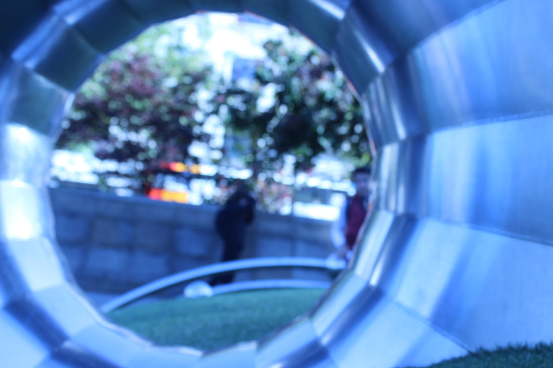
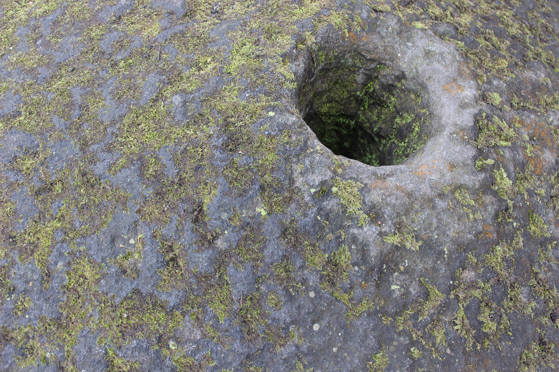
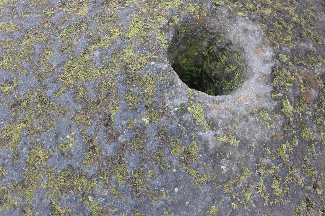
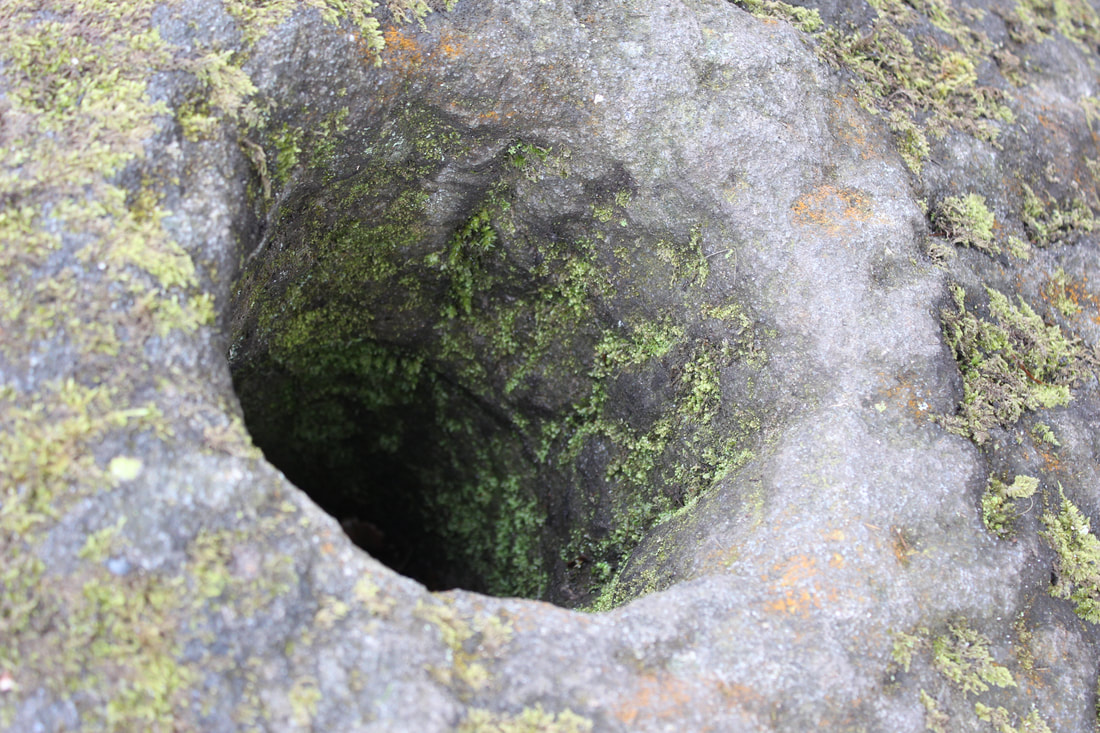
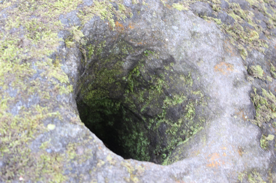
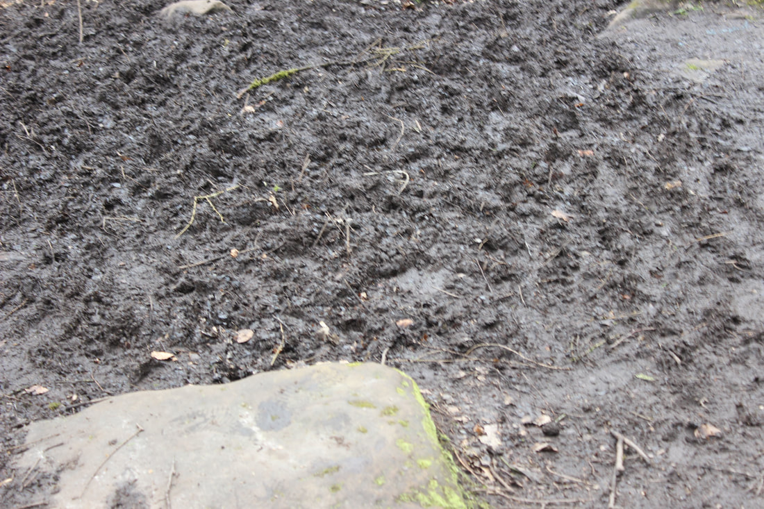
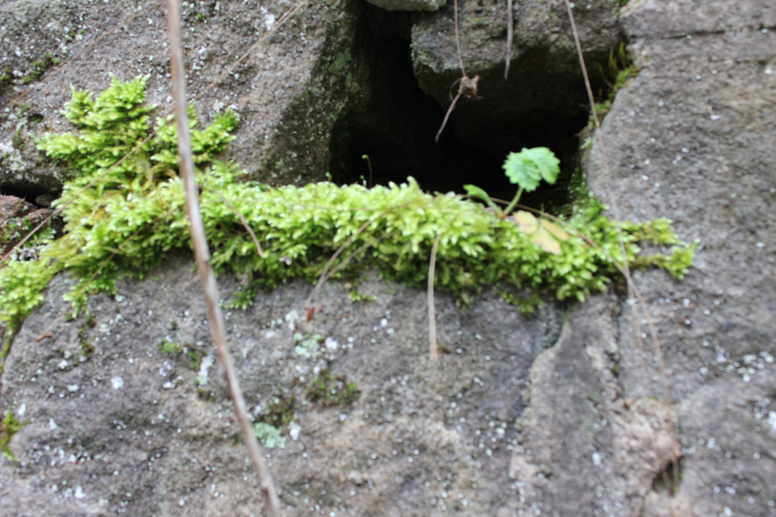
This is my worst because it is very close up and you cant get detail on anything. The hole has not been used well in this because it is down and blurred. The colours are vague and boring in this version of the photo. The green on this is barely noticeable where as in the other photo it is everywhere and illuminated.
|
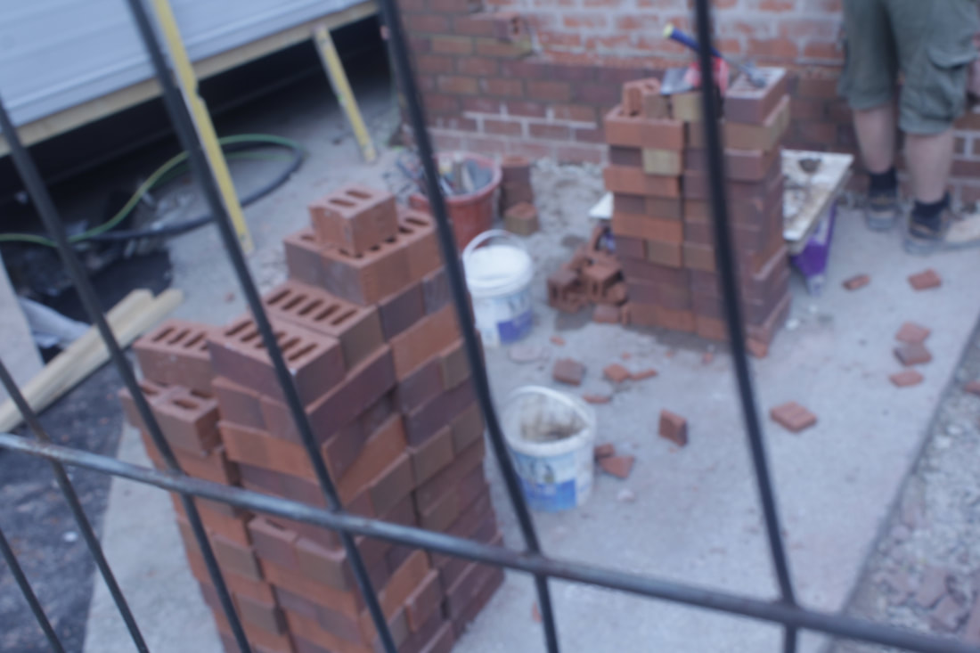
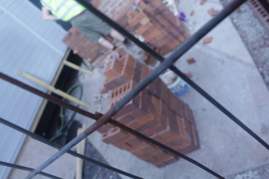
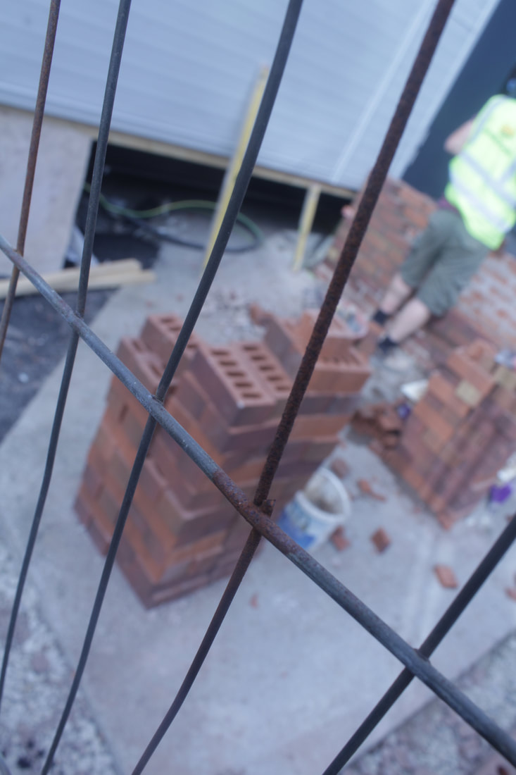
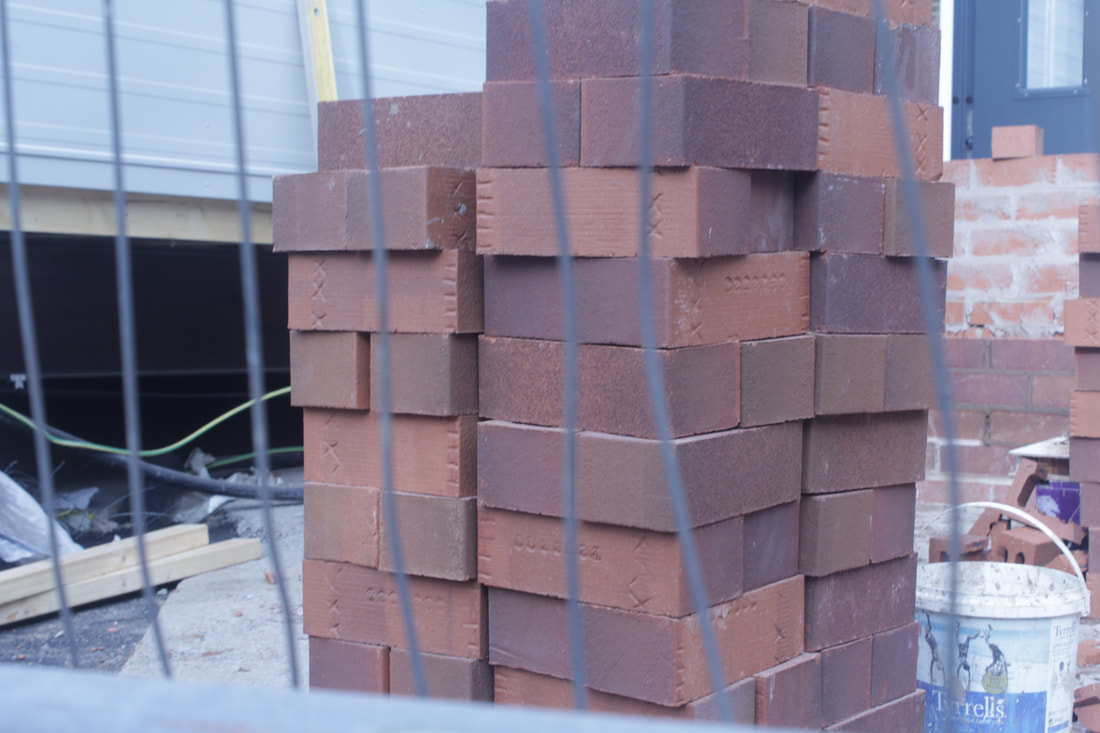
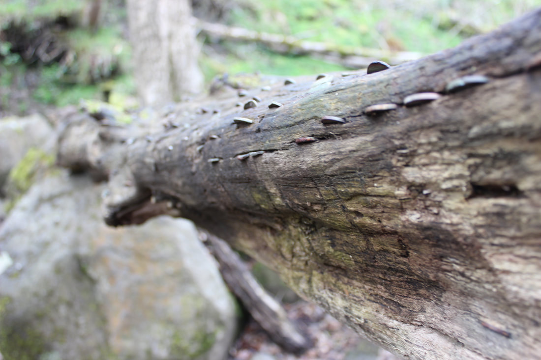
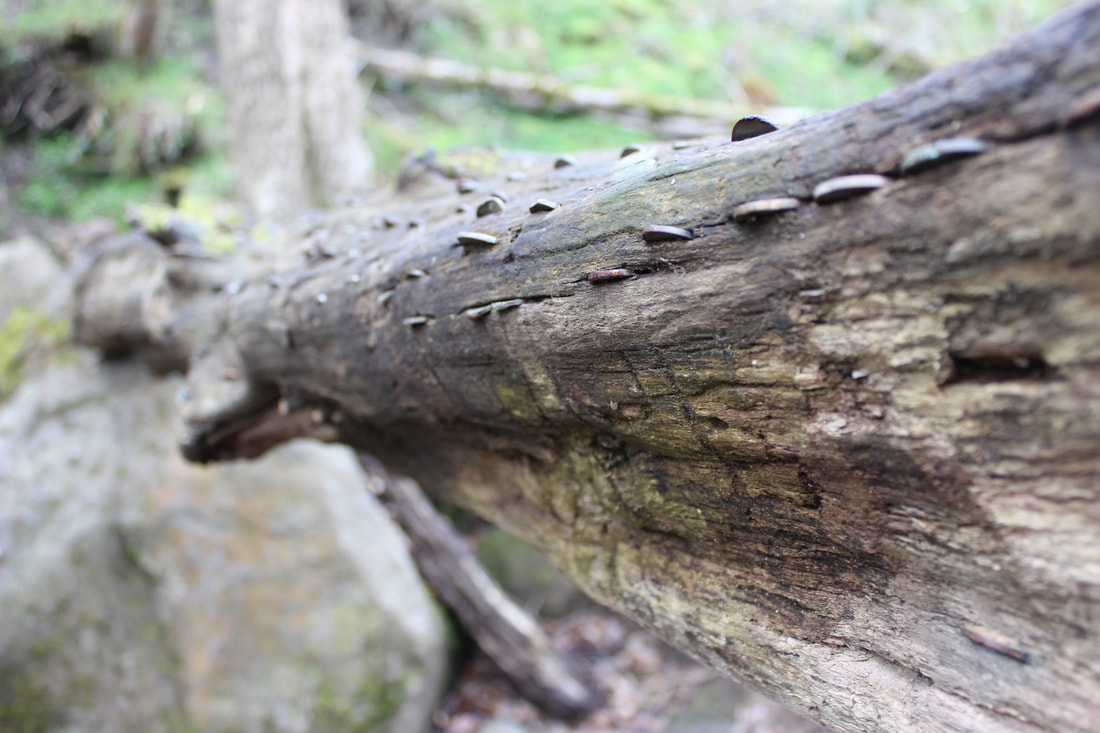
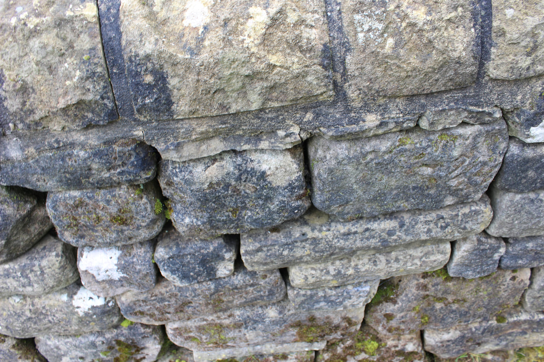
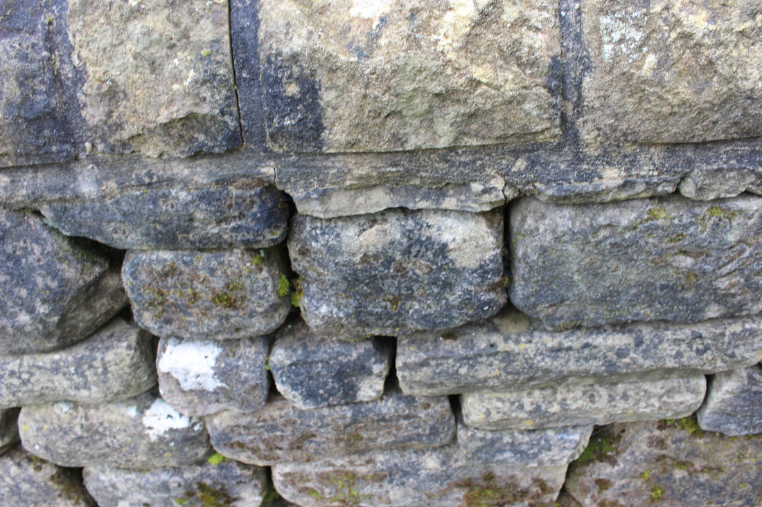
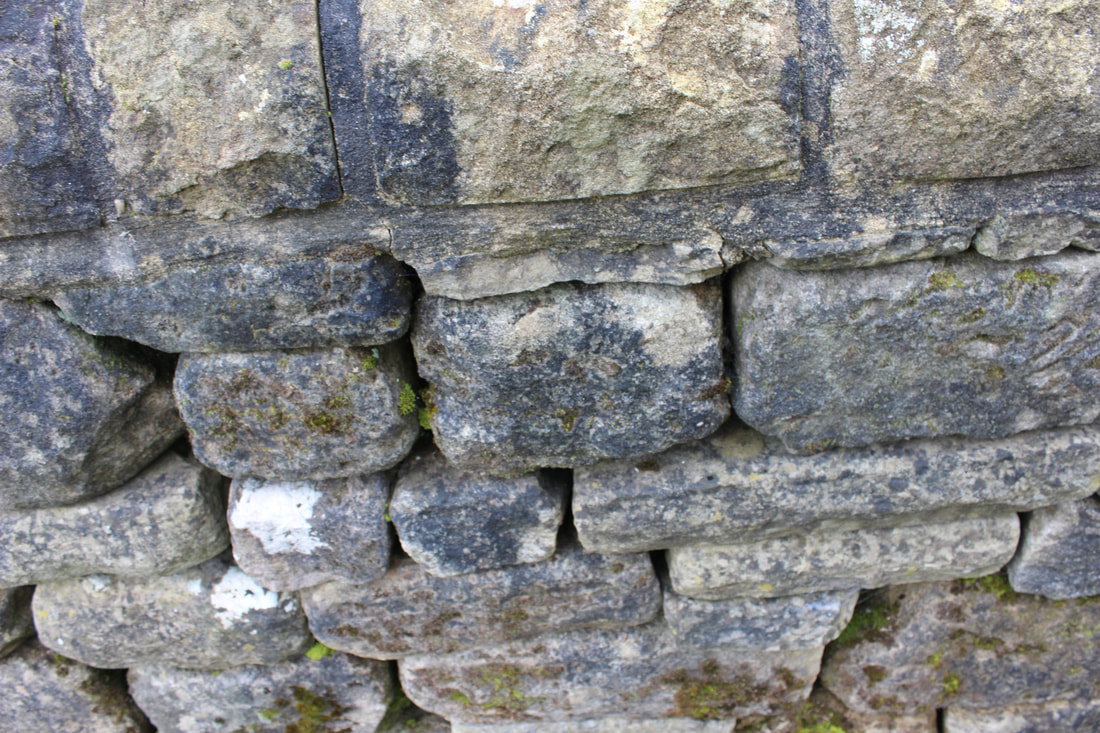
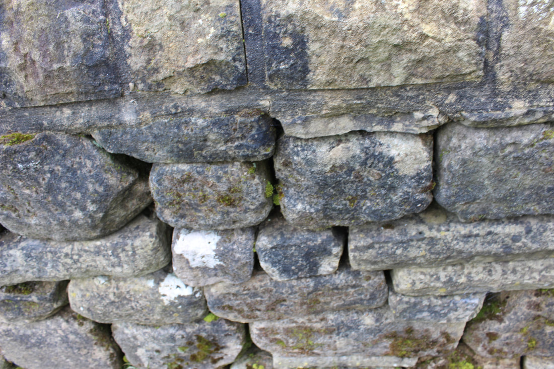
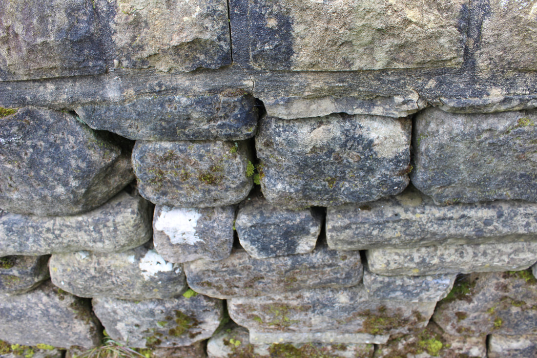
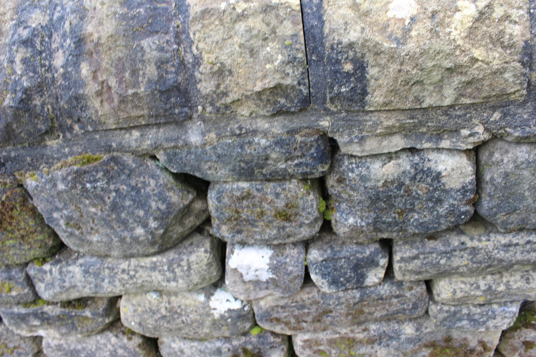
best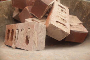
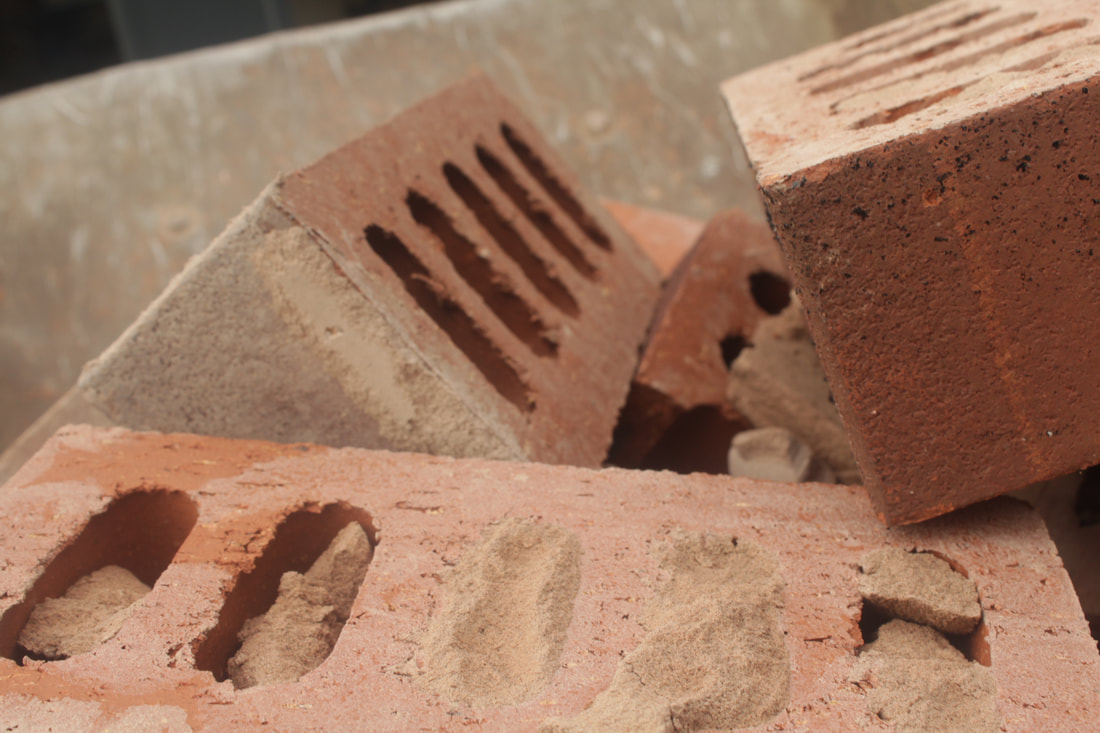
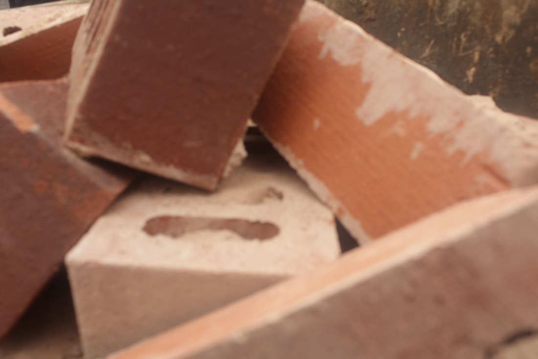
This is my best one because you have a clear view of the bricks and the box there in, the sun is shining onto the top bricks so that adds an effect which makes it seem important with the light shining down onto it. The concrete is pouring through the cracks in the leaf and I captured it well. The composition was used well as I feel it was the right amount with the distance of the camera from the bricks. You can see that the bricks are in a wheel barrow and it almost seems like they are falling into it. Some of the bricks are not in line with the others like a wall which makes you think what are they doing with the bricks.
|
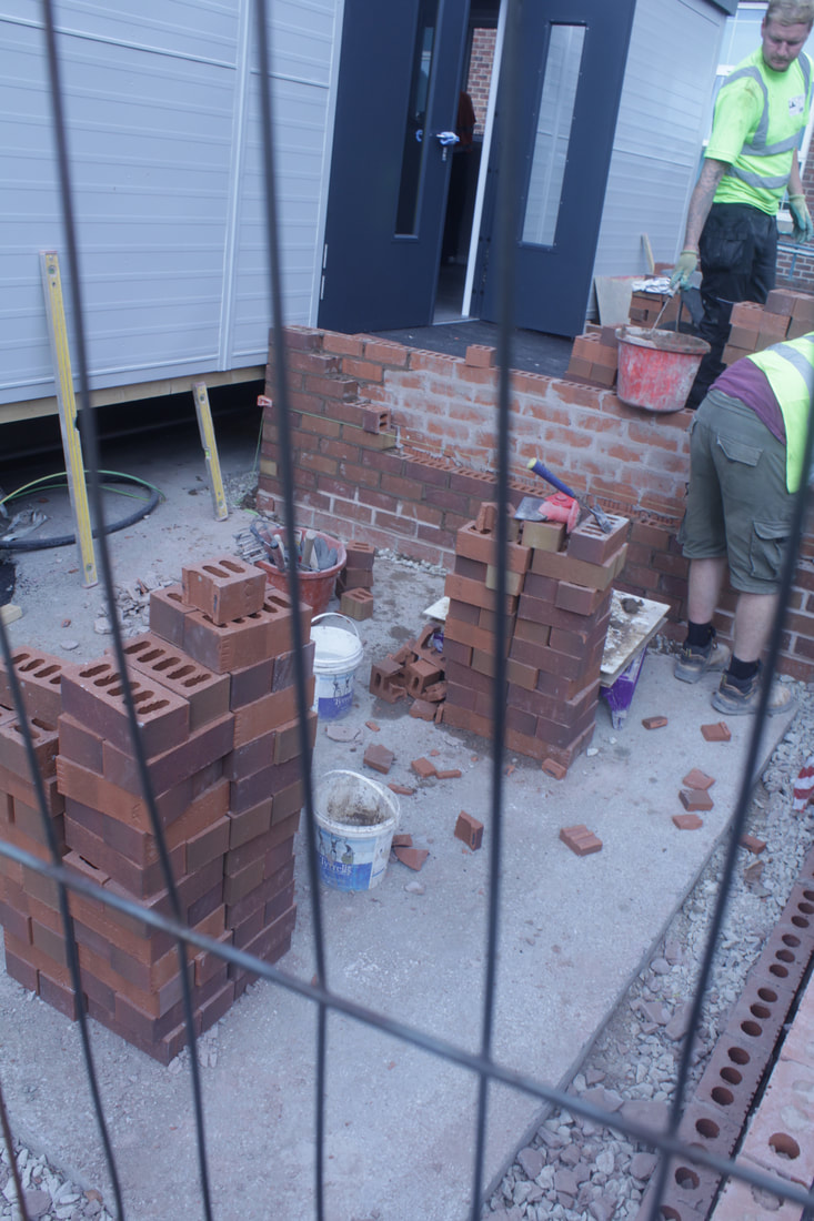
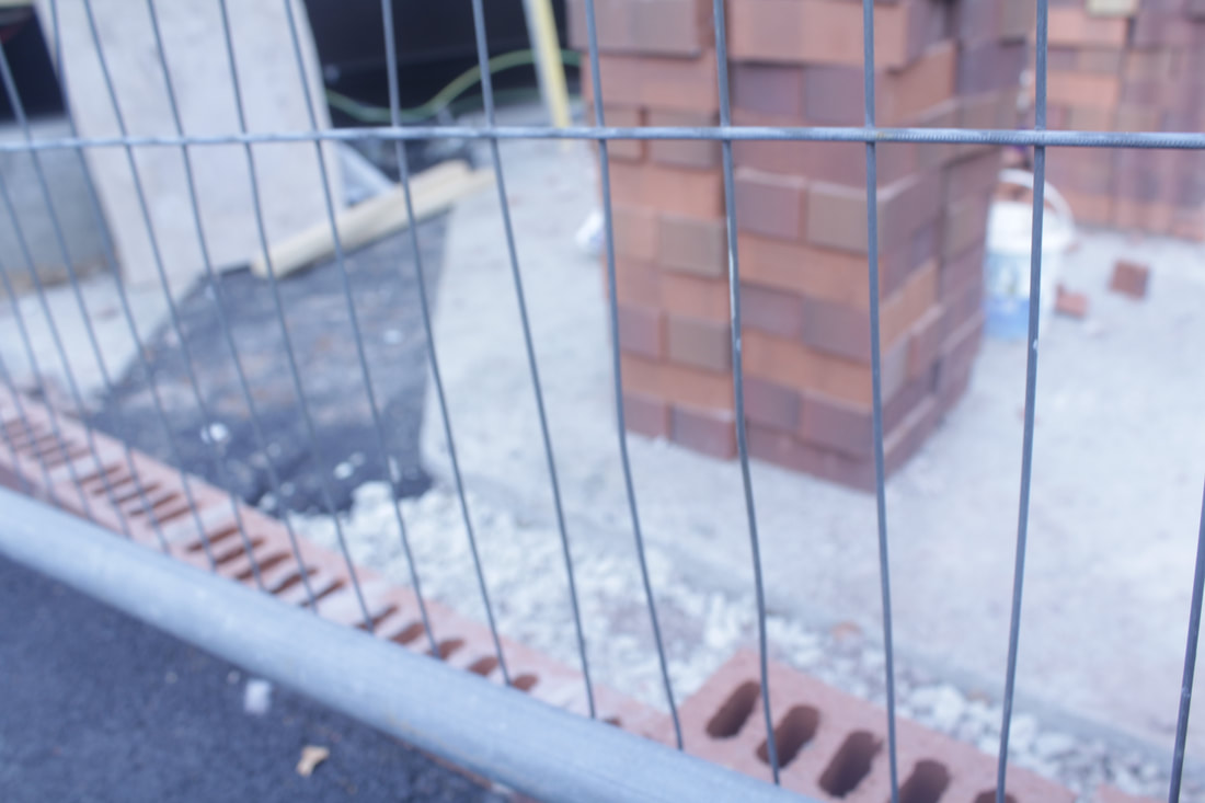
worst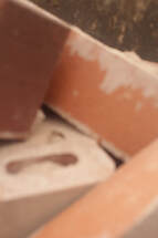
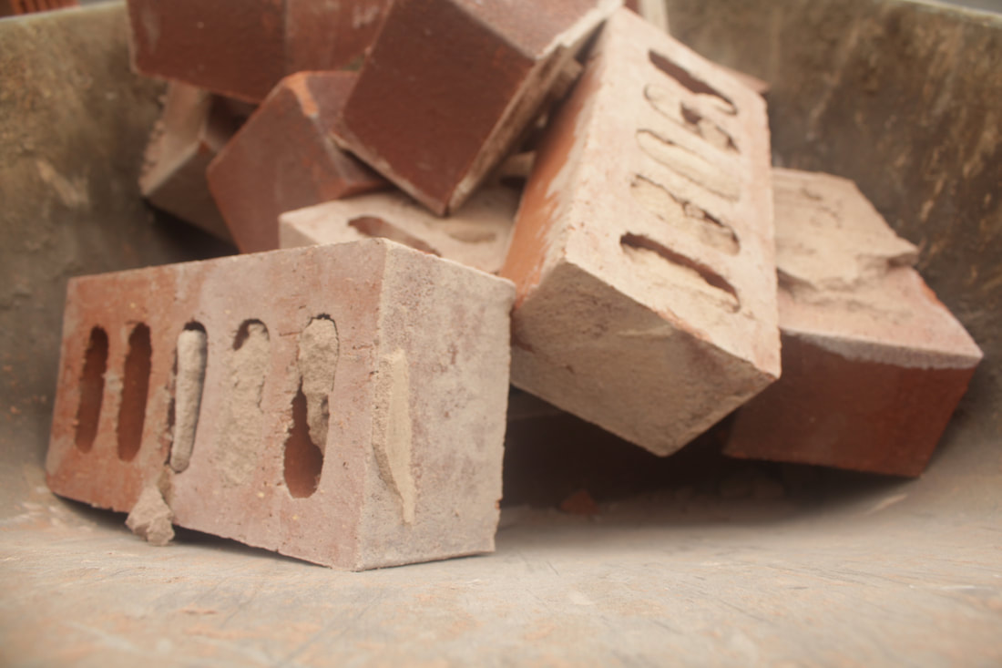
This is my worst because its very close up so you cant see the bricks properly, it is slightly blurred too so it ruins the light on the bricks. You can only see four bricks in this picture where as in my best one there is eight in view so it takes away from the quality of the picture. Nothing about this image is right from the composition to the lighting. The colour of the brick is the same through all of them but on the other picture there is a mixture of red, white and brown with a powder like effect layering the bricks.
|
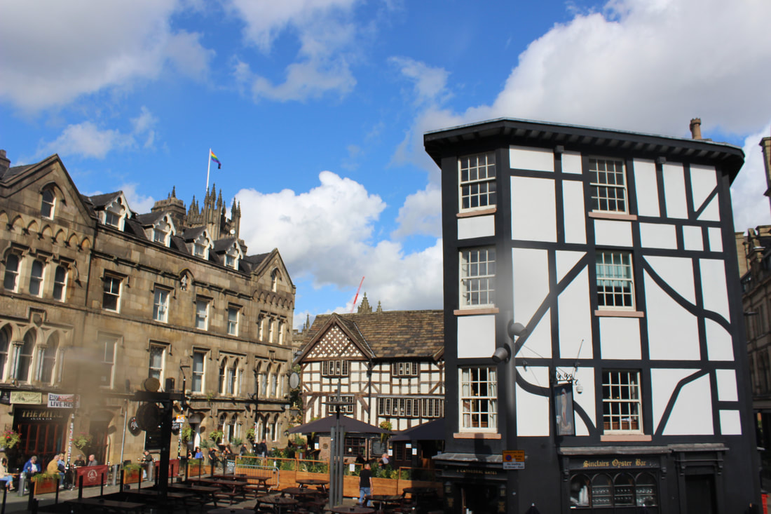
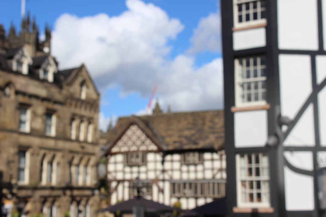
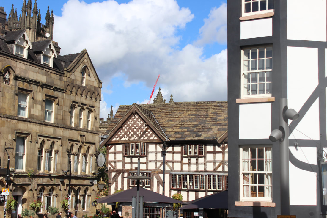
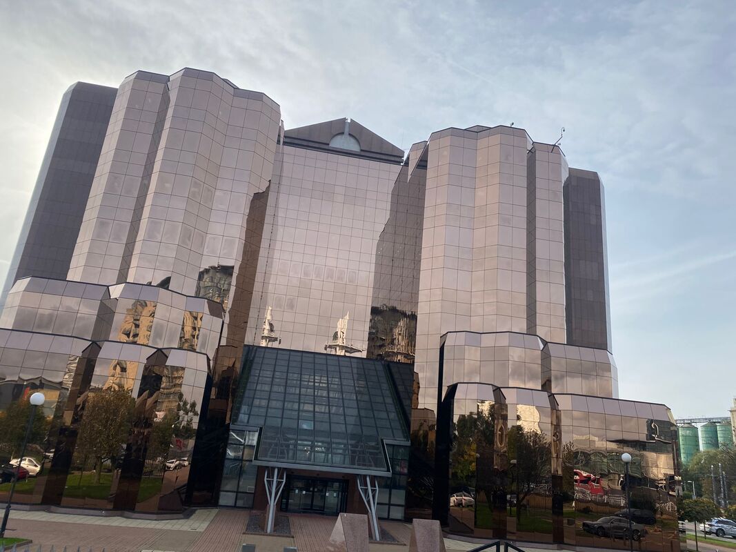
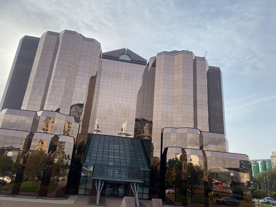
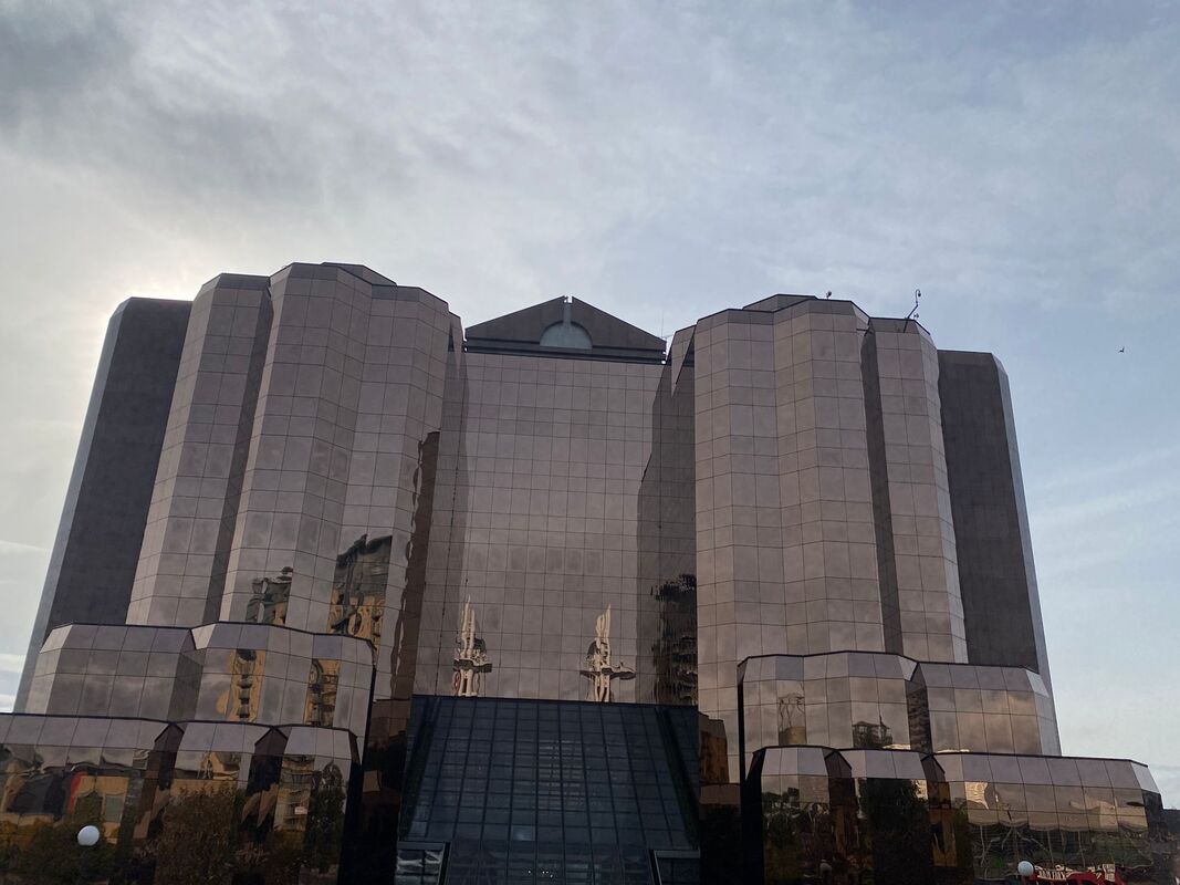
manchester
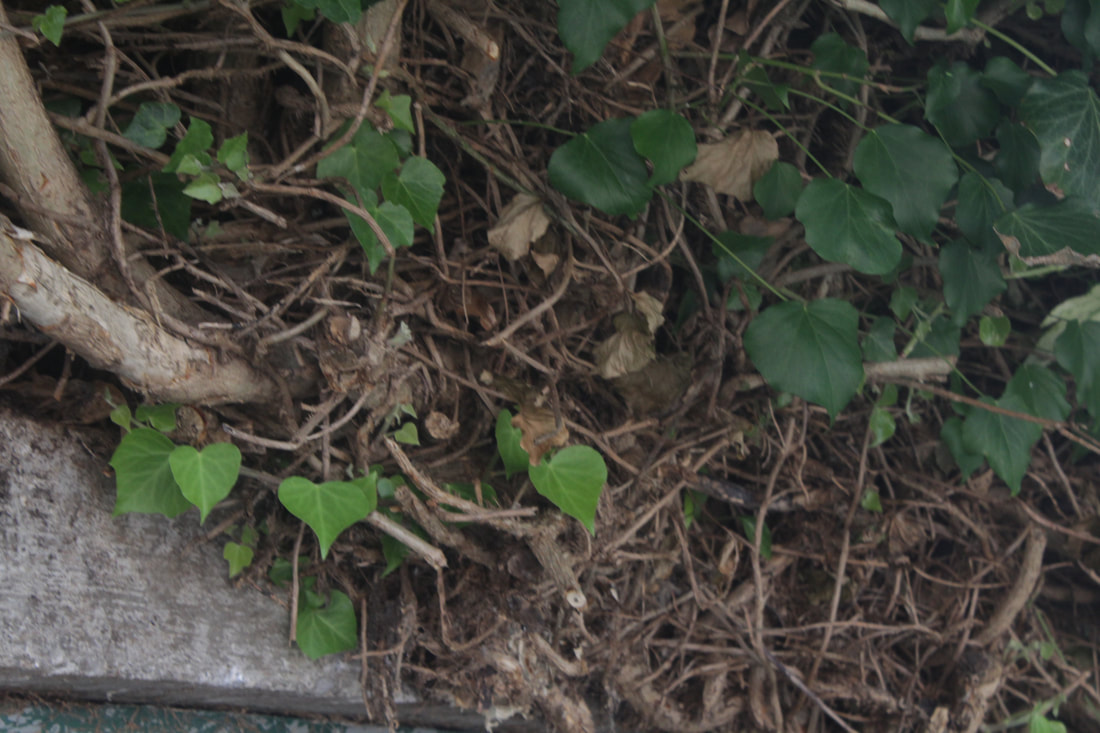
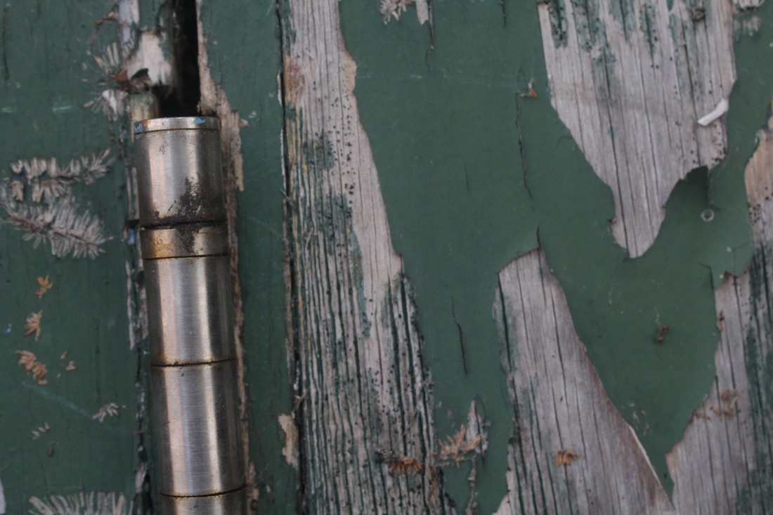
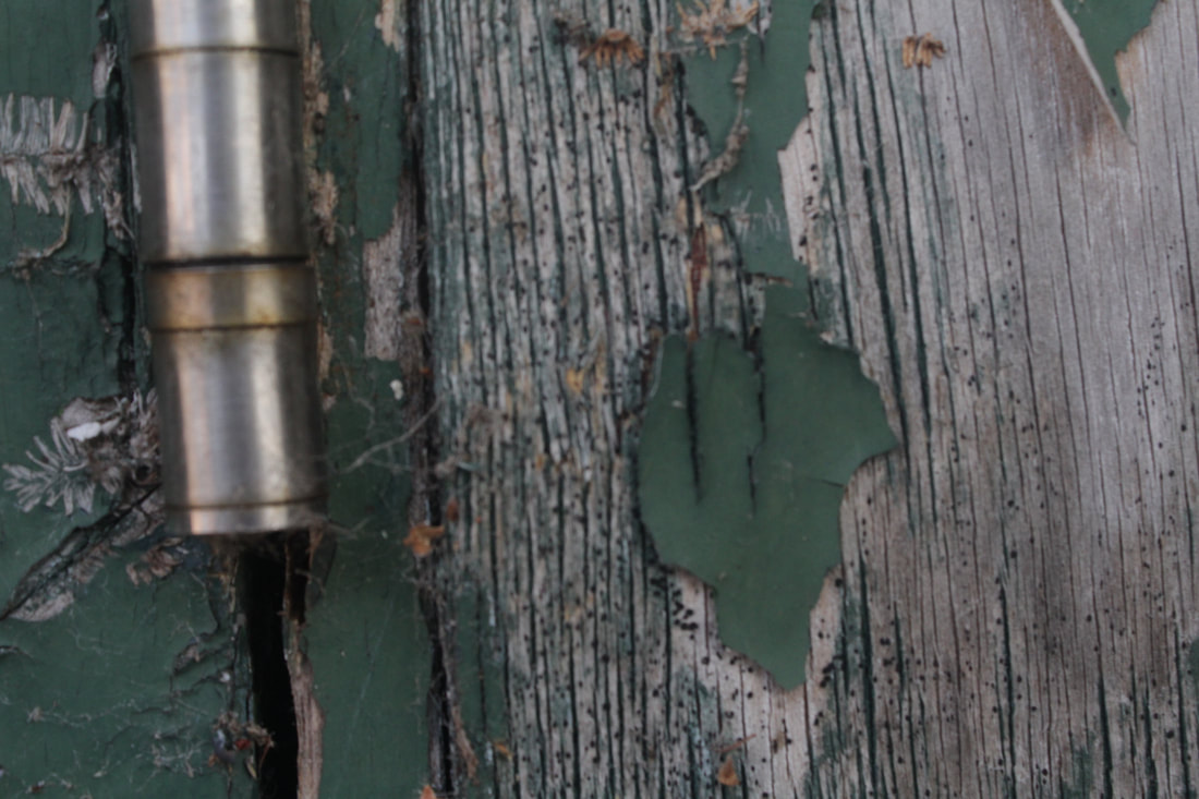
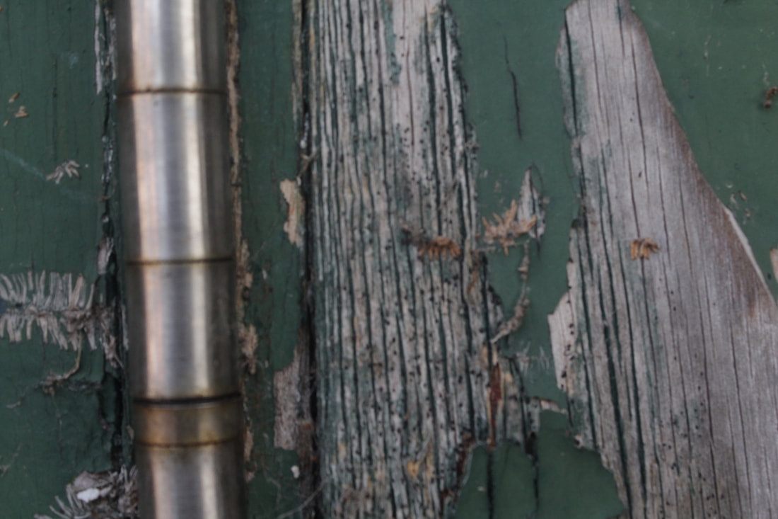
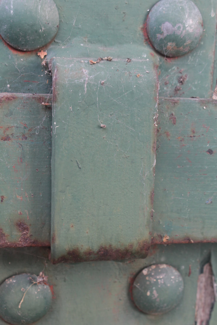
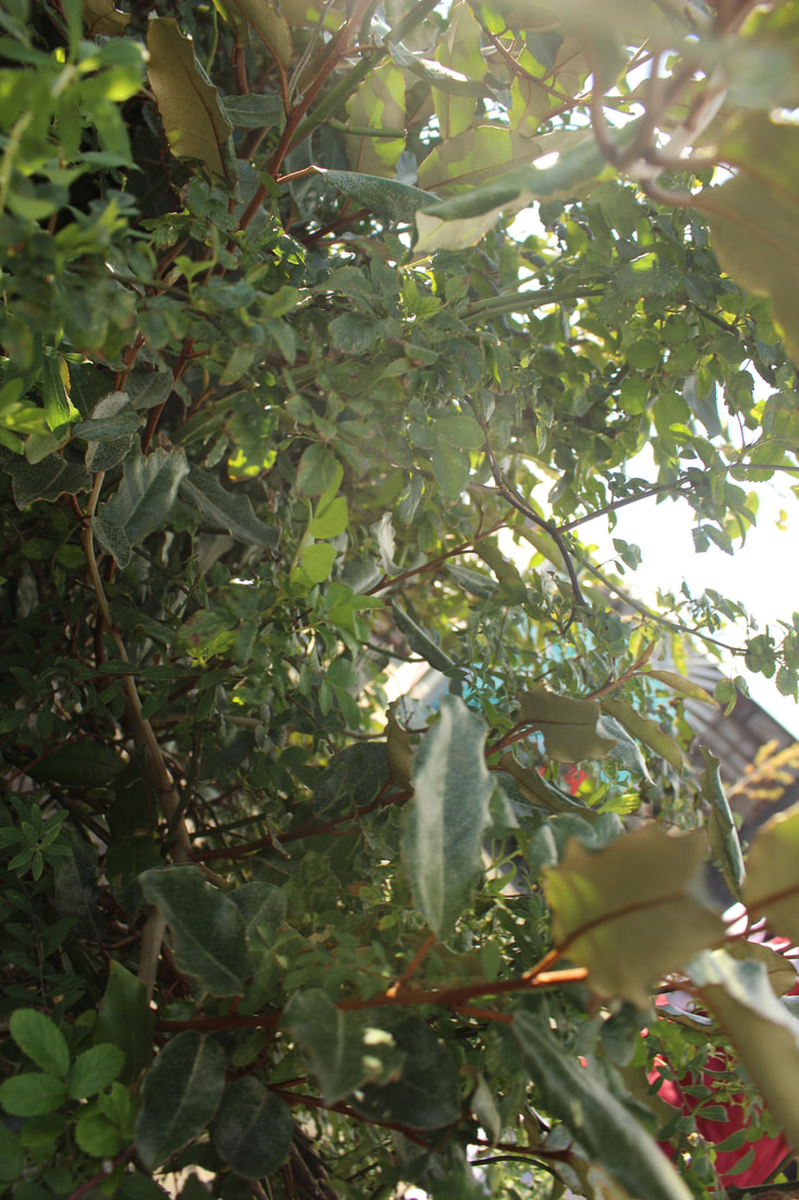
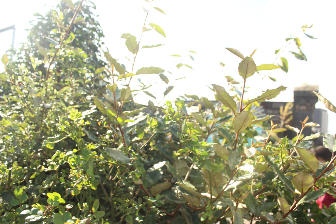
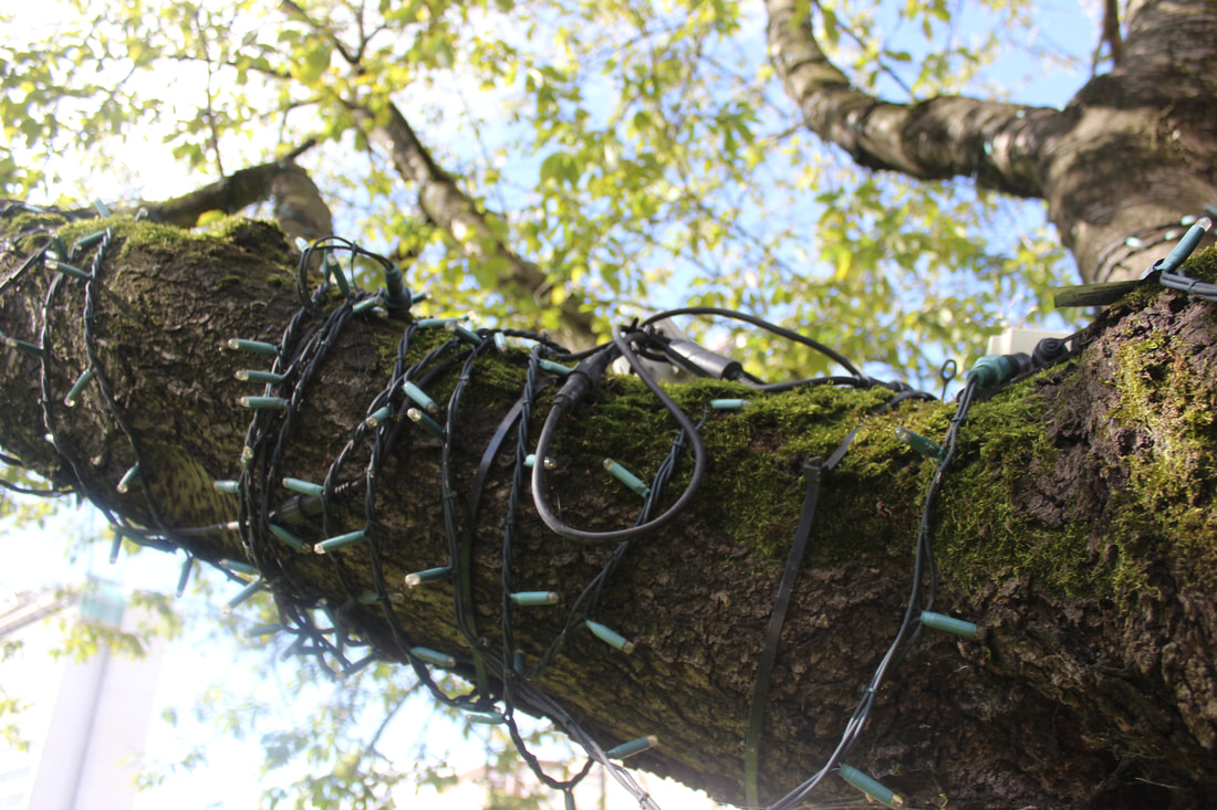
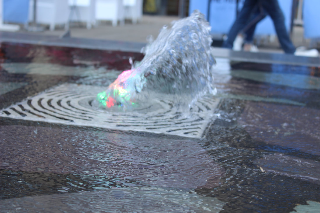
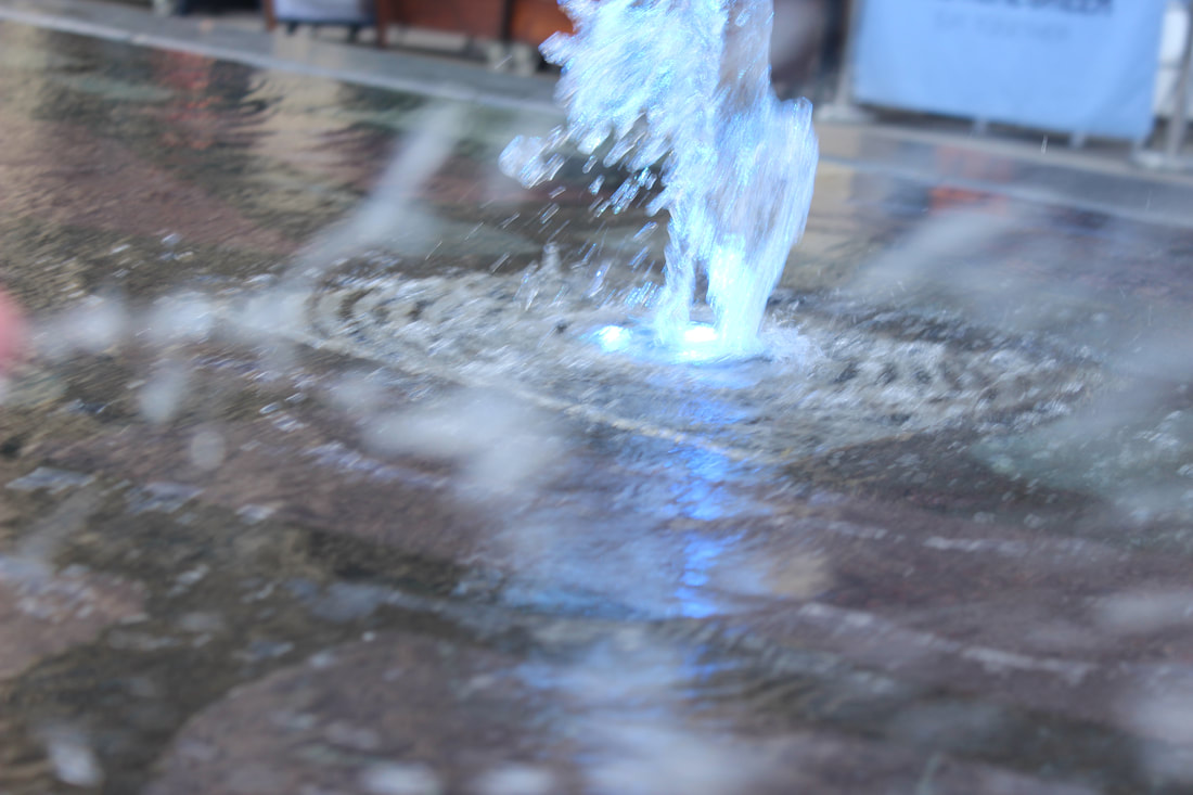
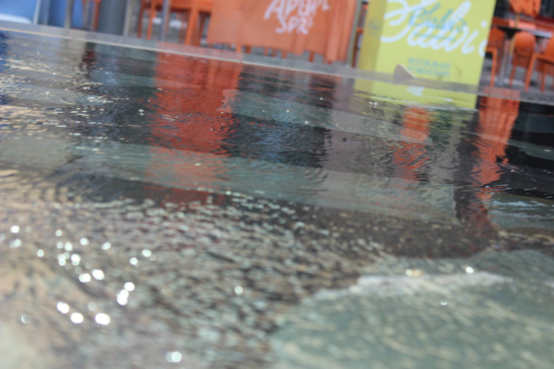
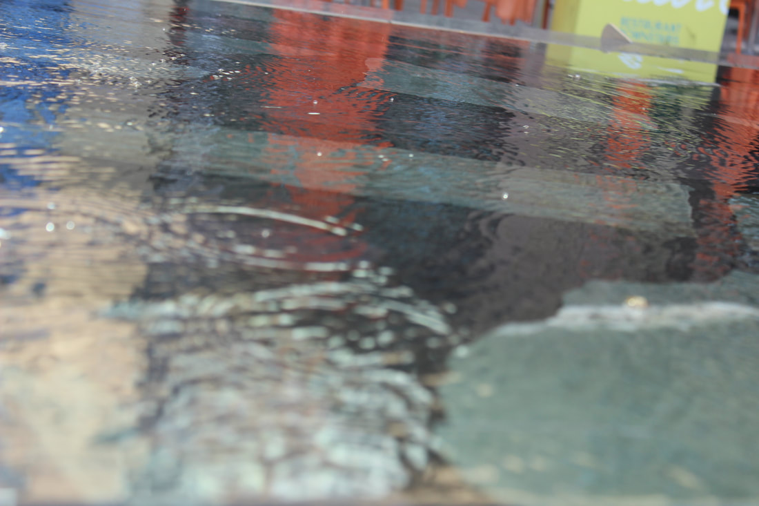
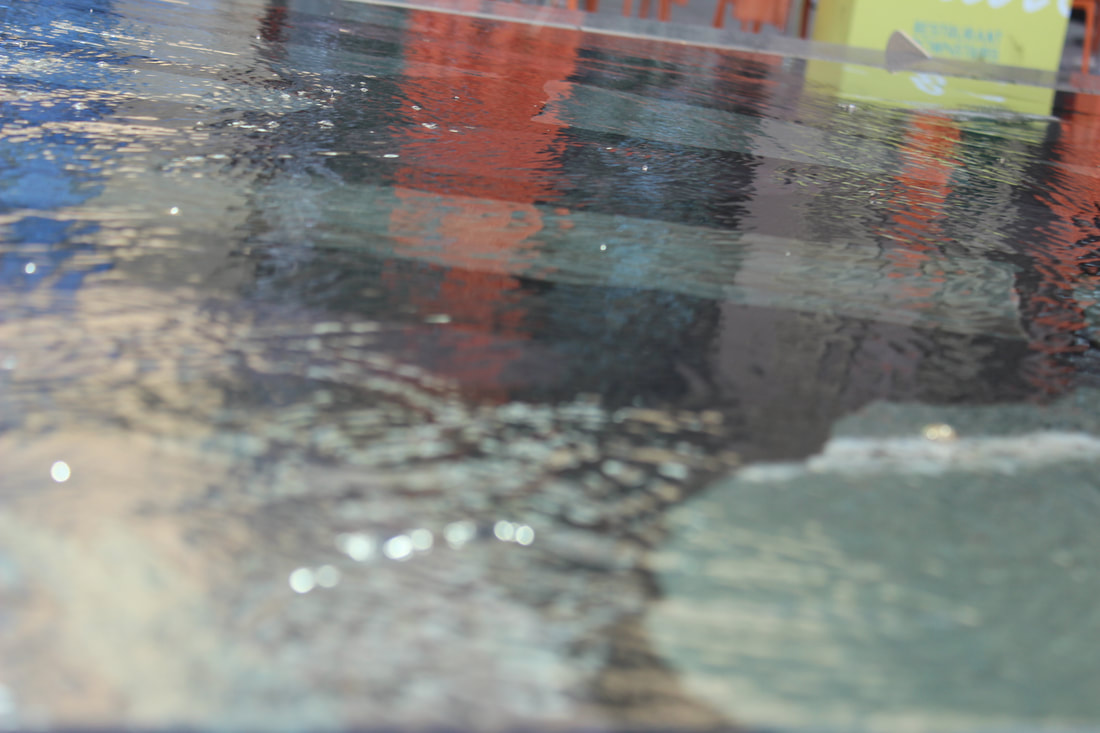
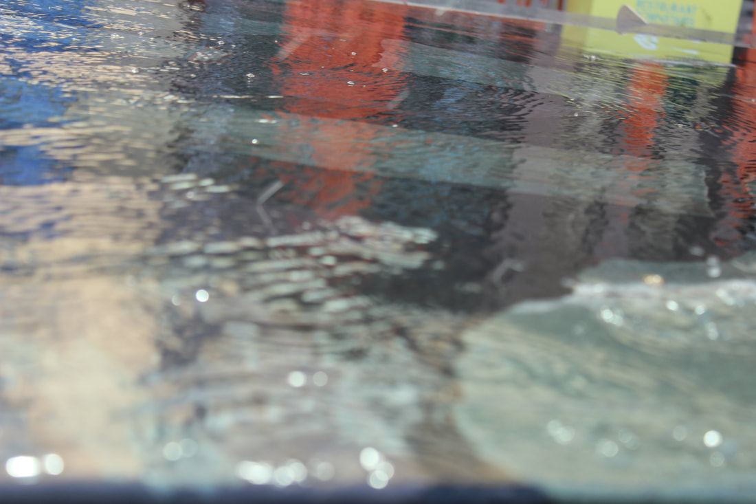
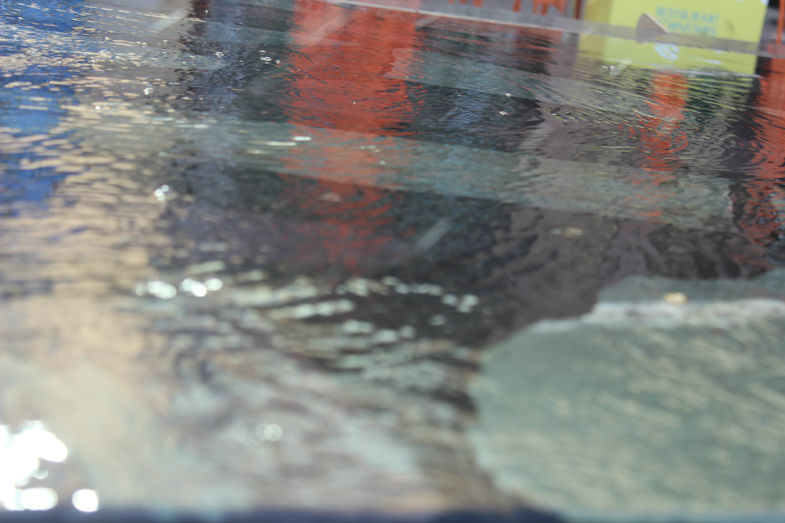
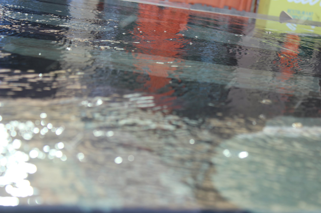
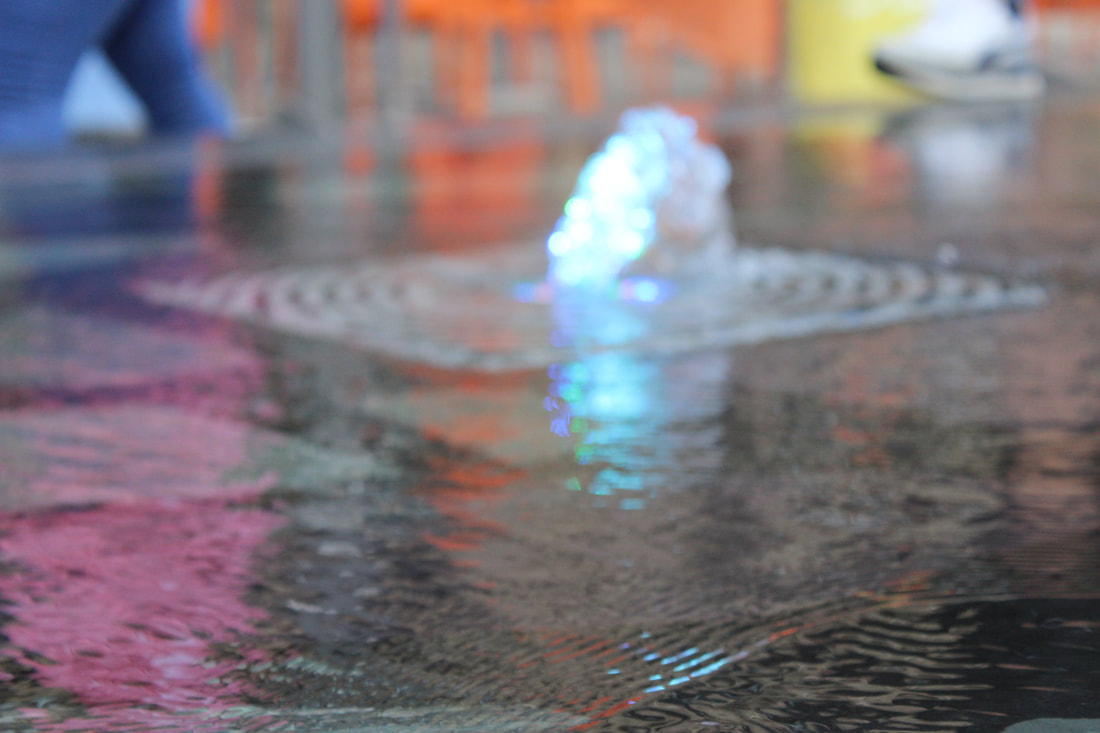
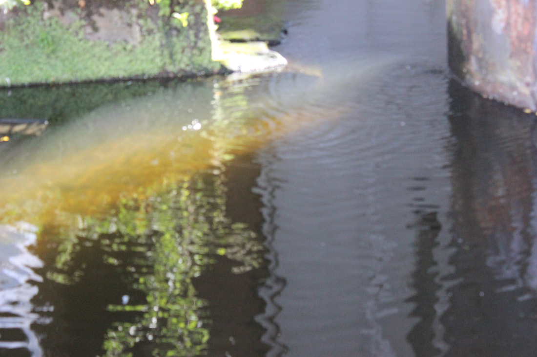
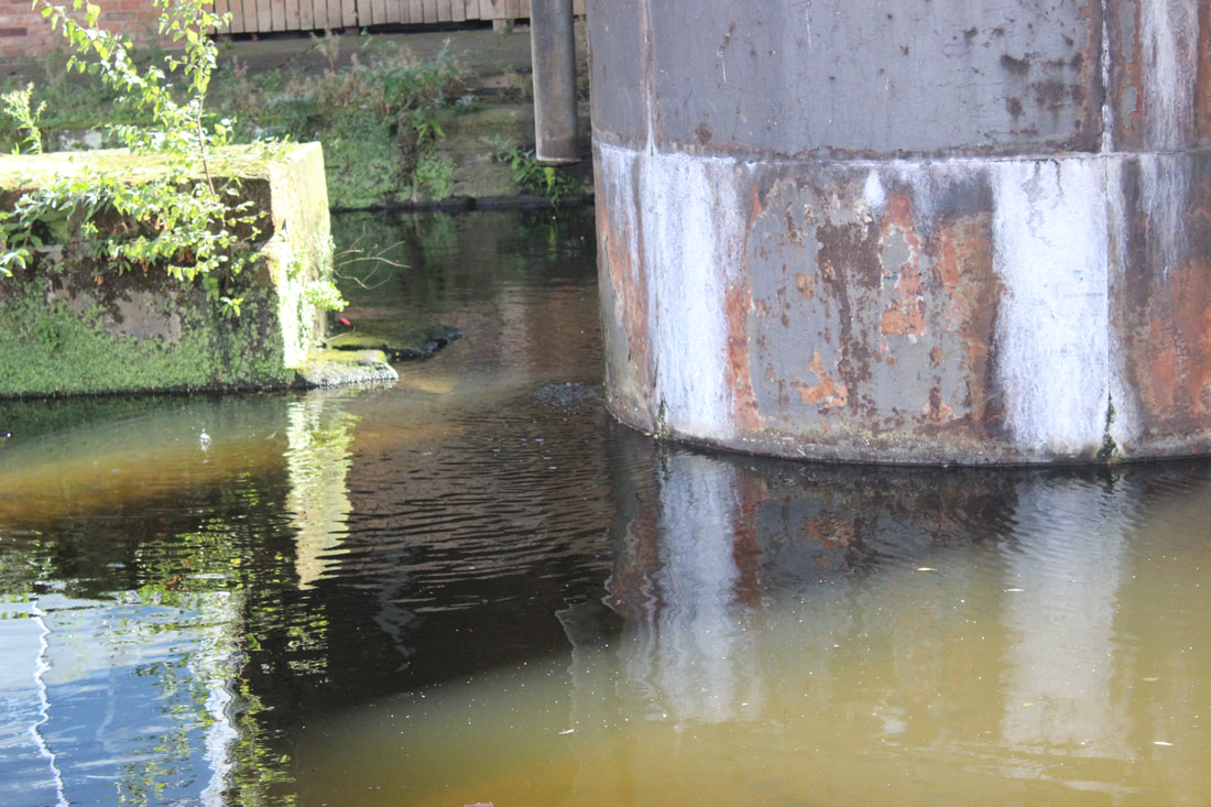
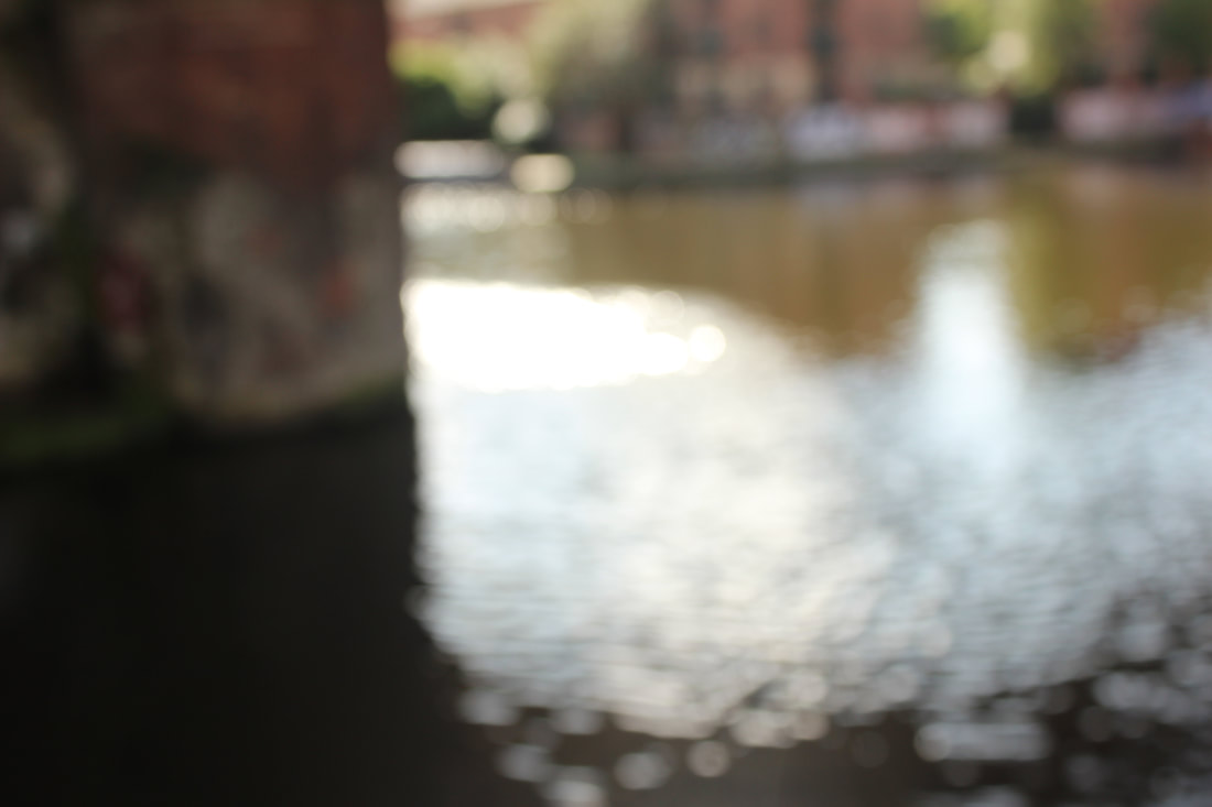
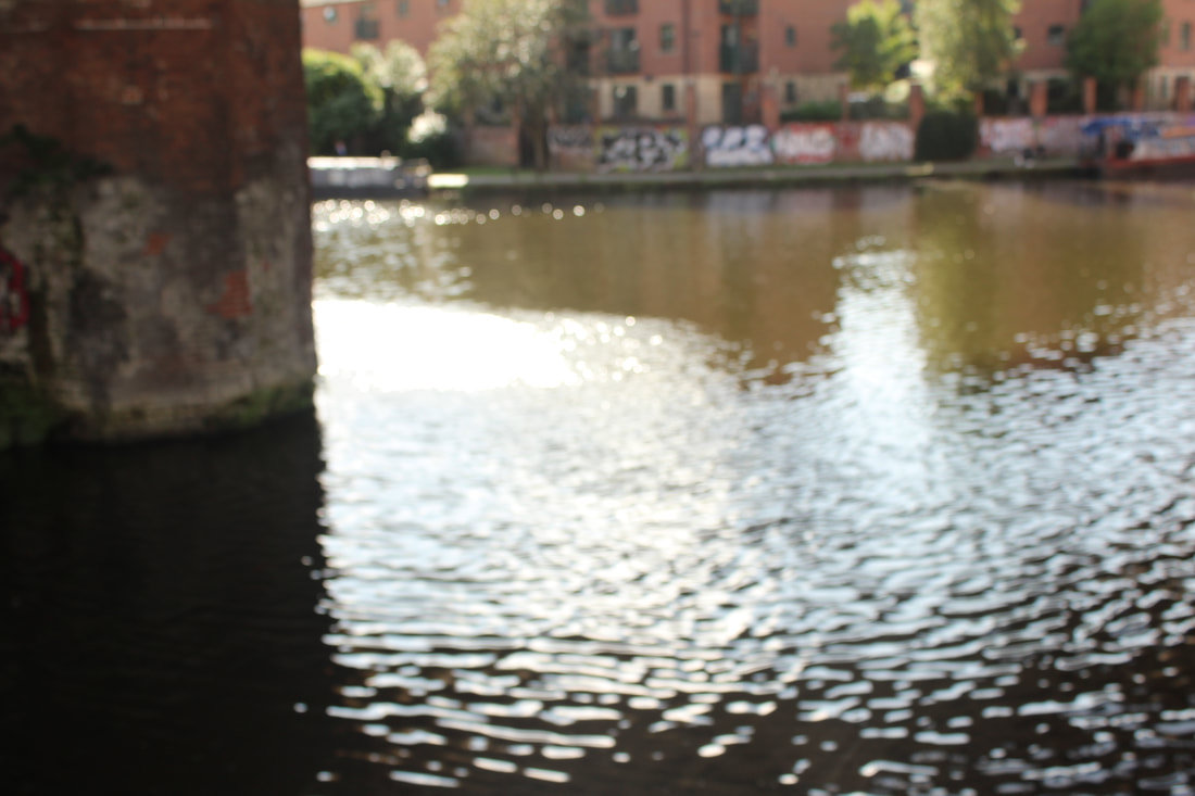
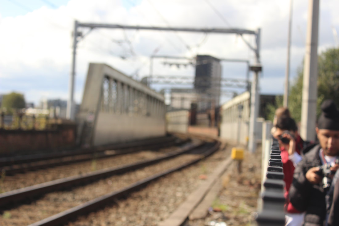
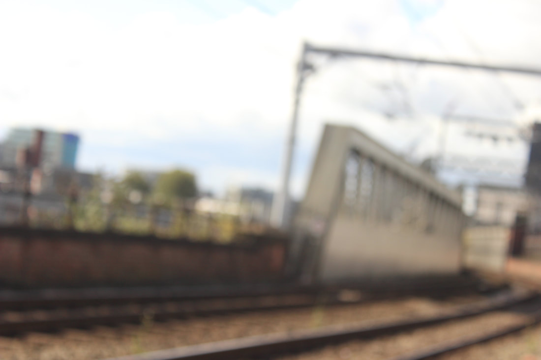
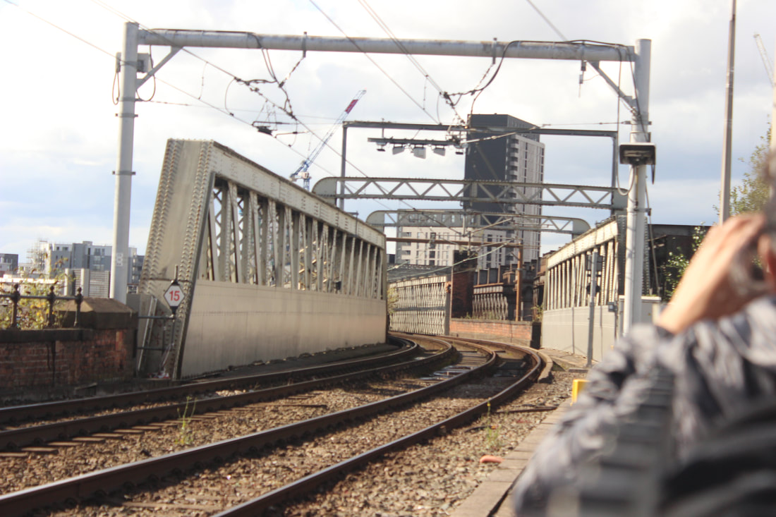
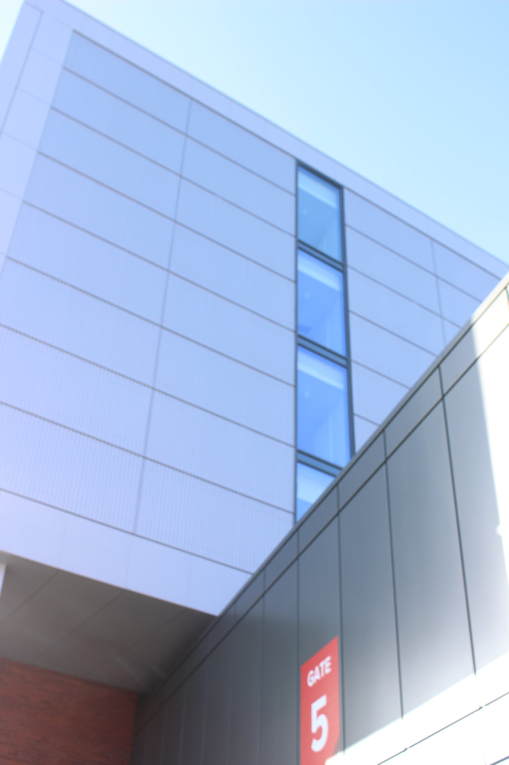
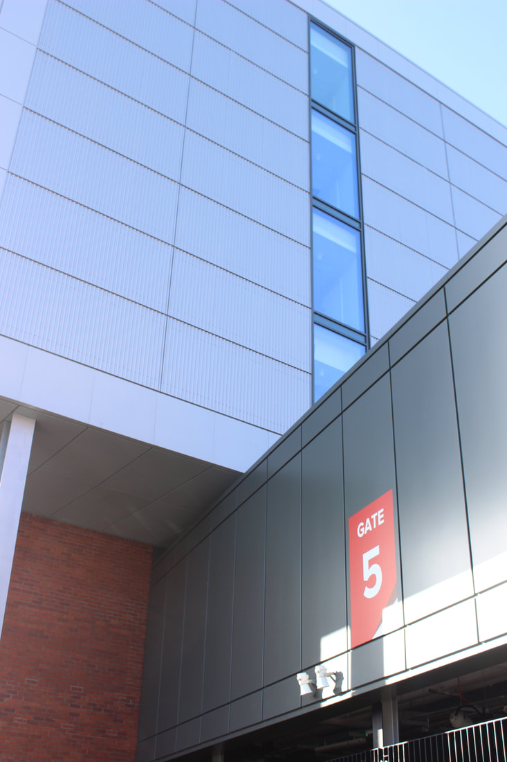
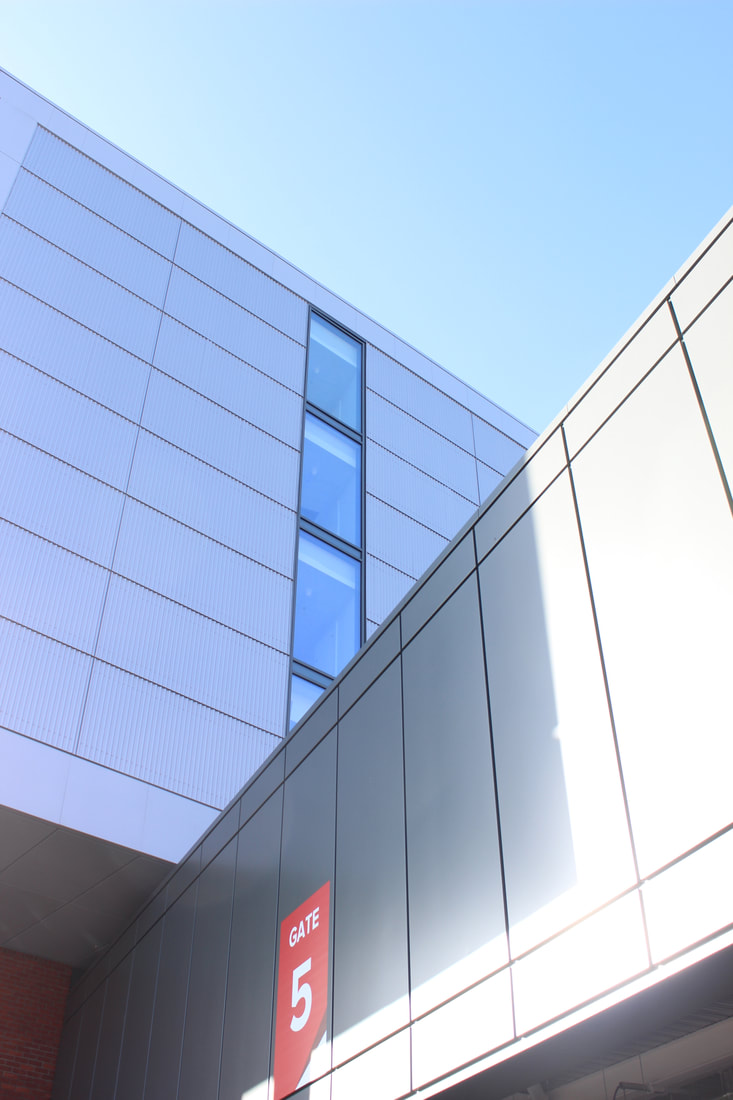
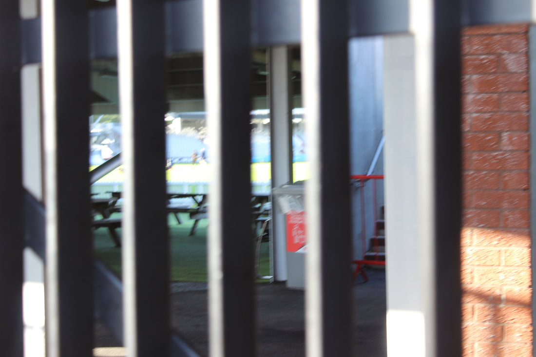
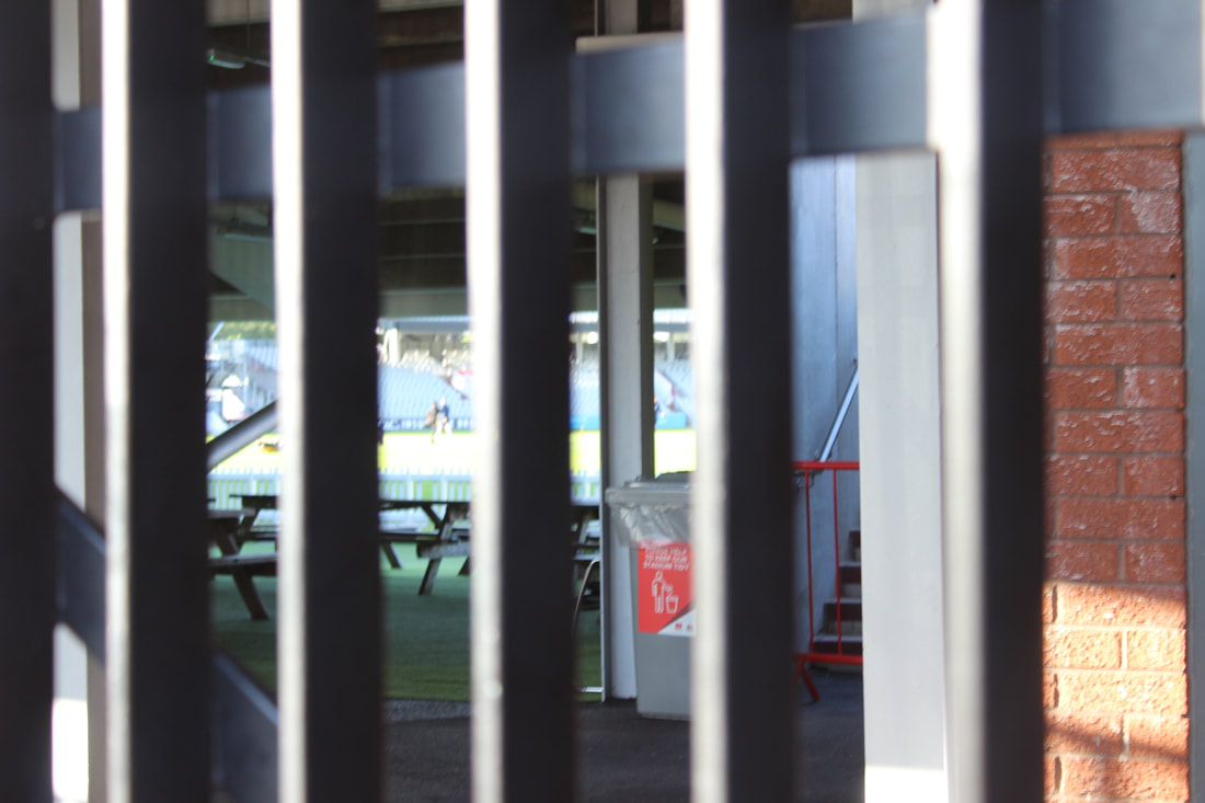
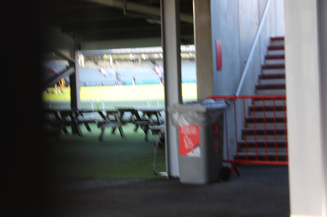
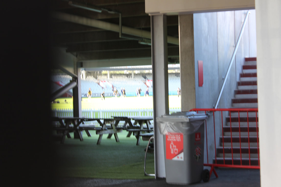
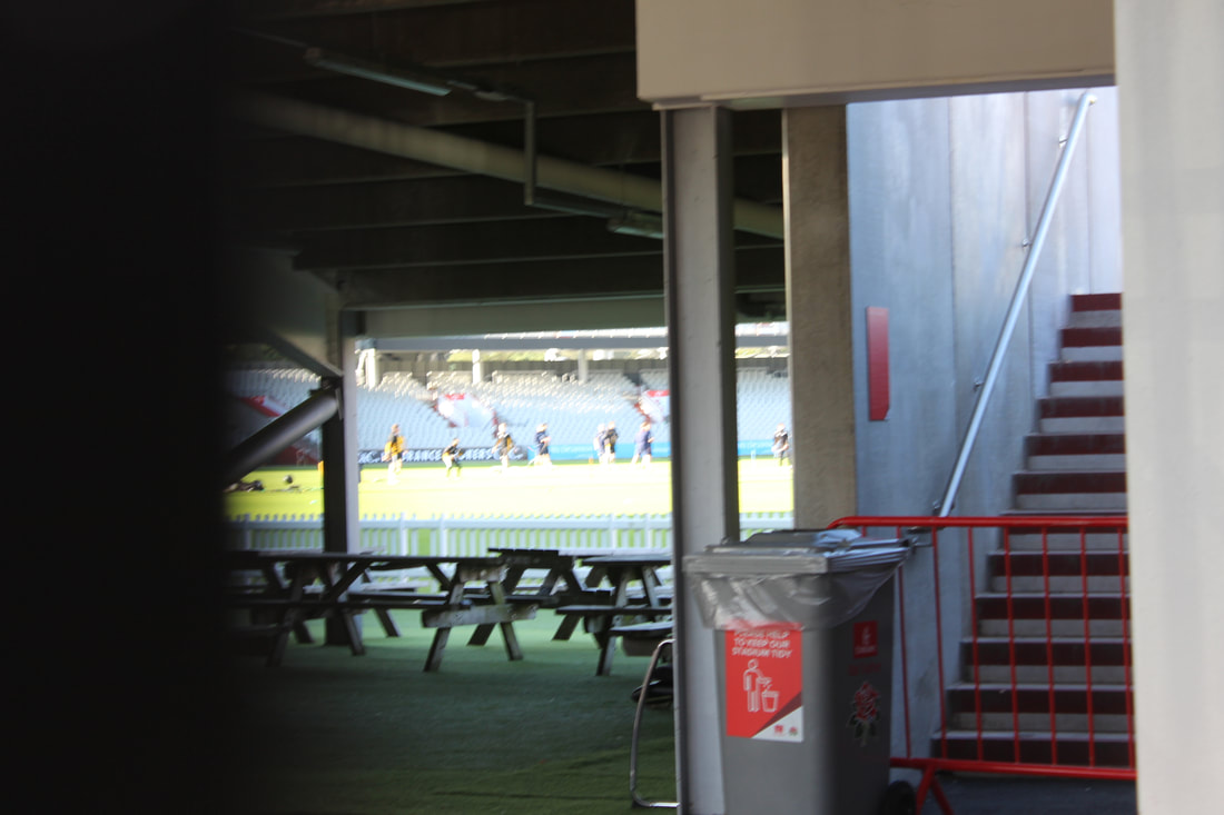
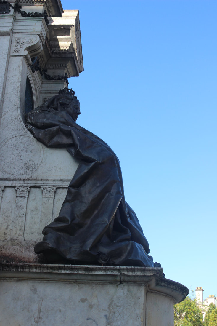
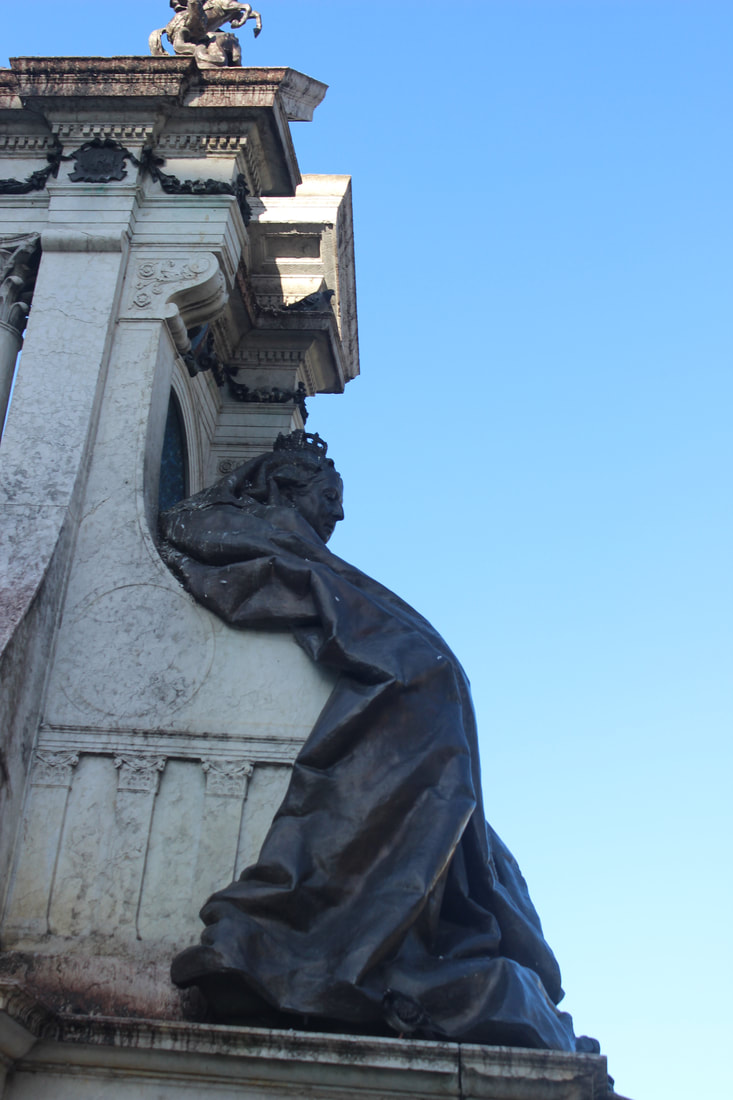
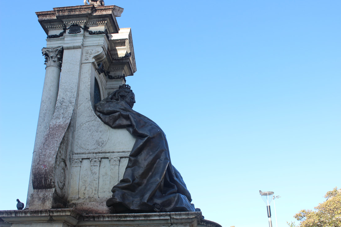
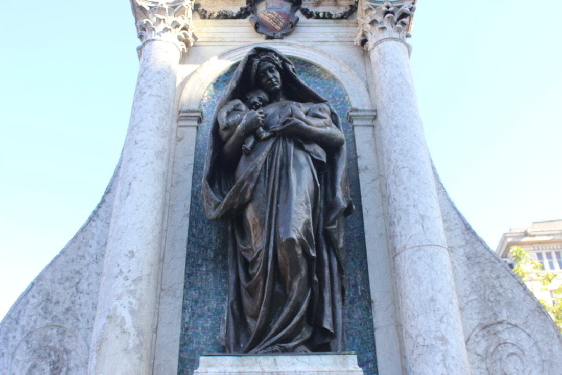
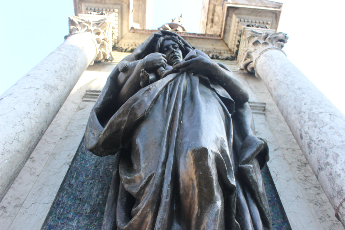
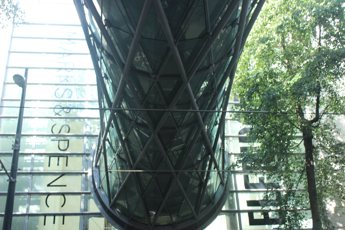
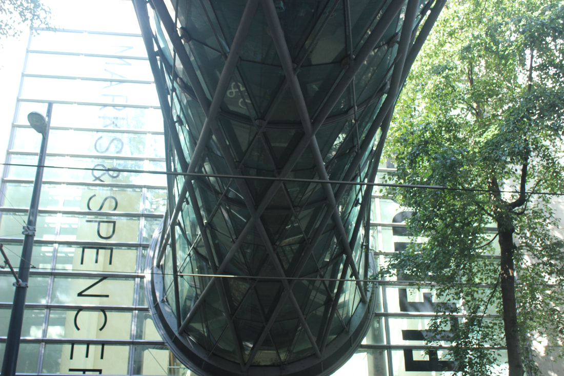
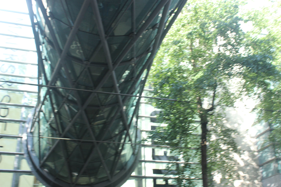
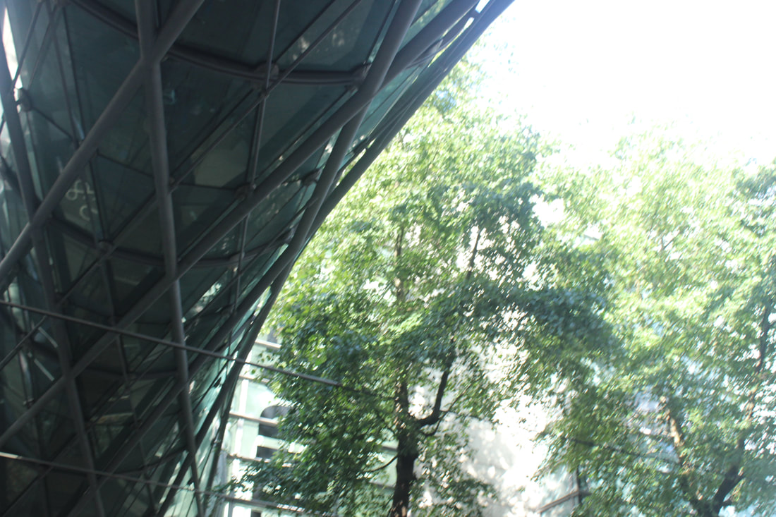
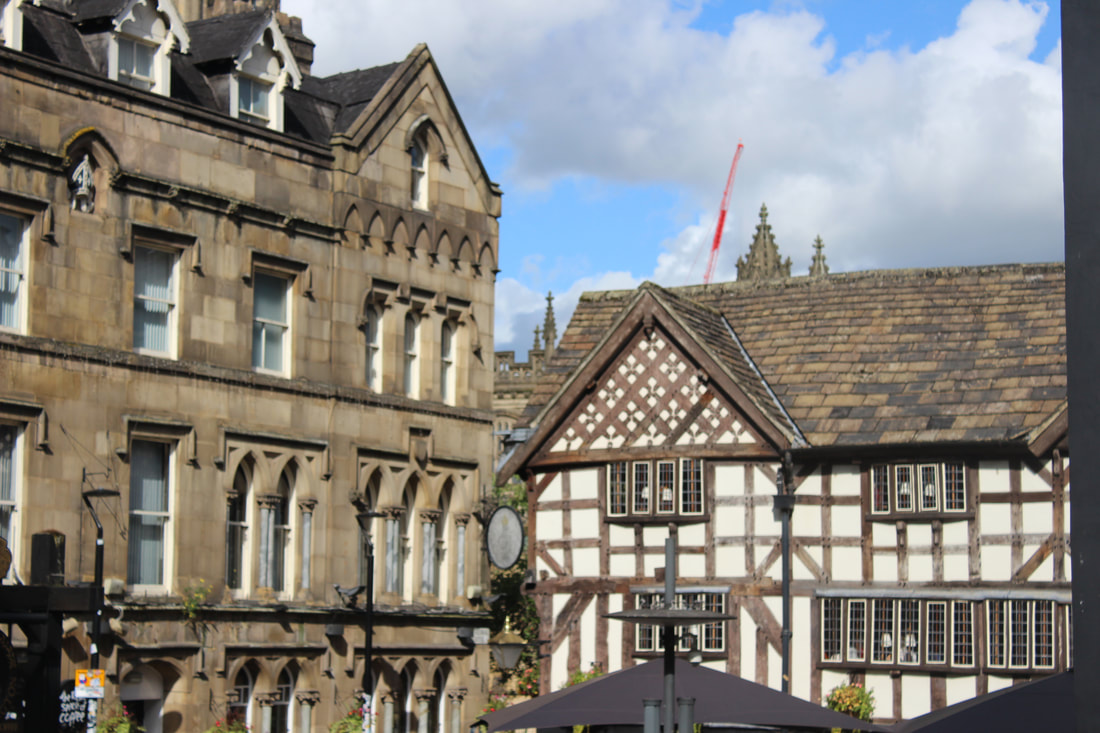
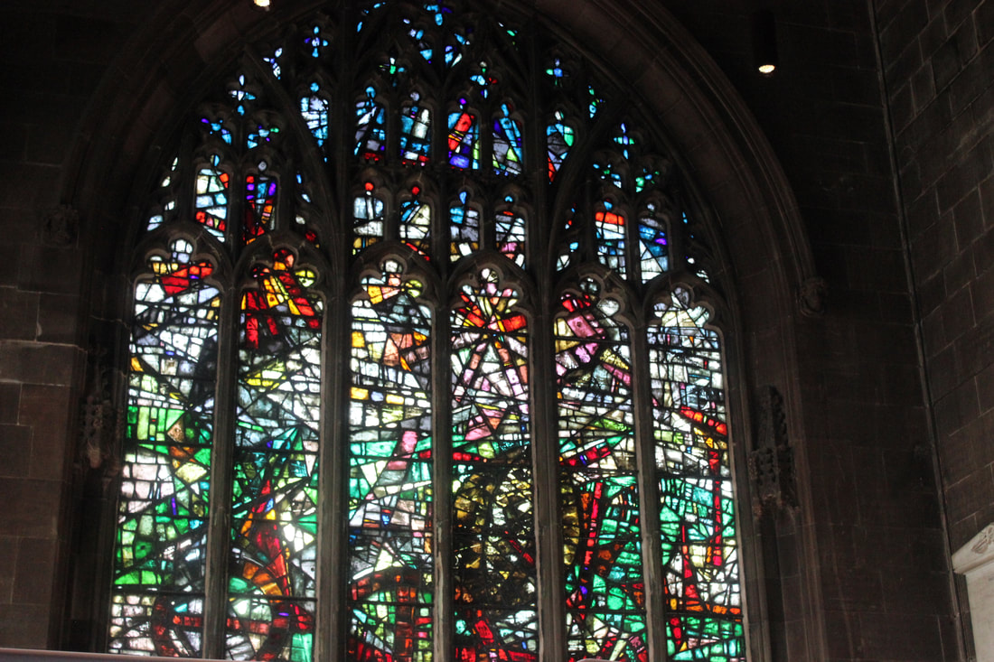
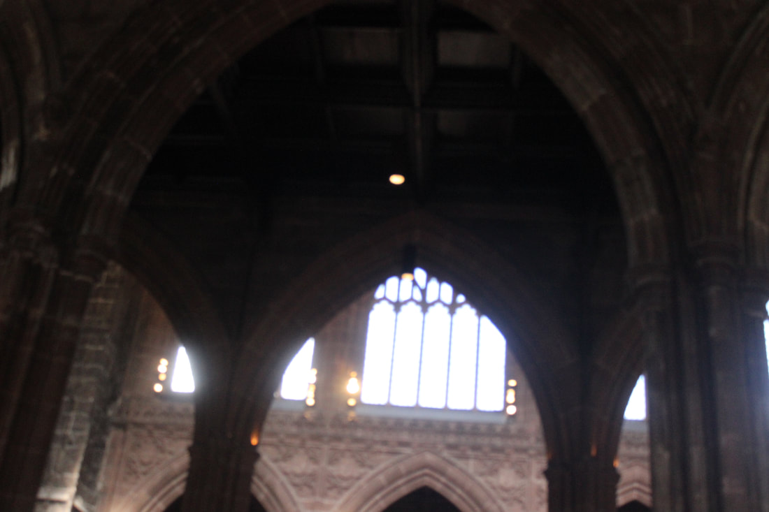
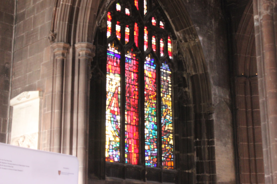
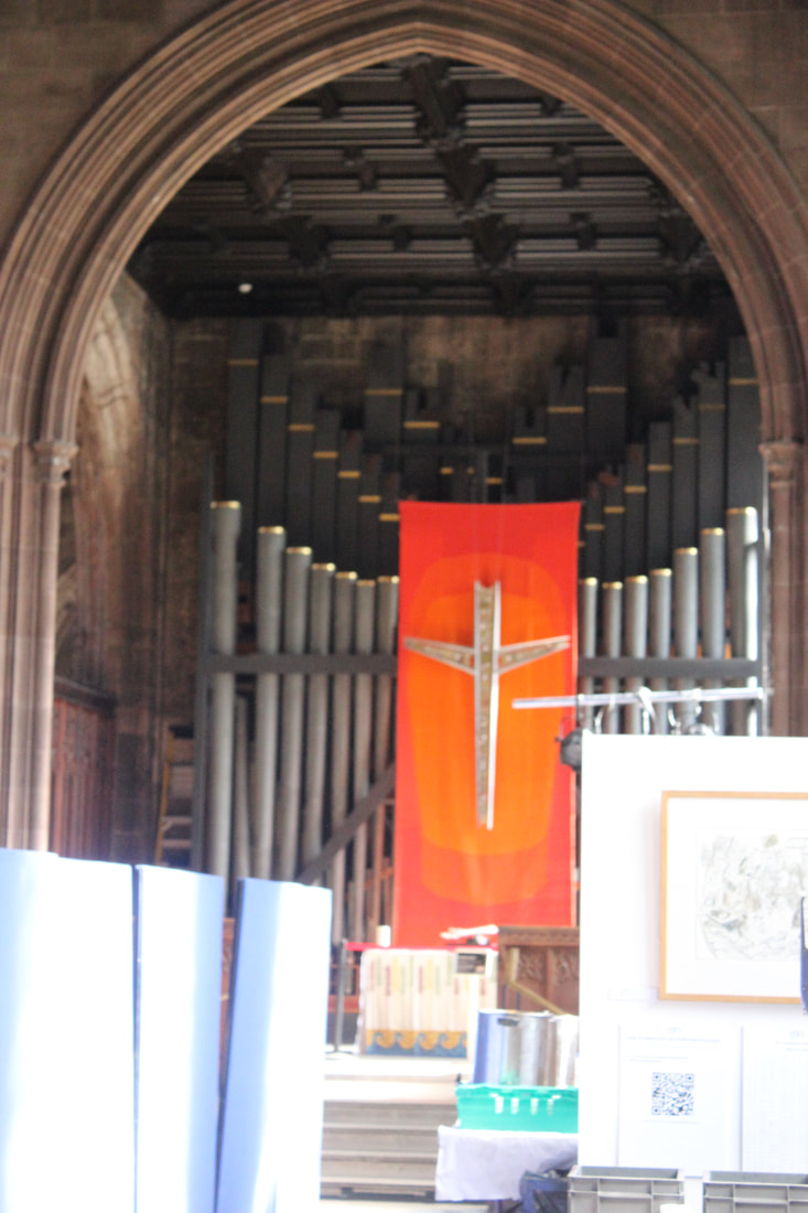
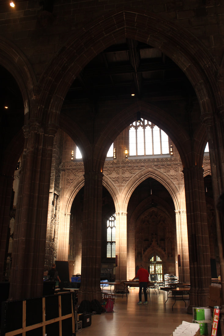
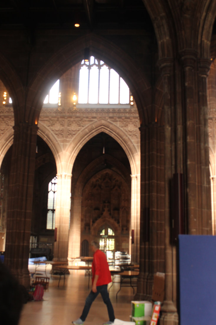
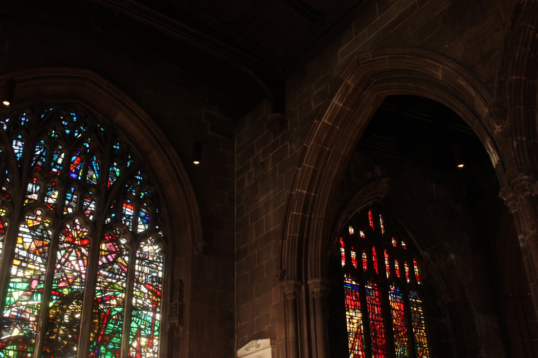
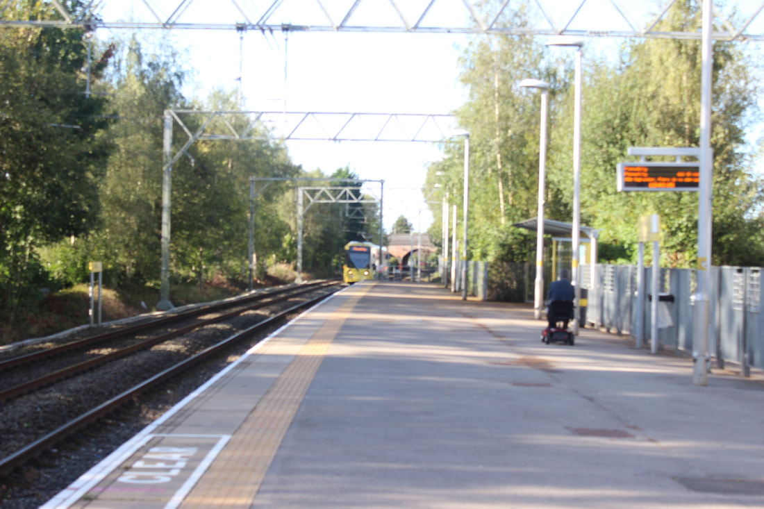
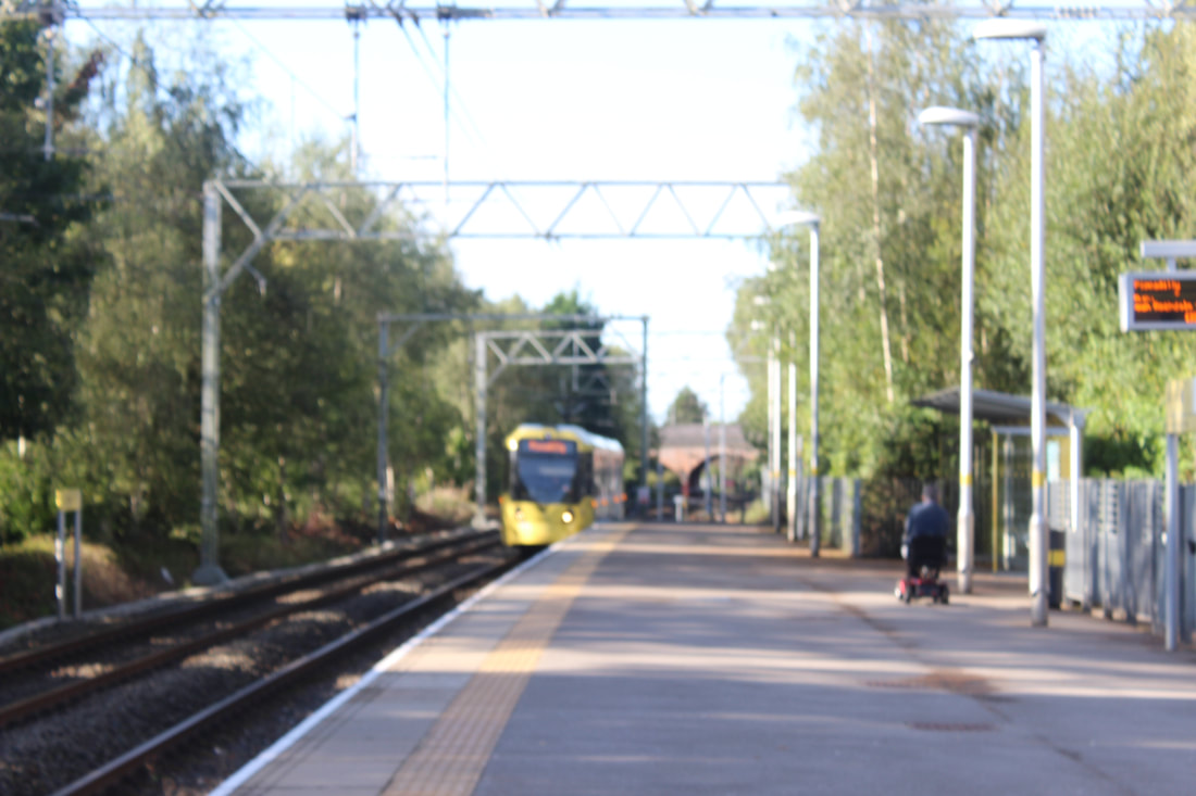
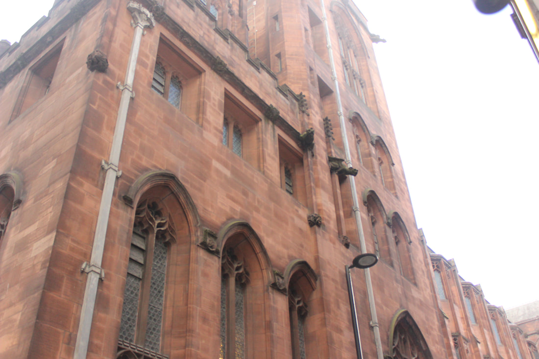
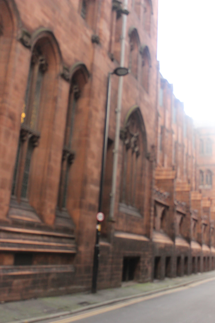
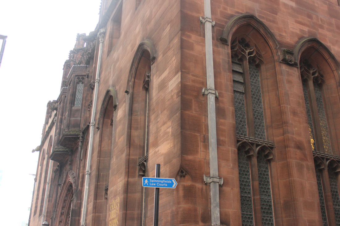
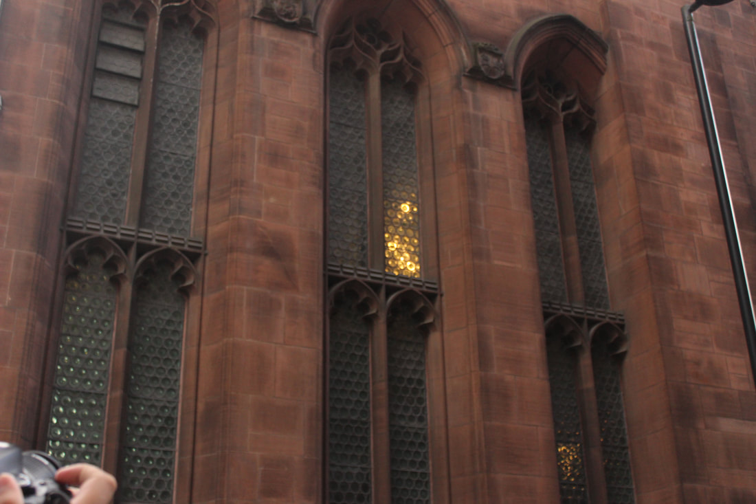
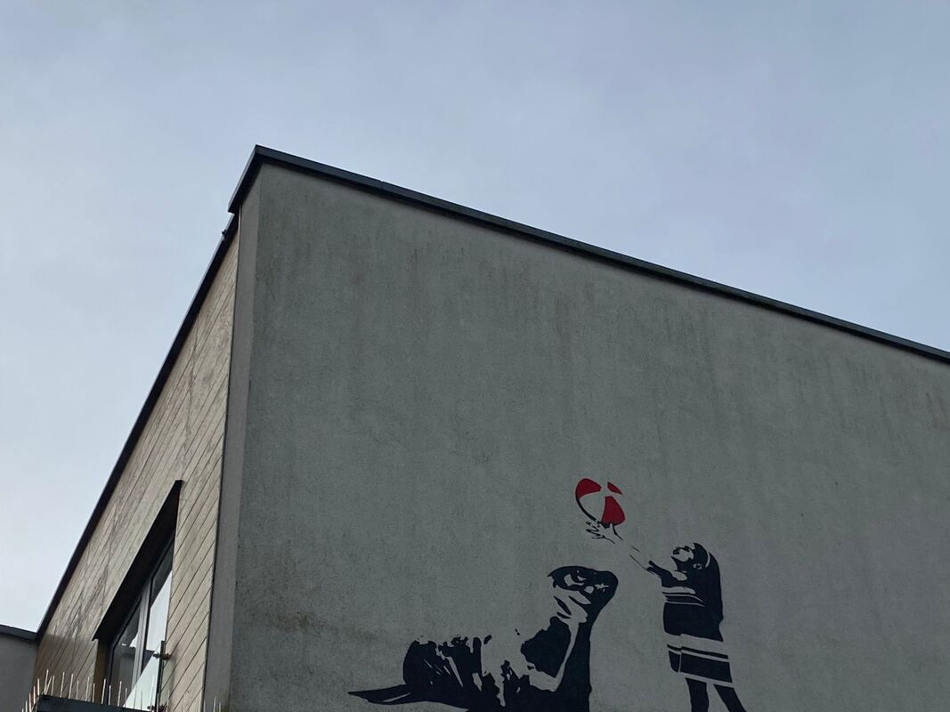
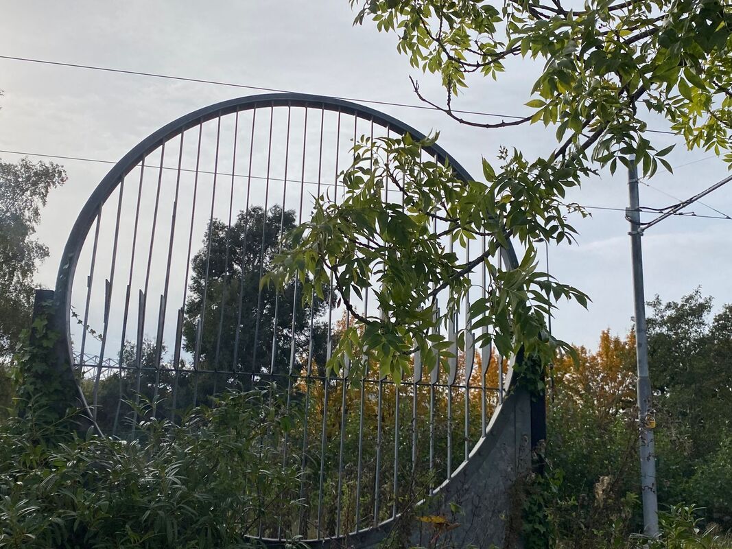
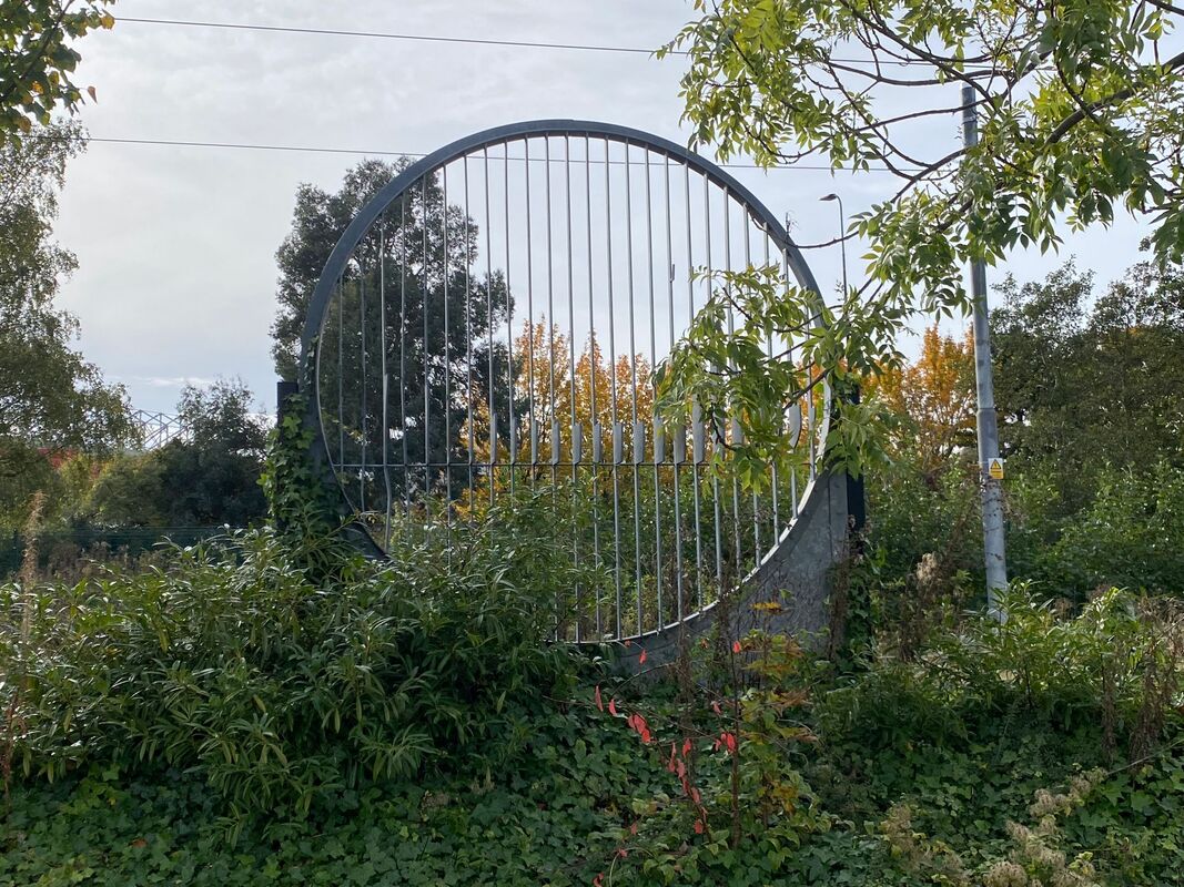
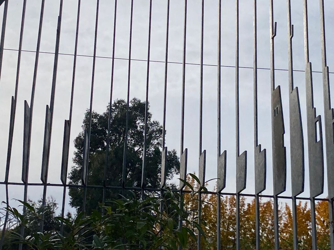
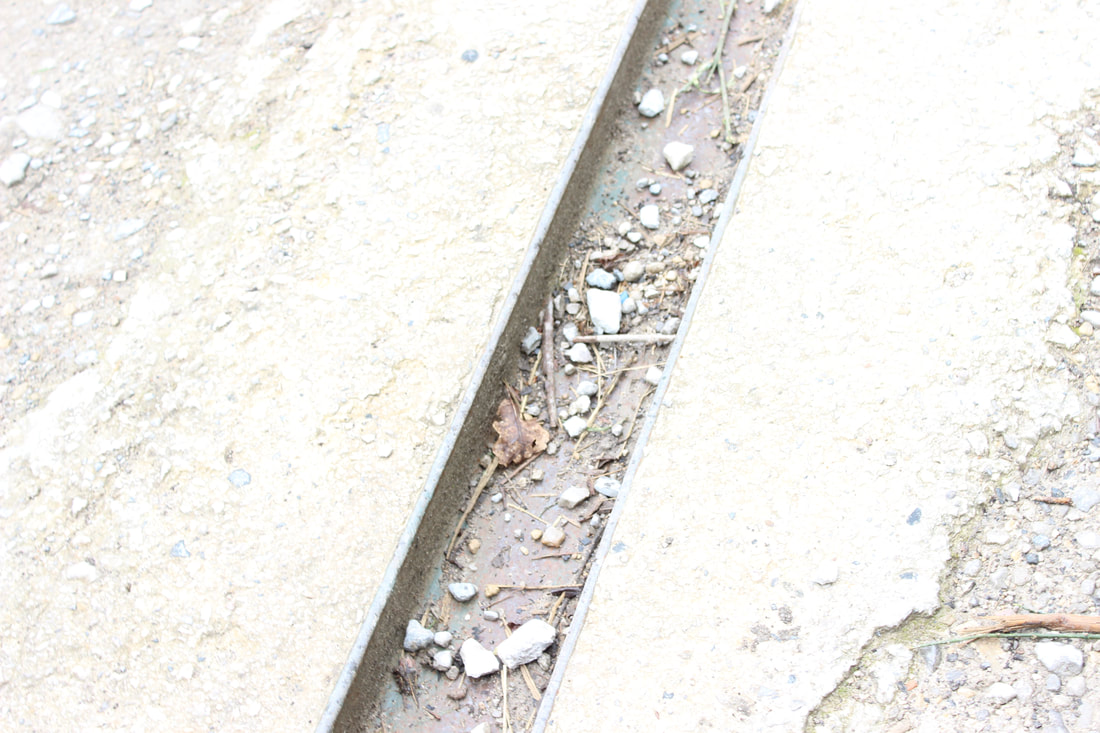
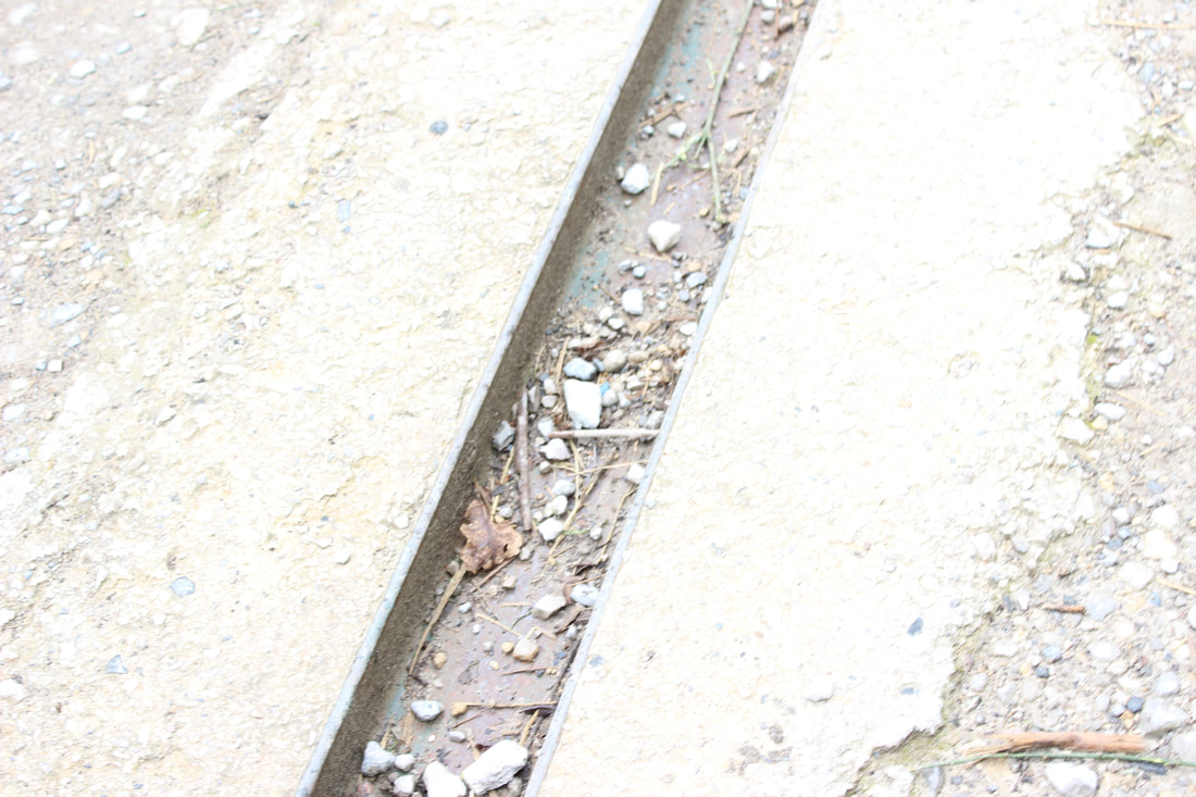
I went into Manchester and stared to take pictures of plants, buildings, textures and people so I could have a good variety of images to edit and use in the final gallery. My personal outcomes are related to the city Manchester and what it looks like through time. I have shown Manchester's nature with the trees to the water. I have shown the water next to the bridge. I have used the statues to show how long this city has been around for. I have used the train tracks which makes you think about how big the city is and how long it goes on for. The church I used in my photos shows how amazing the architecture is in this city and also how aged it is. This is personal to me because it is the city I live in so I had to take pictures around the area to show its history.
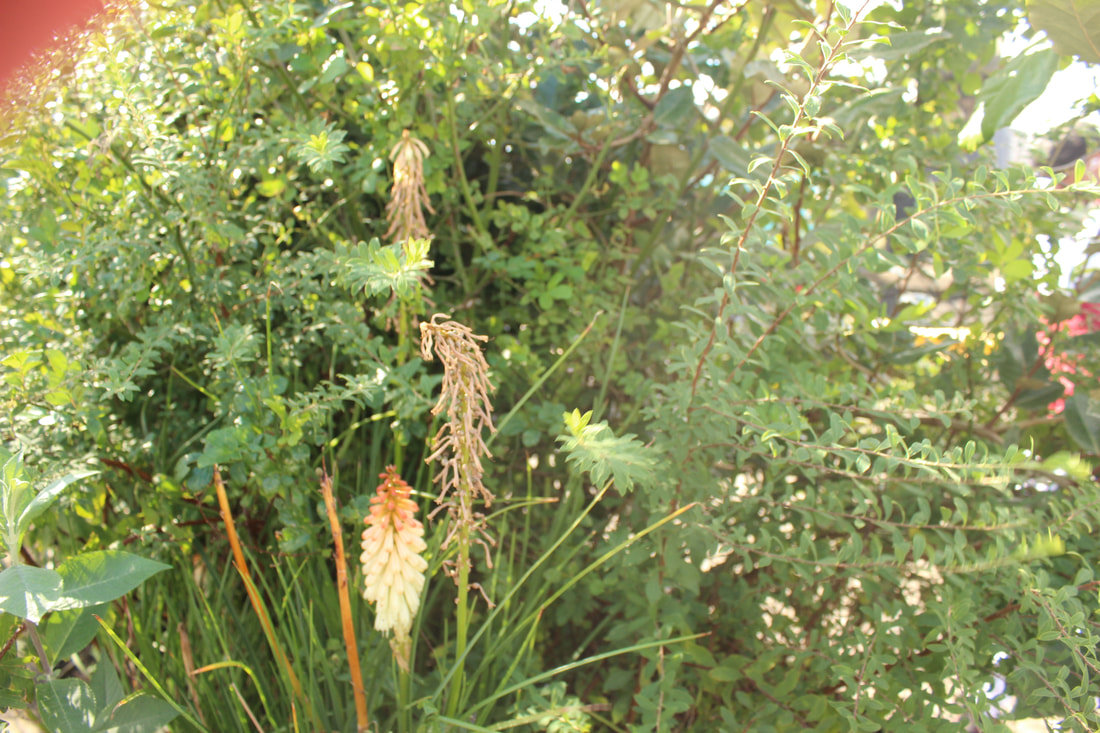
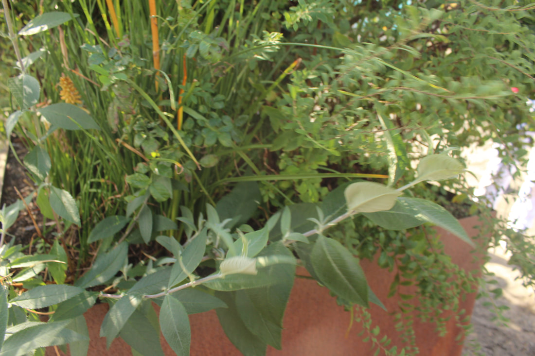
manchester texture


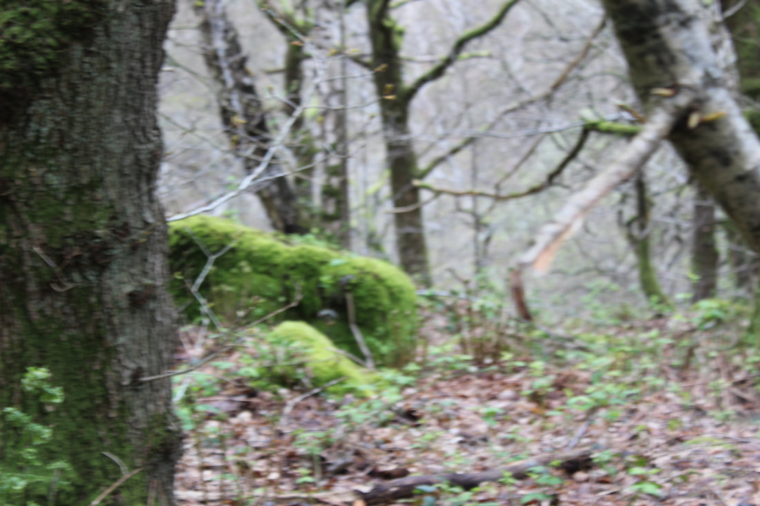
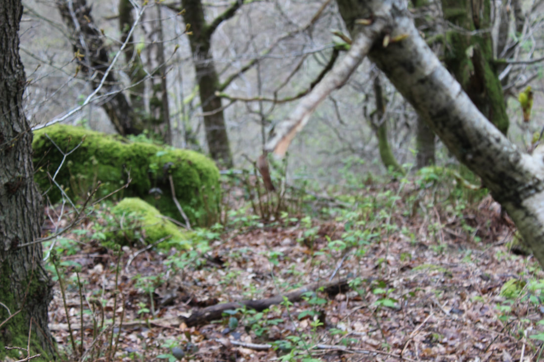
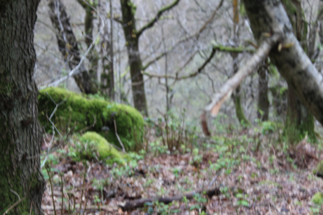
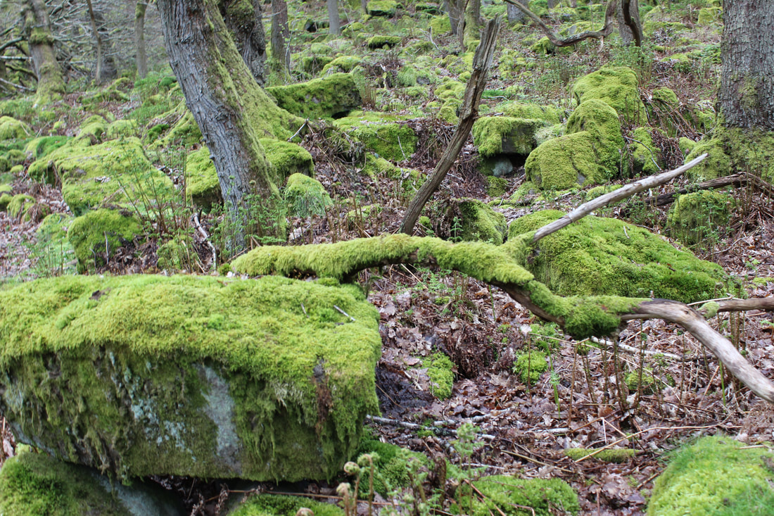
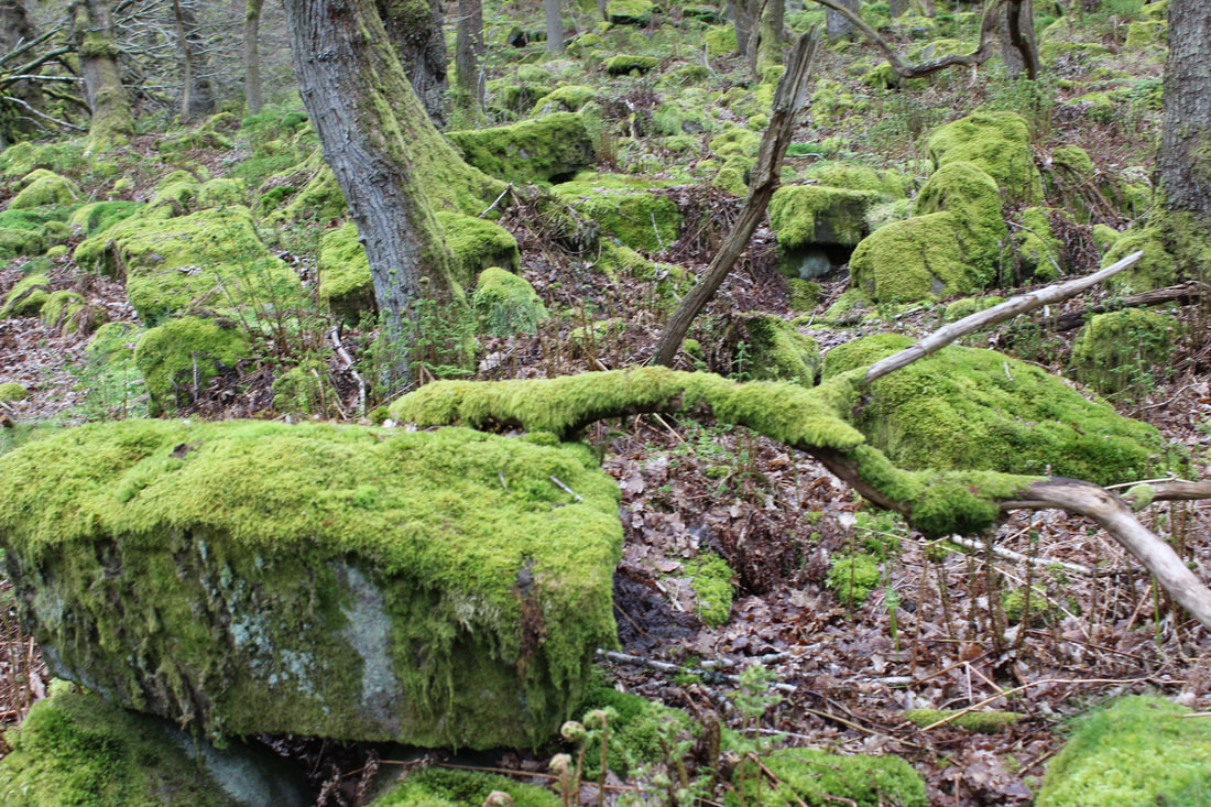
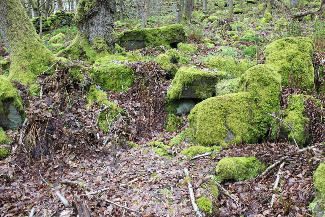
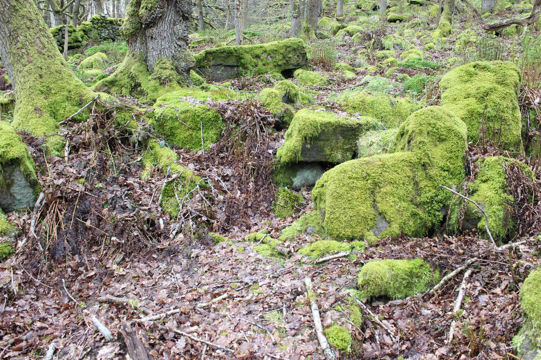
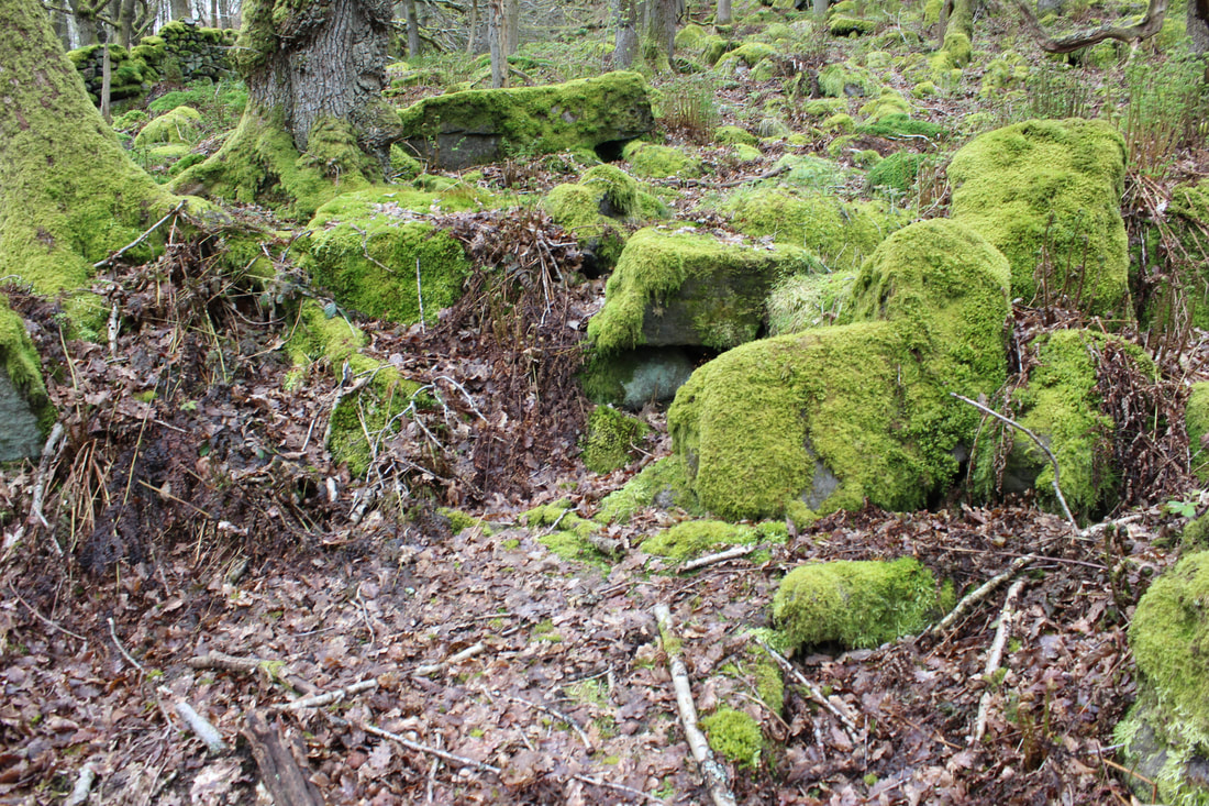
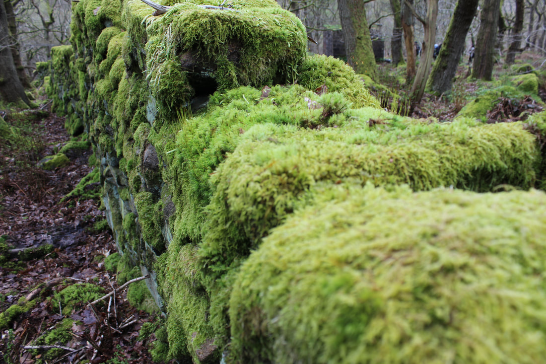
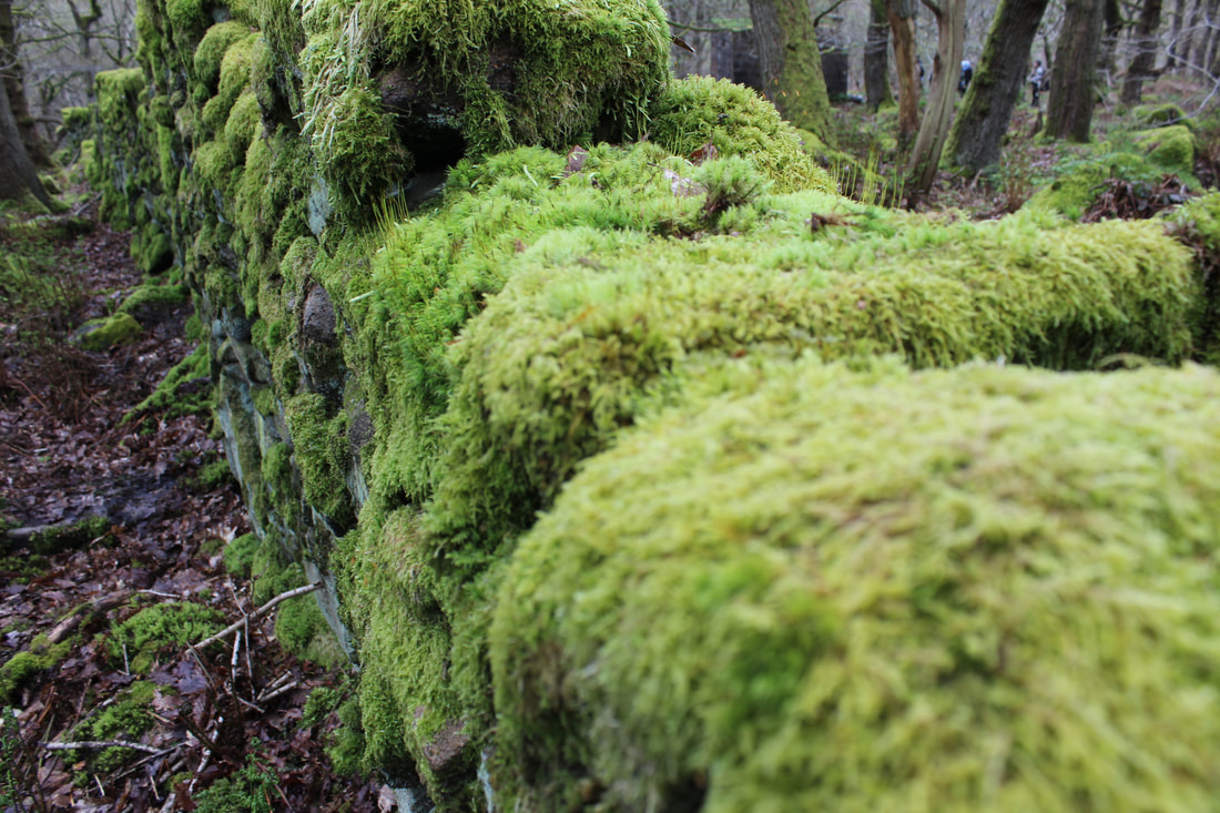
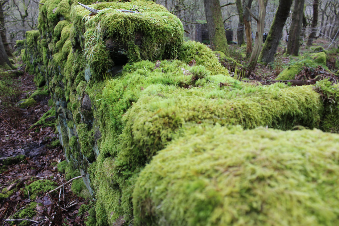
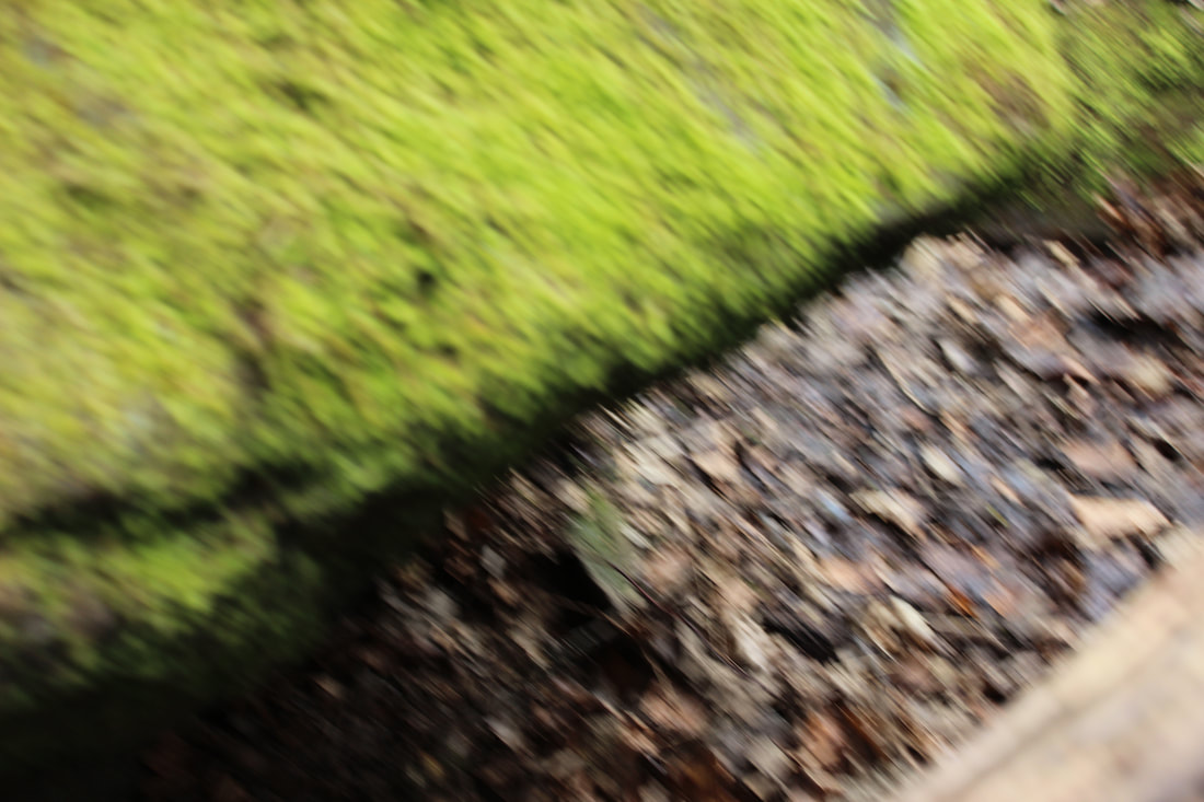
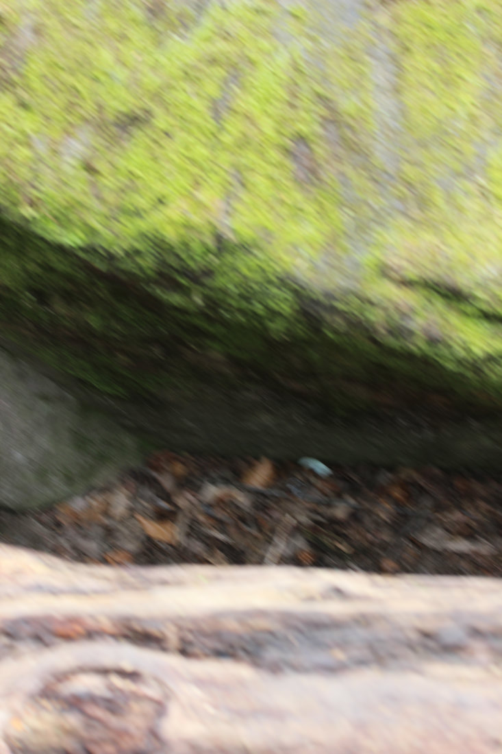
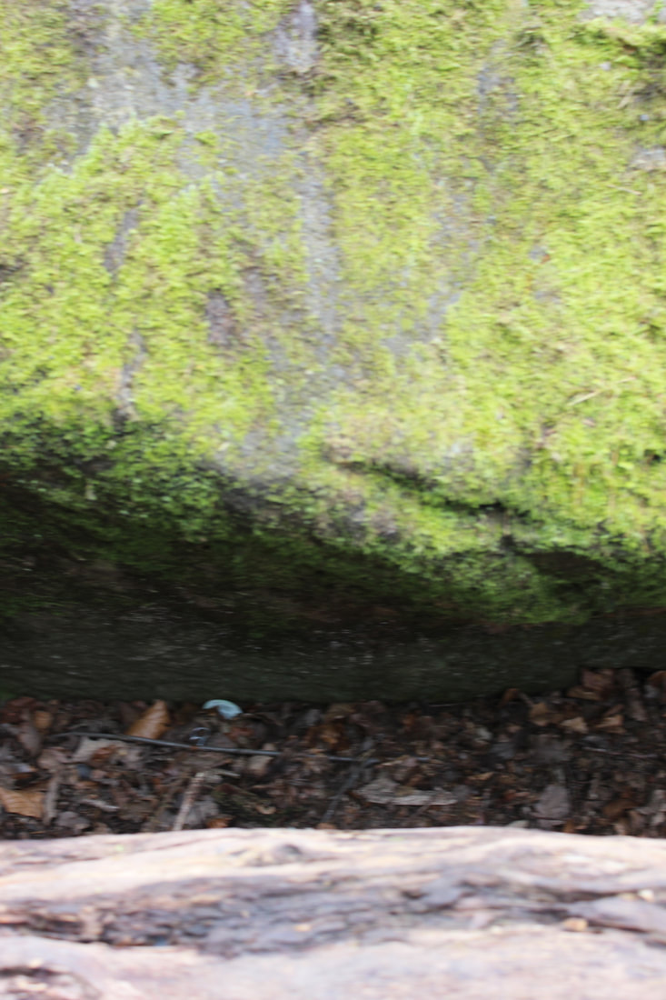
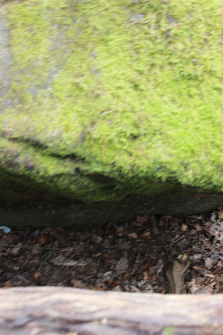
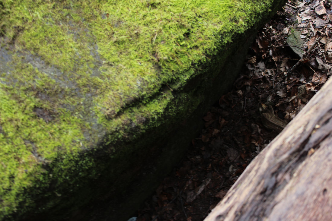
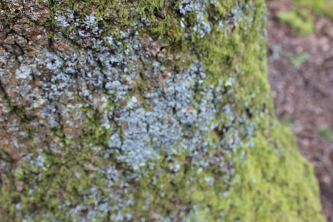
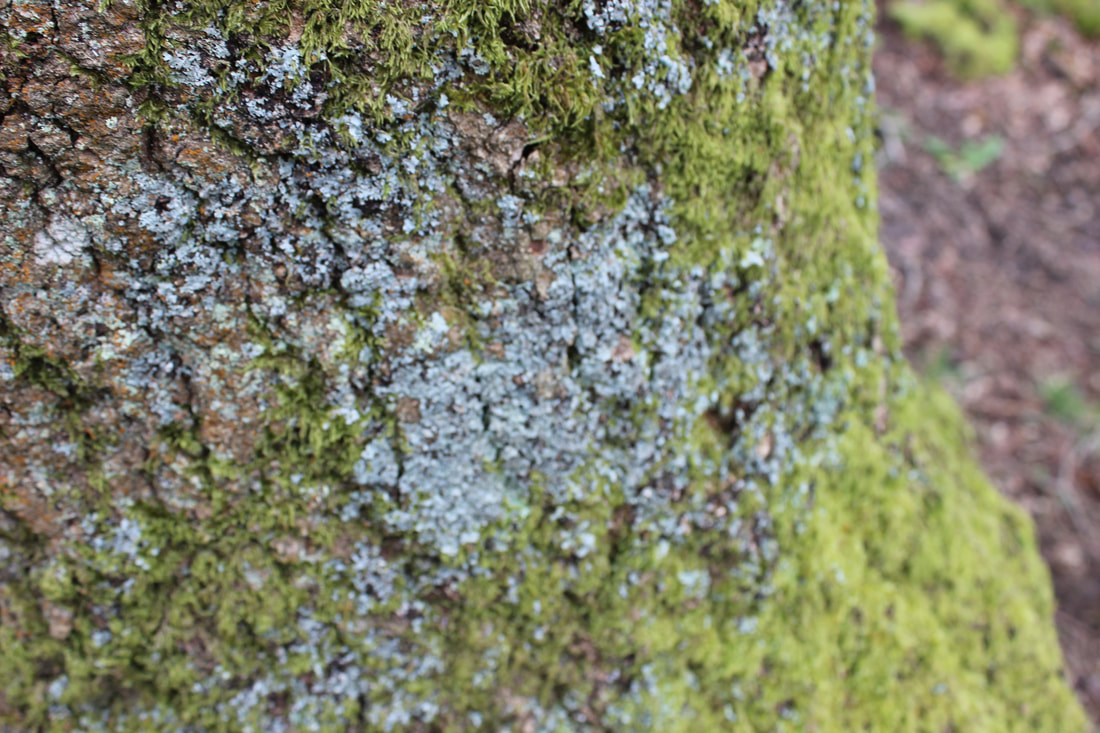
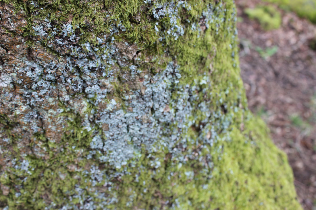
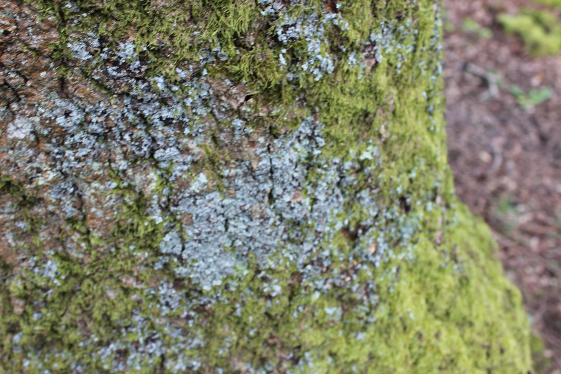
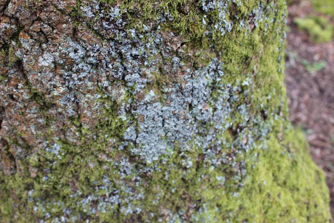
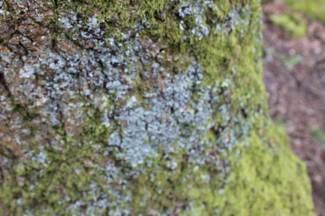
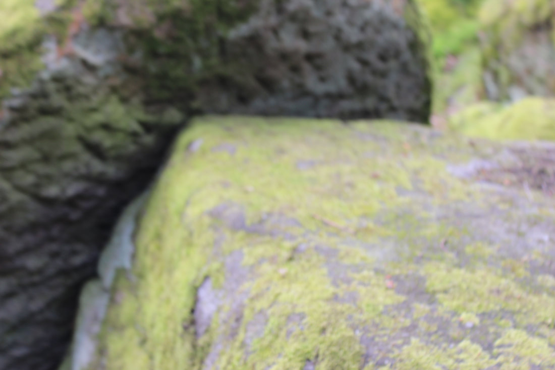
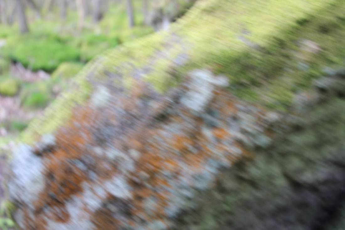
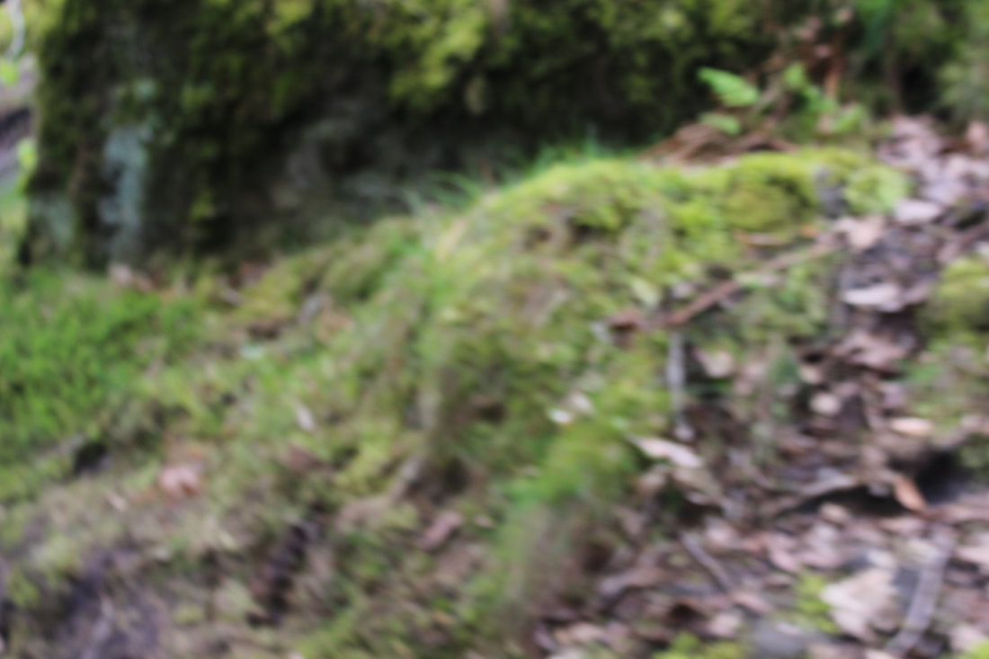
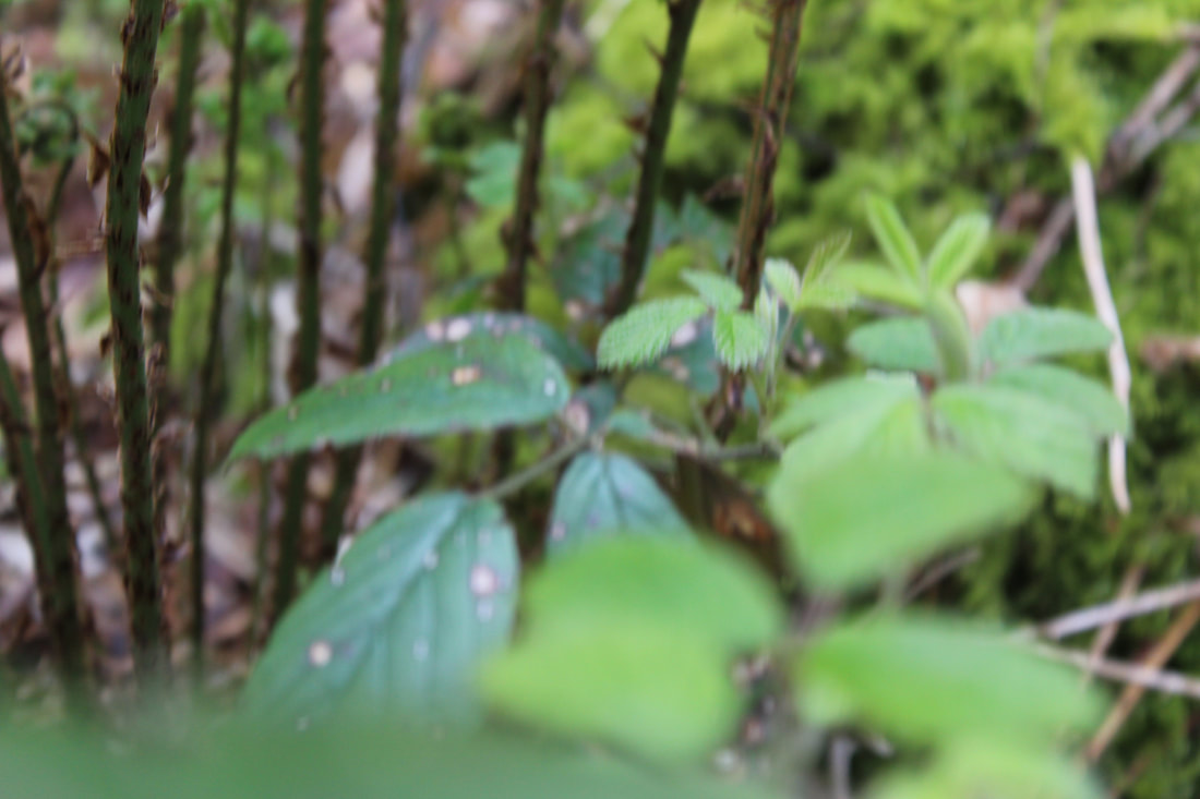
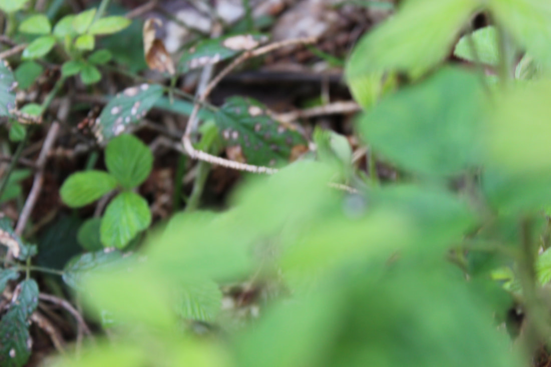
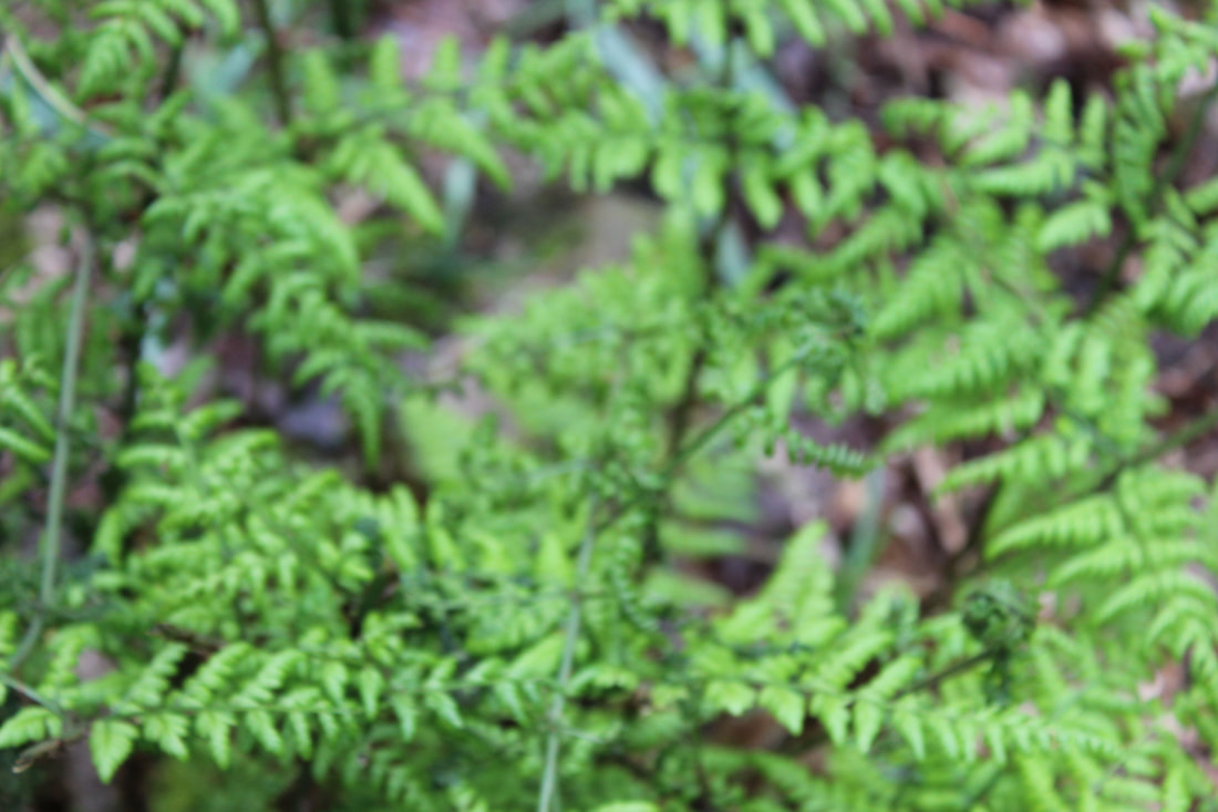
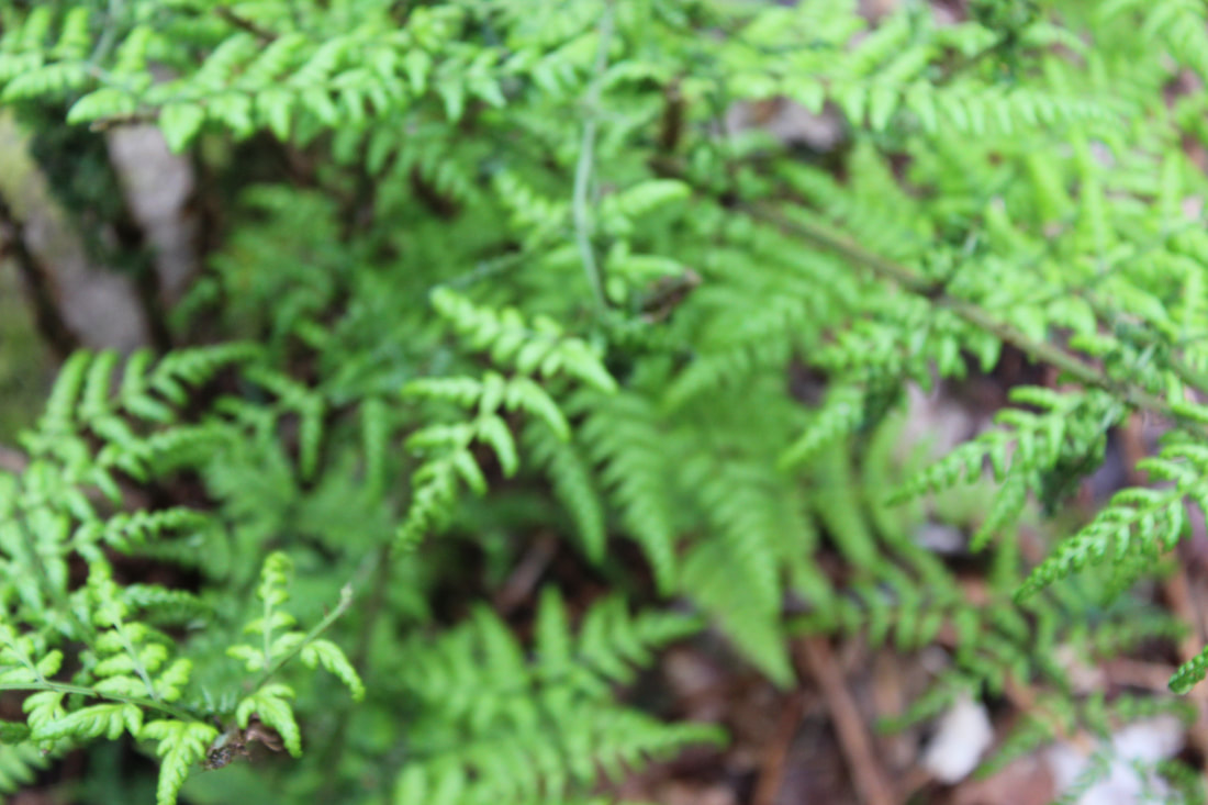
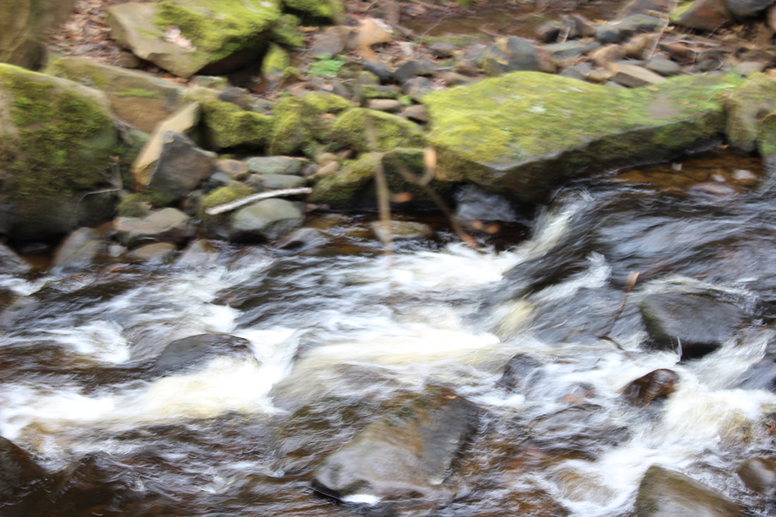
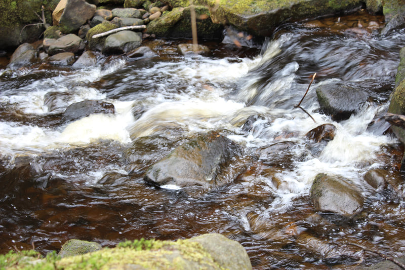
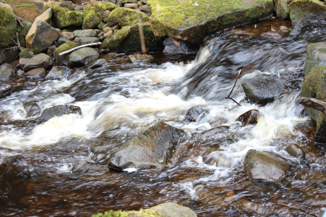
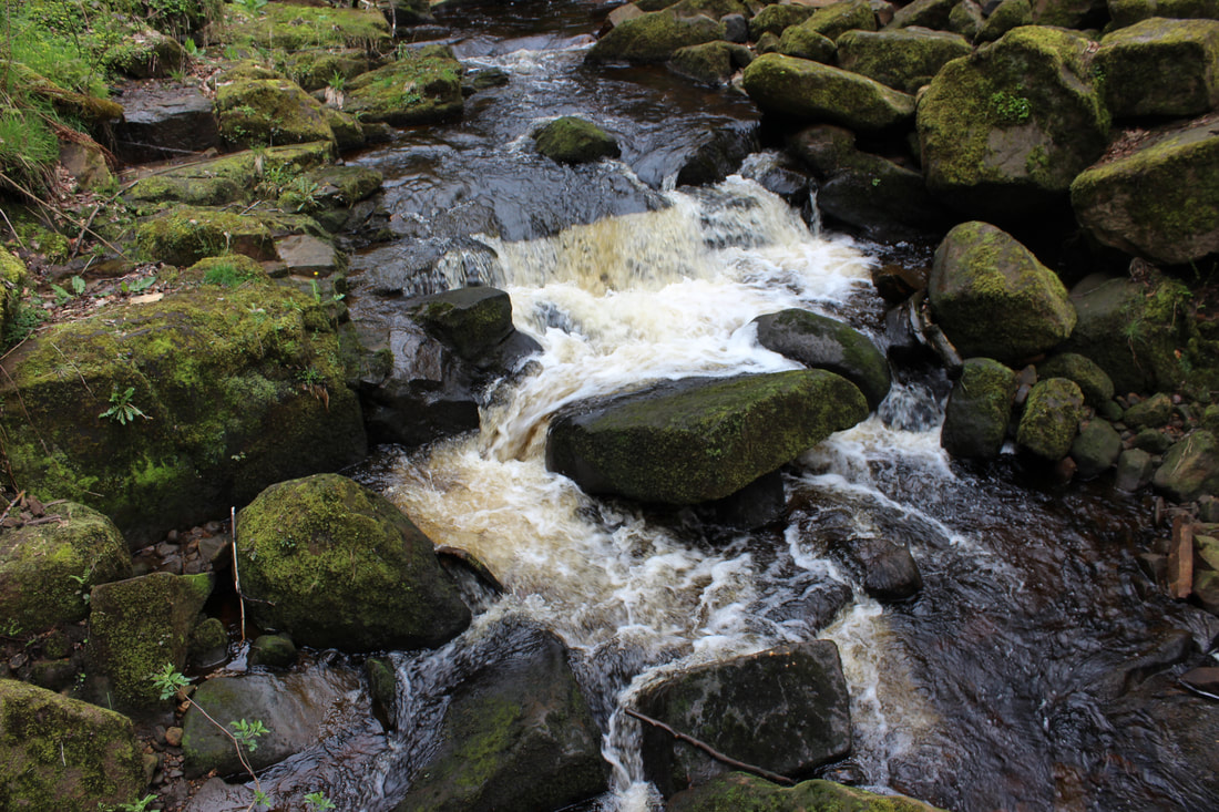
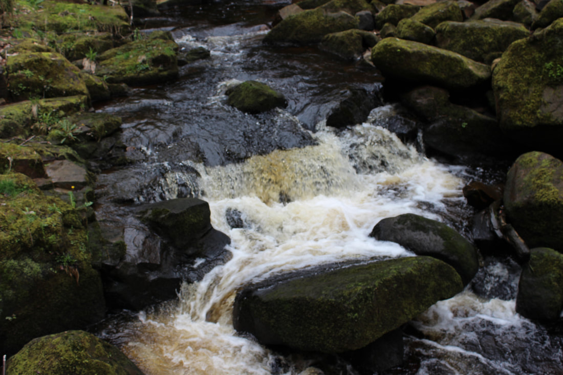
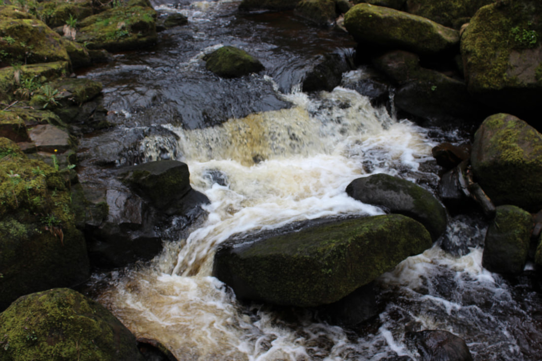
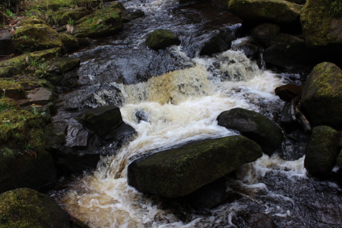
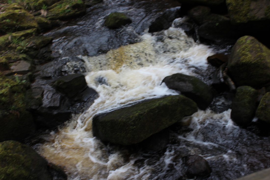
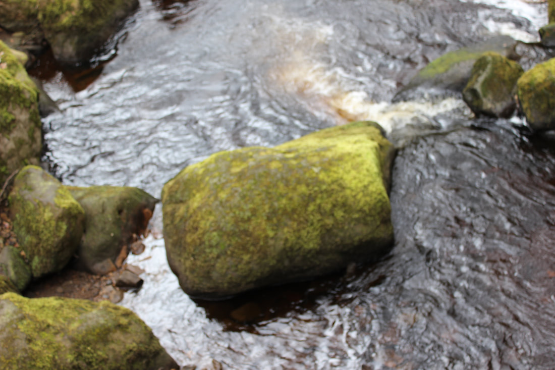
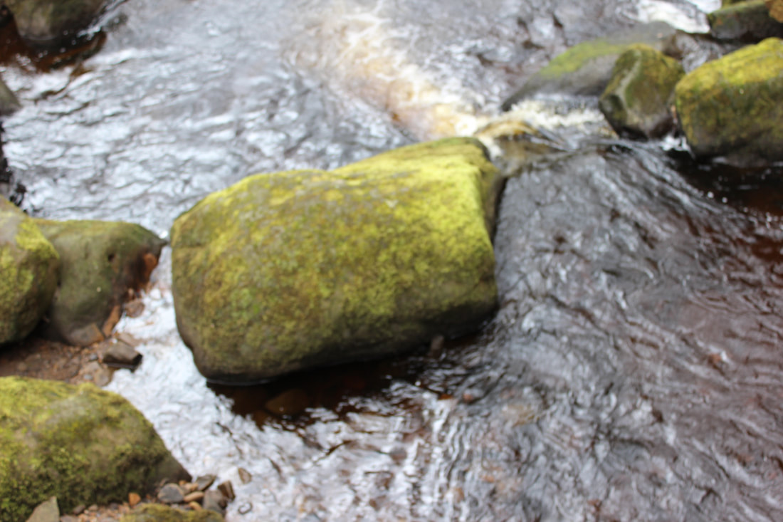
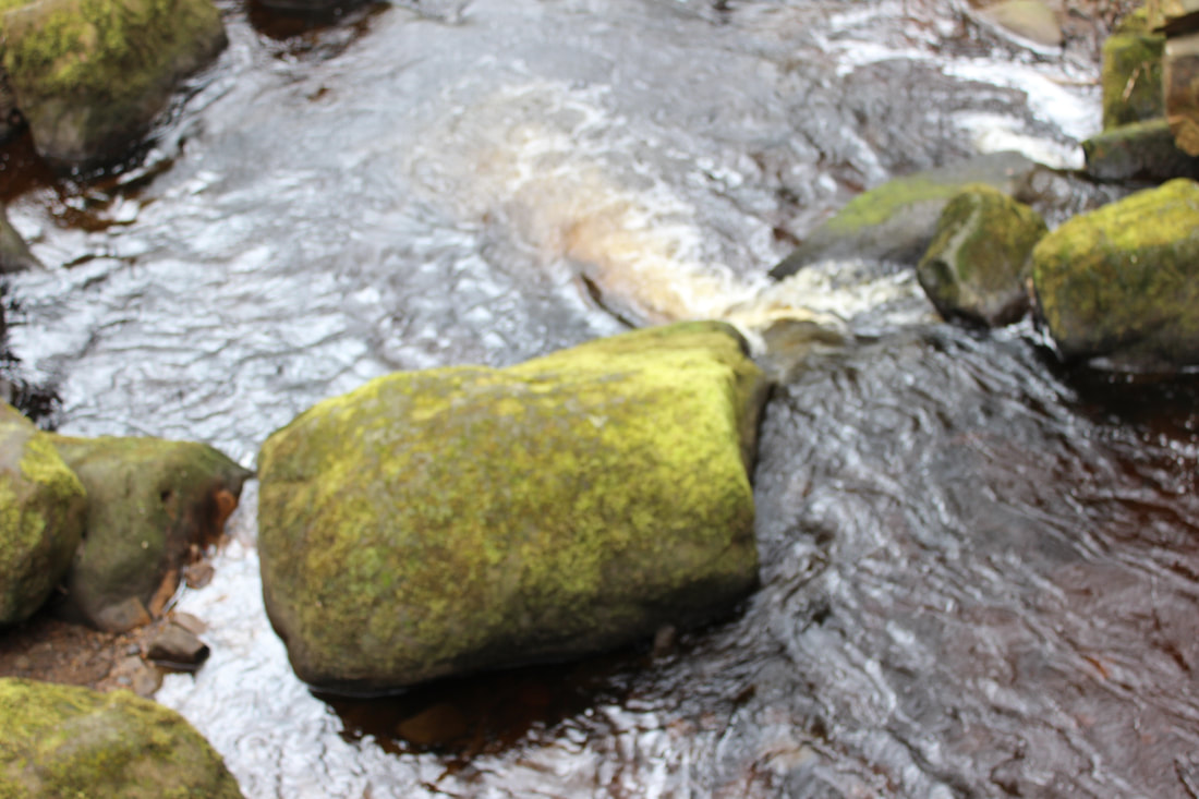
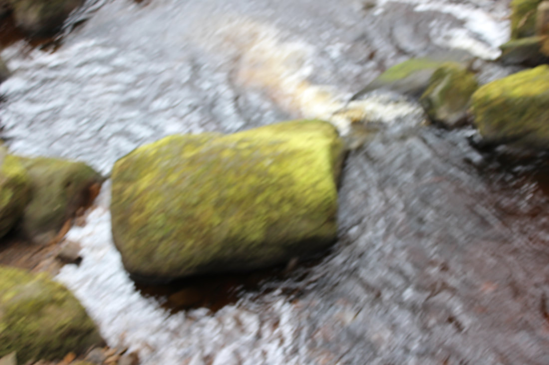
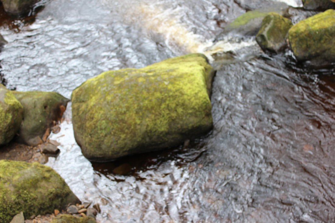
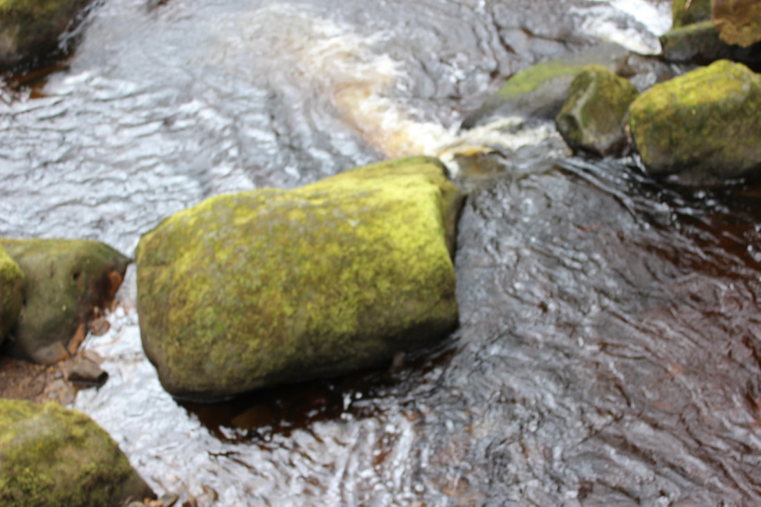
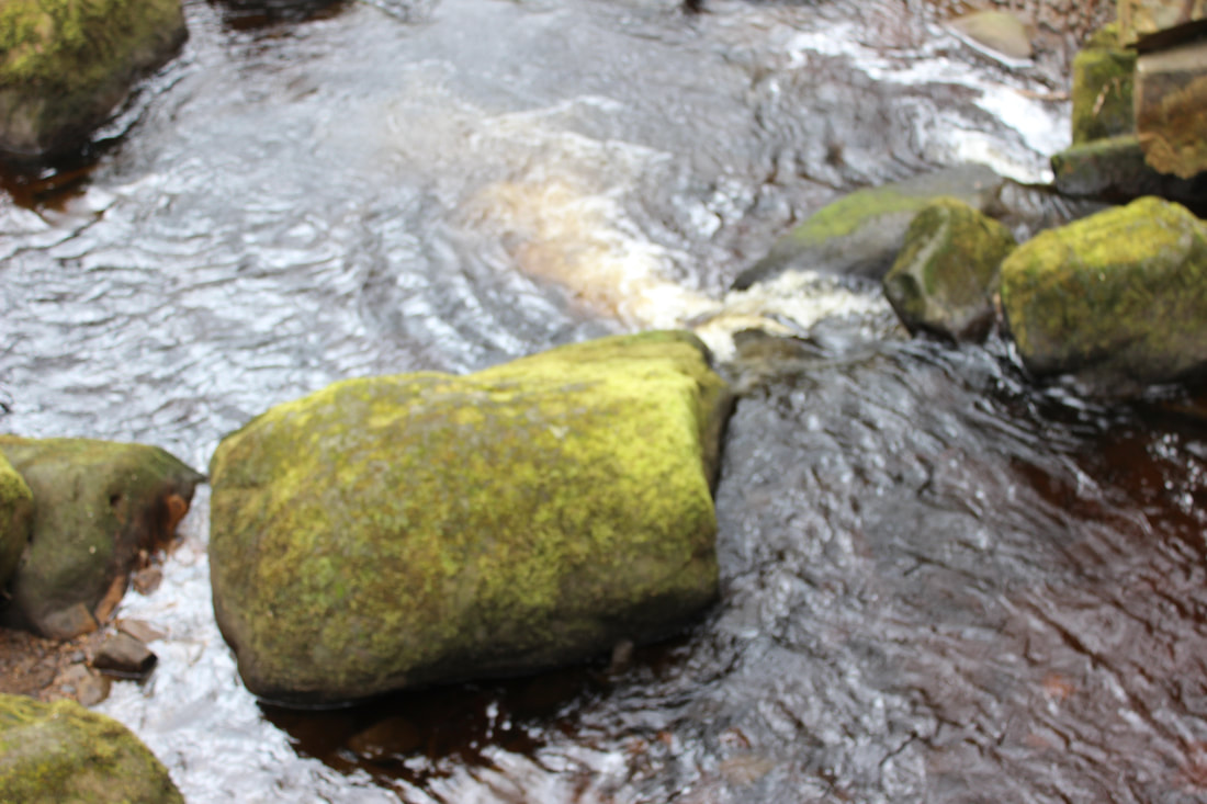
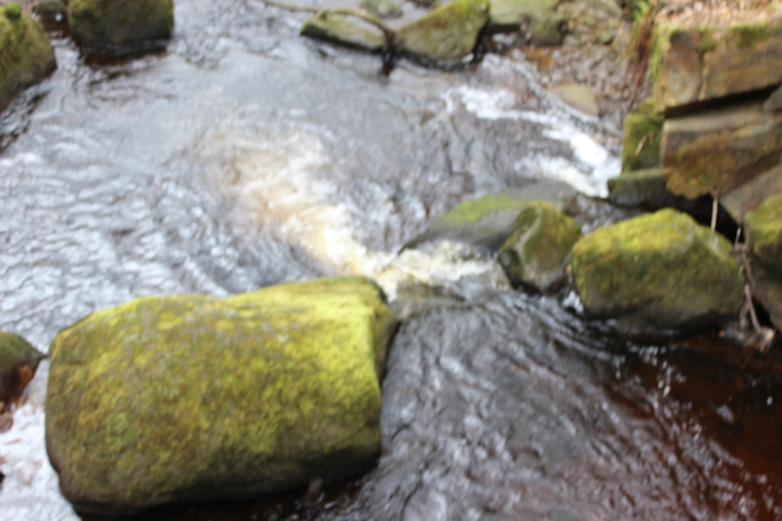
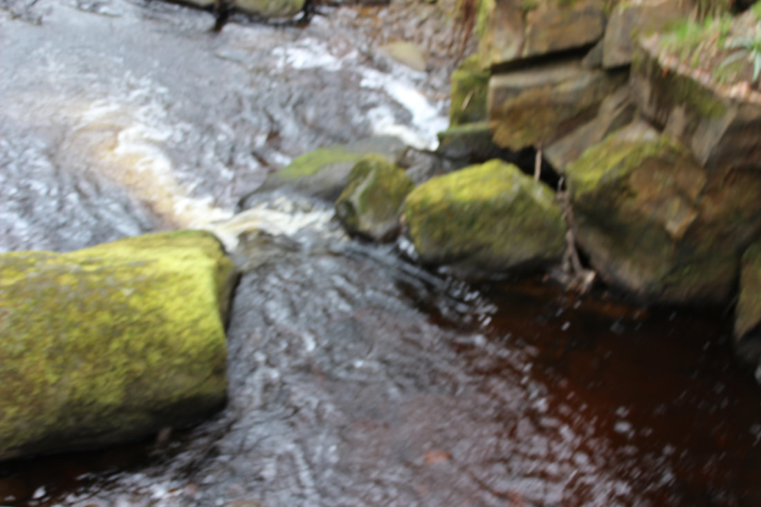
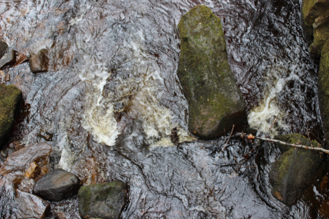
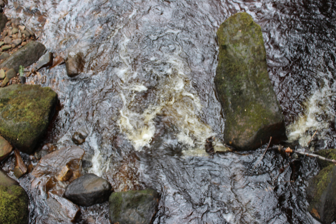
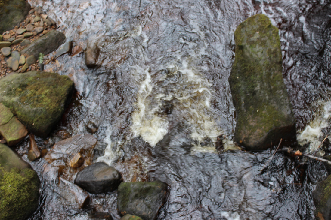
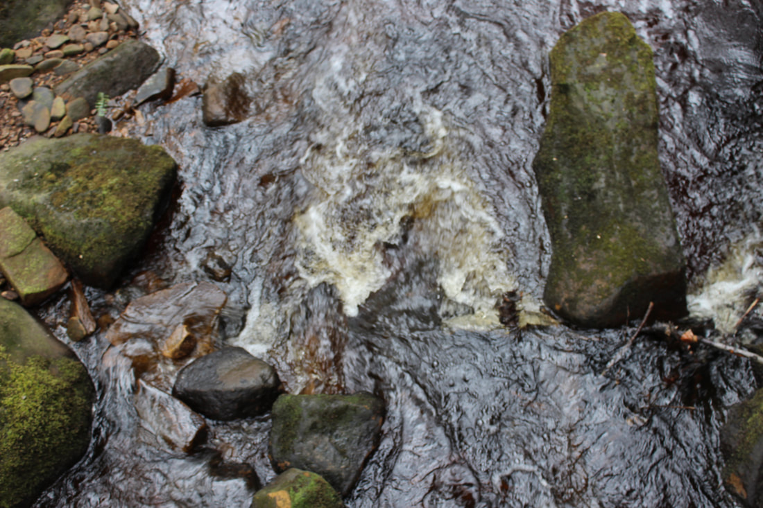
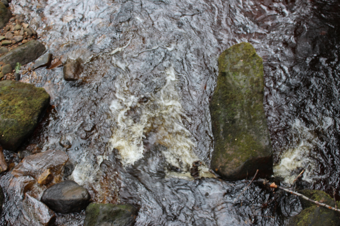
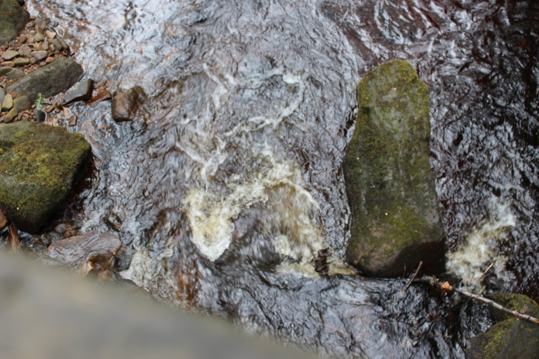
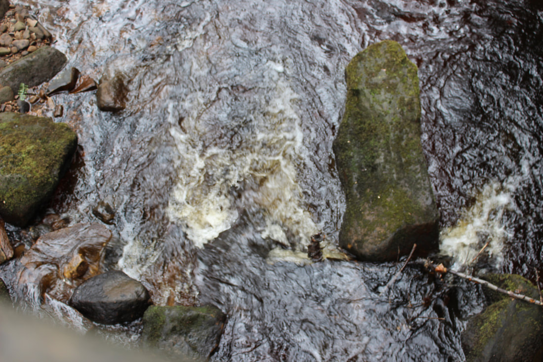
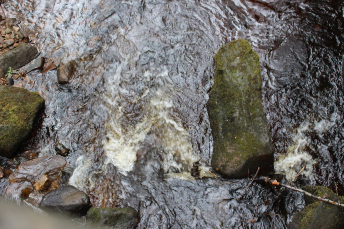
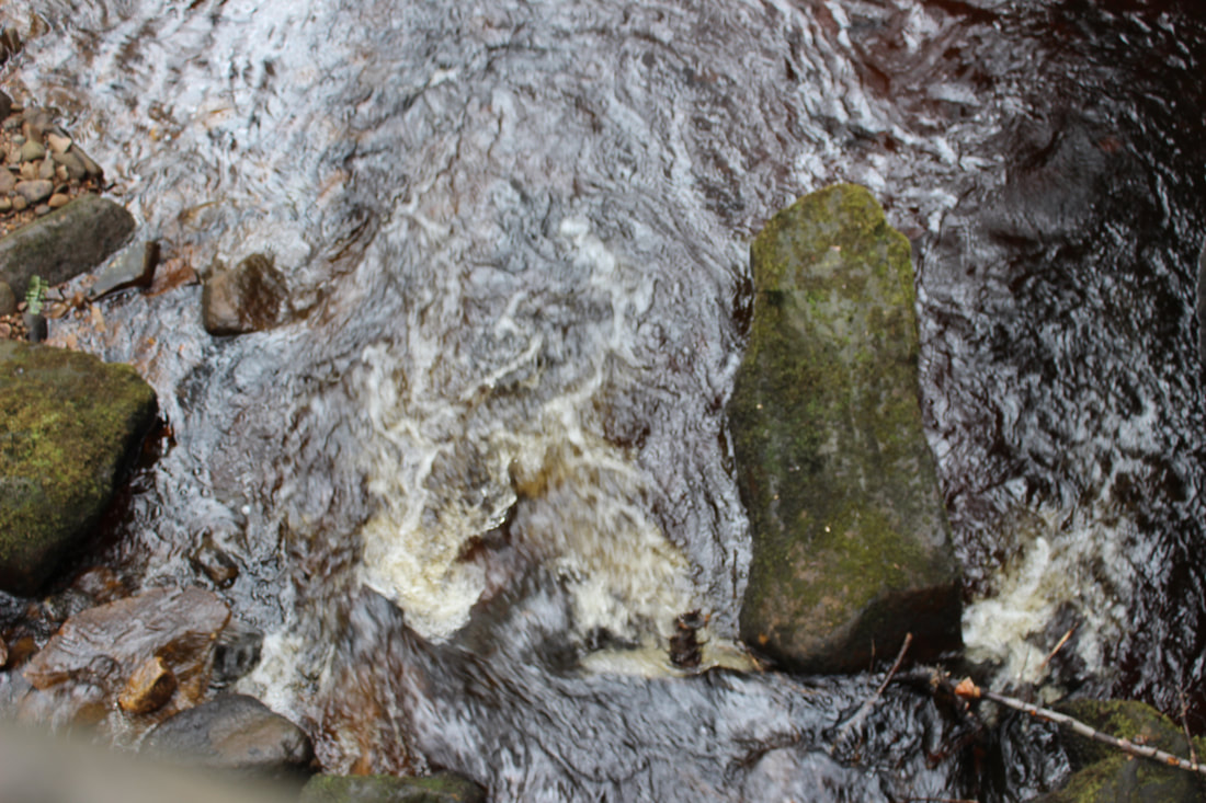
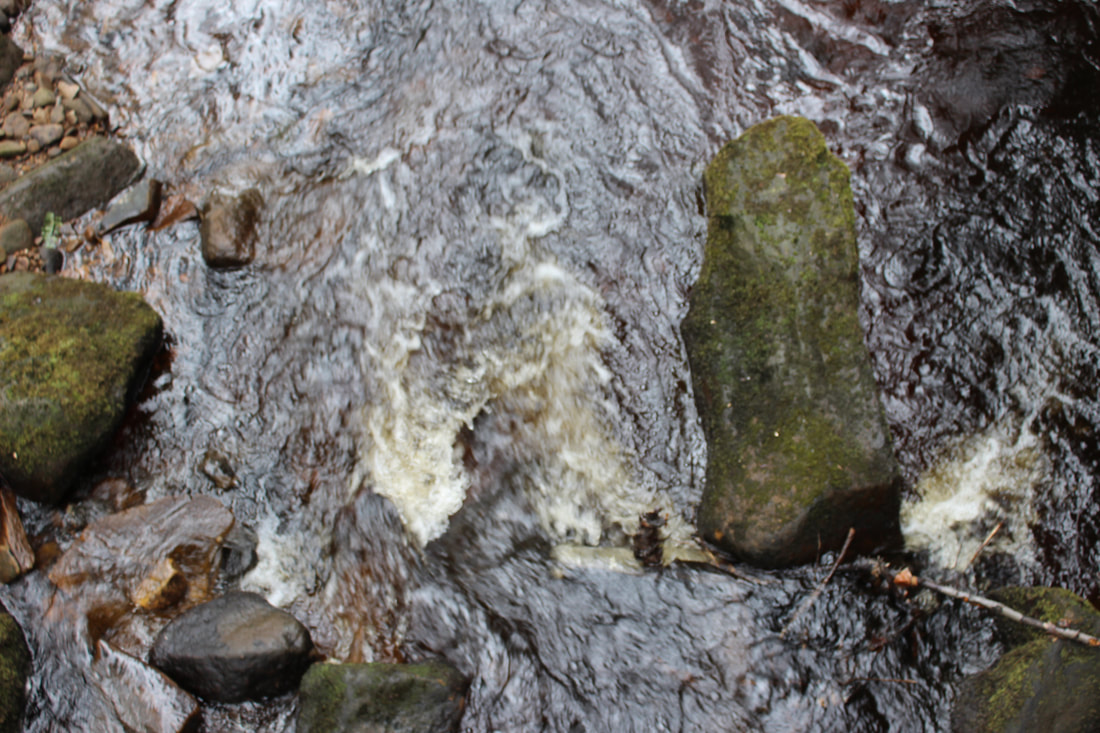
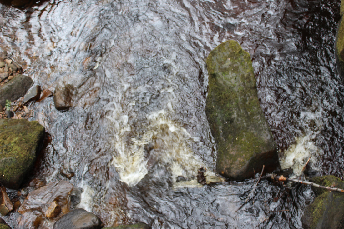
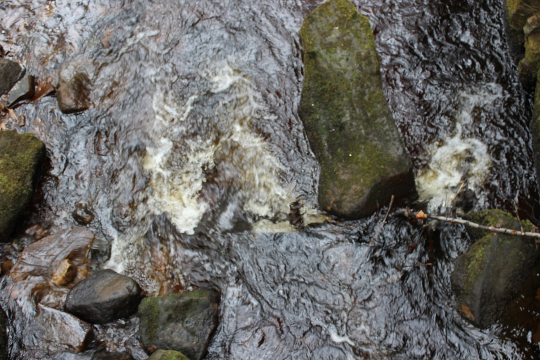
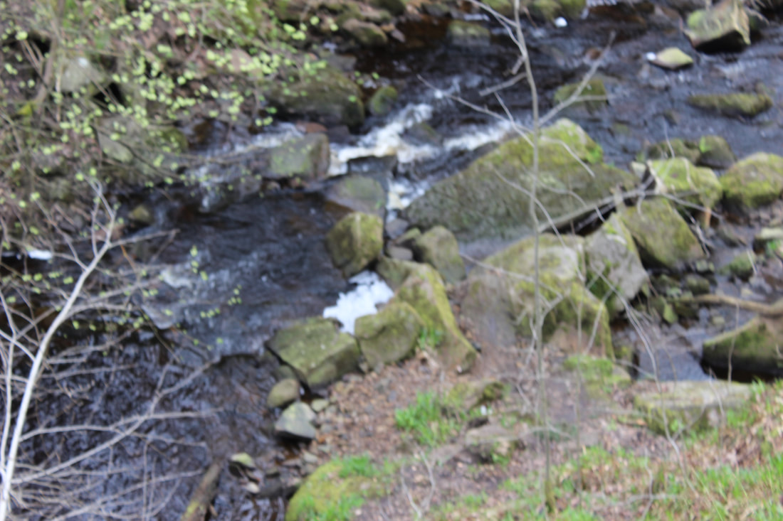
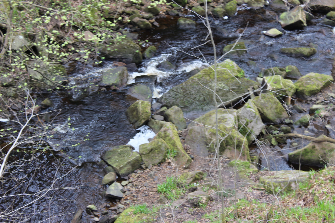
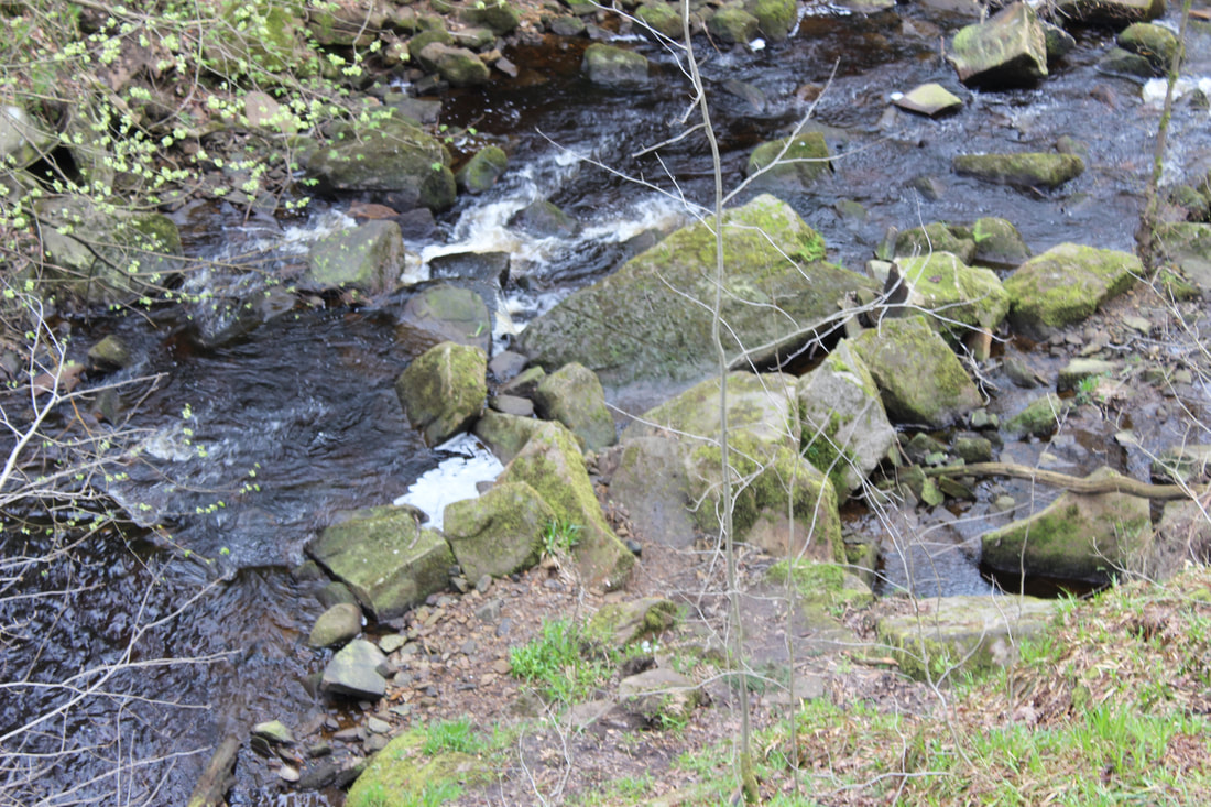
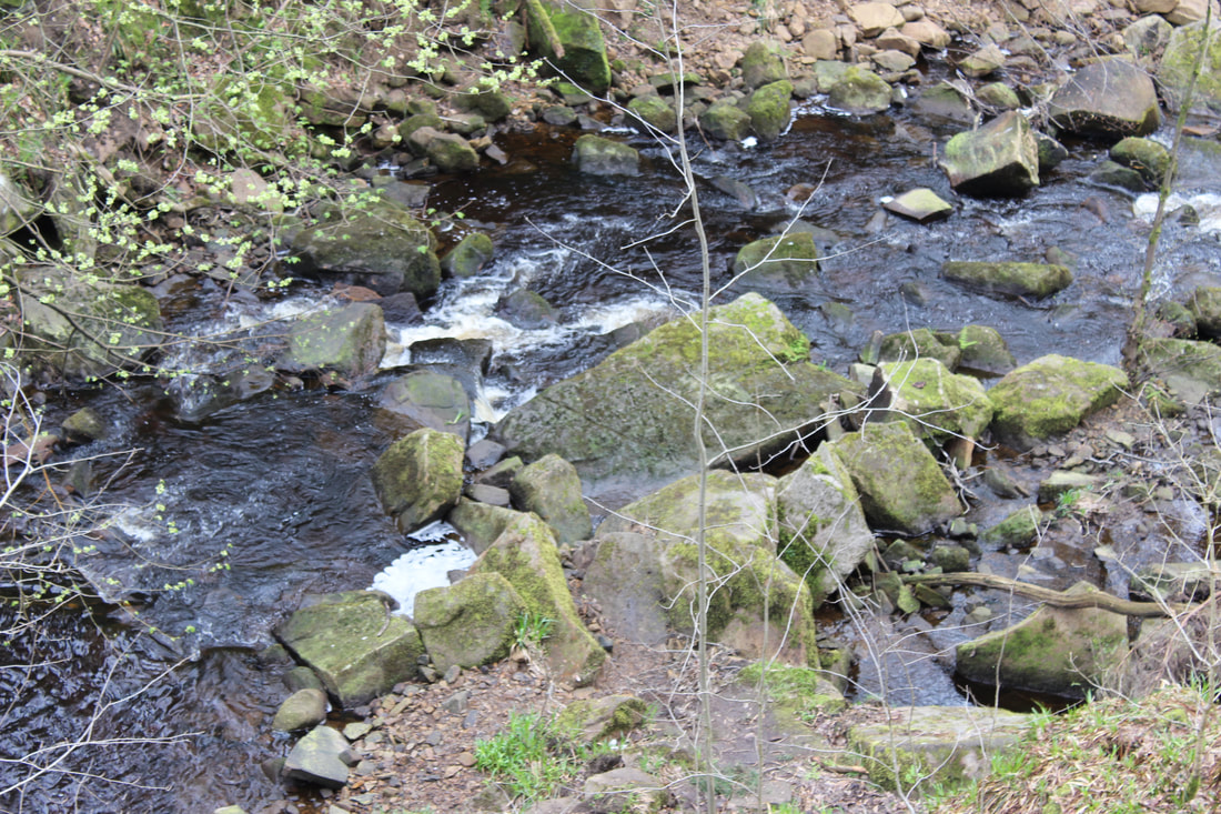
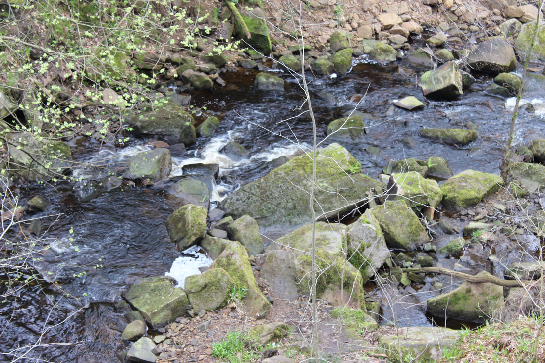
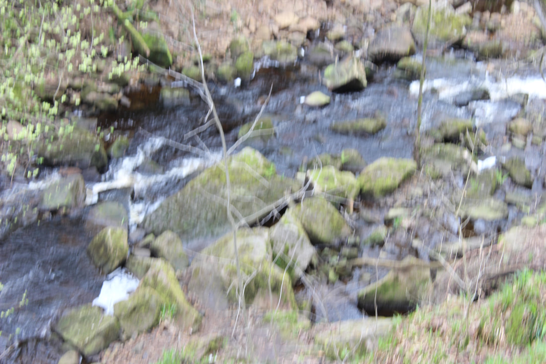
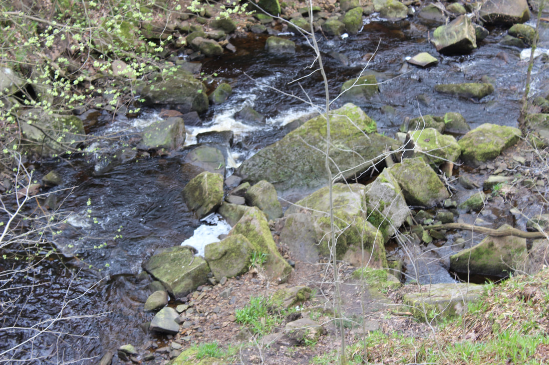
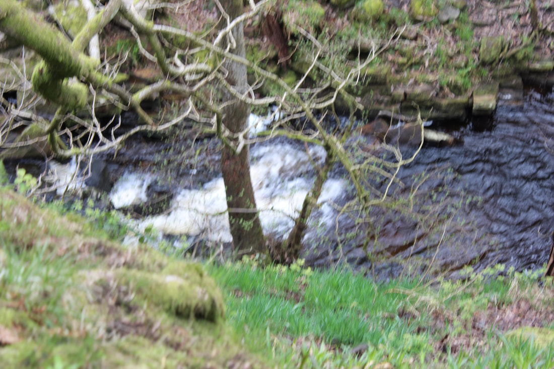
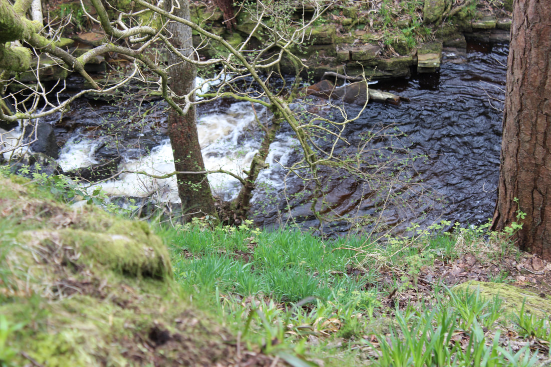
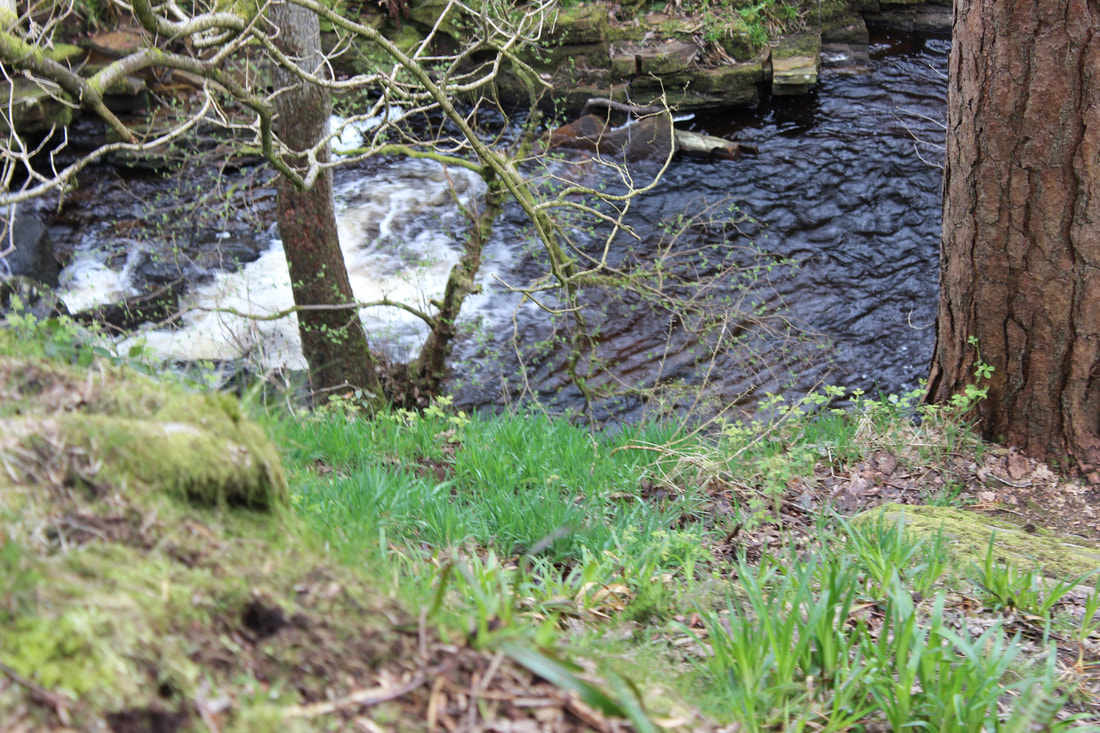
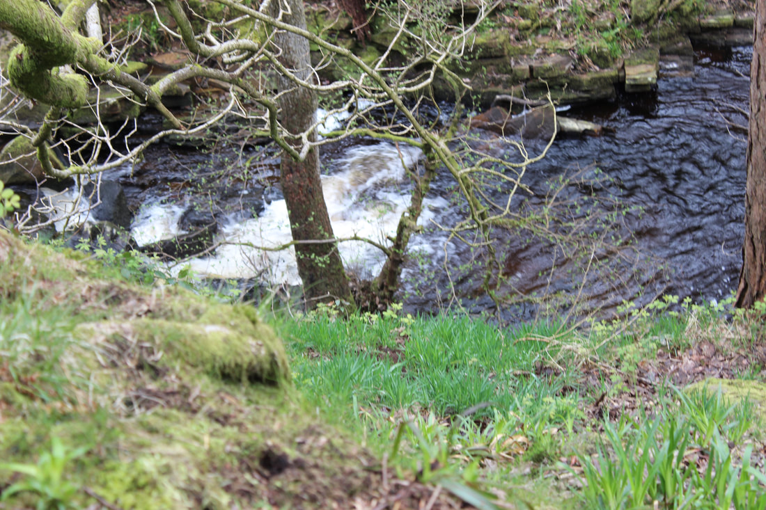
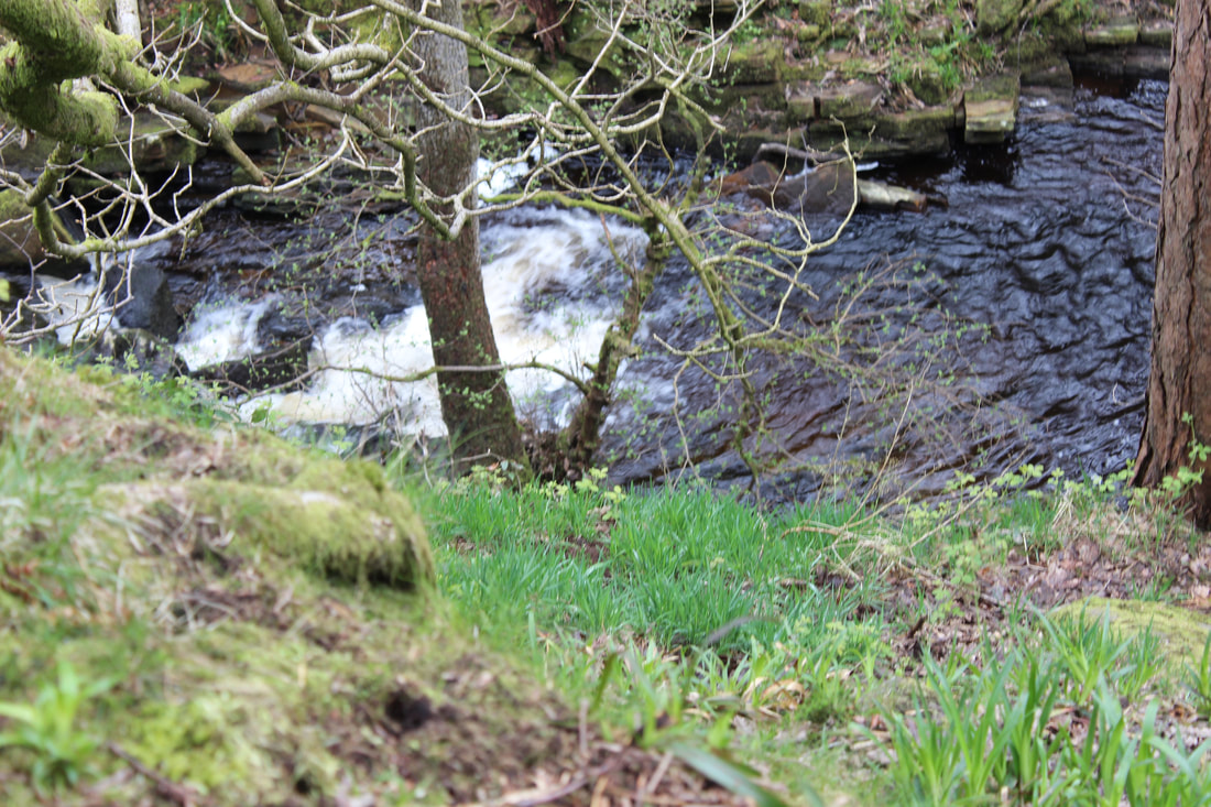
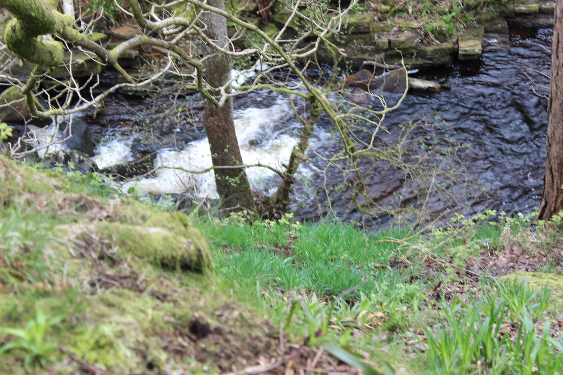
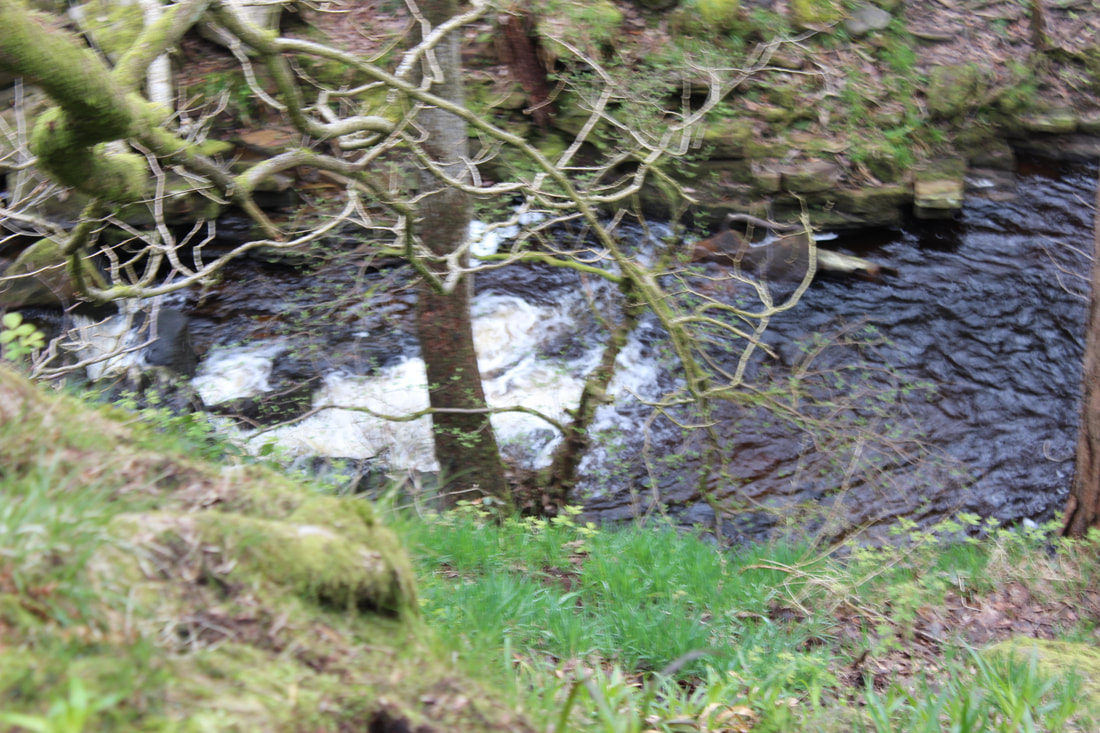
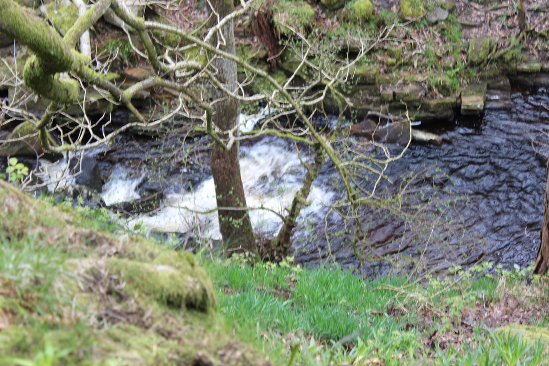
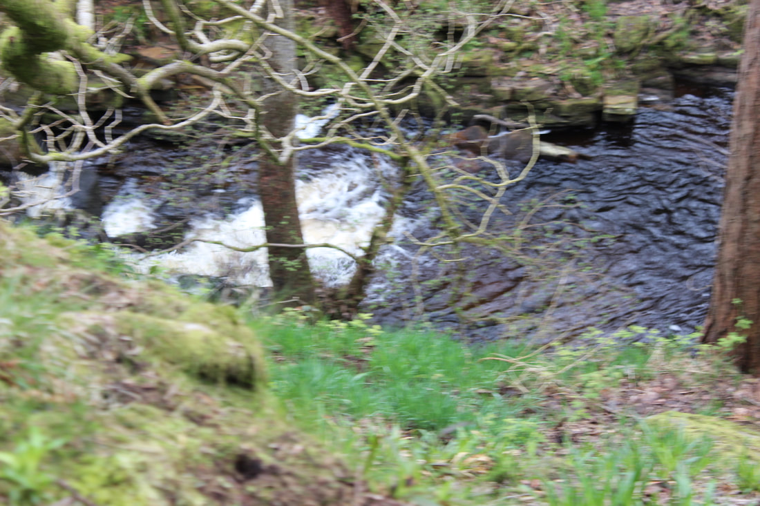
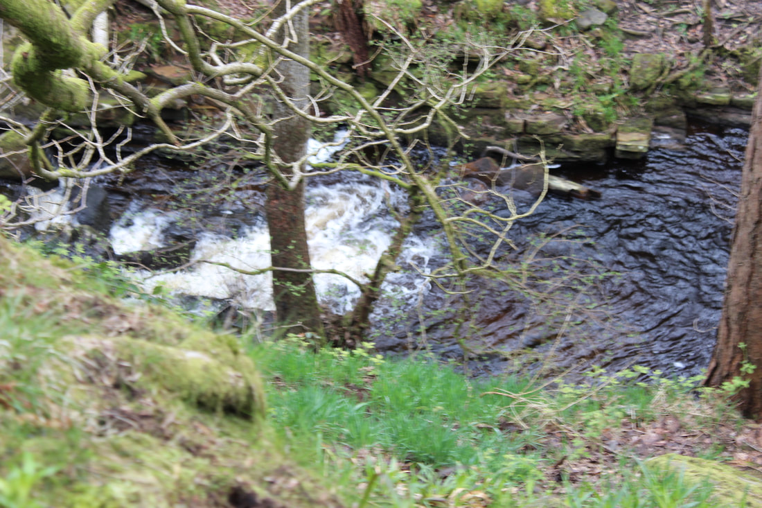
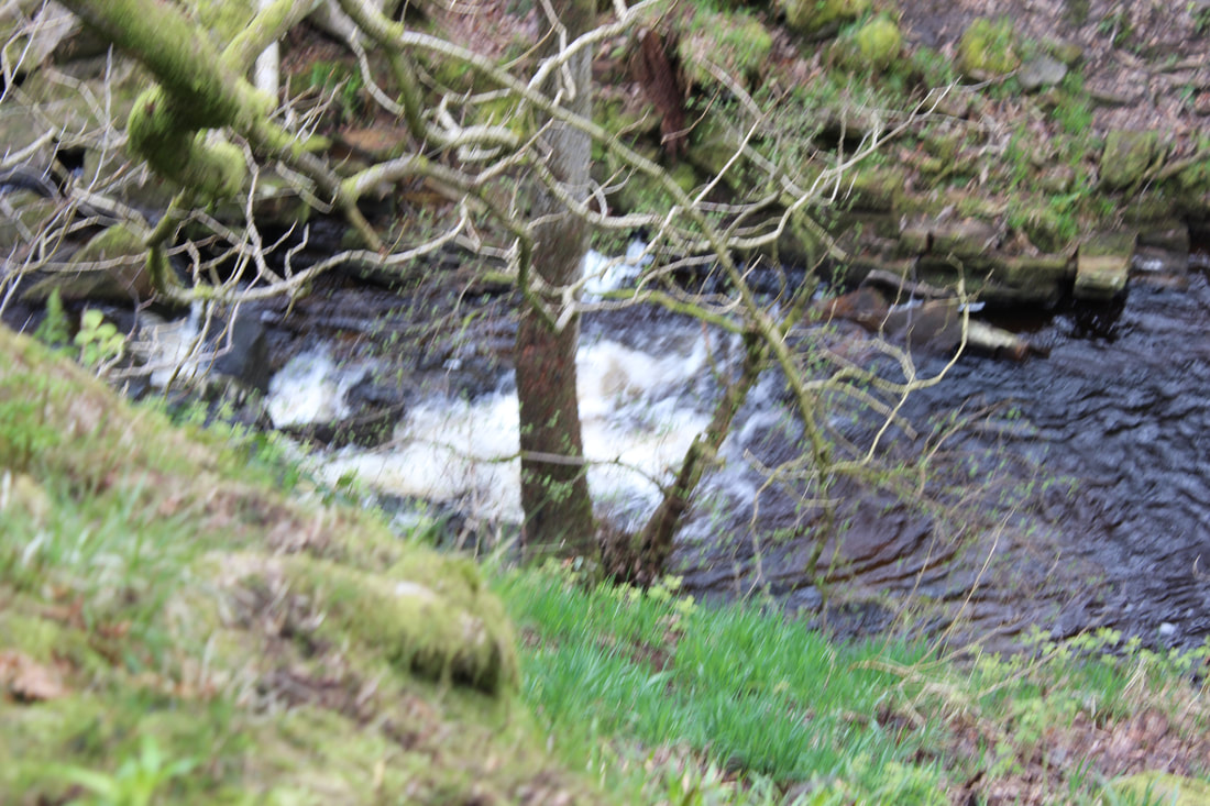
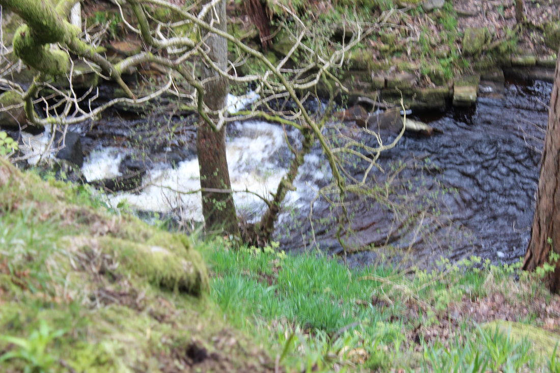
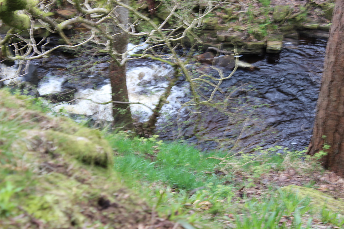
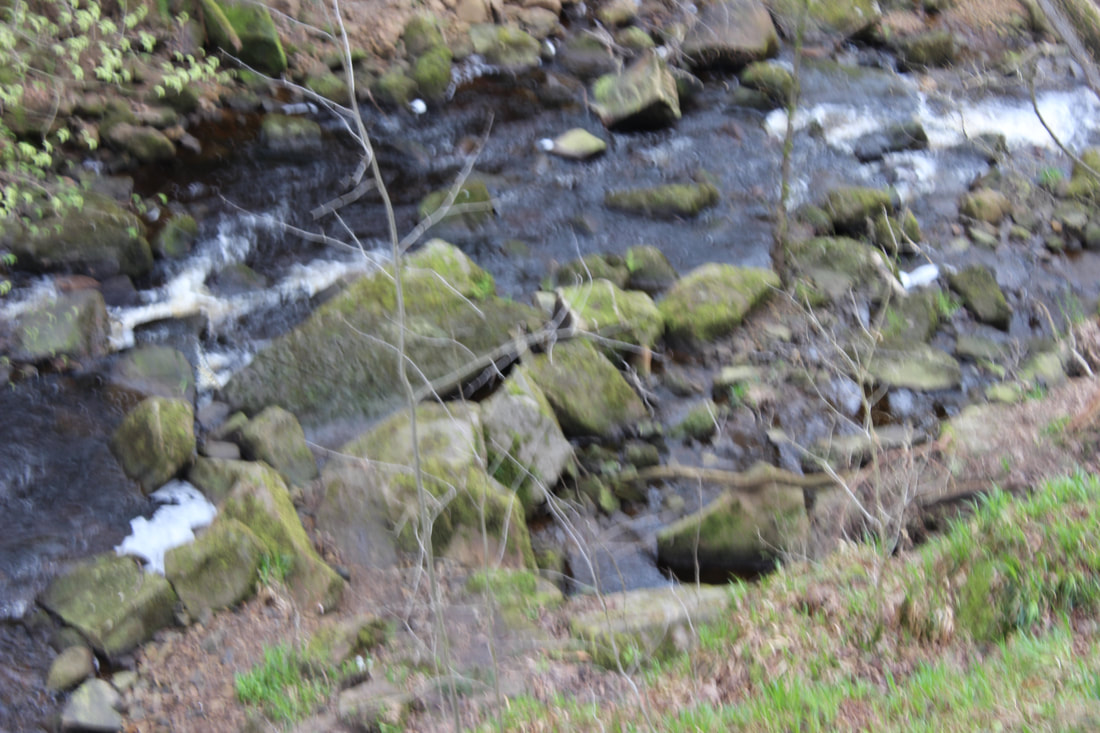
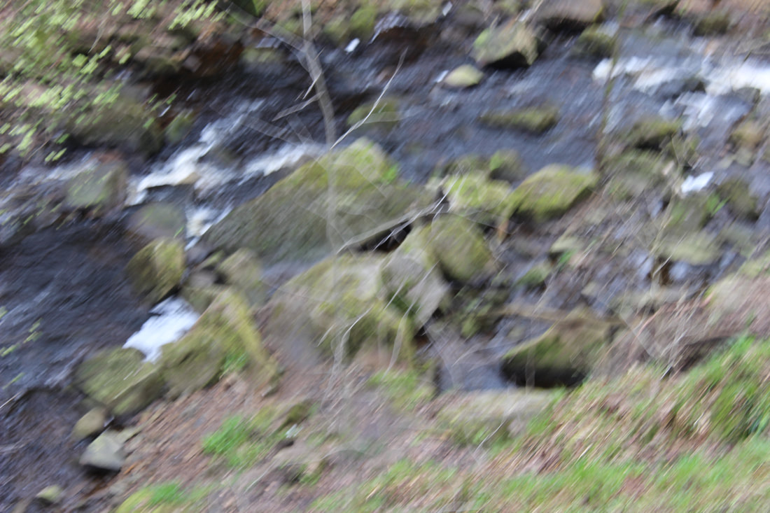
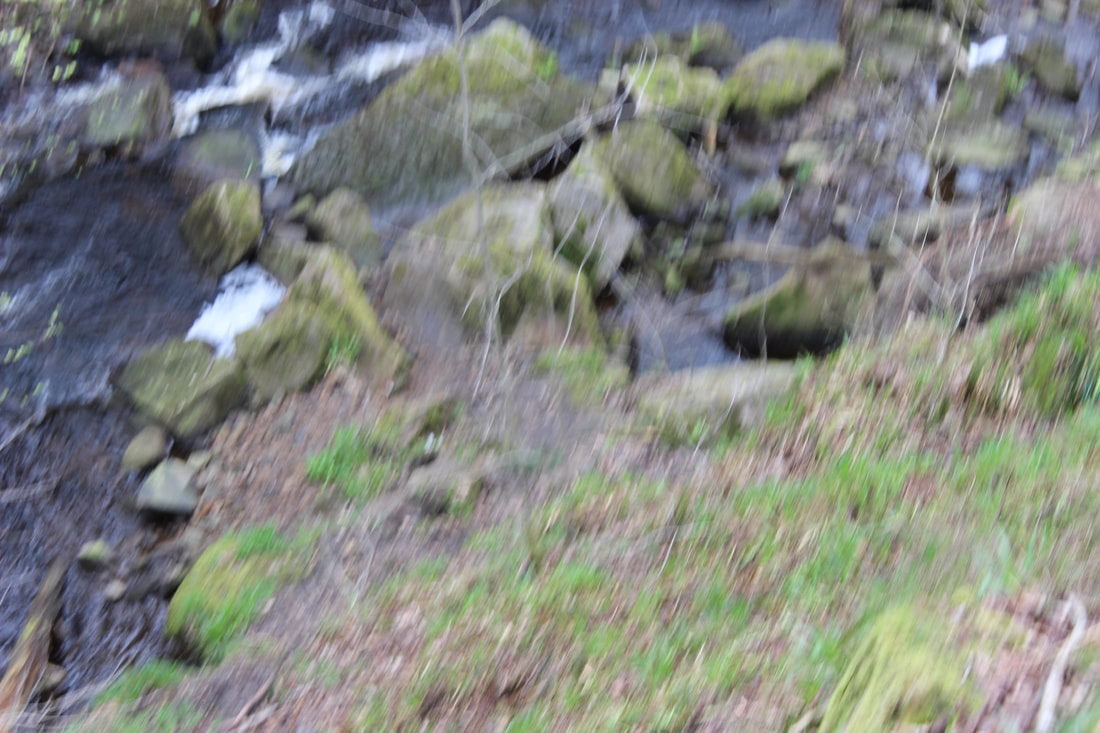
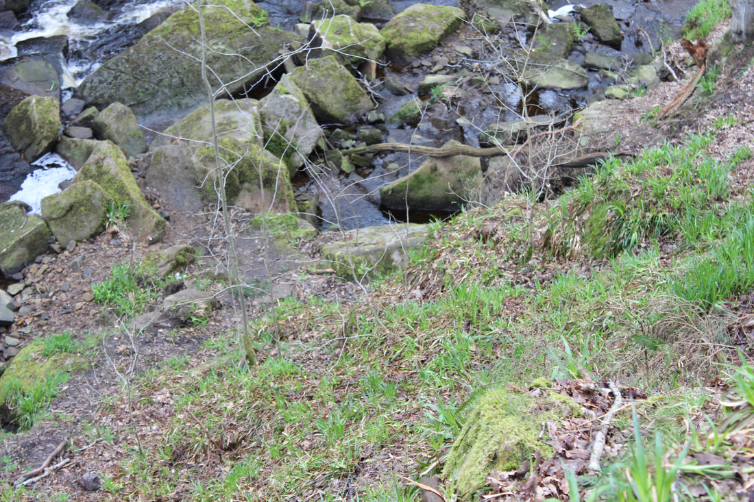
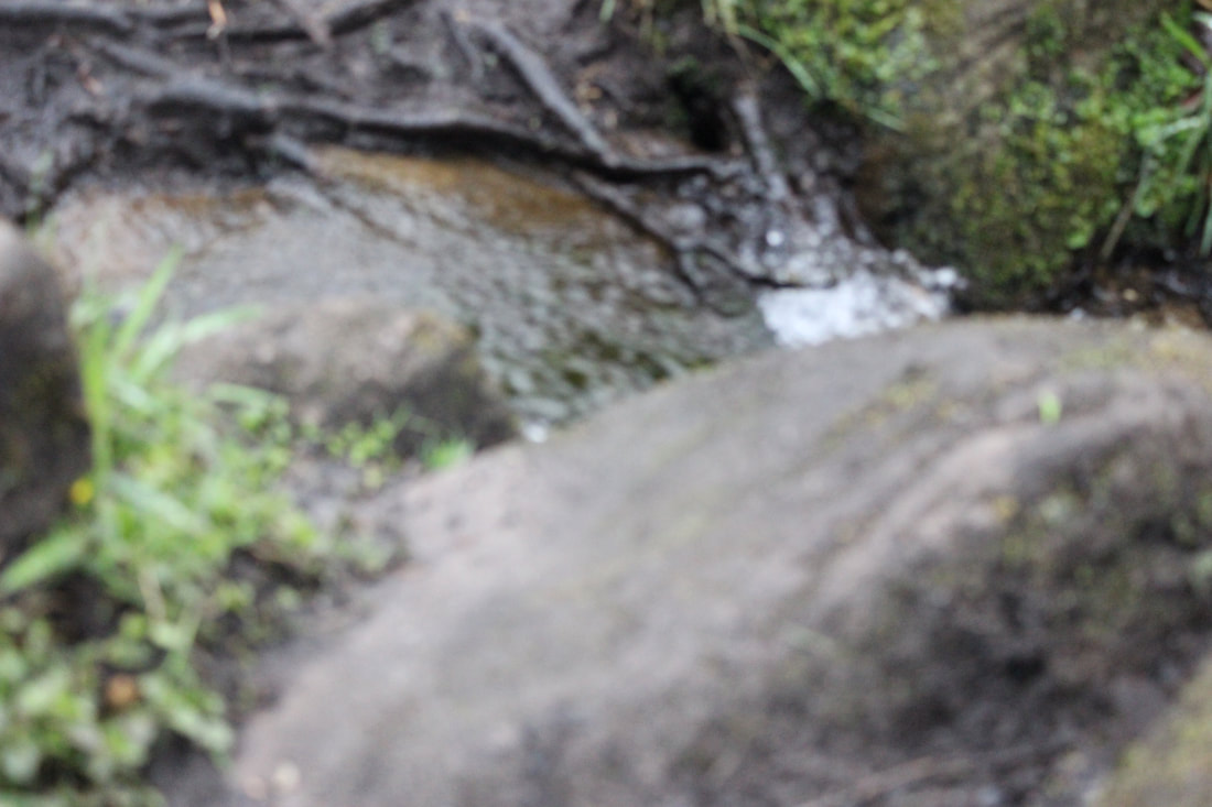
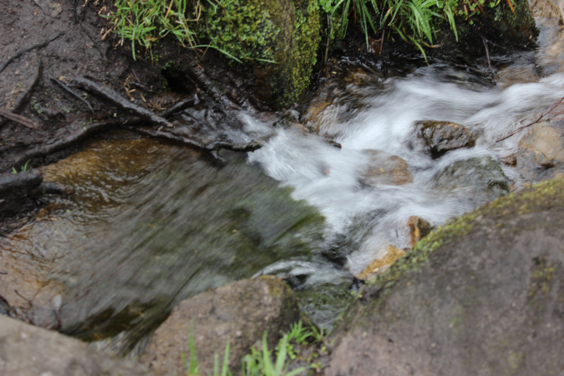
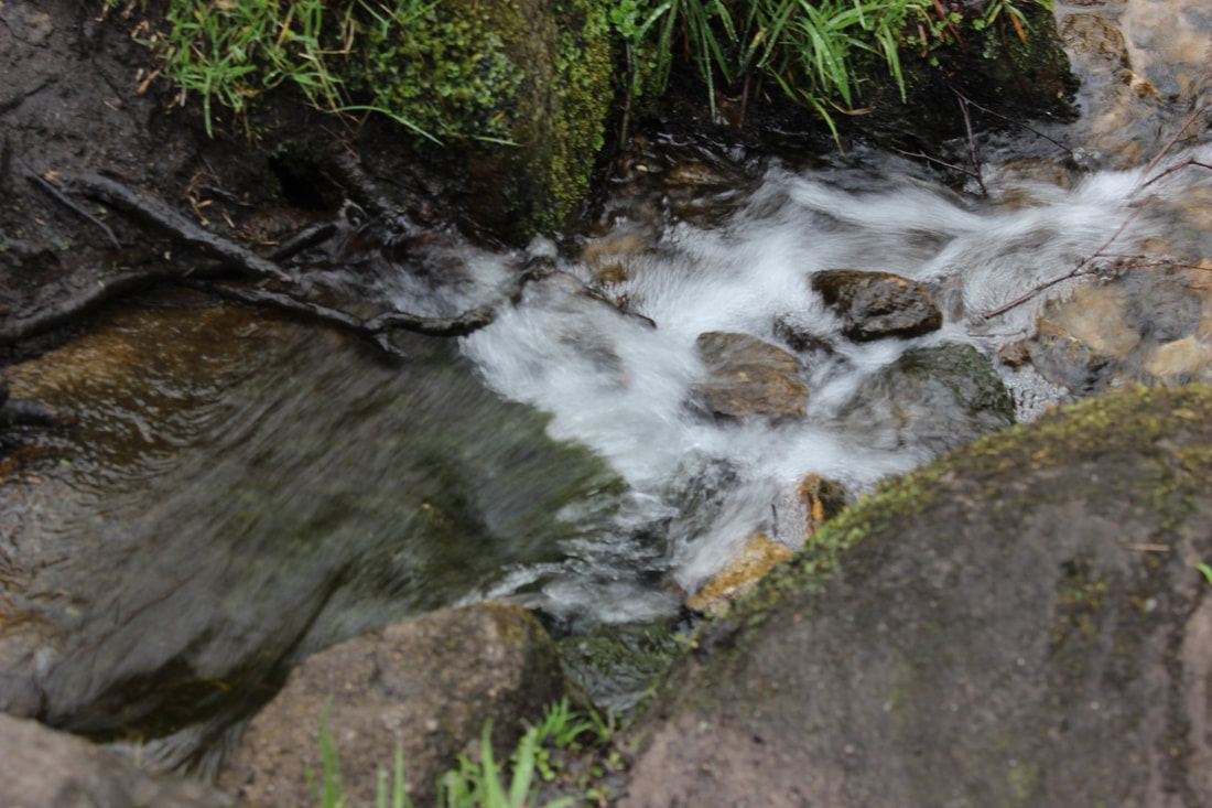
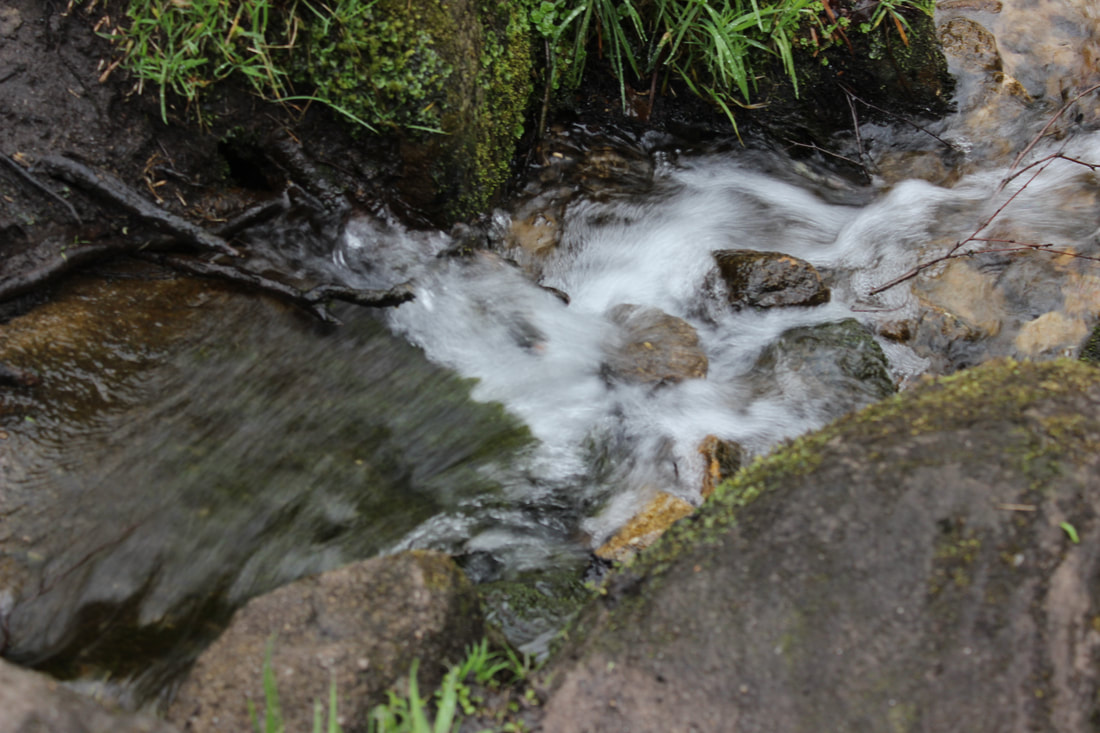
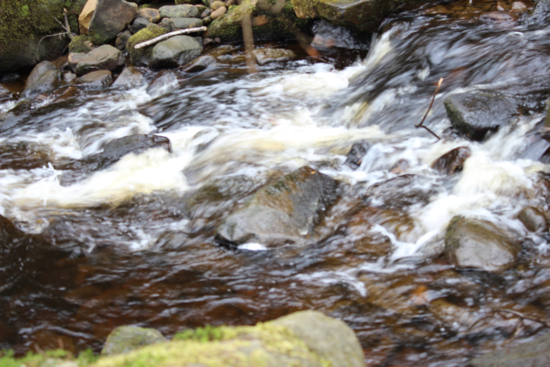
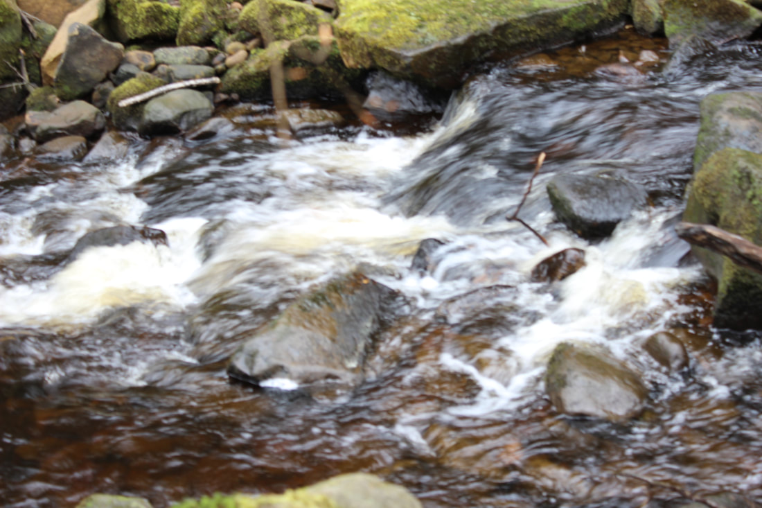
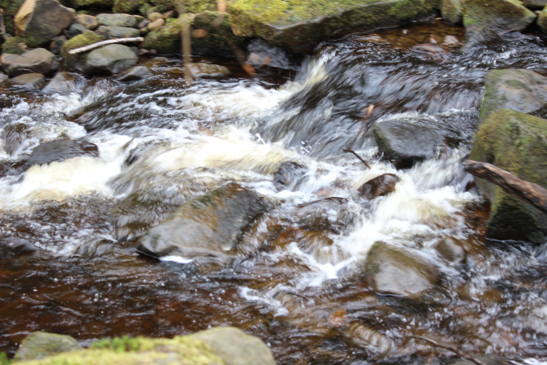
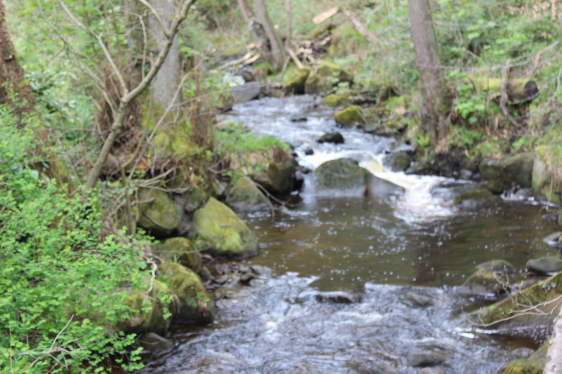
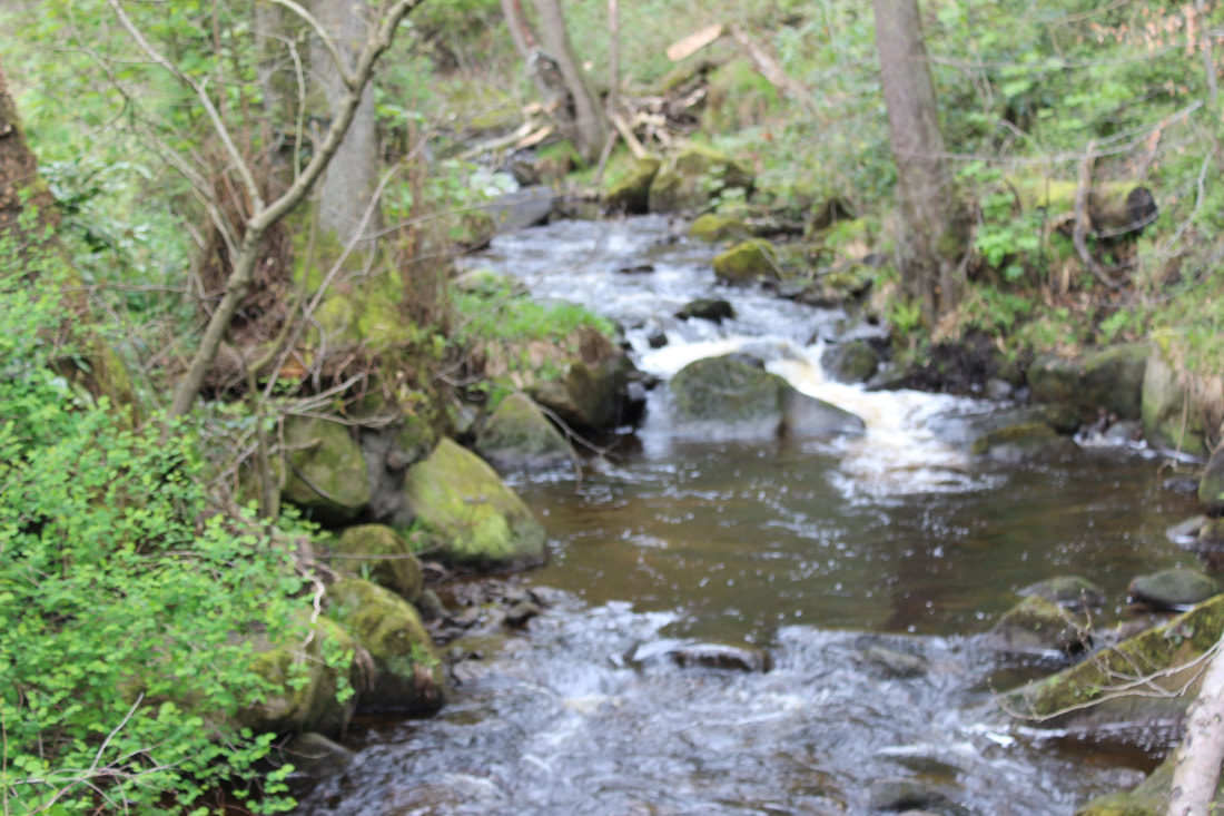
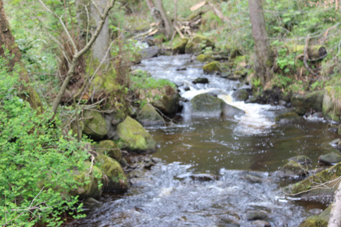
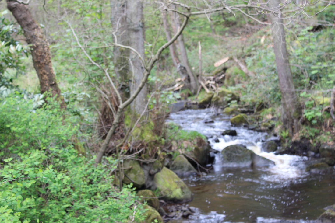
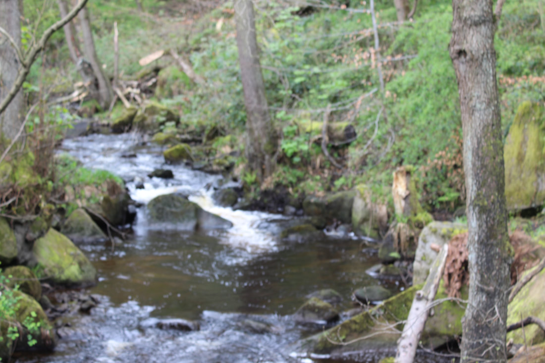
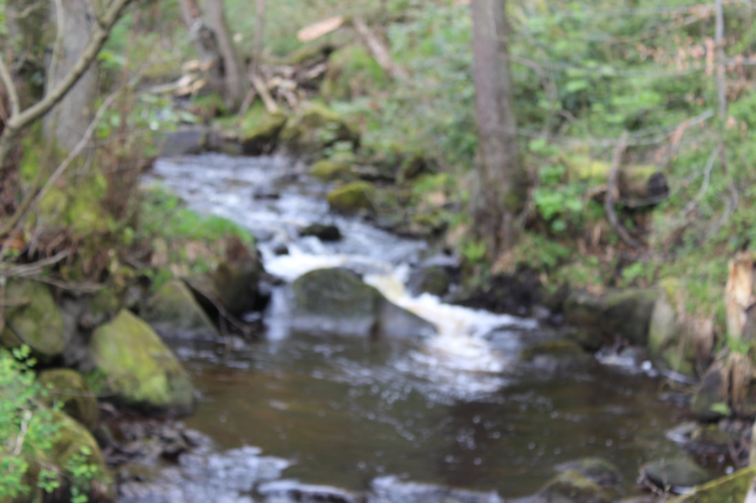
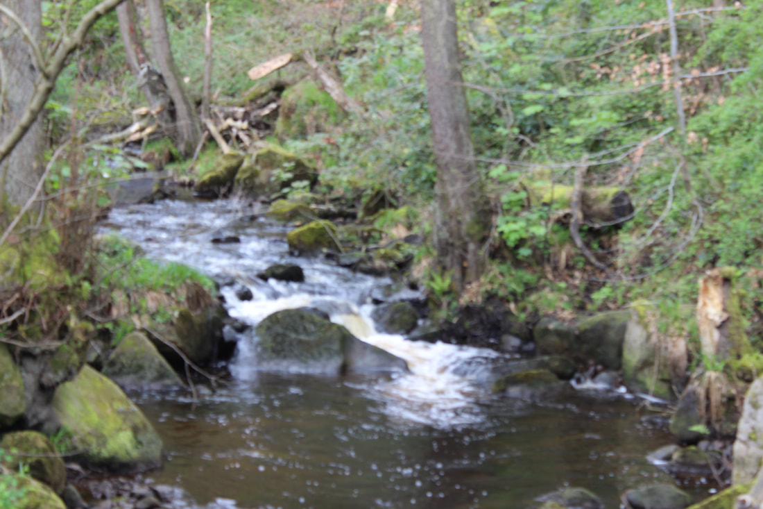
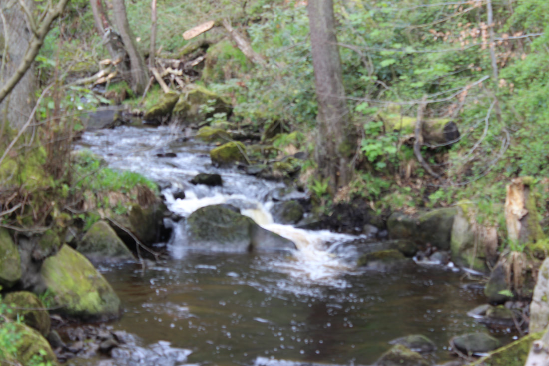
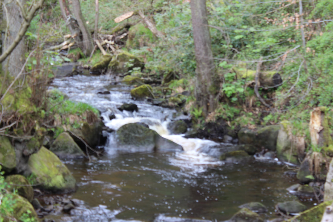
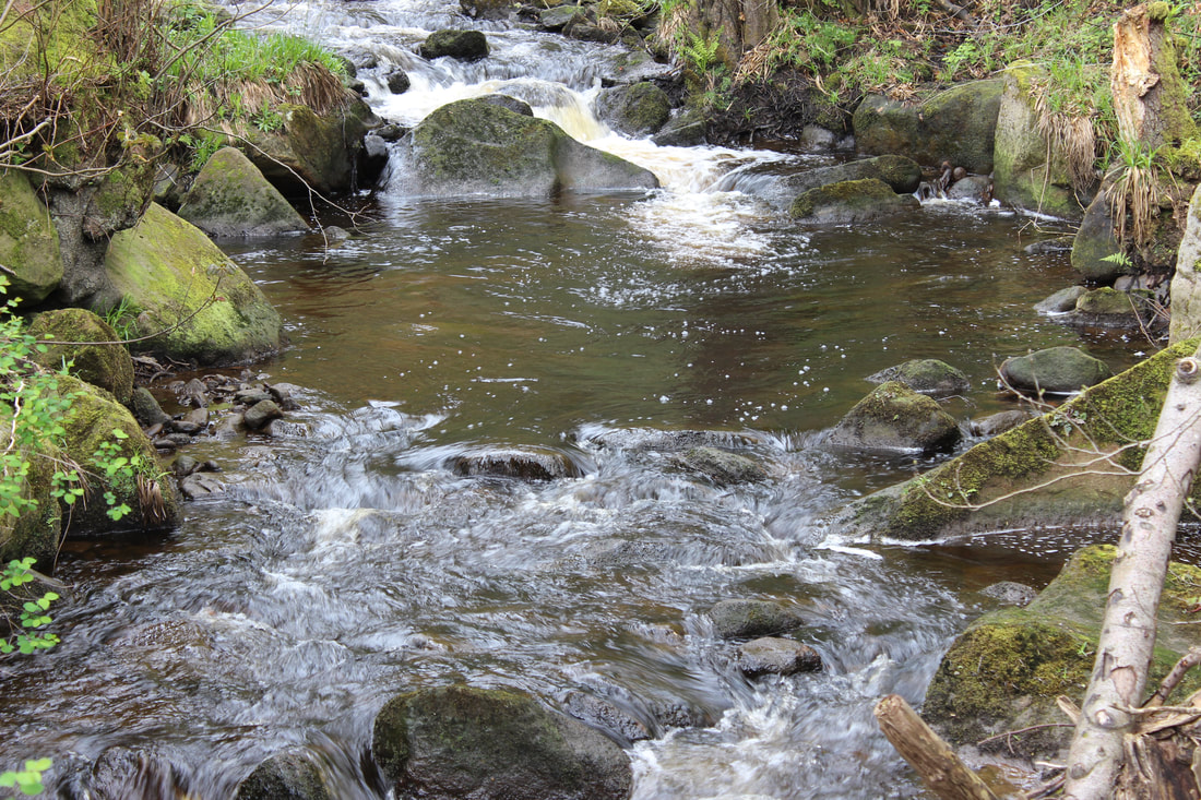
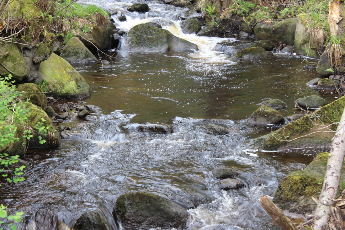
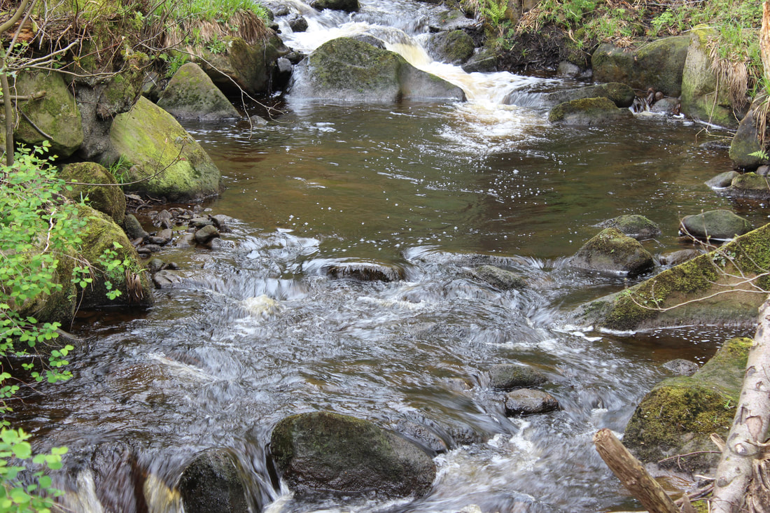
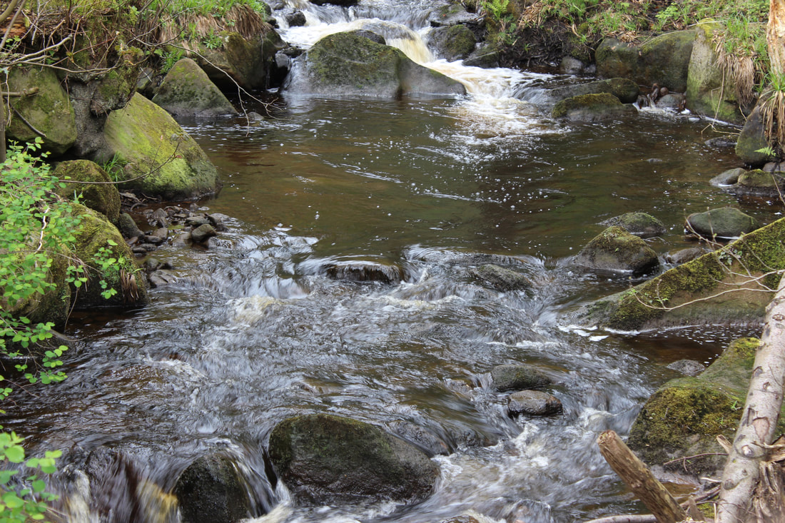
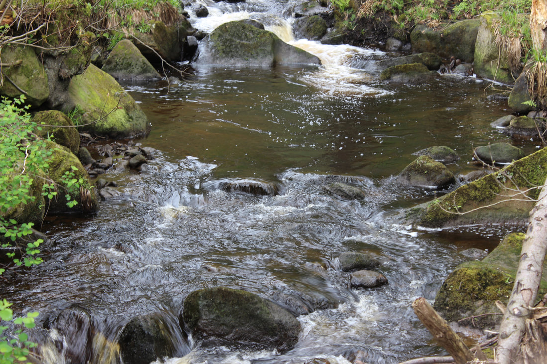
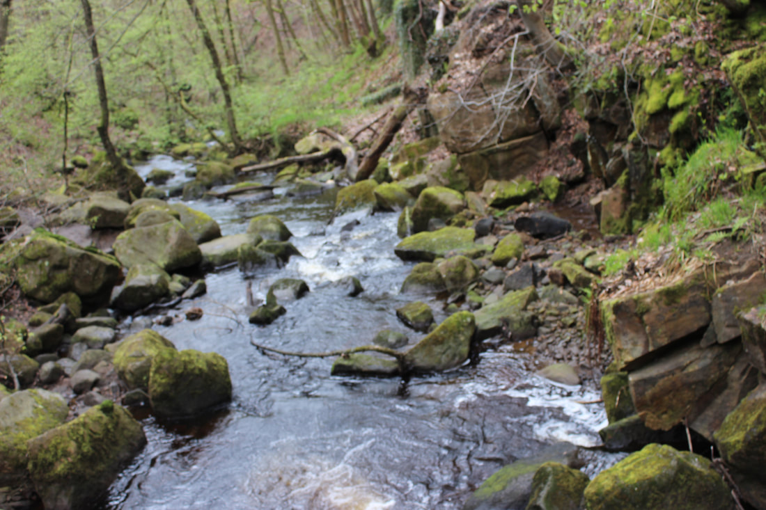
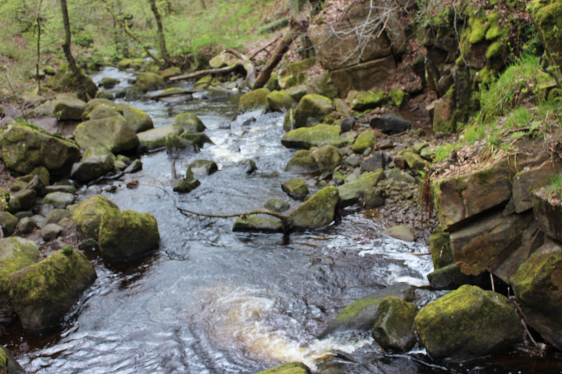
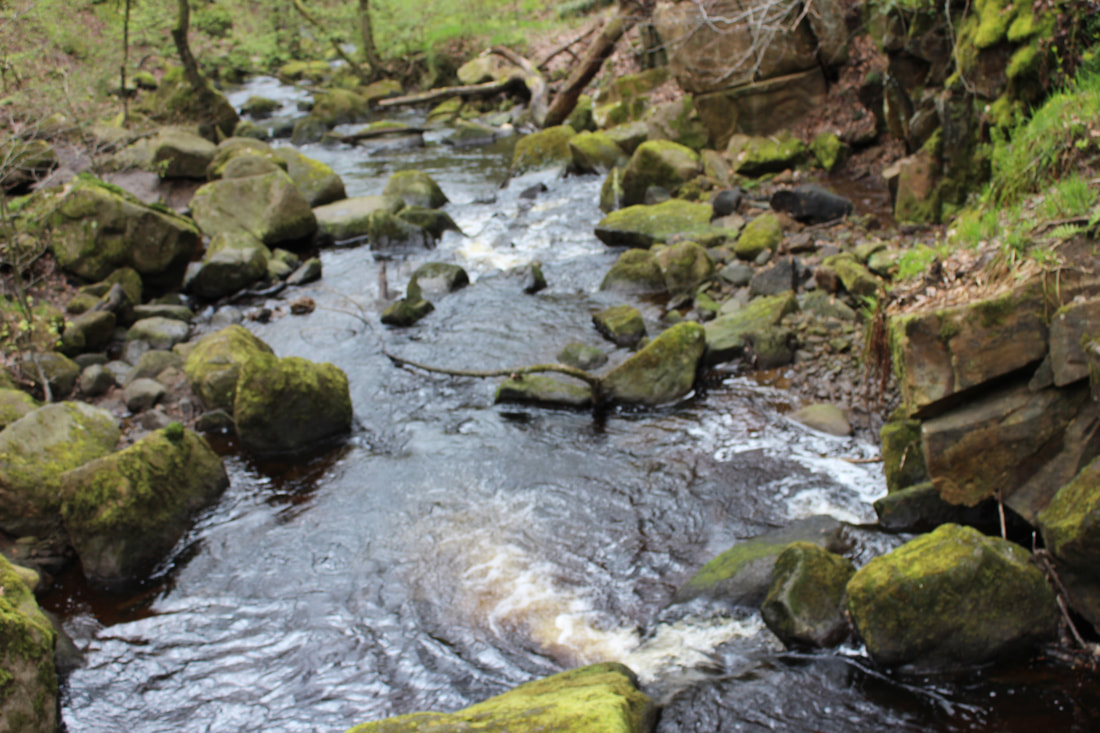
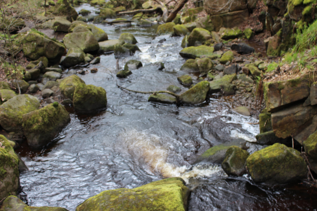
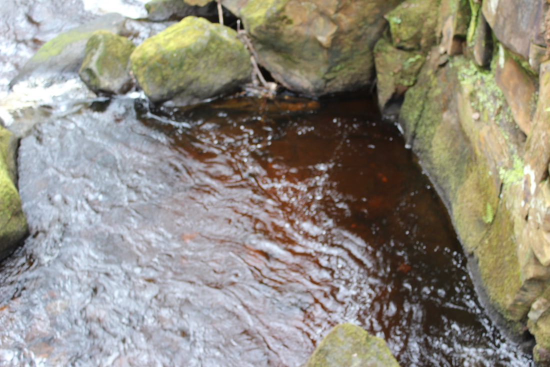
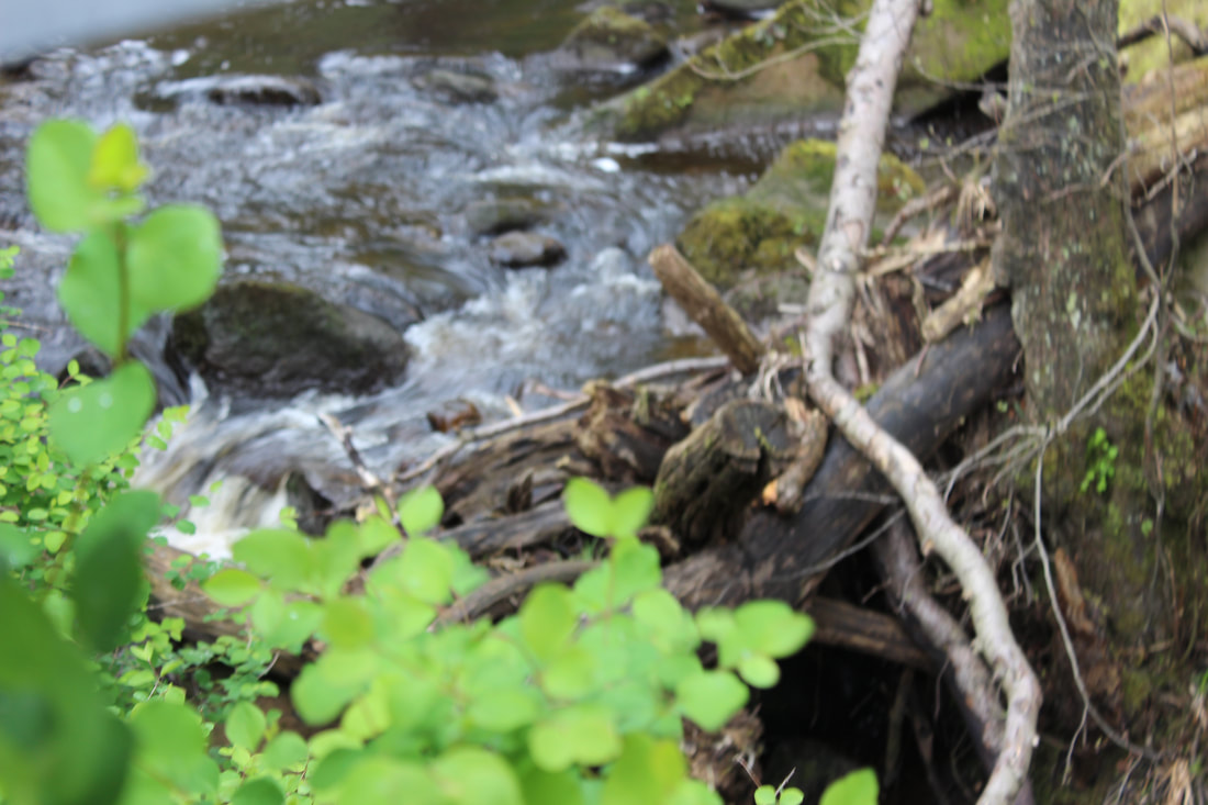
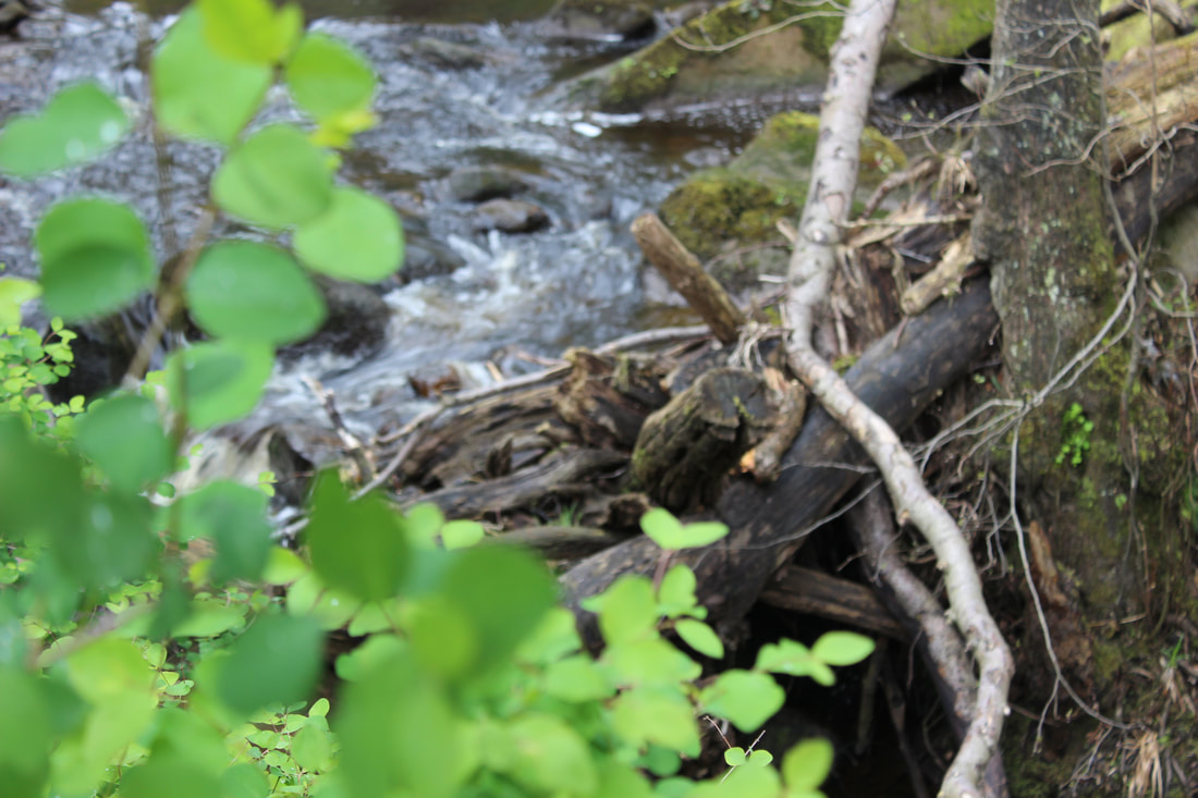
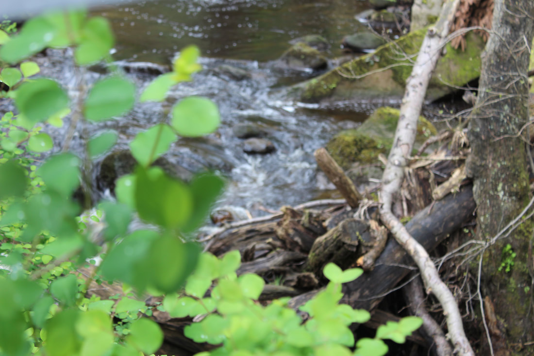
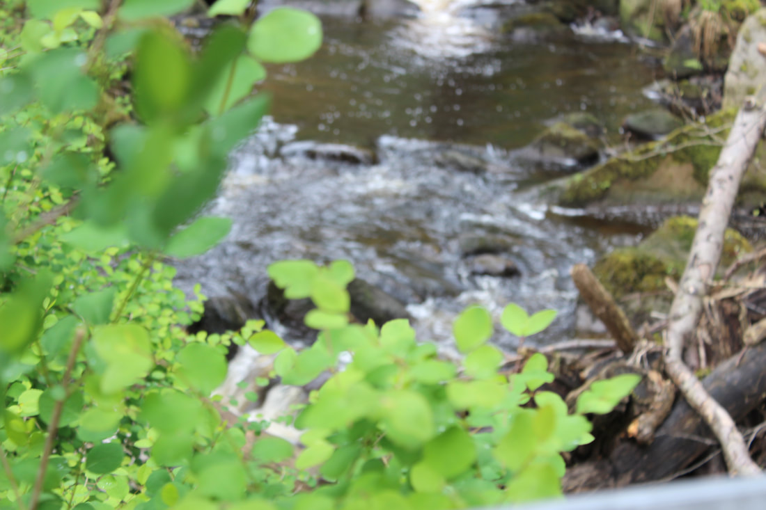
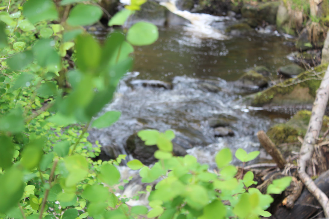
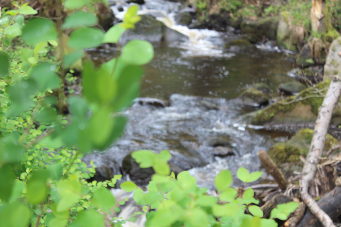
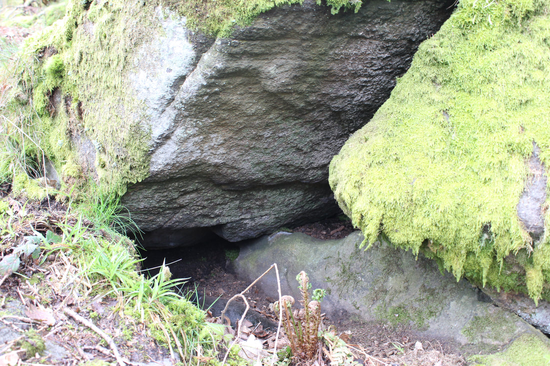
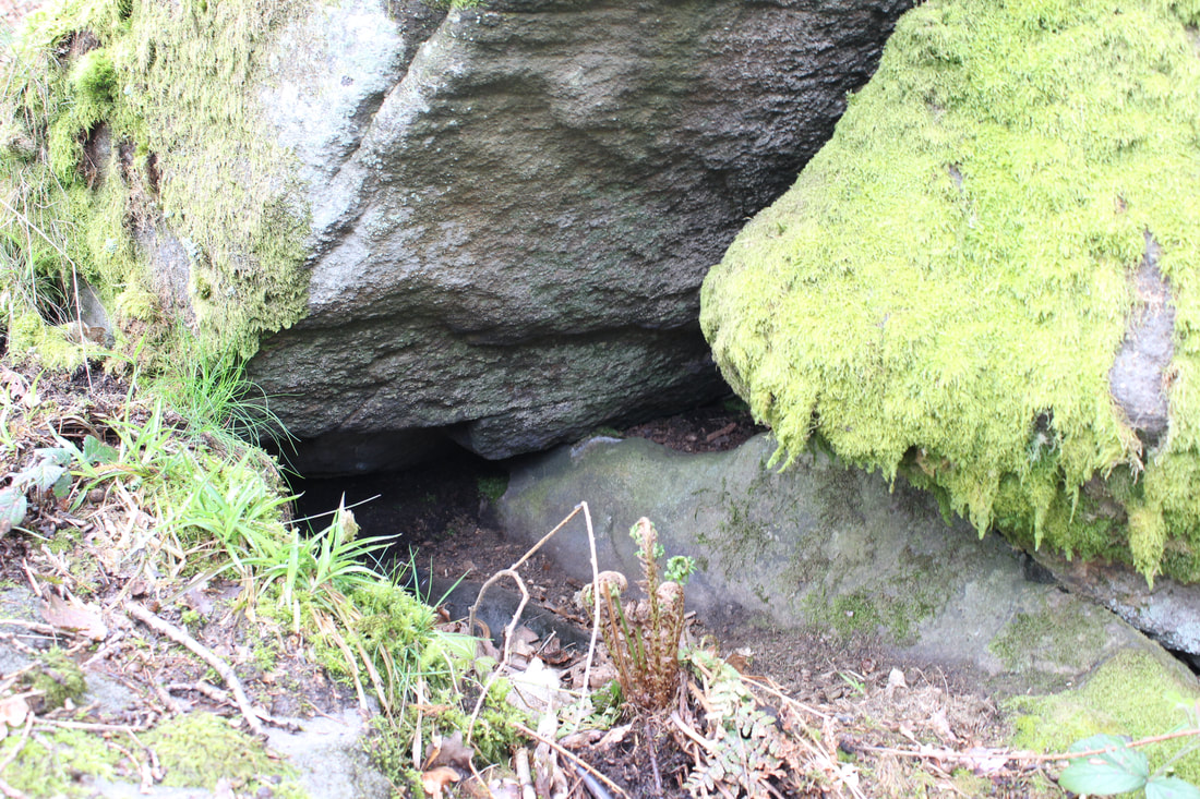
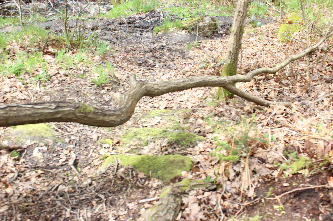
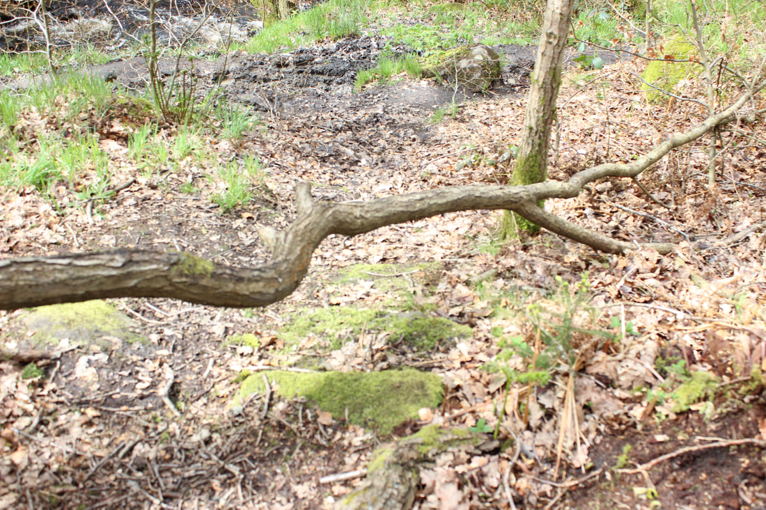
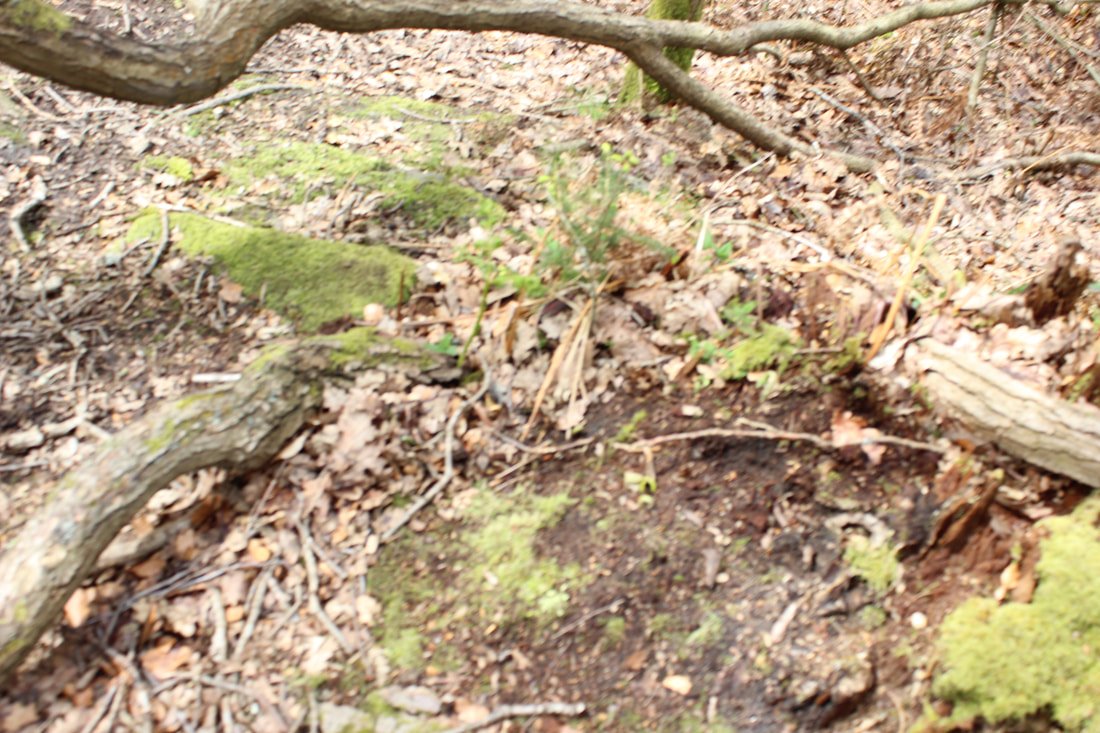
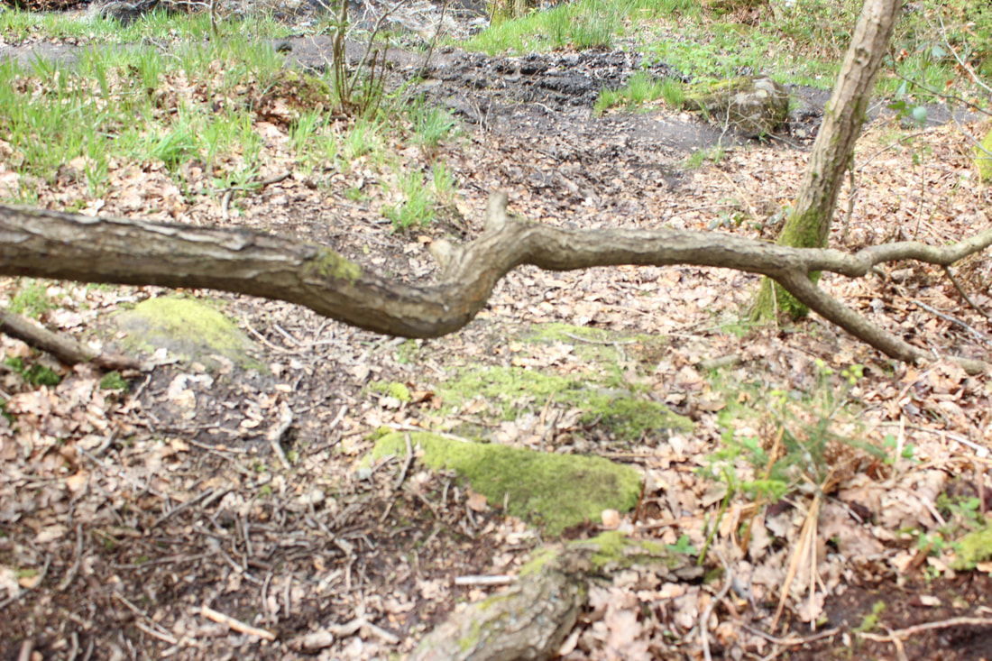
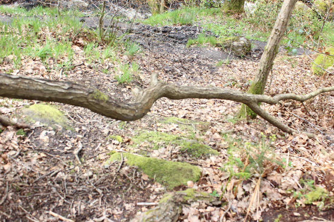
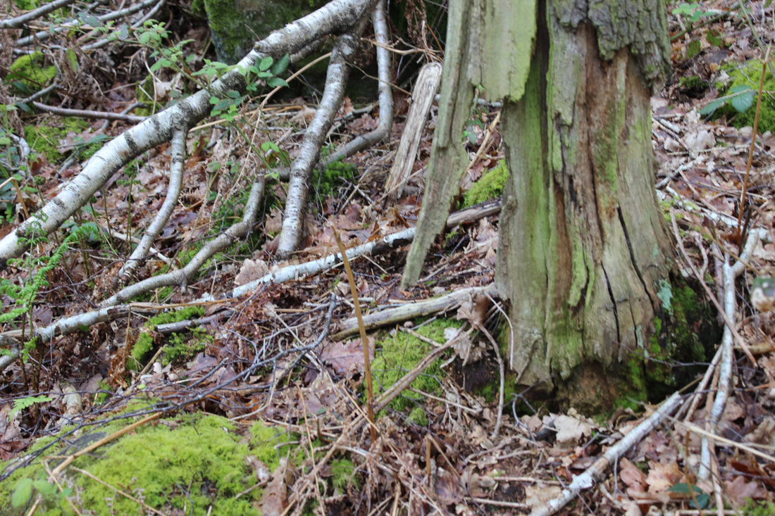
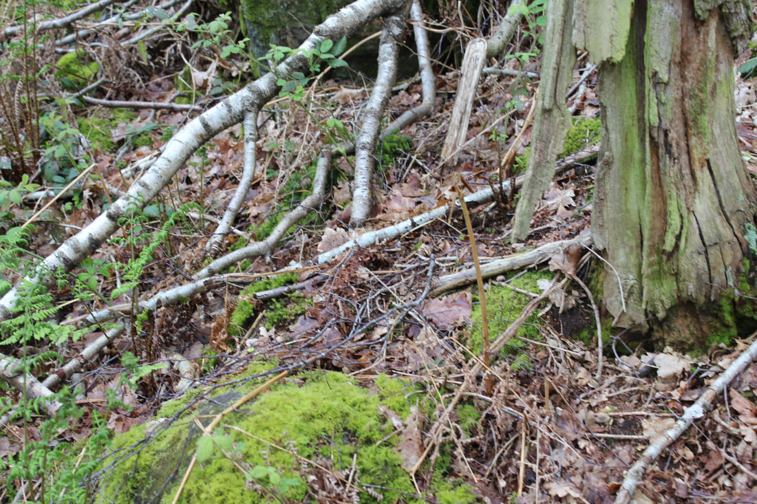
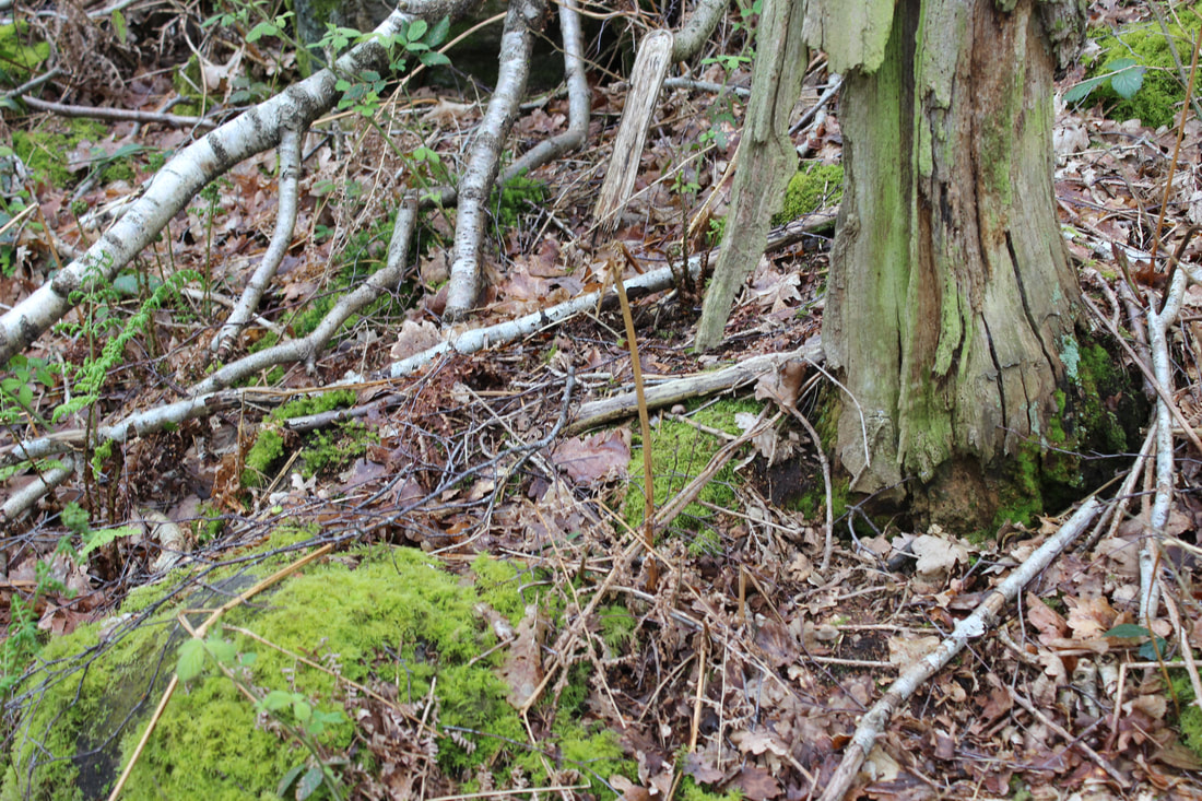
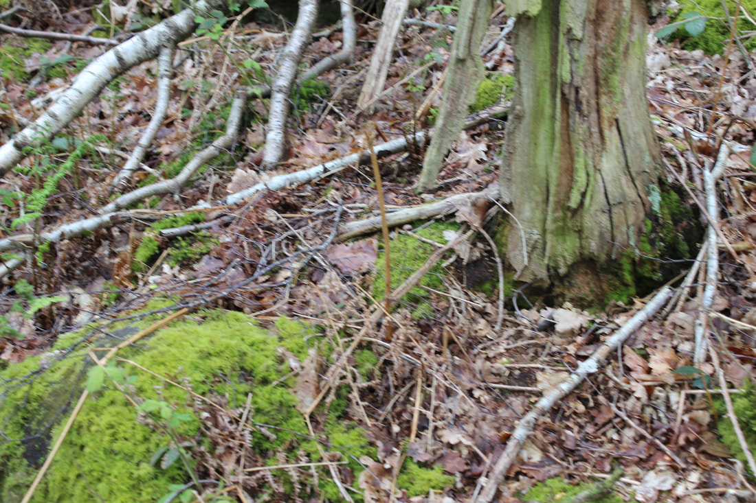
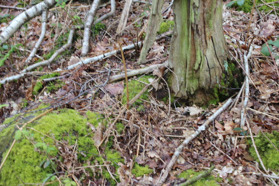
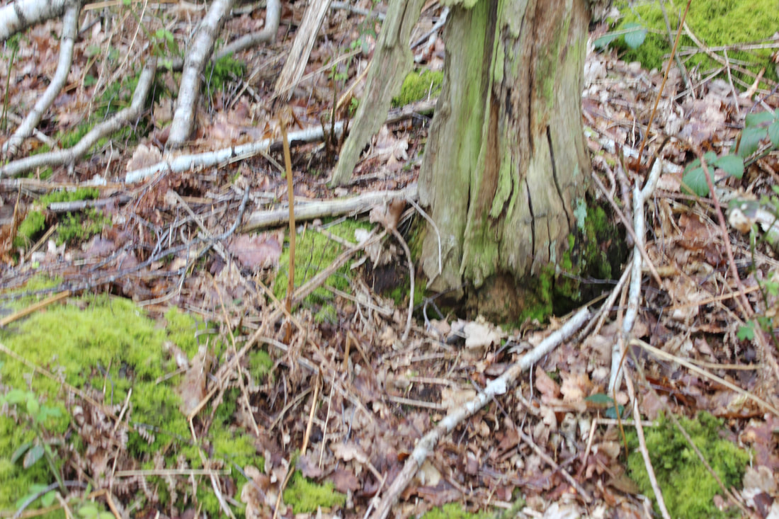
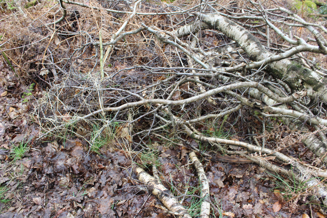
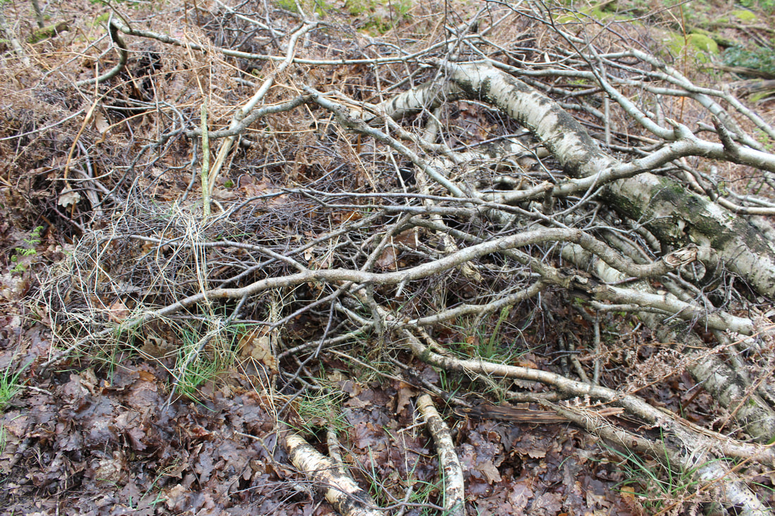
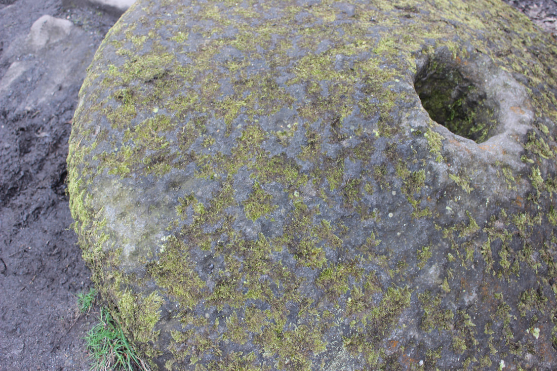
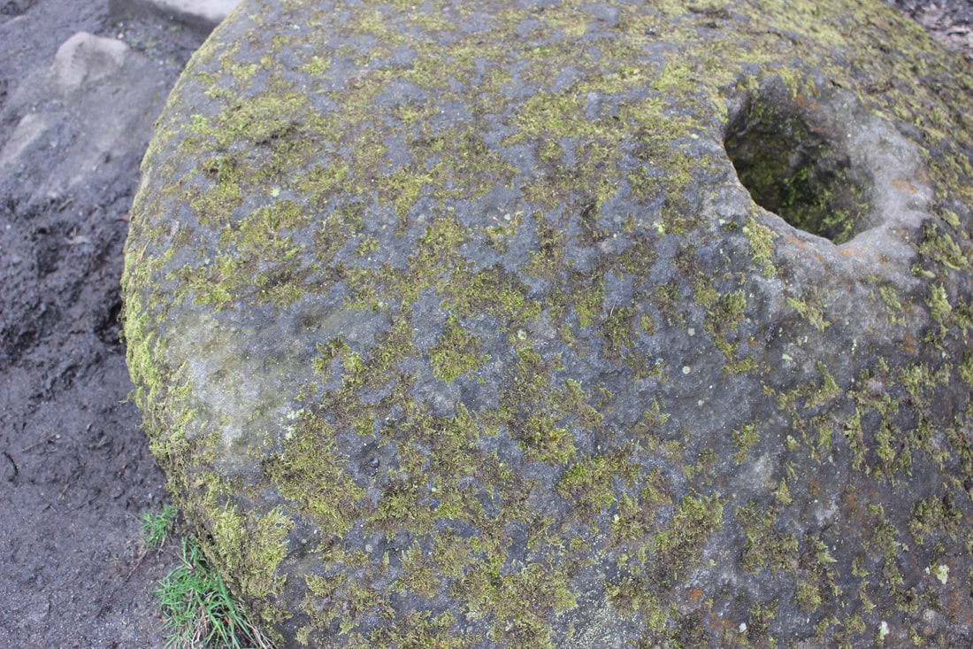
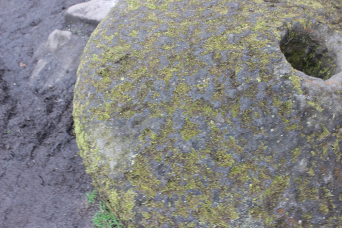
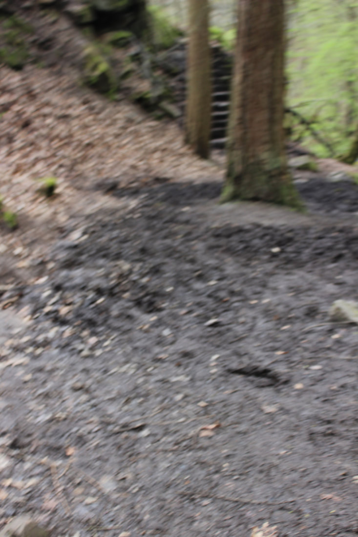
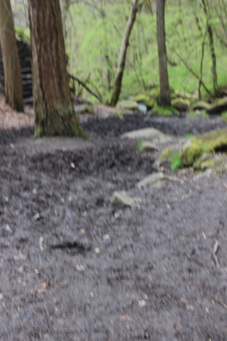
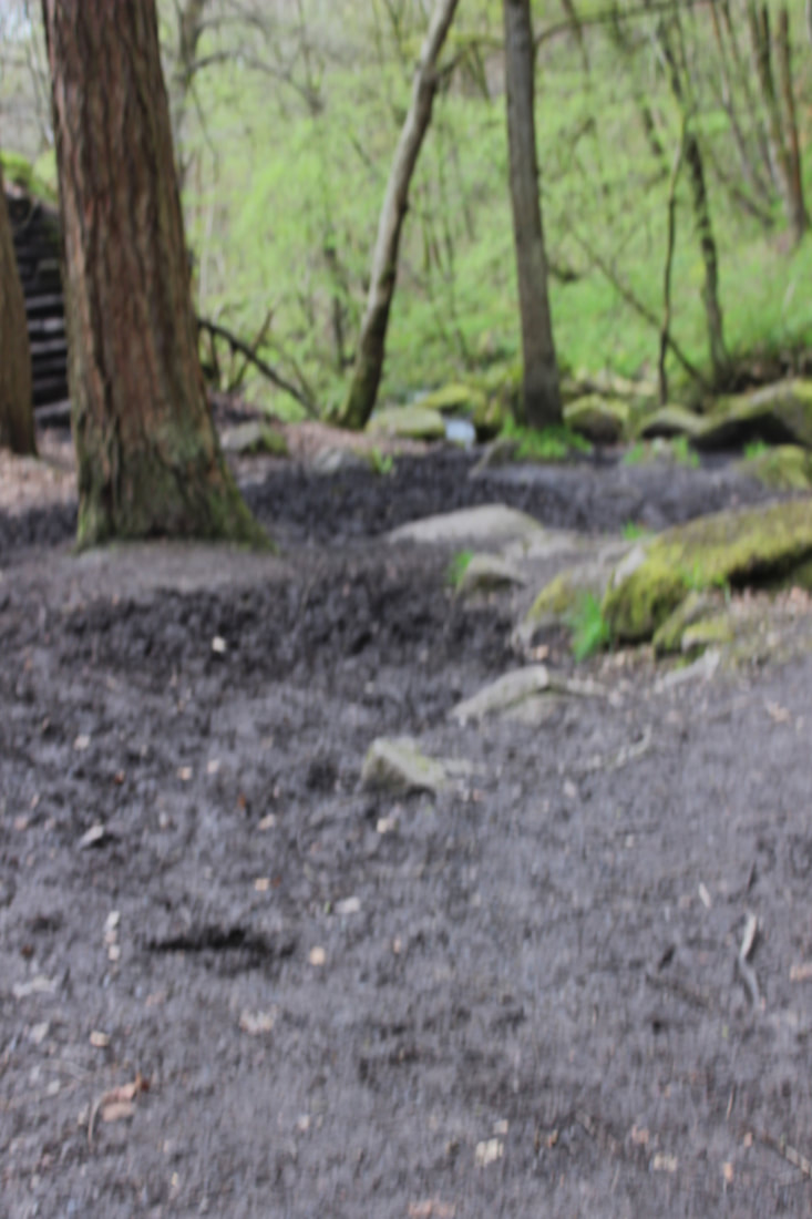
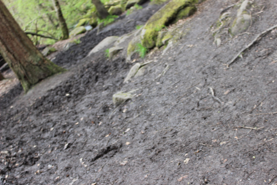
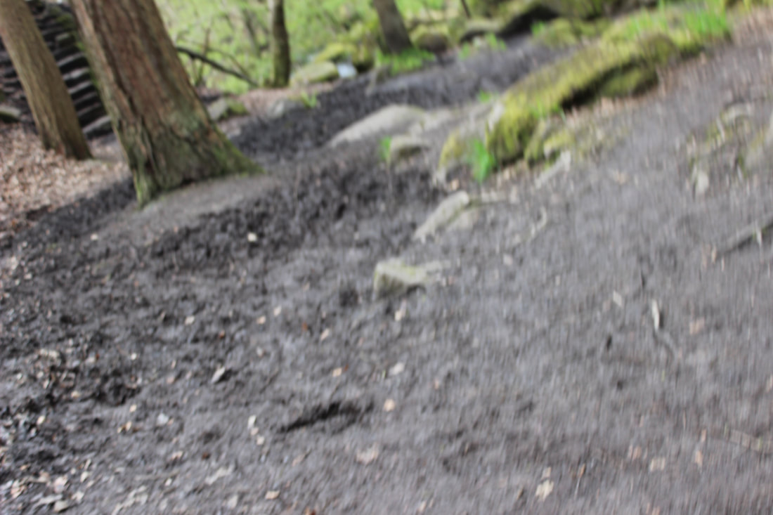
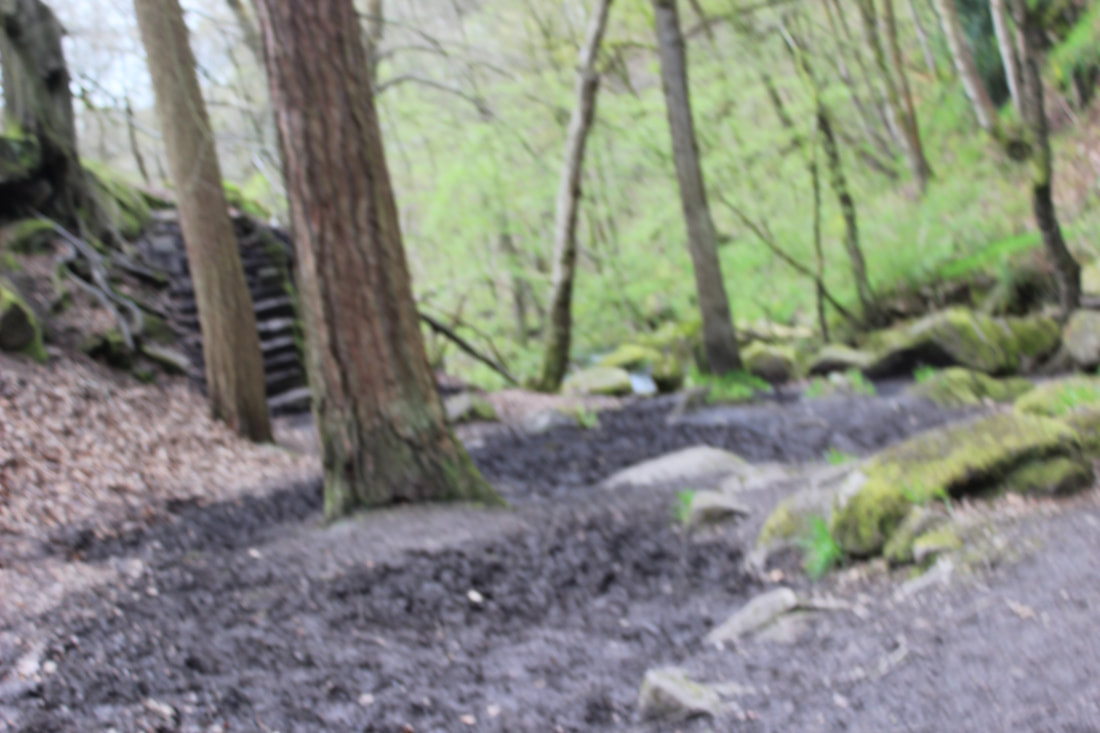
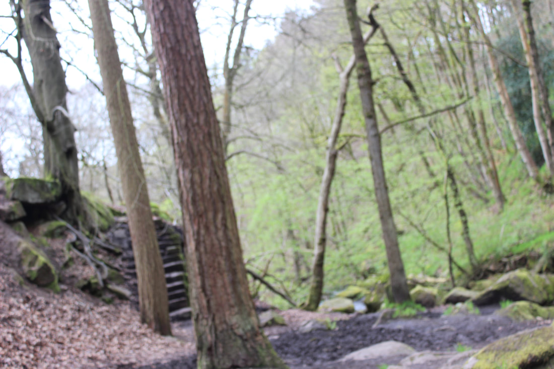
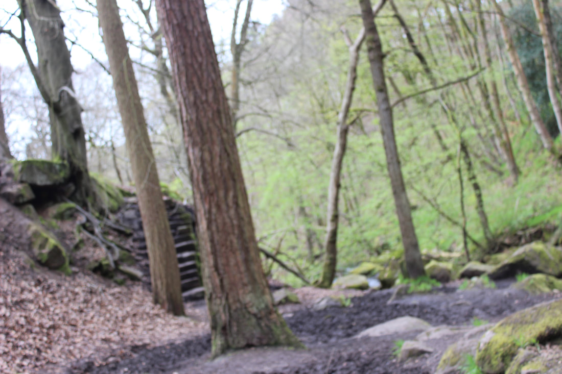
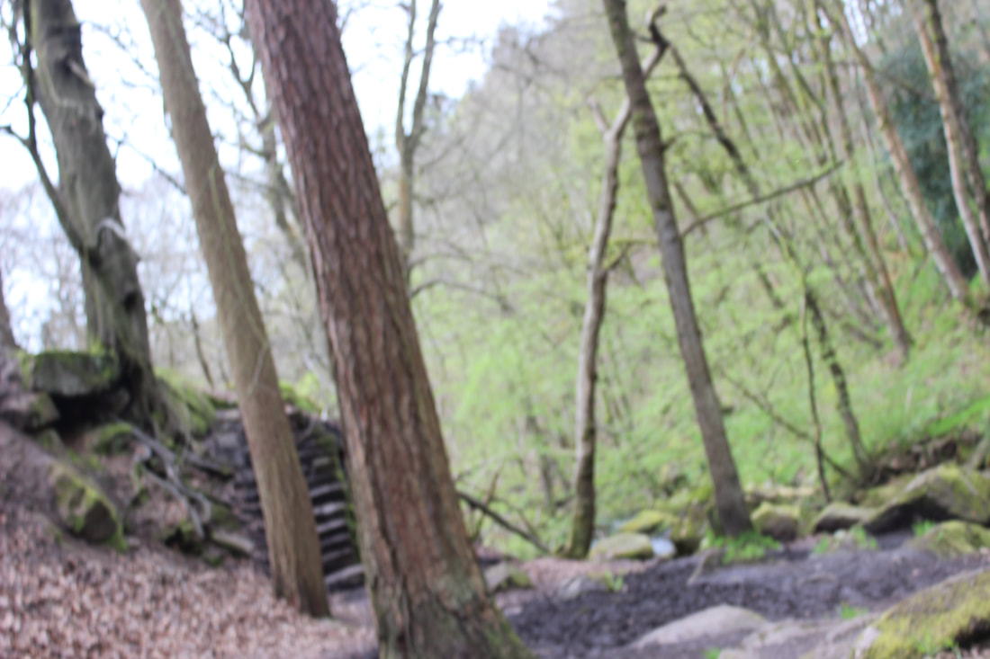
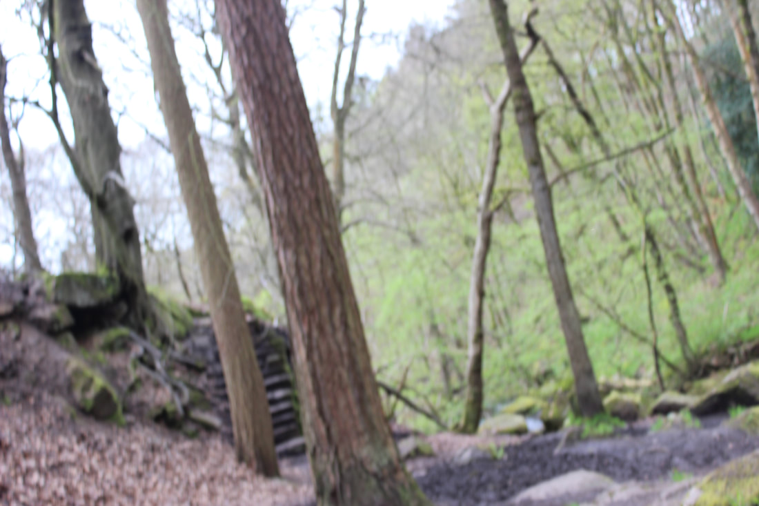
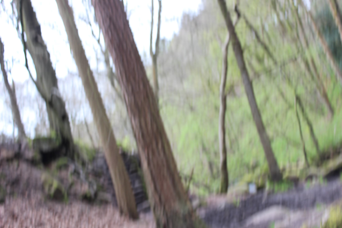
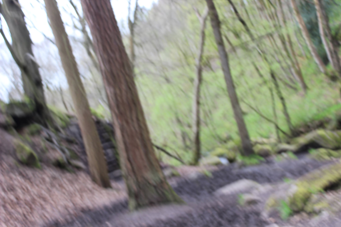
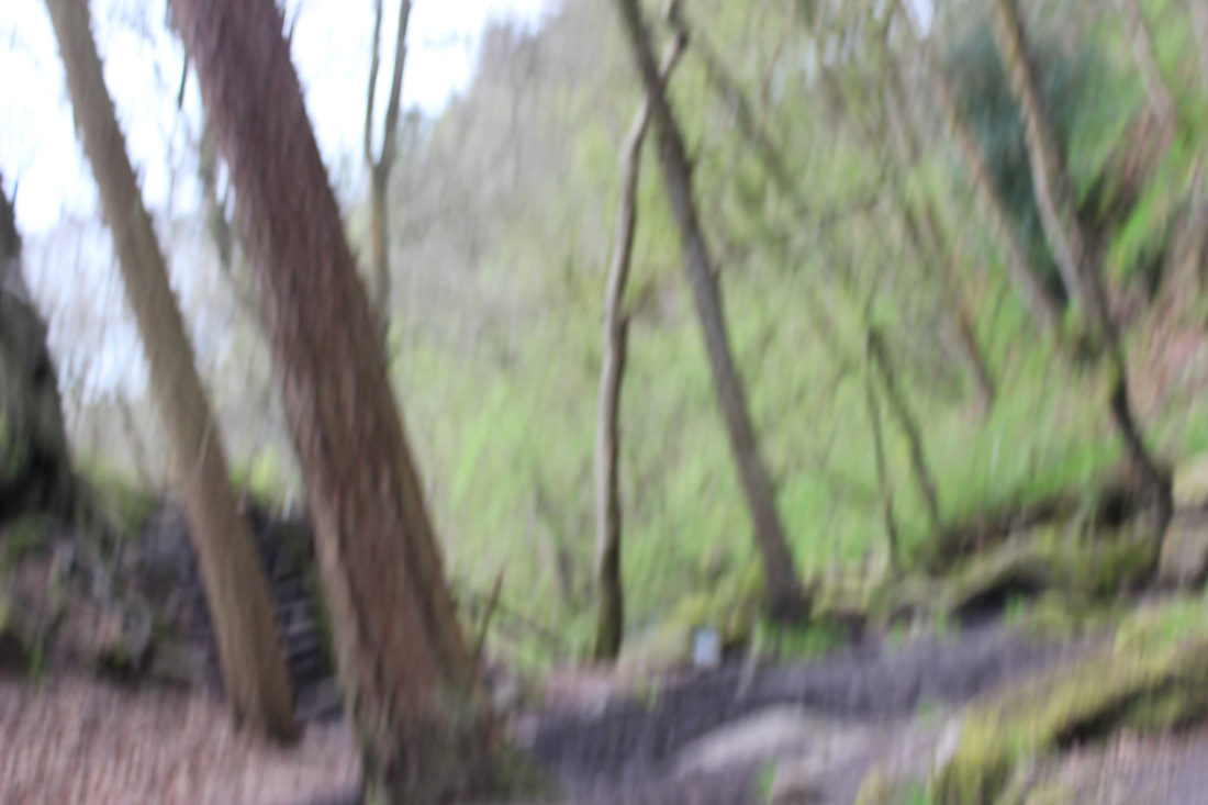
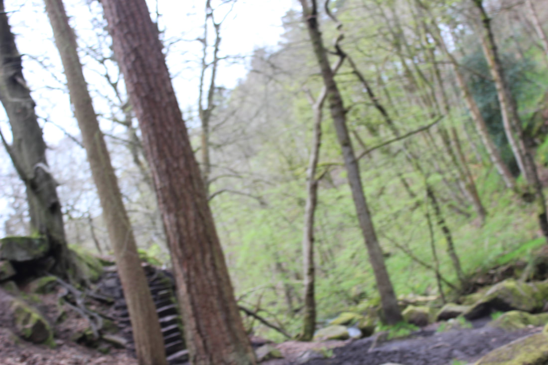
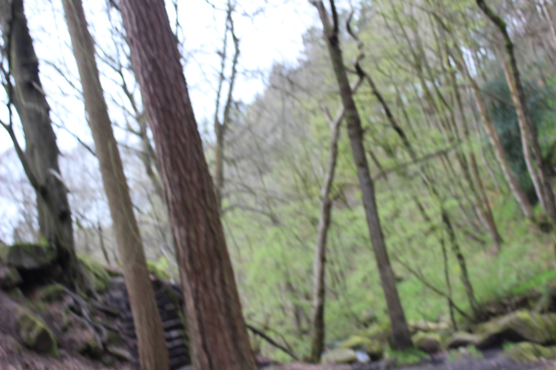
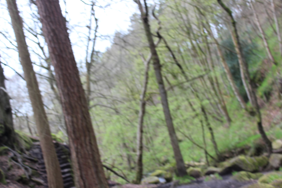
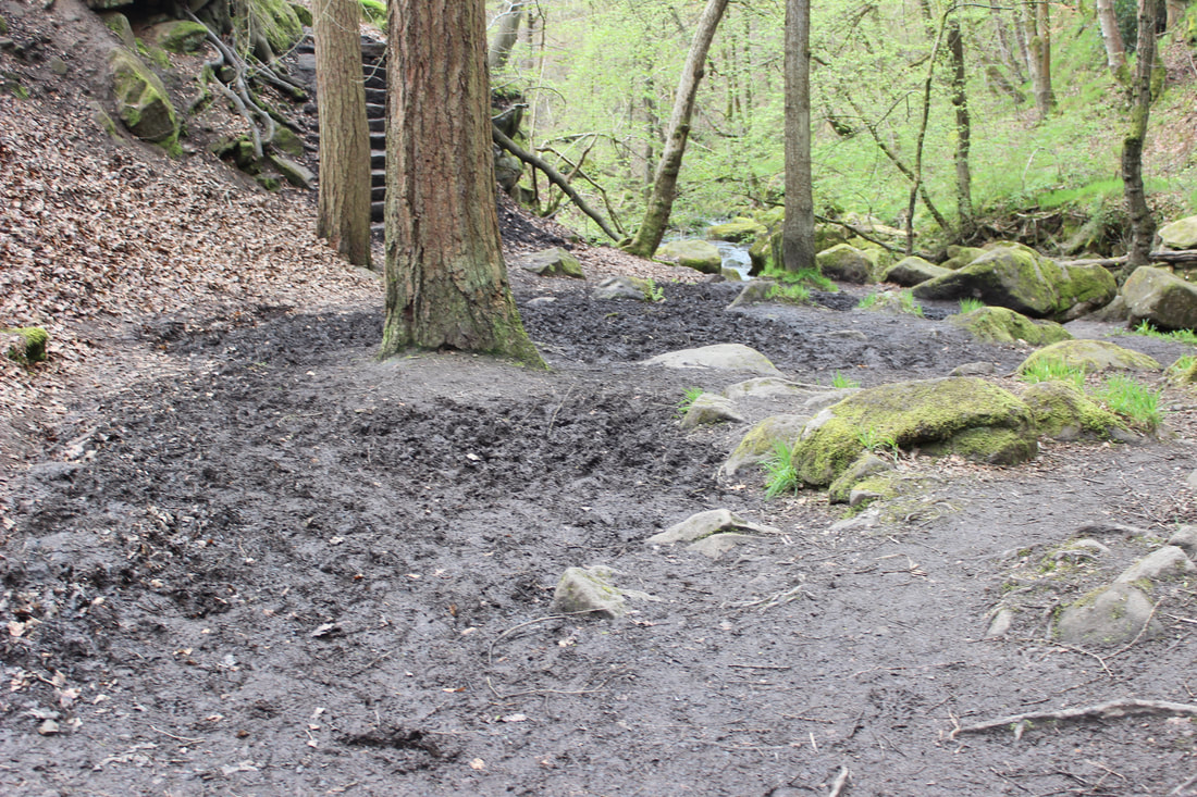
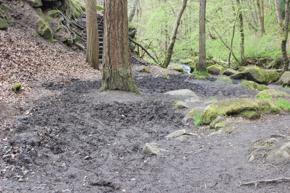
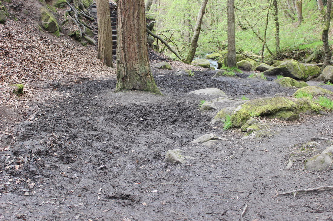
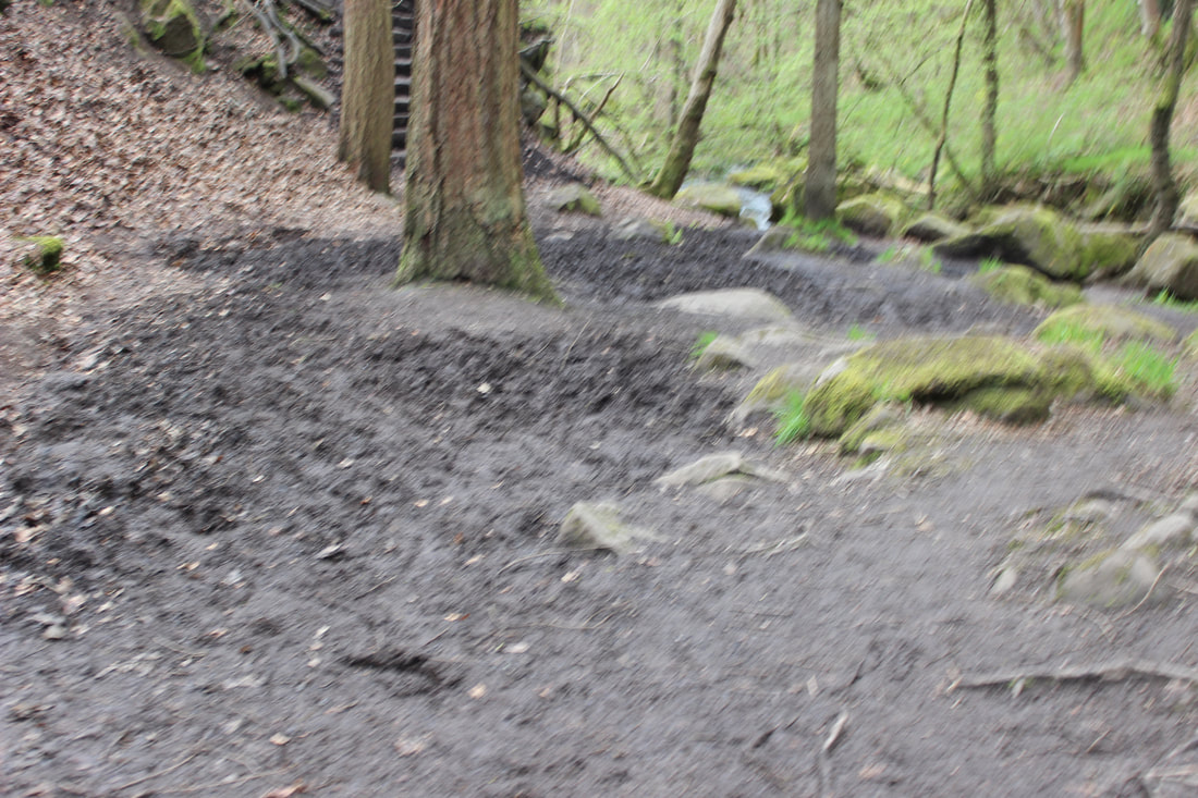
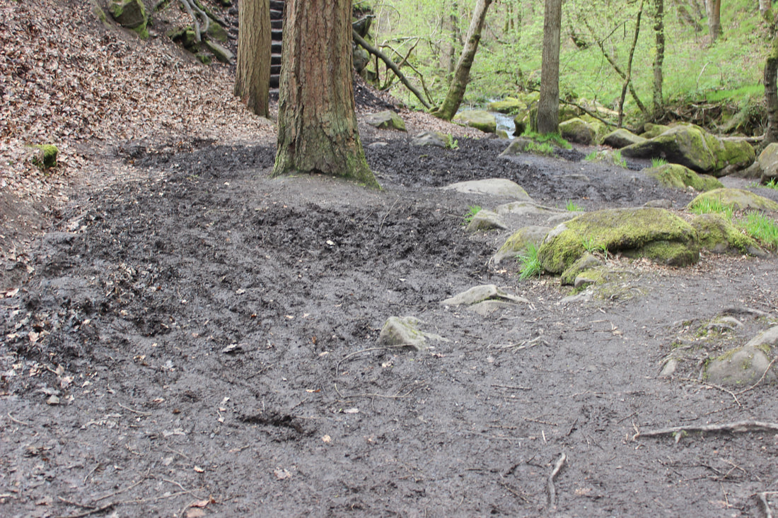
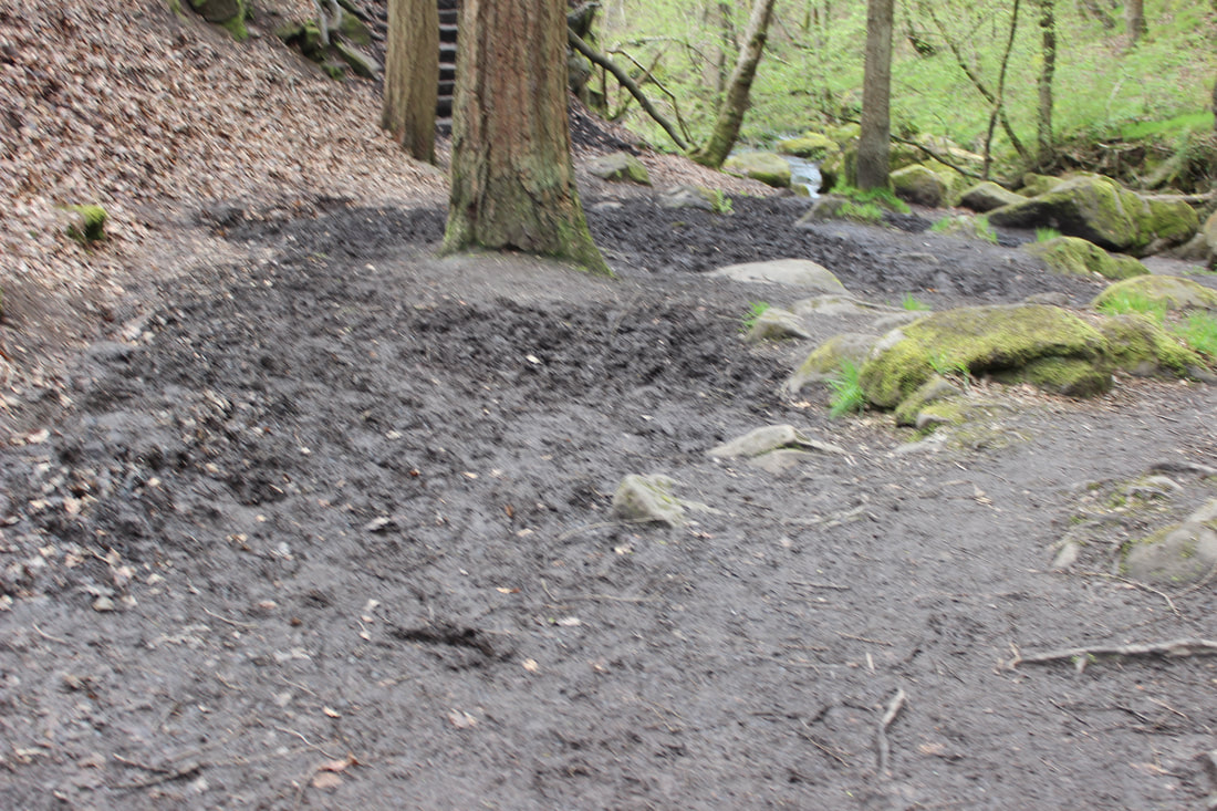
PADLEY GORGE
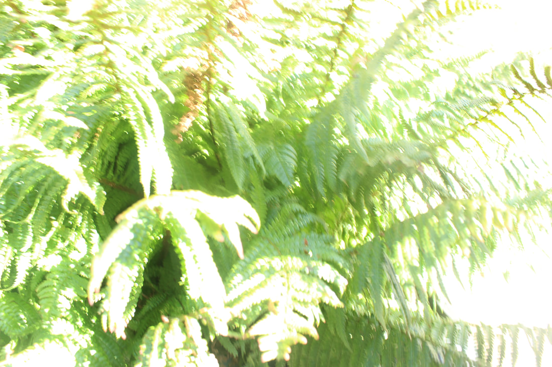
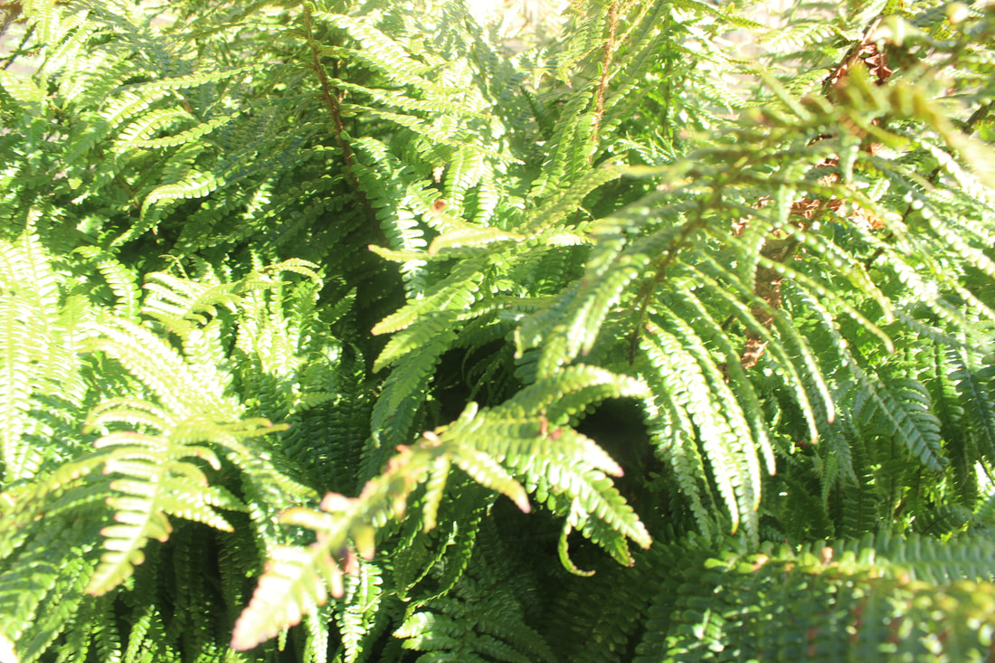
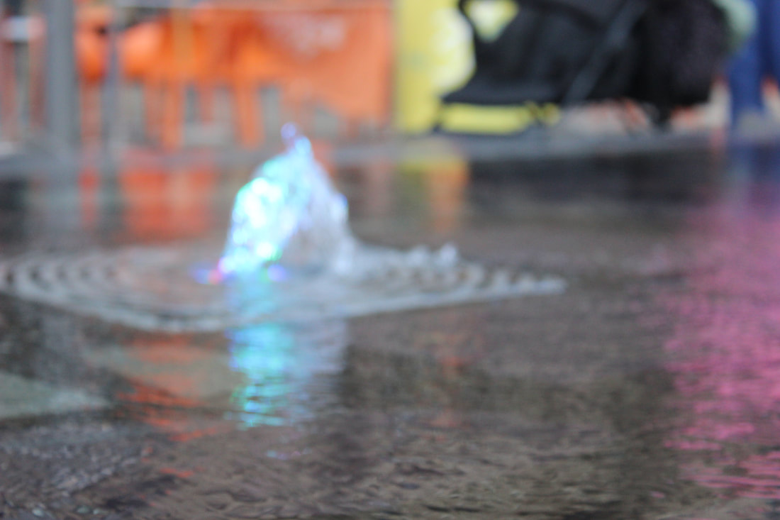
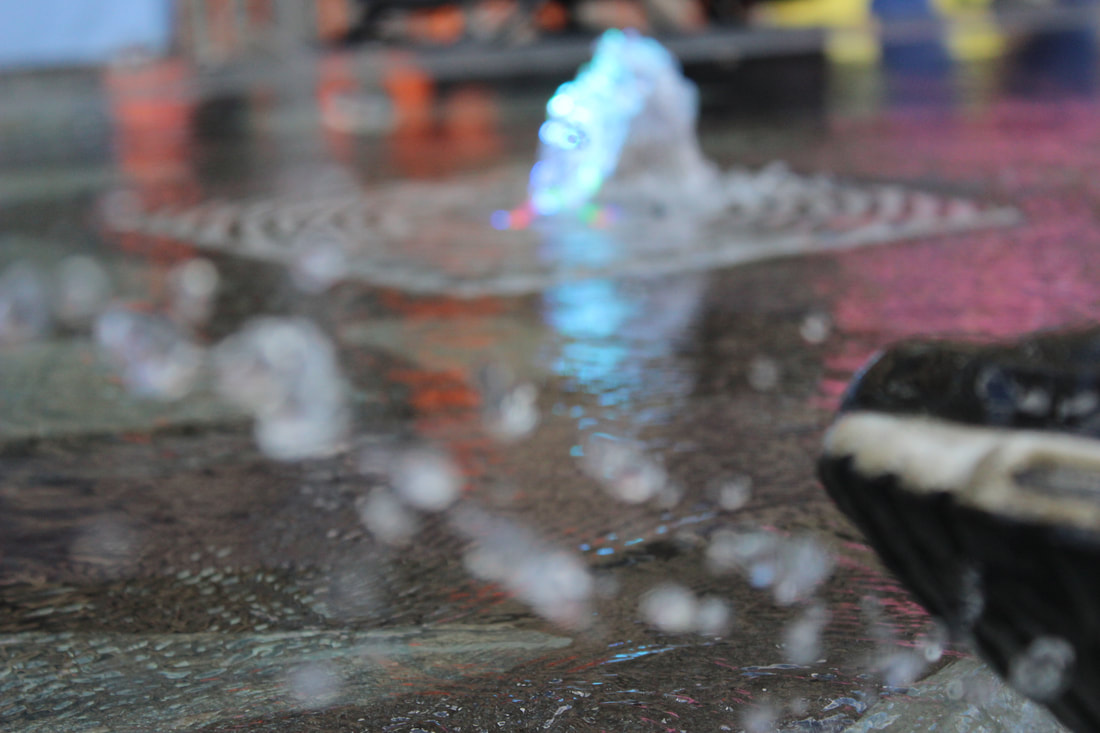
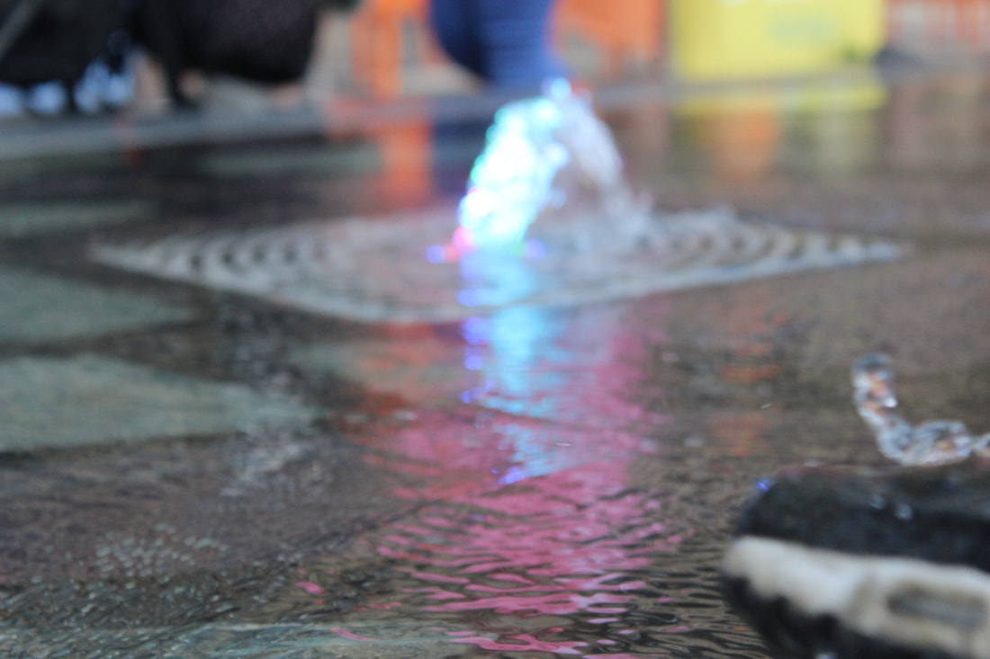
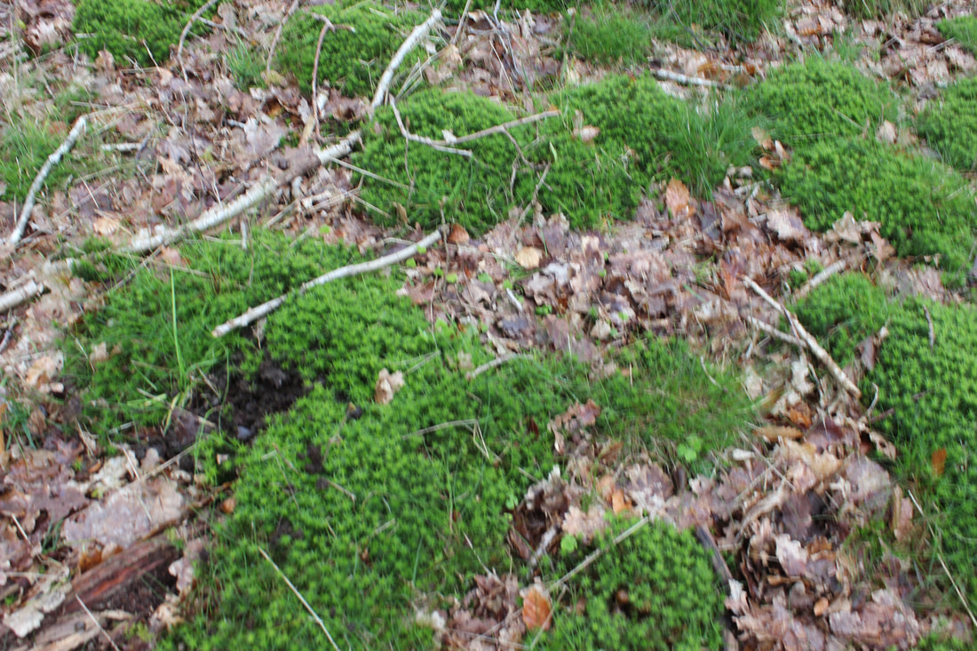
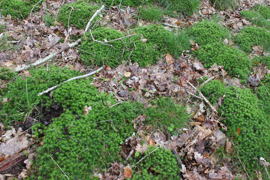
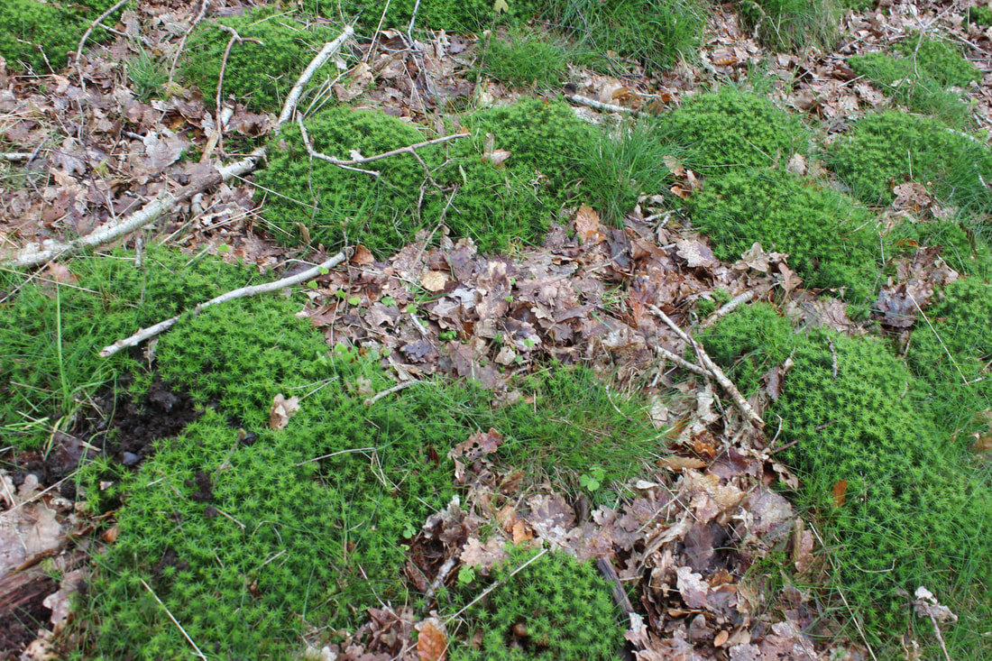
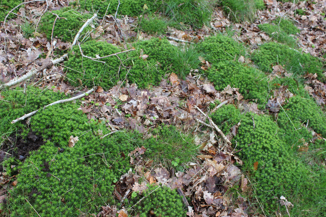
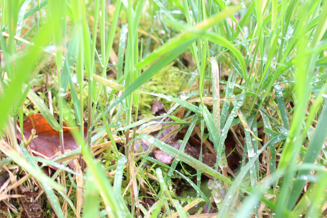
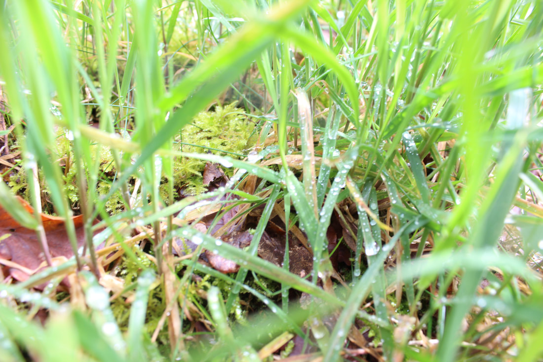
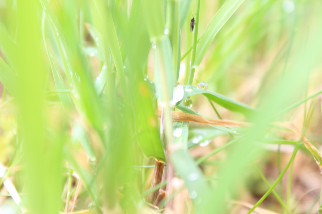
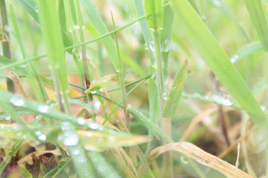
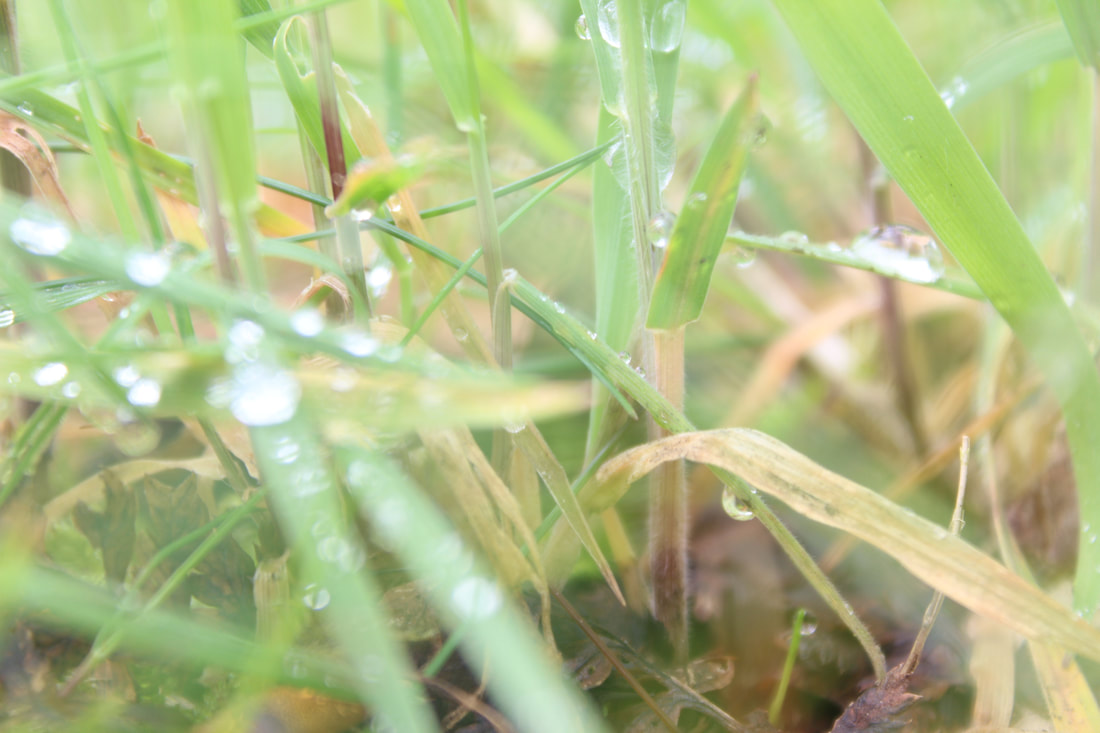
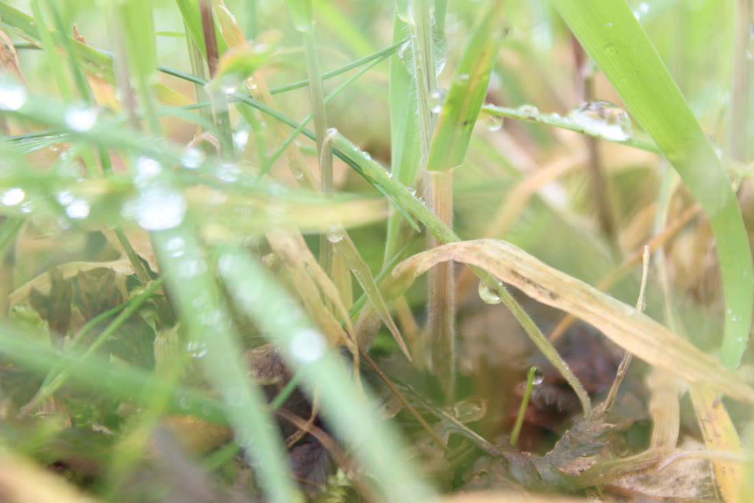
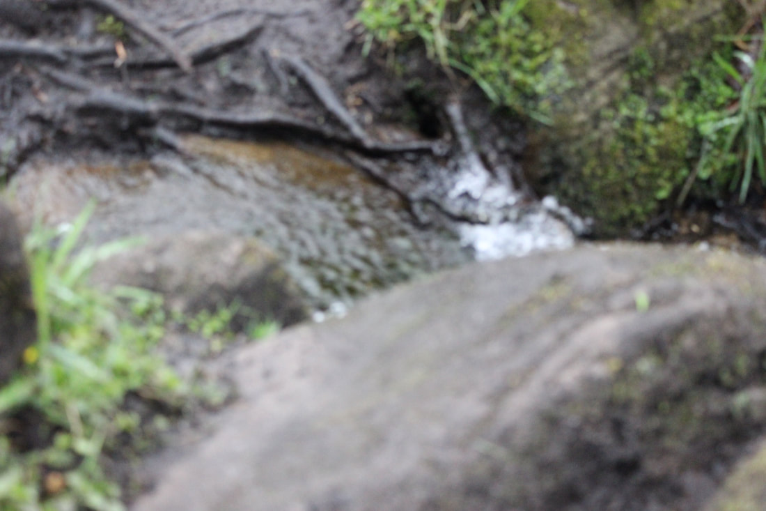
I went to Padley Gorge because I needed more pictures for my texture project. Padley Gorge is full of streams, rocks, and trees to take pictures of. I was constantly changing the exposure on the camera because some areas were lighter than others and it was outside where the light changes a lot. The weather was constantly changing so I got good pictures of rain and heat. Most of the area was covered with moss so I captured it. The water was good for this project because it was crashing off rocks and that had good texture. I was changing the white balance a lot because there were different parts where I would use tungsten and others I would use fluorescent light. I needed to take photos of trees, water, moss and bricks because I didnt have a lot of texture and these photos have a lot of texture which really helped my project. I was using the camera on Manuel because I needed to control what my photos came out like. Padley Gorge was a good location because it had untouched nature and trees that had fallen down. My best photo was a close up of grass which you can see all the water on the leaves. This was my best because I used a good white balance and the exposure was correct and it was all in focus.

This was my best because I used a good white balance and the exposure was correct and it was all in focus. You can see the leaves in focus with water running down them. There is nothing else in the photo other than what's supposed to be there. The photo has a white filter on it which makes it look brighter.
bushy moss grass wood
mossy wood trees
moss wall
moss rock
moss wood
moss rock
corrosponding moss
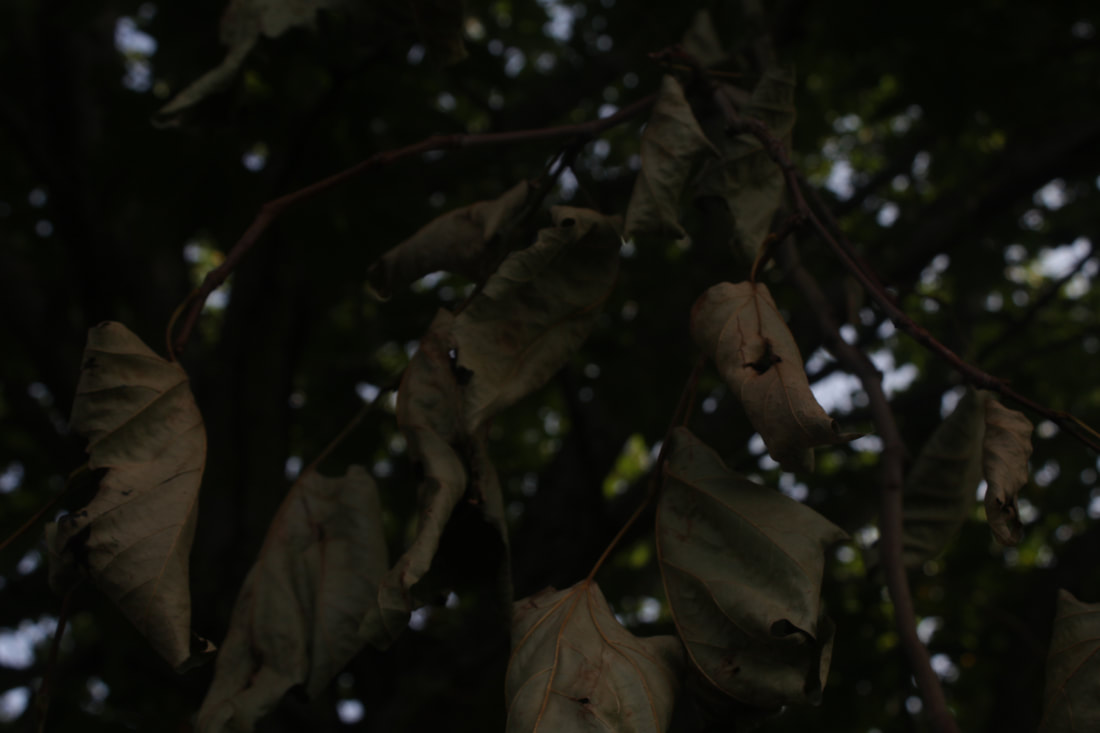
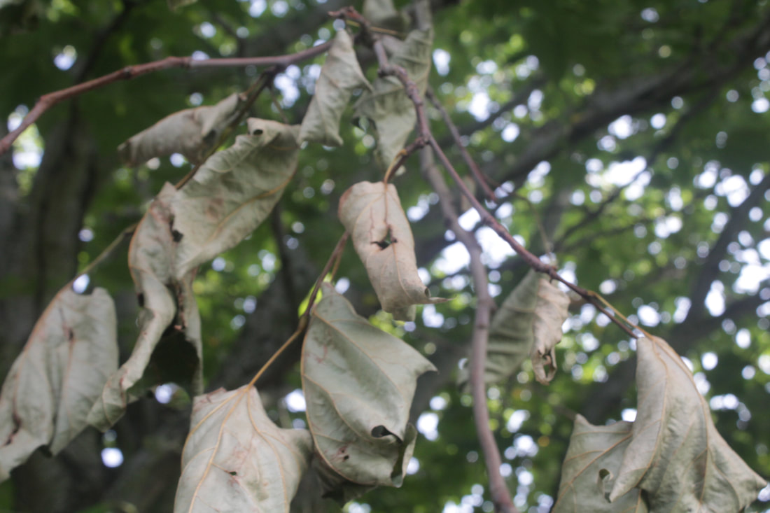
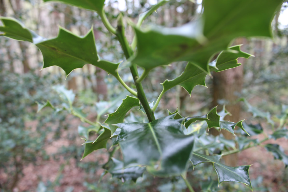
spikey leaf
leaves
grass
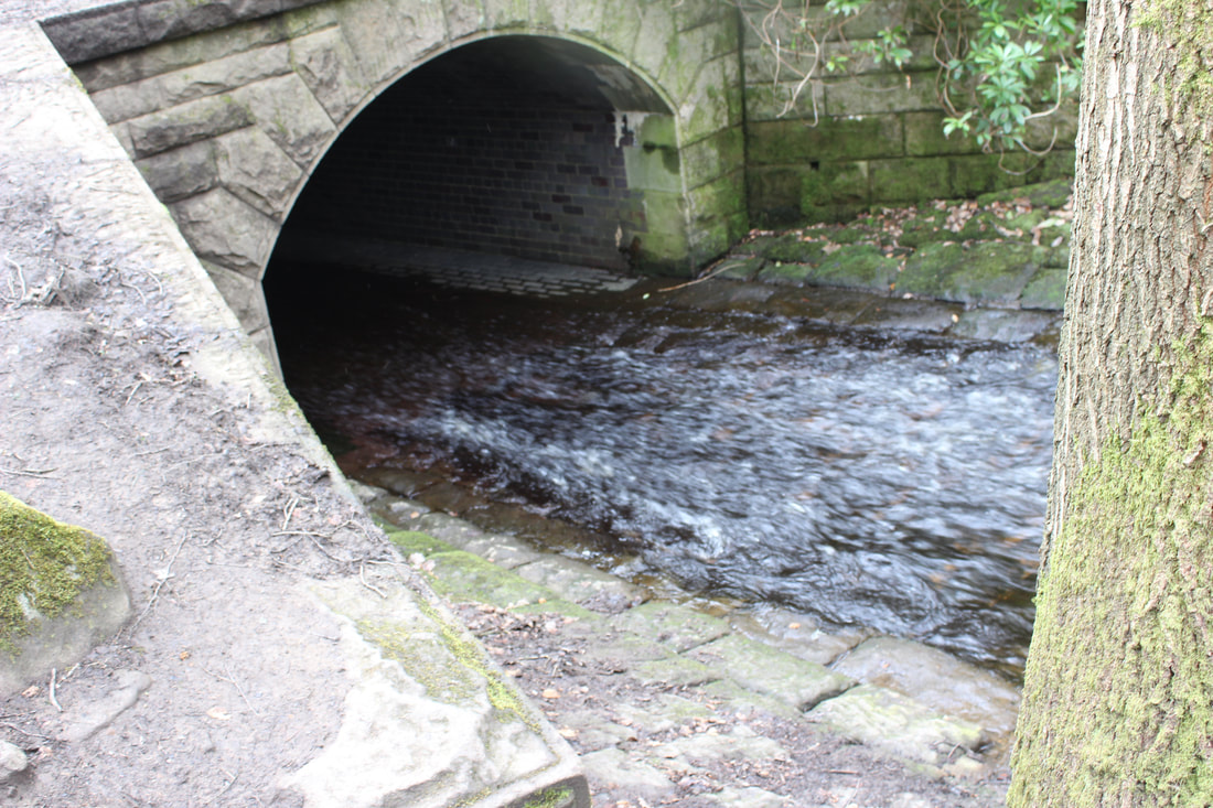
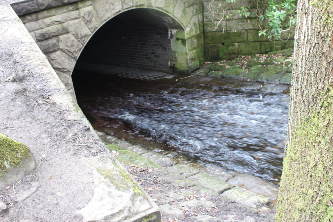
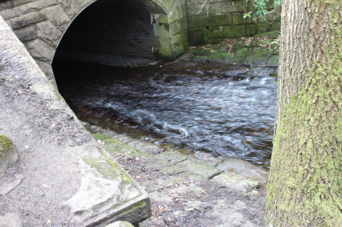
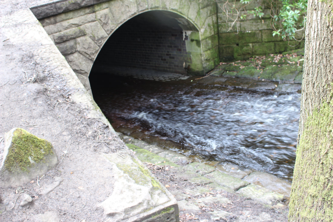
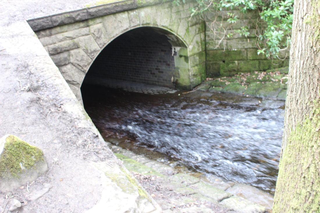
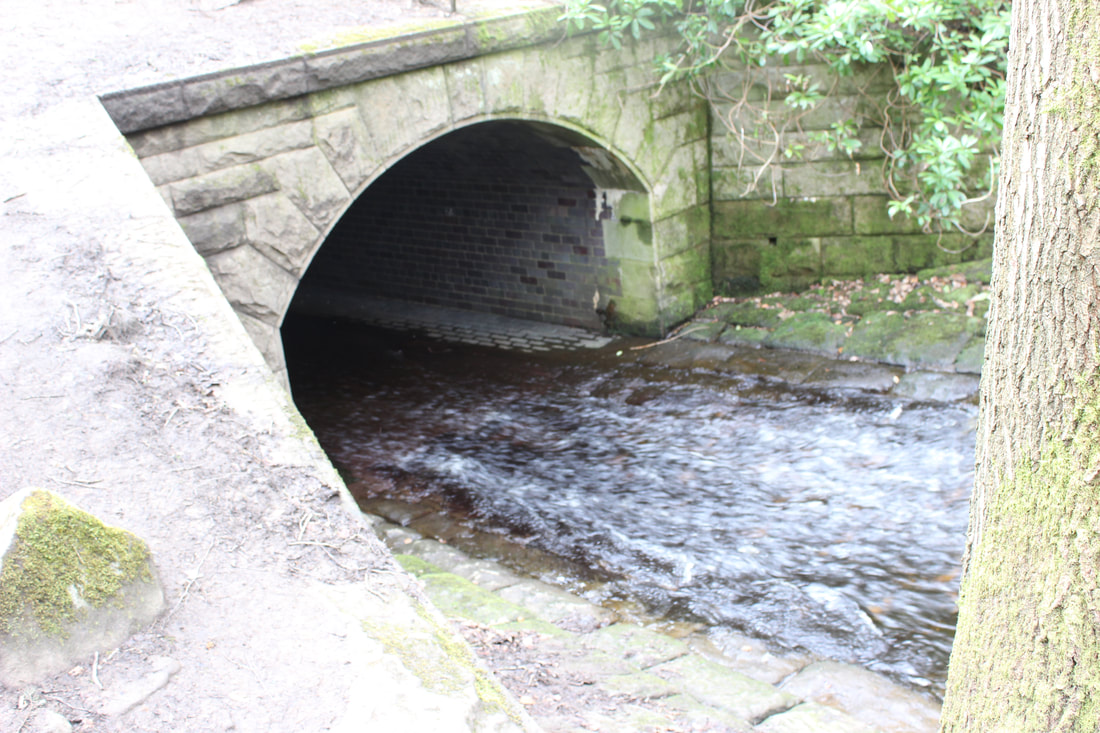
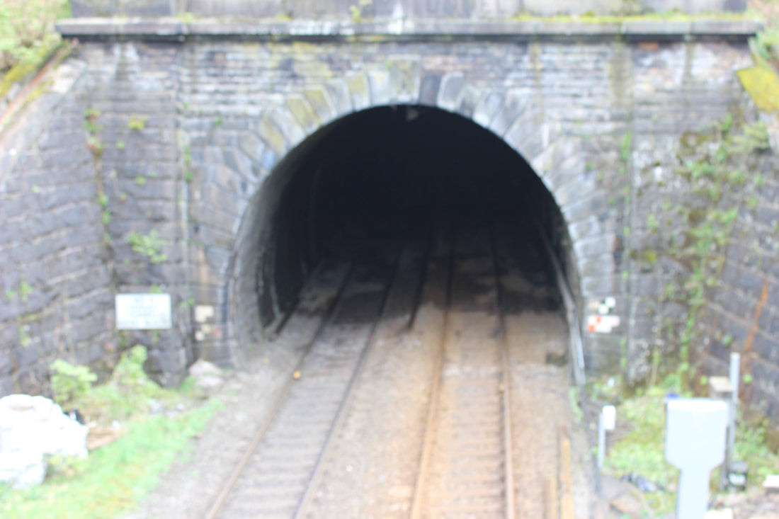
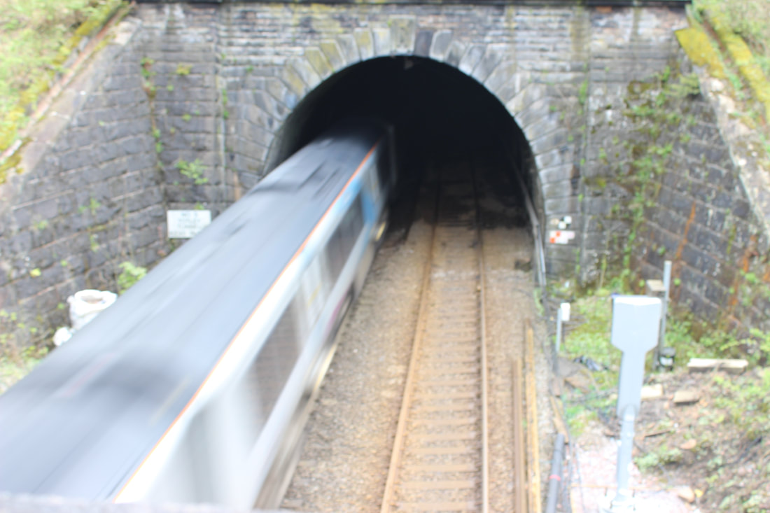
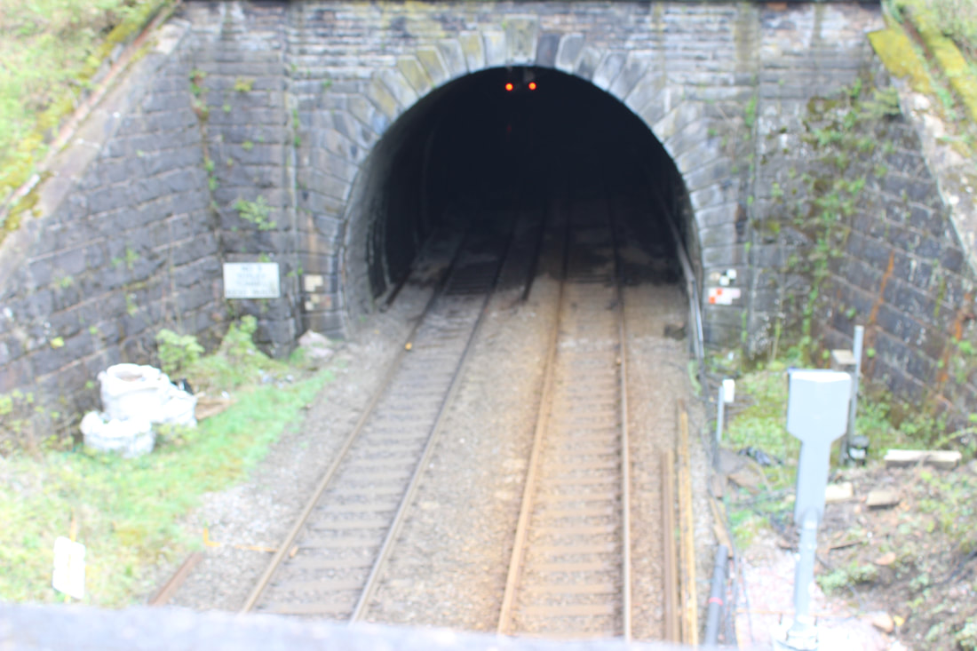
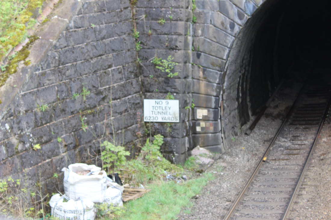
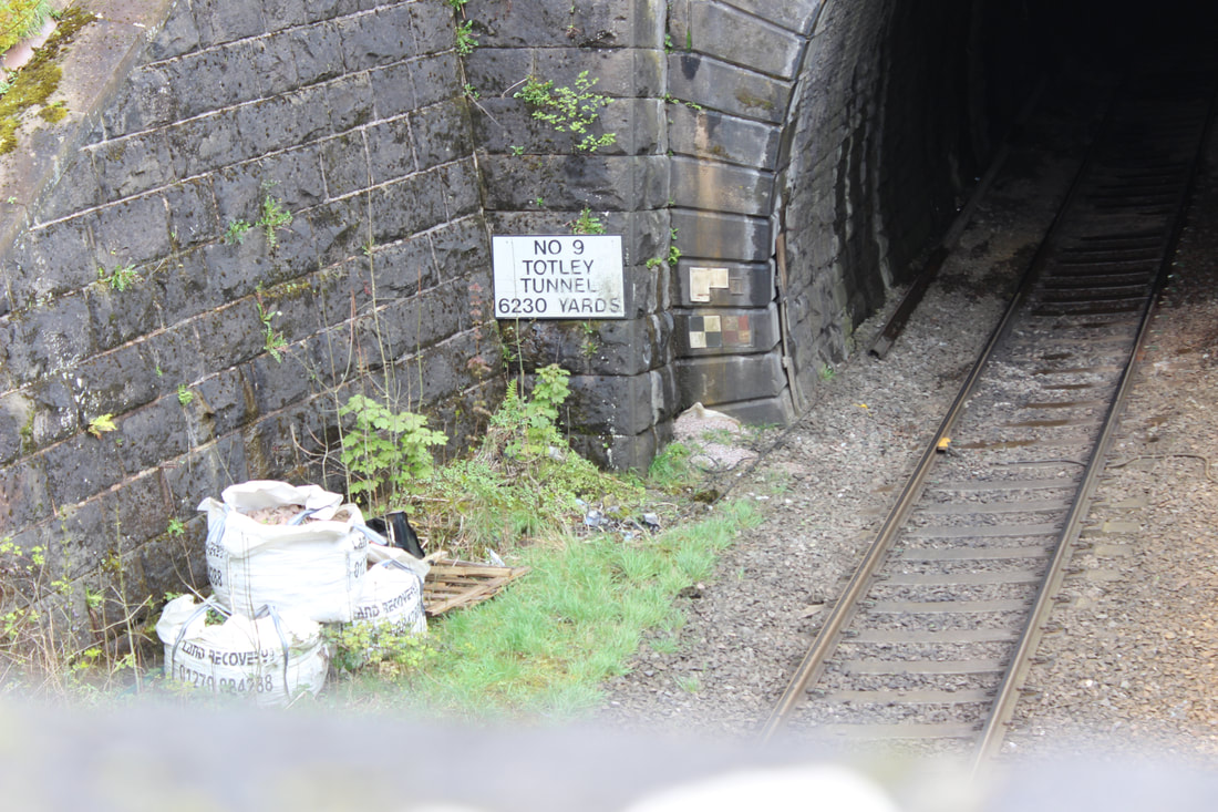
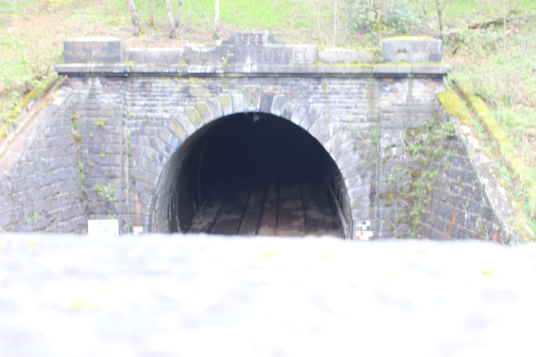
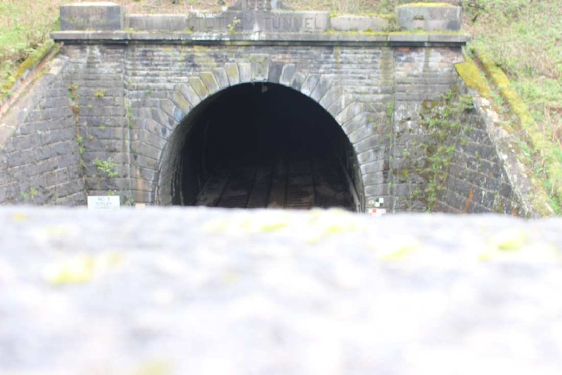
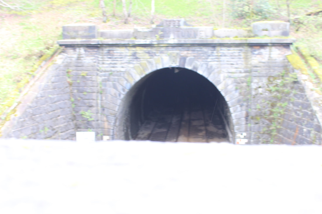
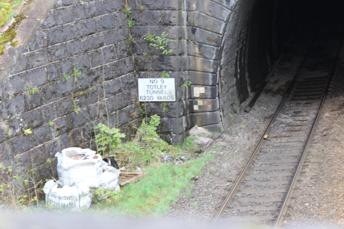
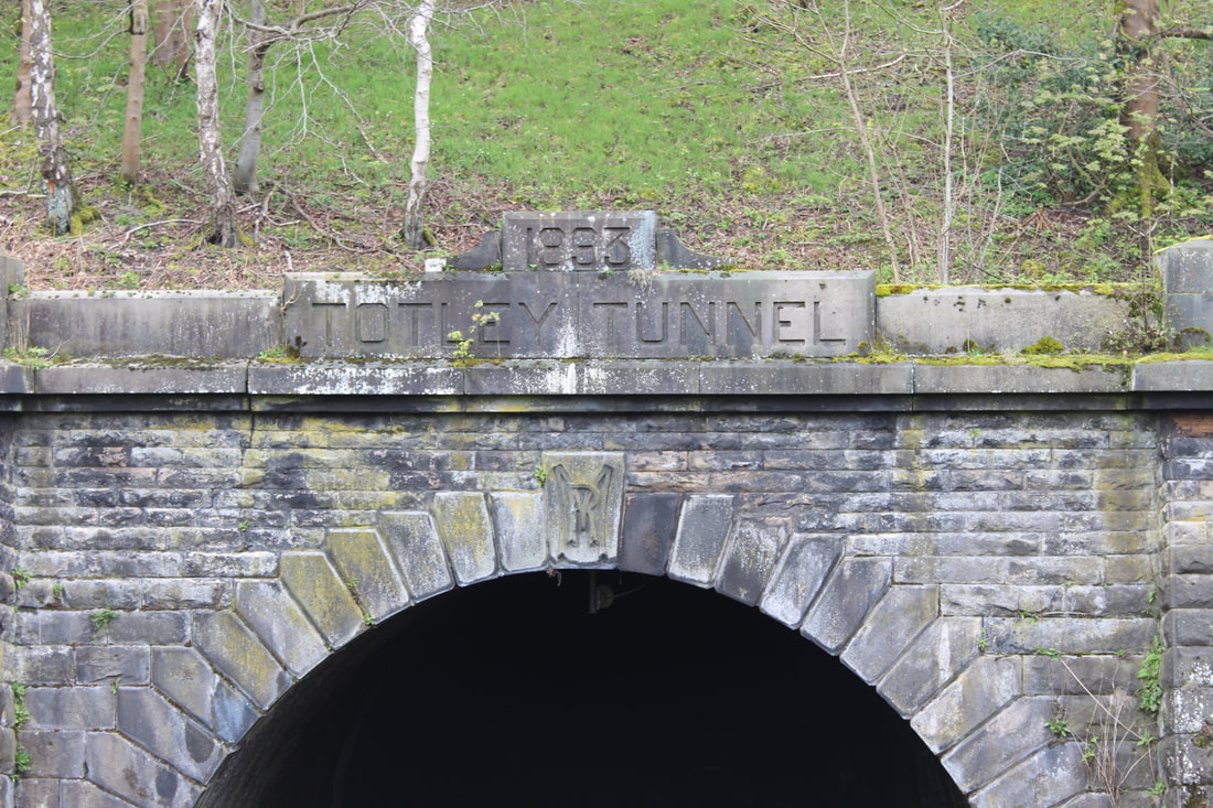
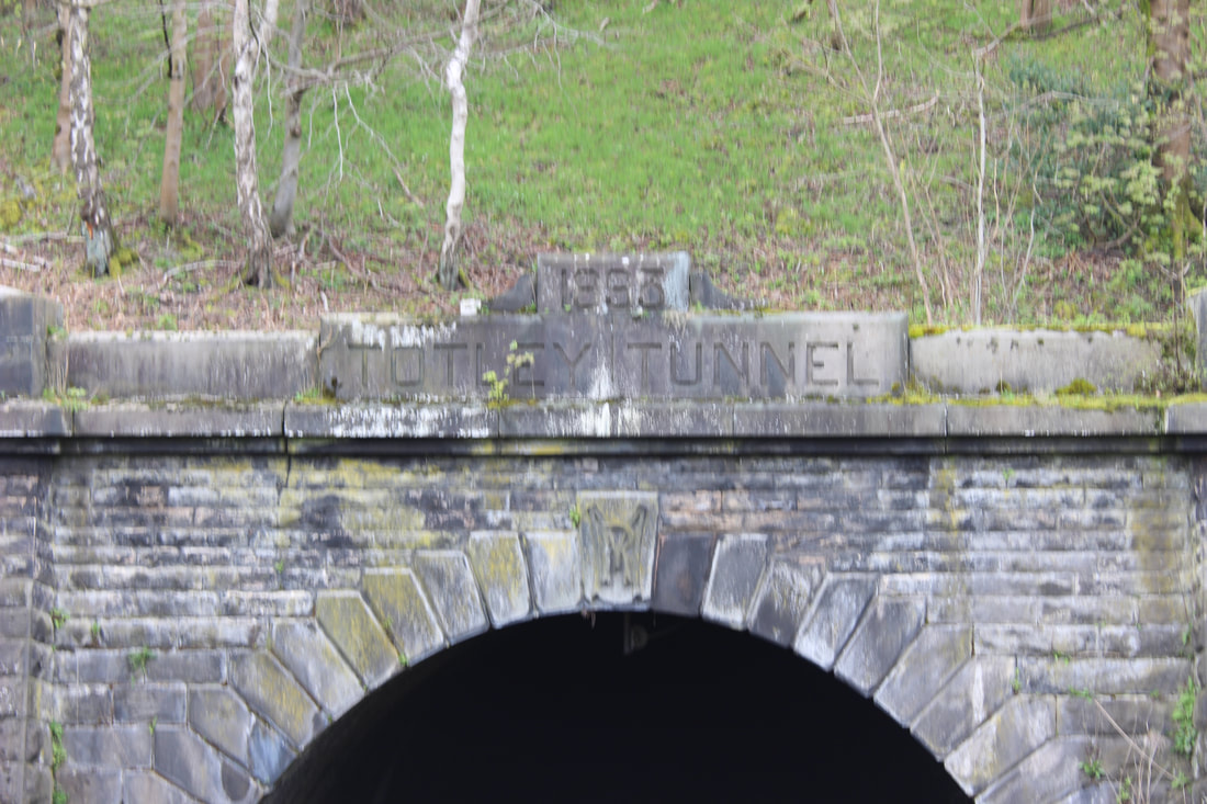
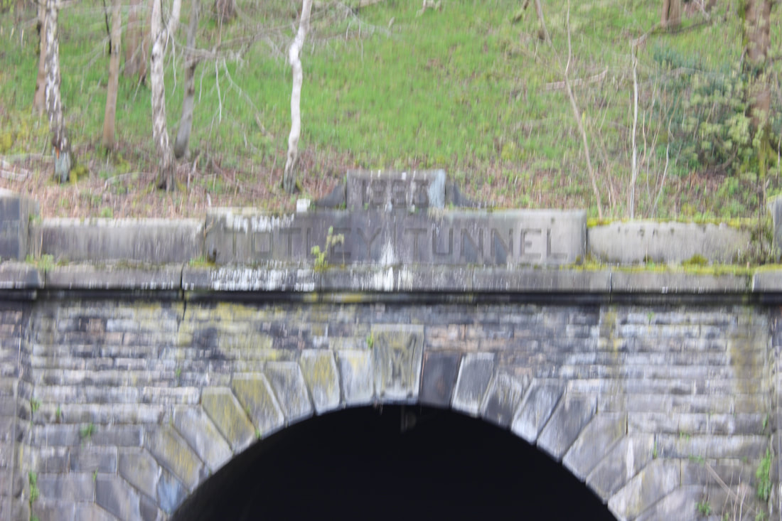
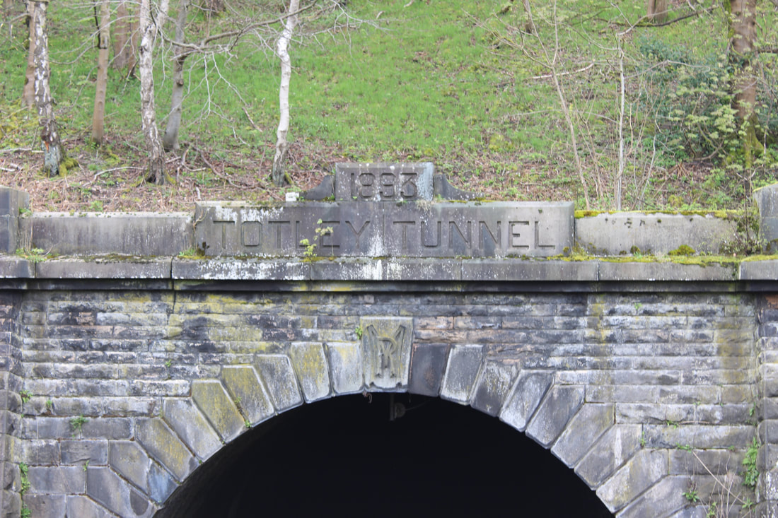
tunnel with water
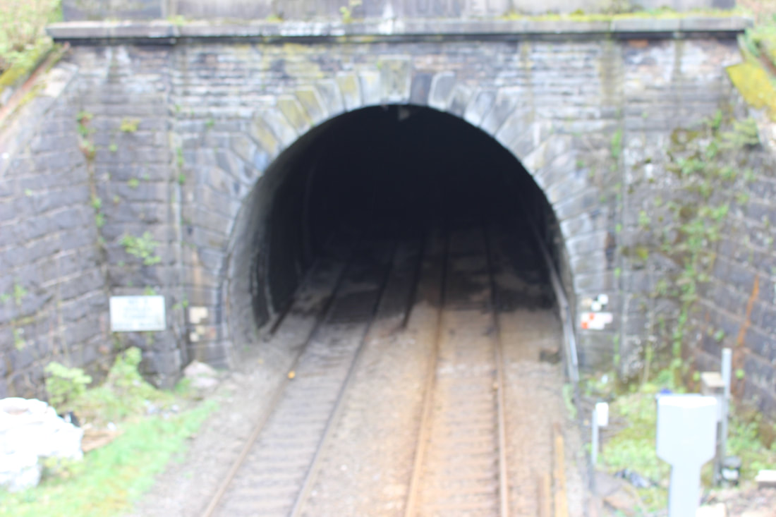
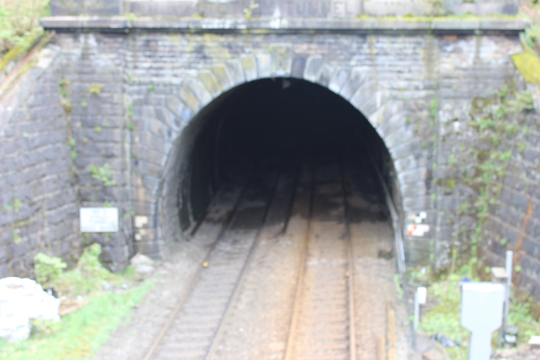
tunnel with trains
water with rocks
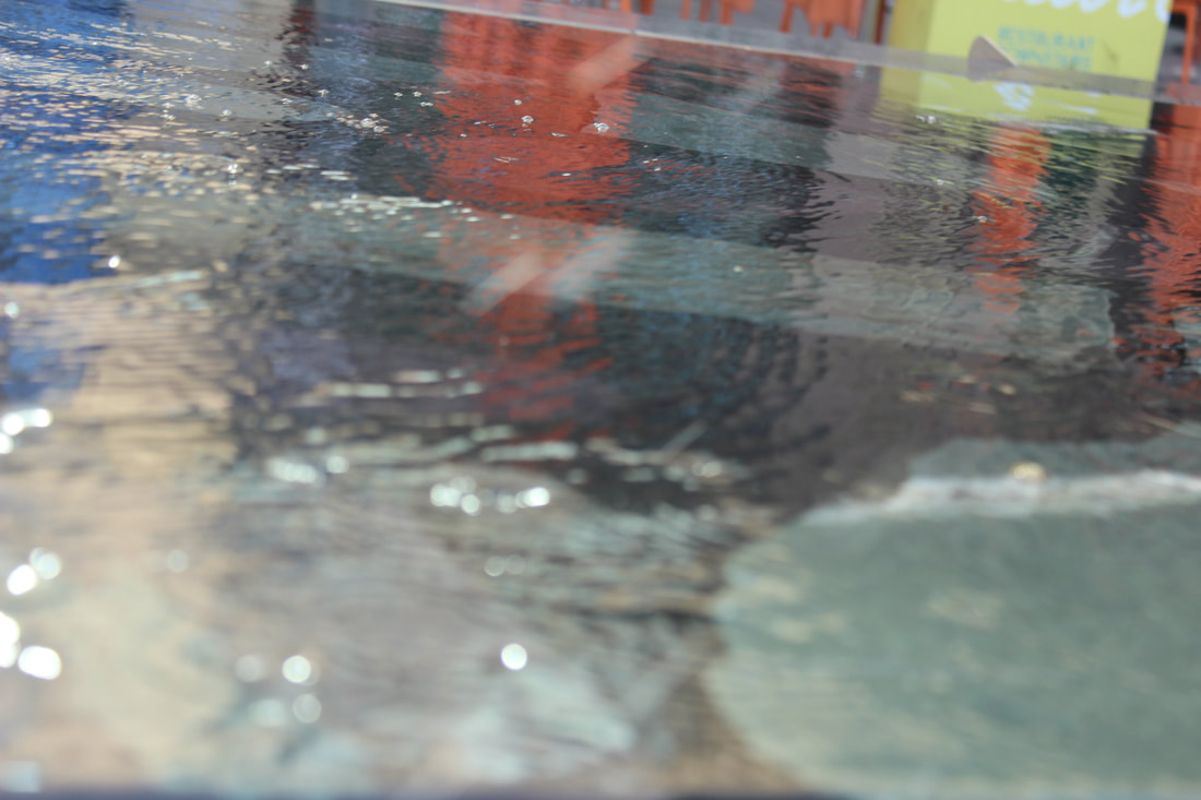
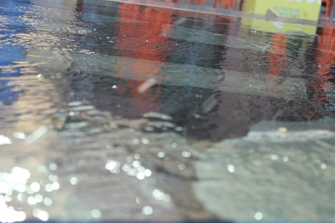
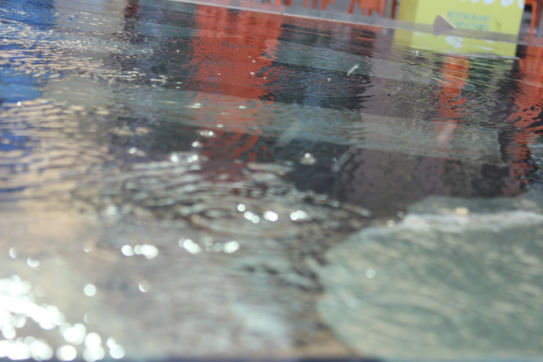
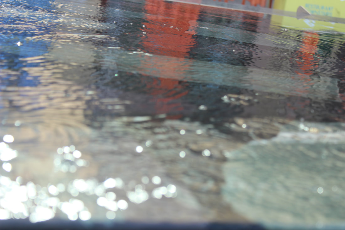
stream
water surrounded by rocks
water with rock and tree
water with BIG rock
stream with water
water wall
mossa rocky

fallen tree
broken tree
fallen tree with pennies
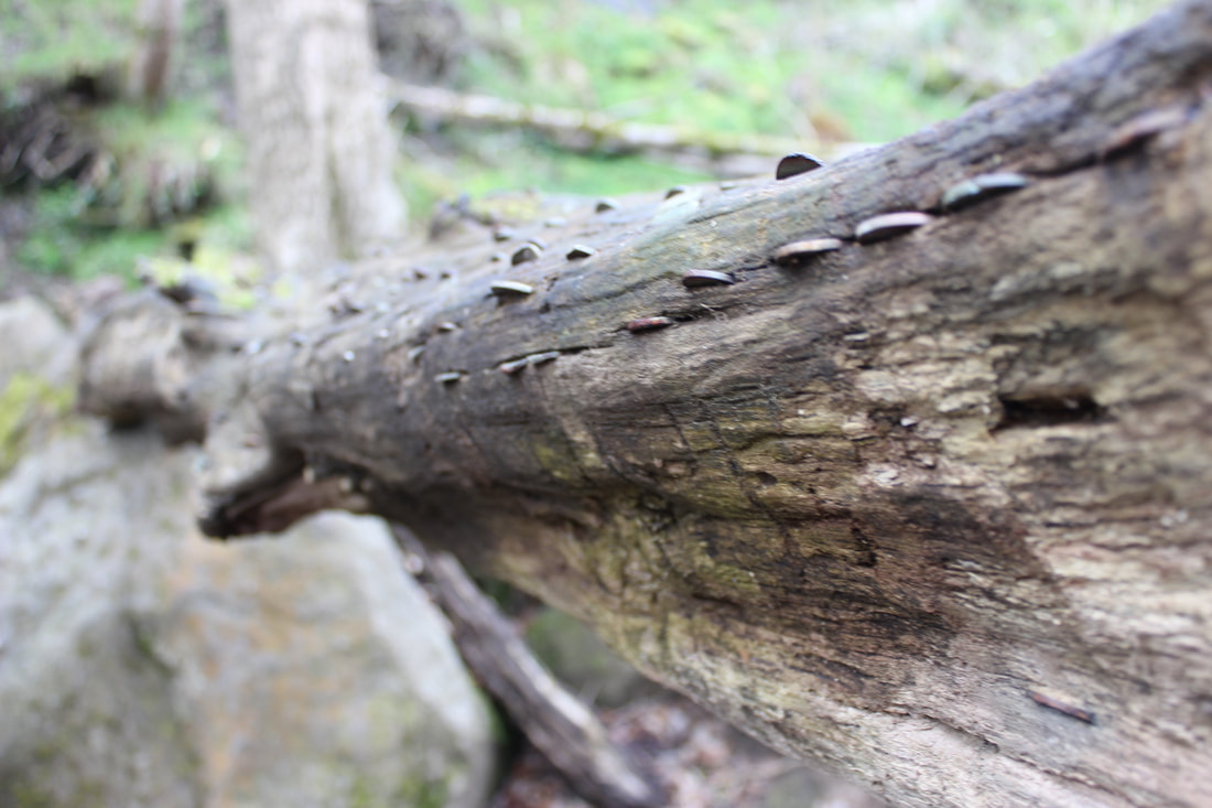
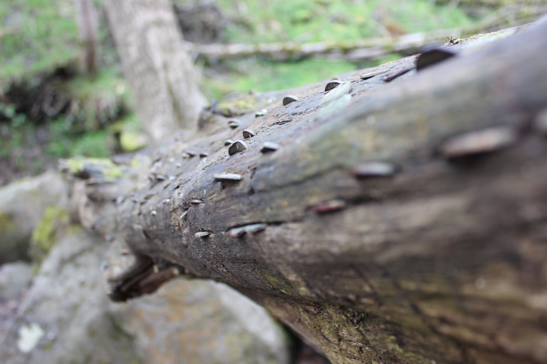
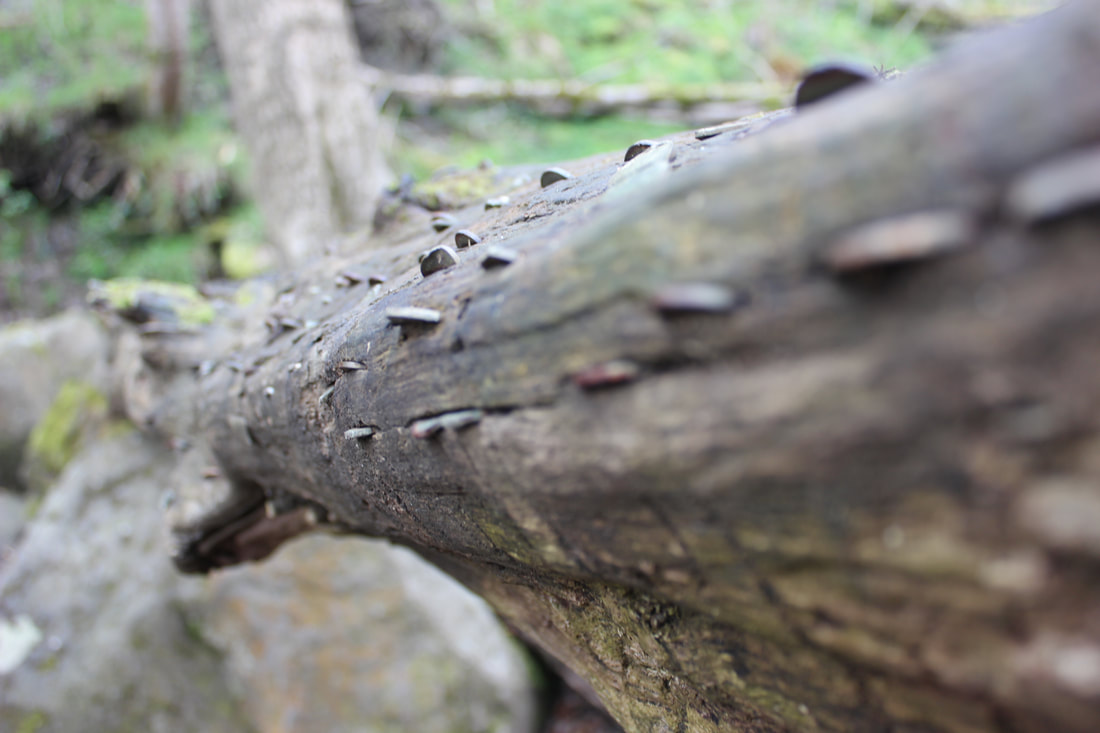
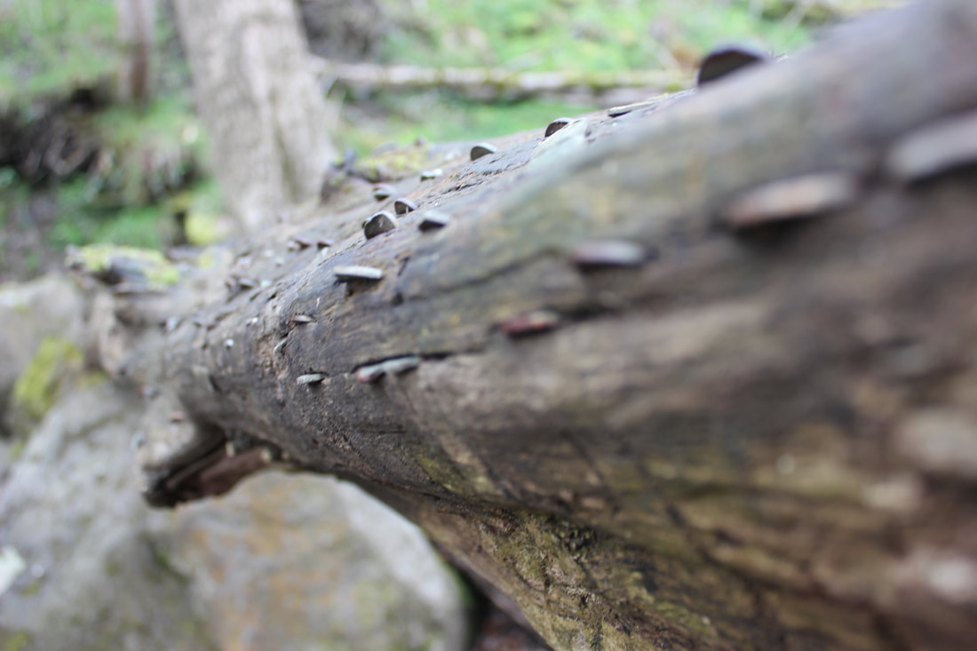
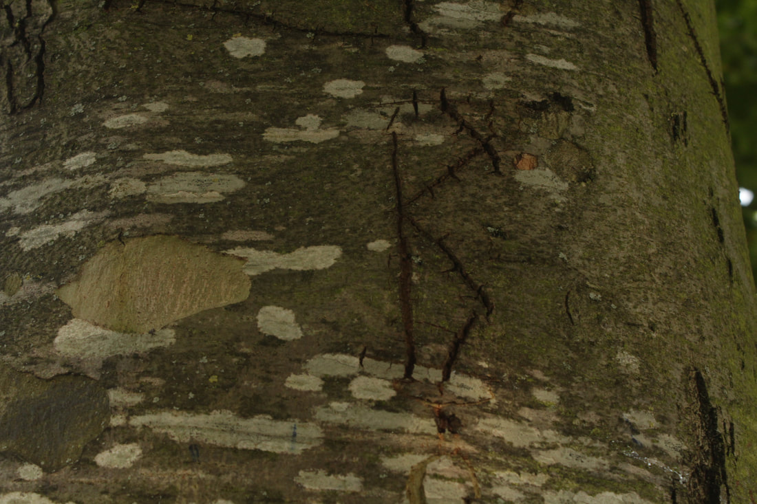
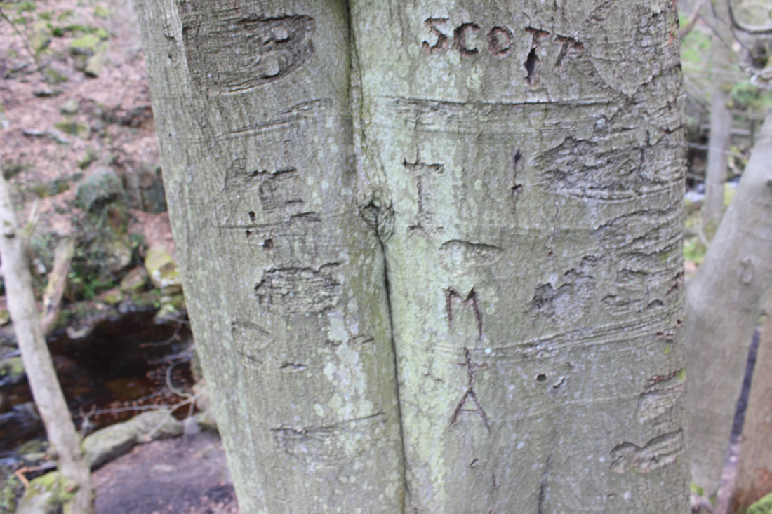
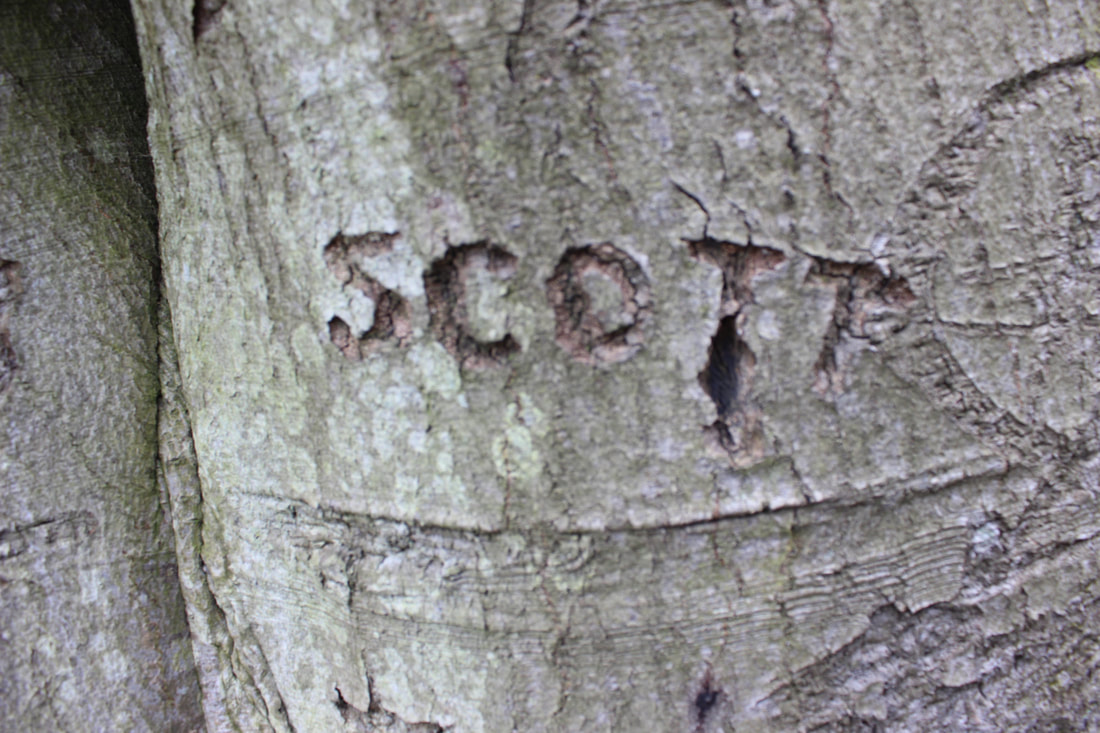
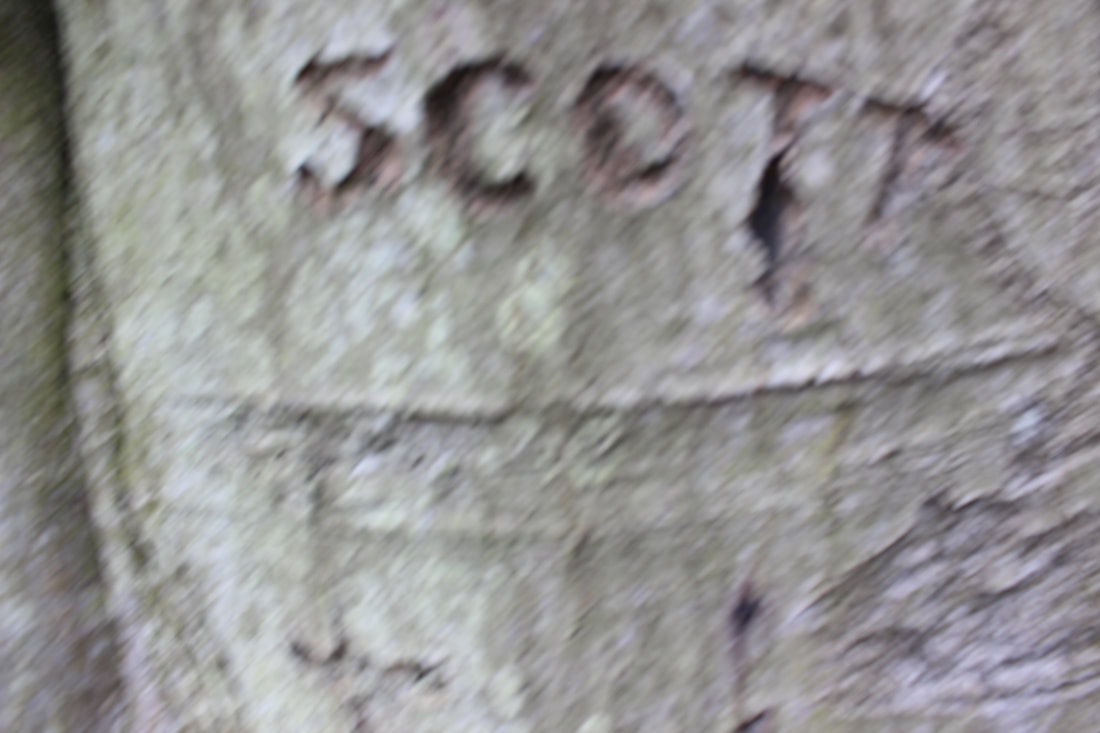
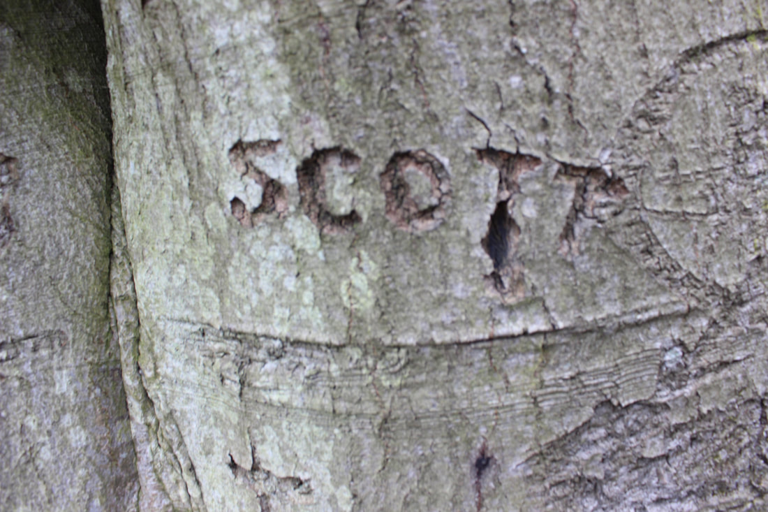
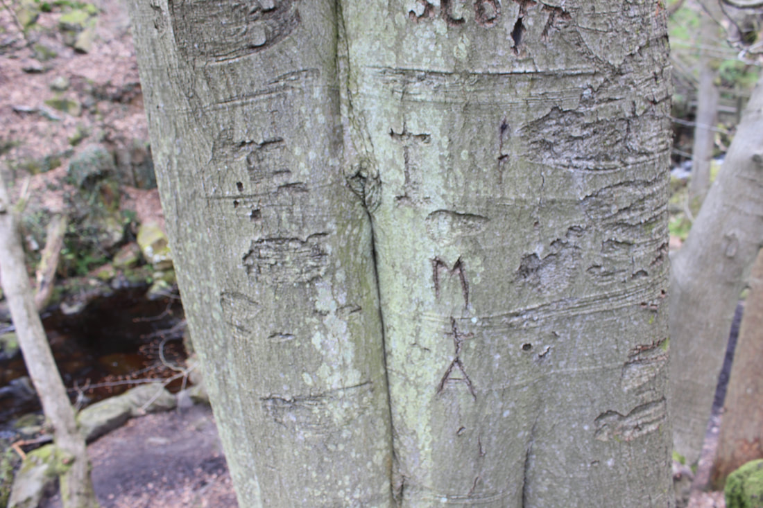
scott tree engraving
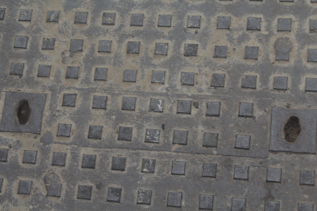
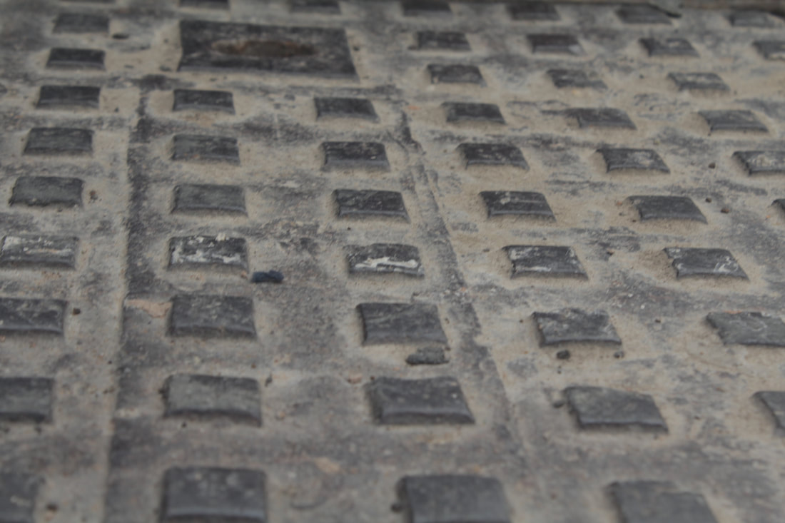
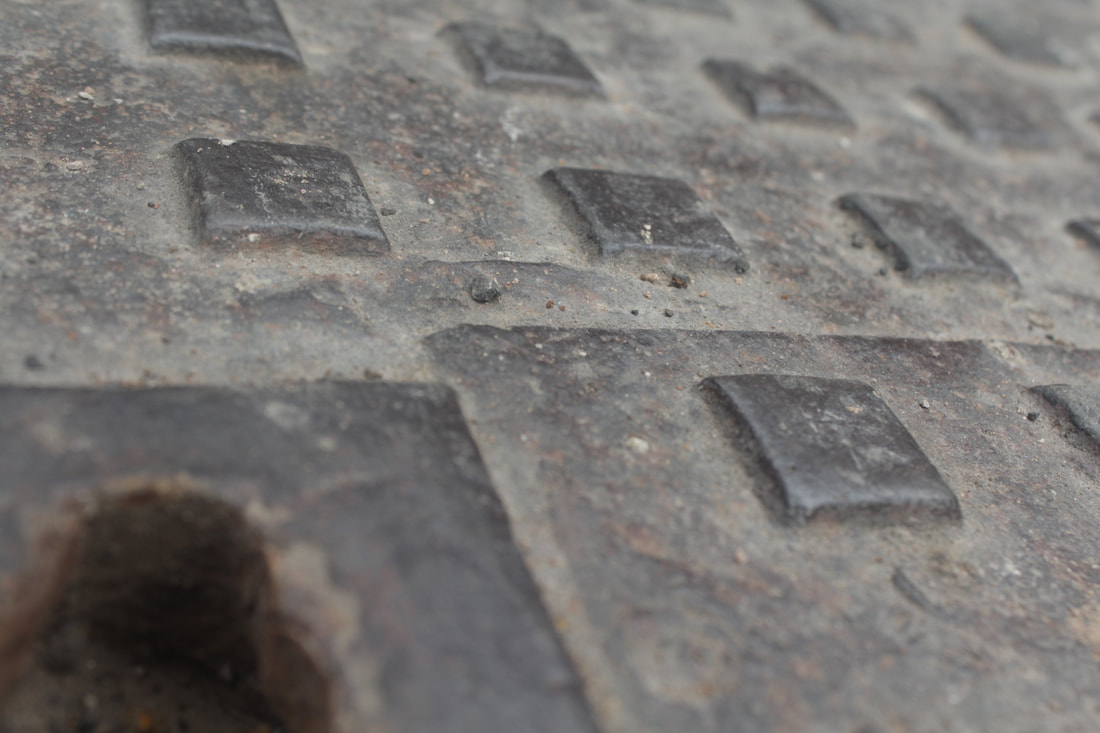
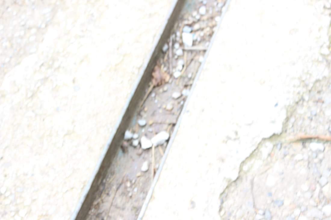
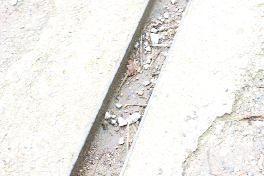
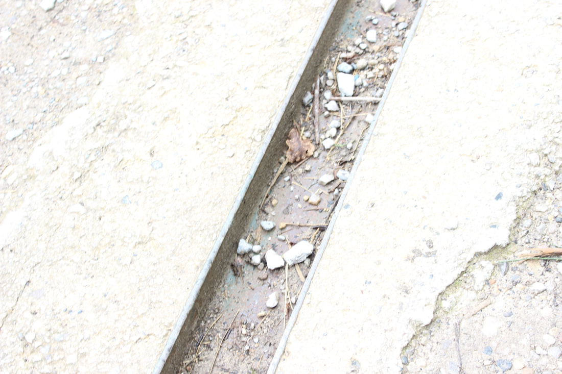
hole in floor
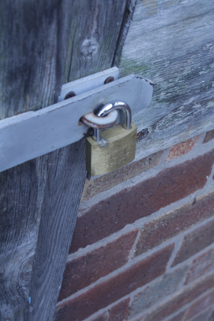
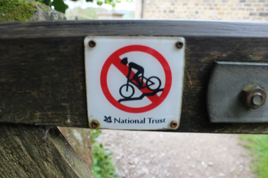
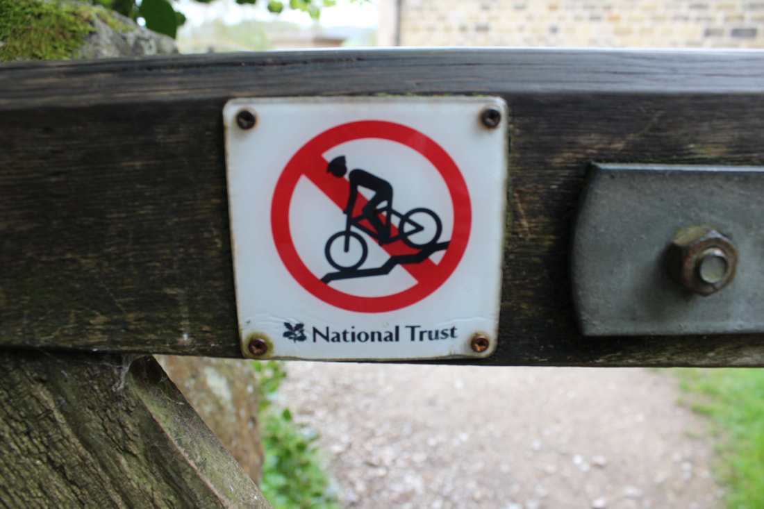
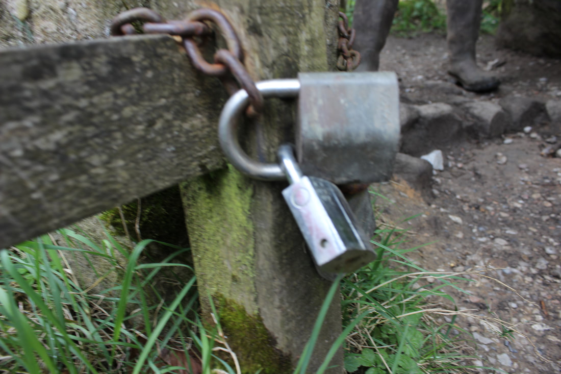
sign on fence
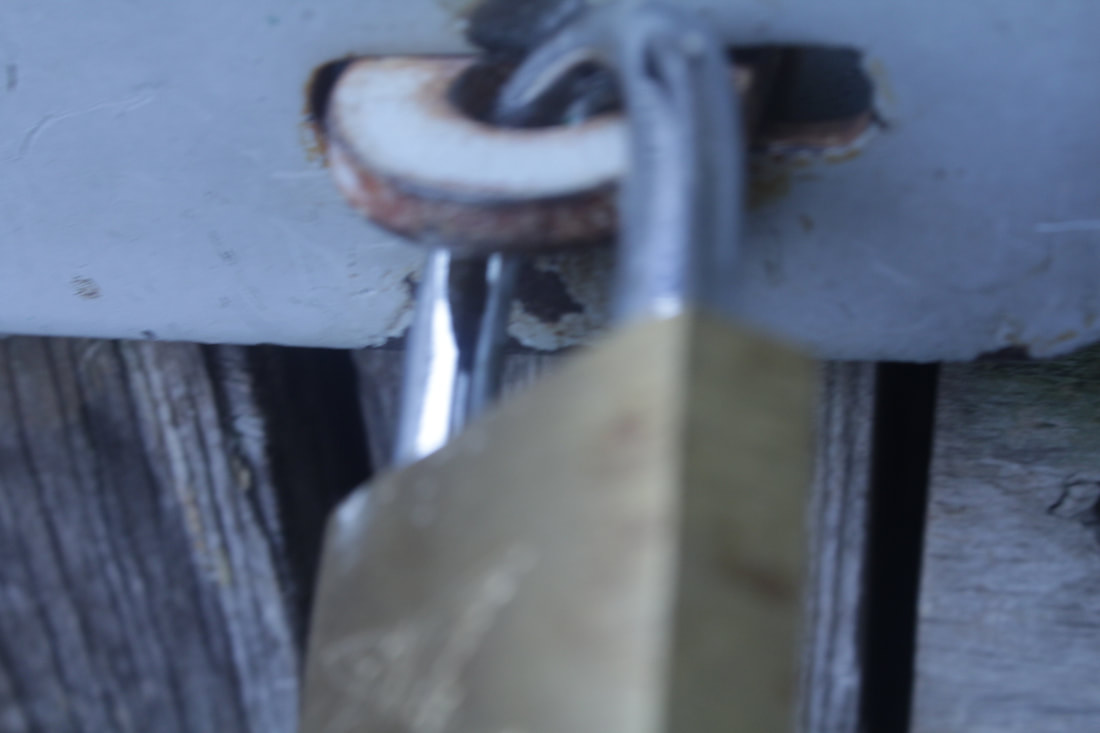
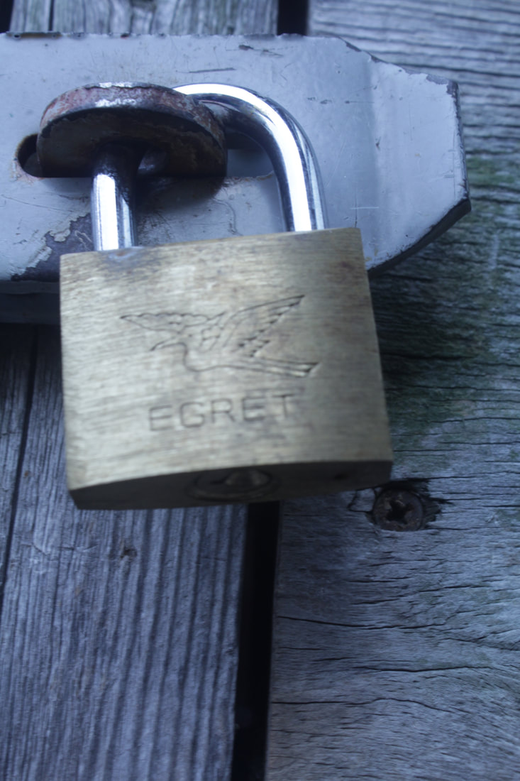
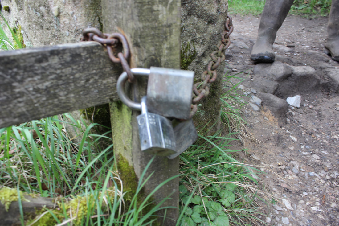
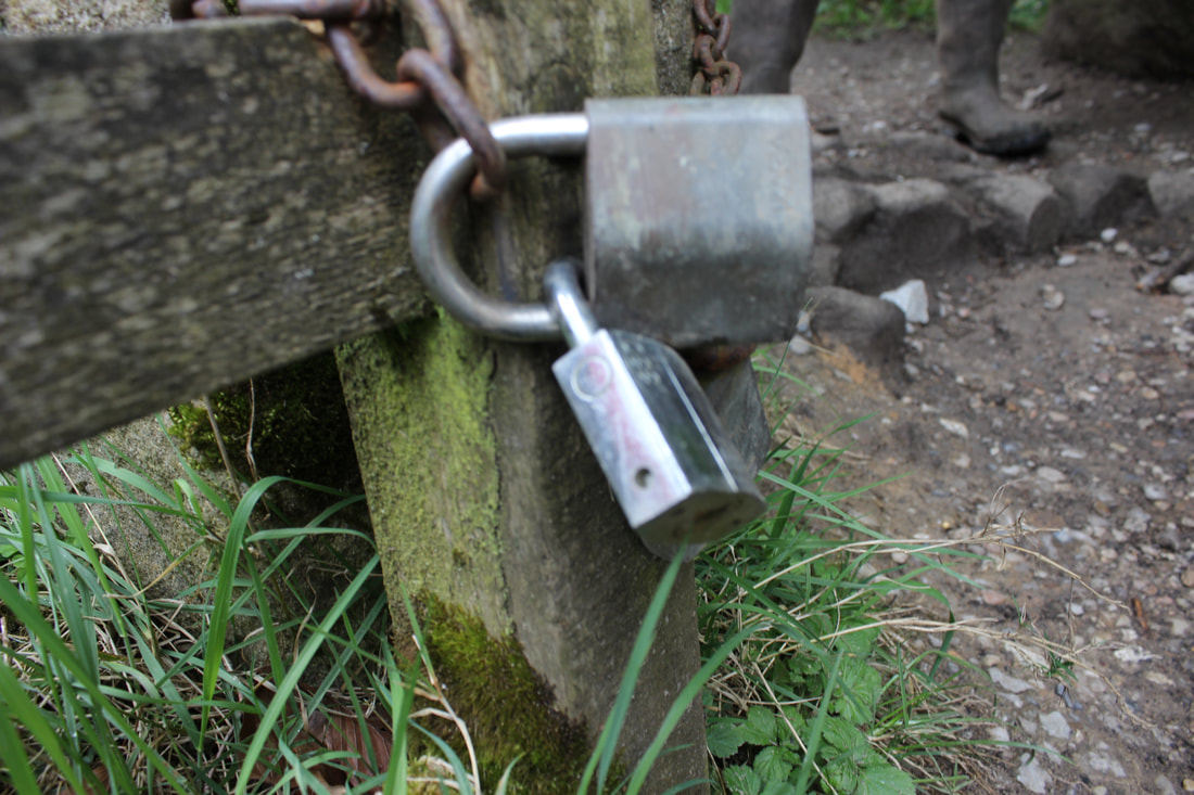
padlock
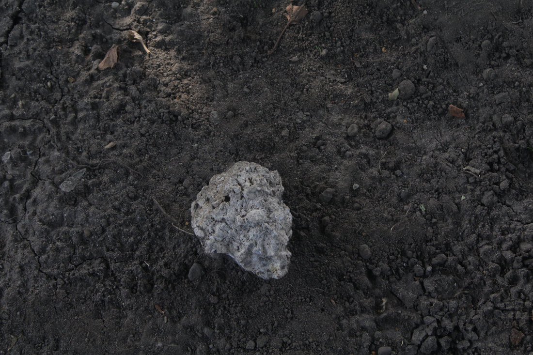
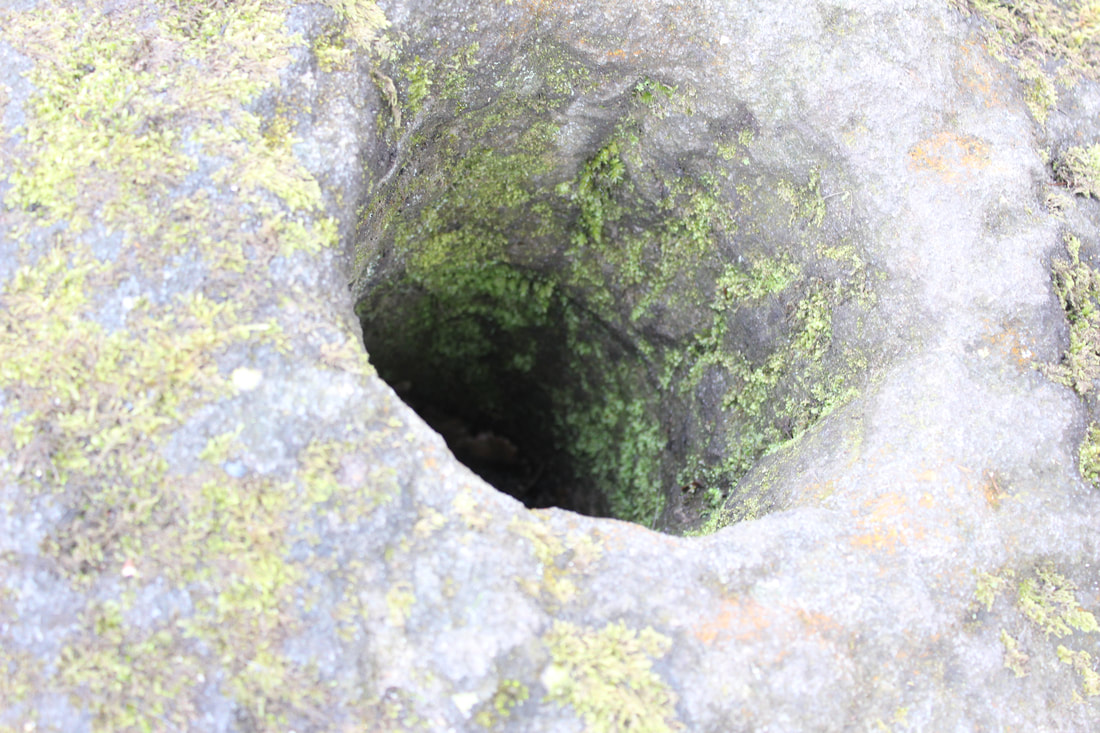
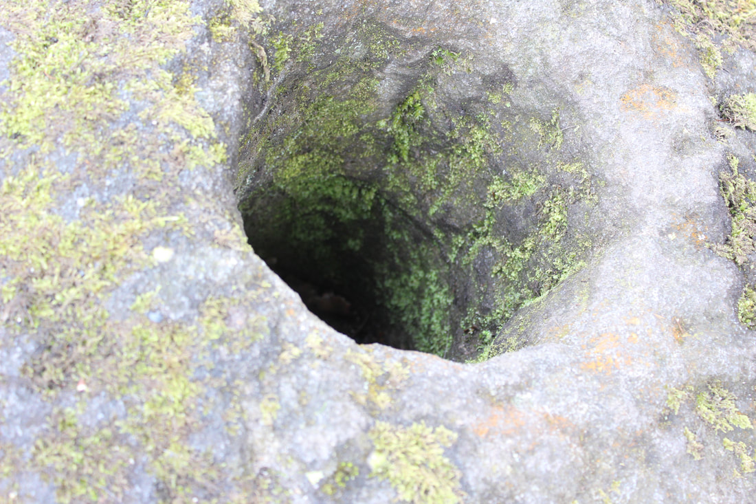
rock with hole
brick wall
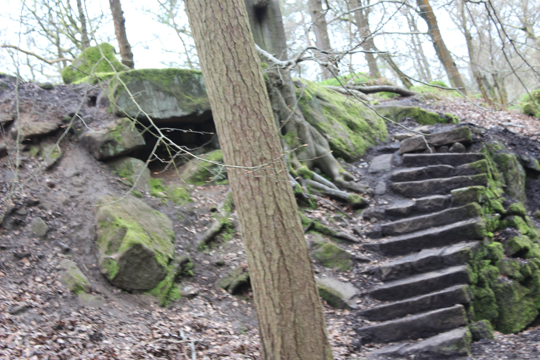
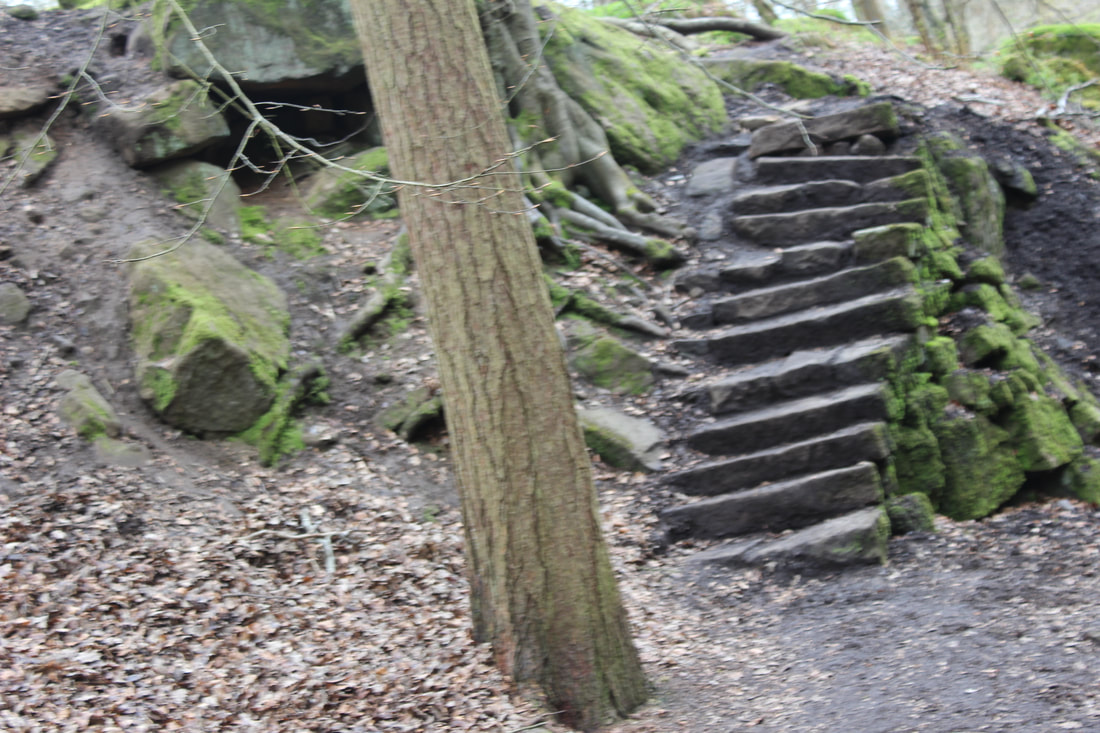
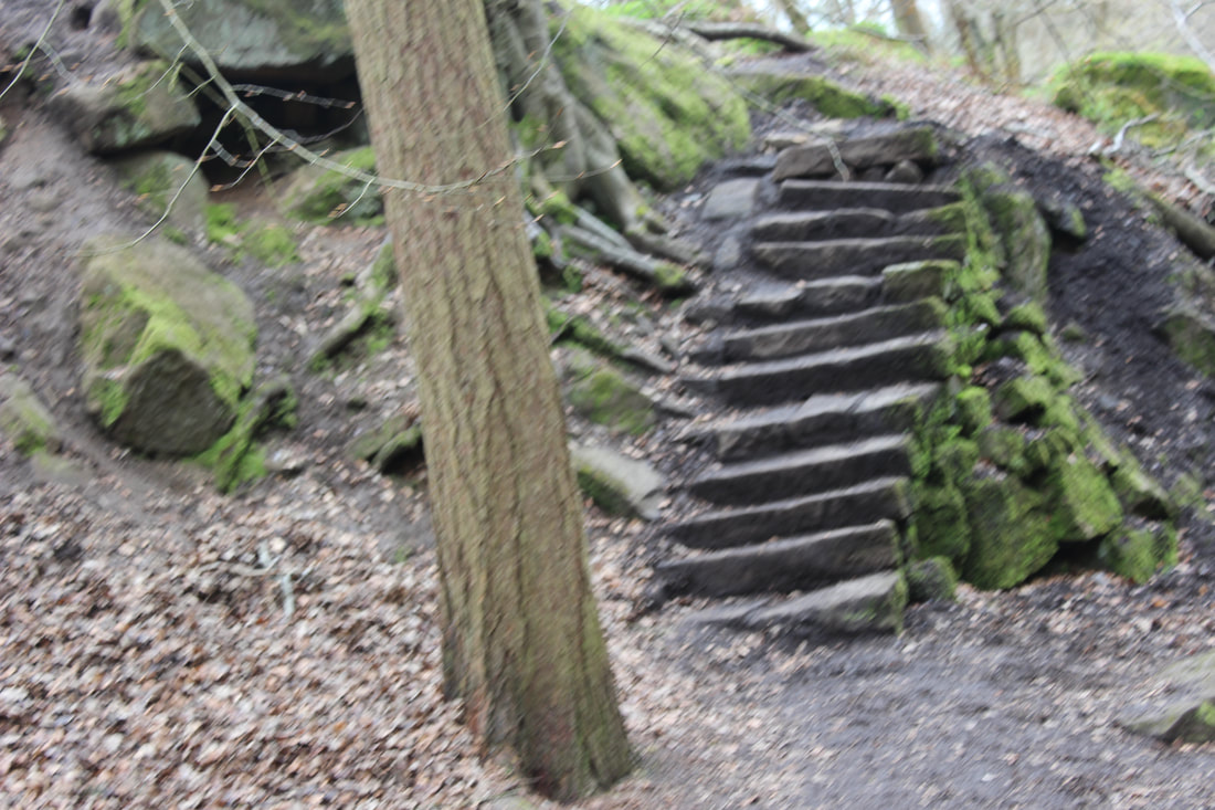
stairs
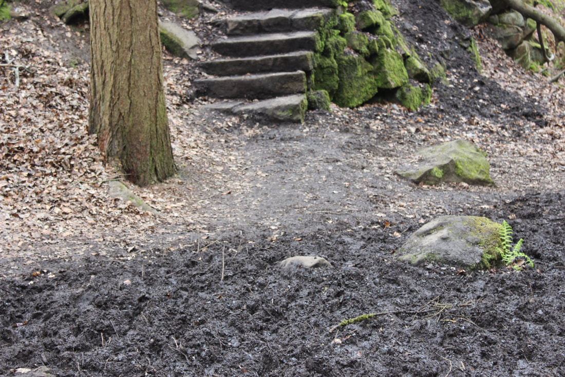
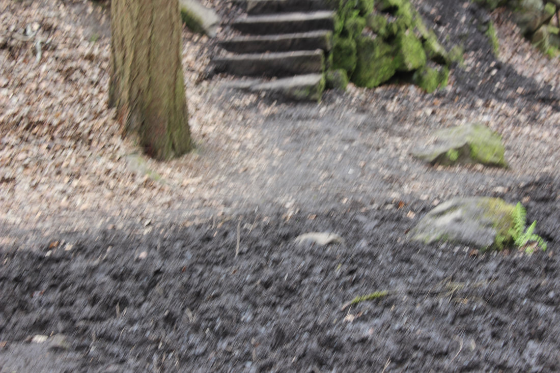
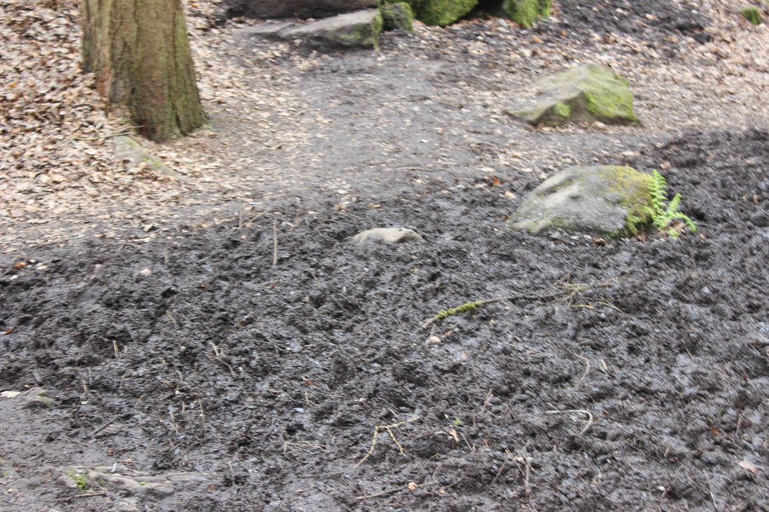
mud
moss wall in hole
editing my images
before
|
after
|
developing my ideas to extend my images
I would like to develop on double exposure and create more images around it. From this I would have a good collection of images to choose from for the final gallery. I chose double exposure because it was a harder skill to learn and I felt like I could have some good outcomes from this. I was able to use the pictures from Manchester in this project and images of people I took so that also helped me choose this.
tutorial i am using
Mood board
final gallary
|
  |
original |
editing |
final image
For this image I used an image of google for the forest so this shows I need to take more pictures like this so I can use this as my own image.
original |
   Editing |
final image
ORIGINAL |
    EDITING |
FINAL IMAGE
original |
   editing |
final image
original |
editing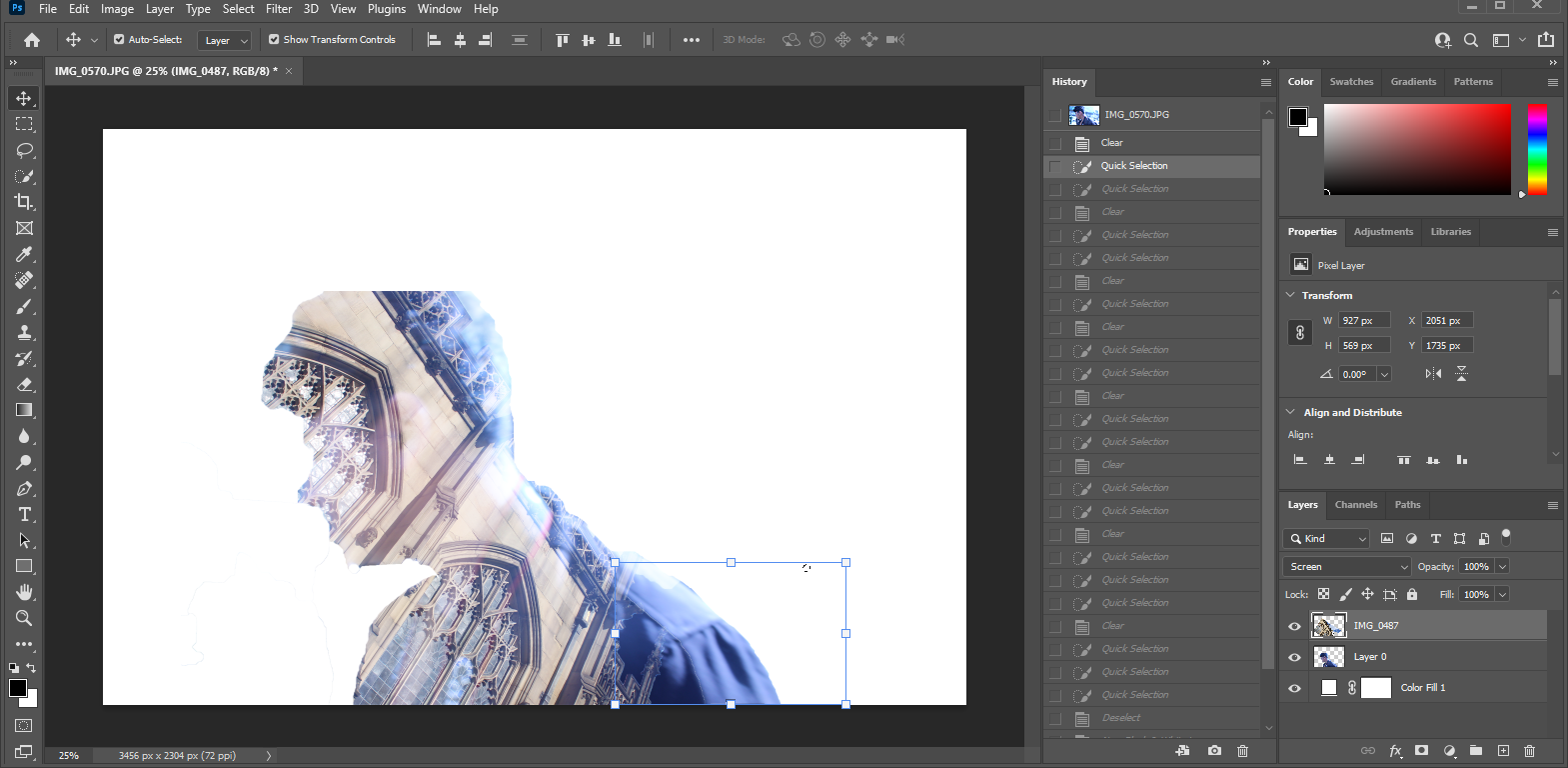 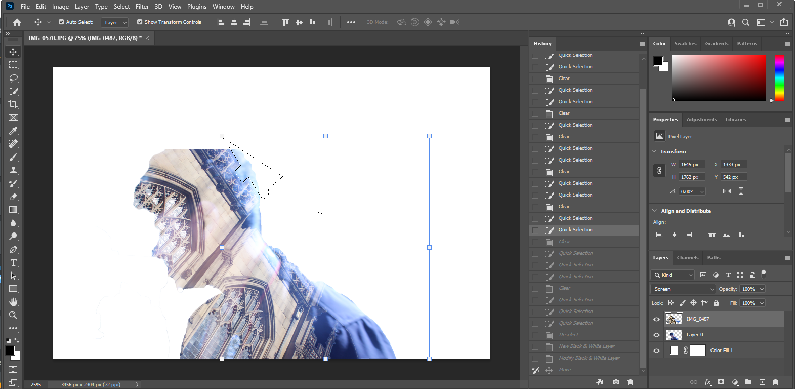 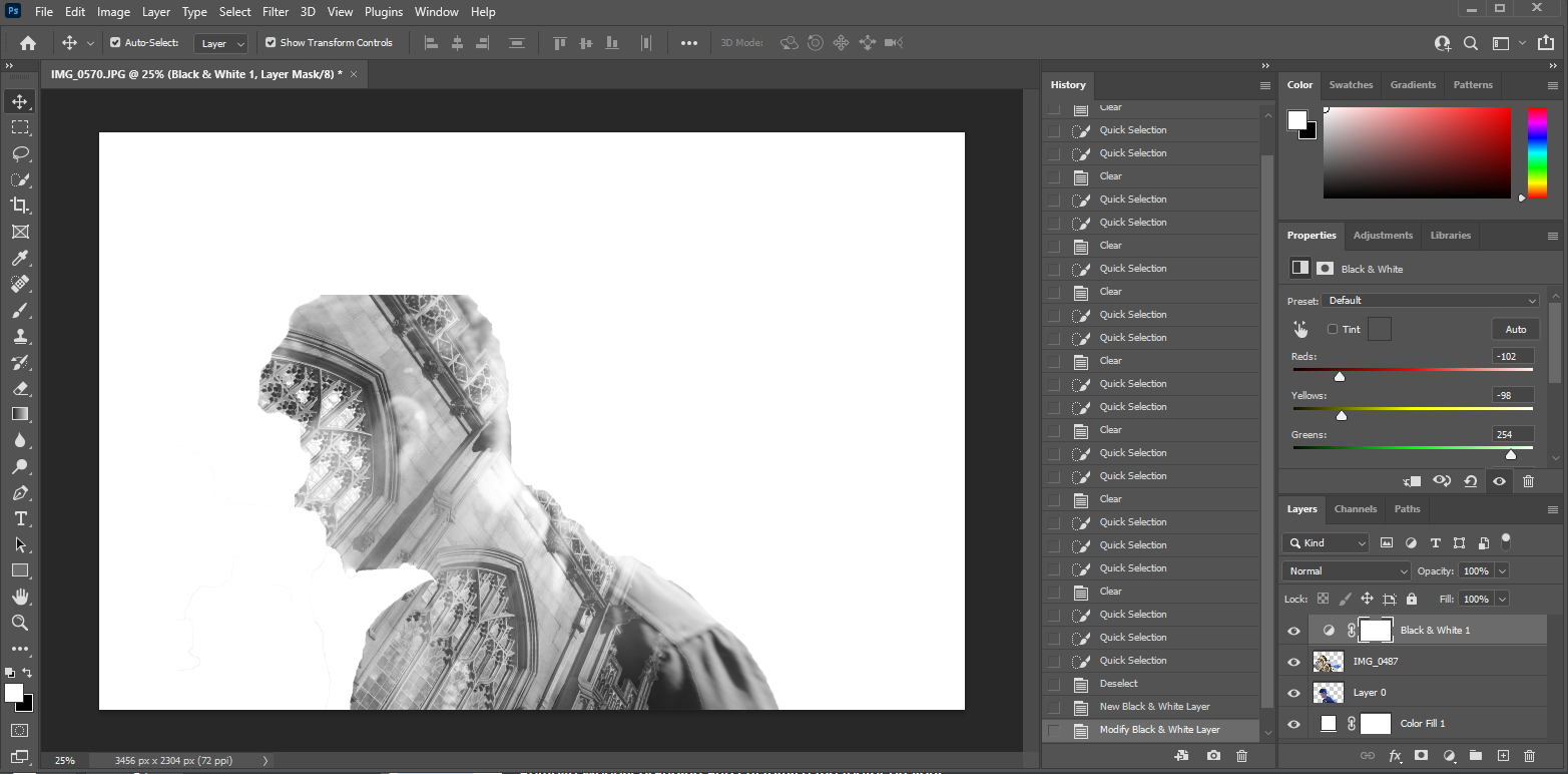 |
final image
Second shoot plan
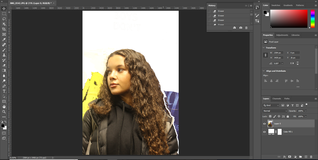
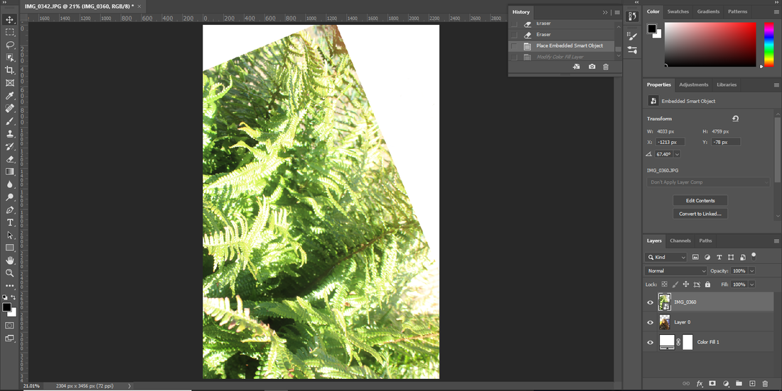
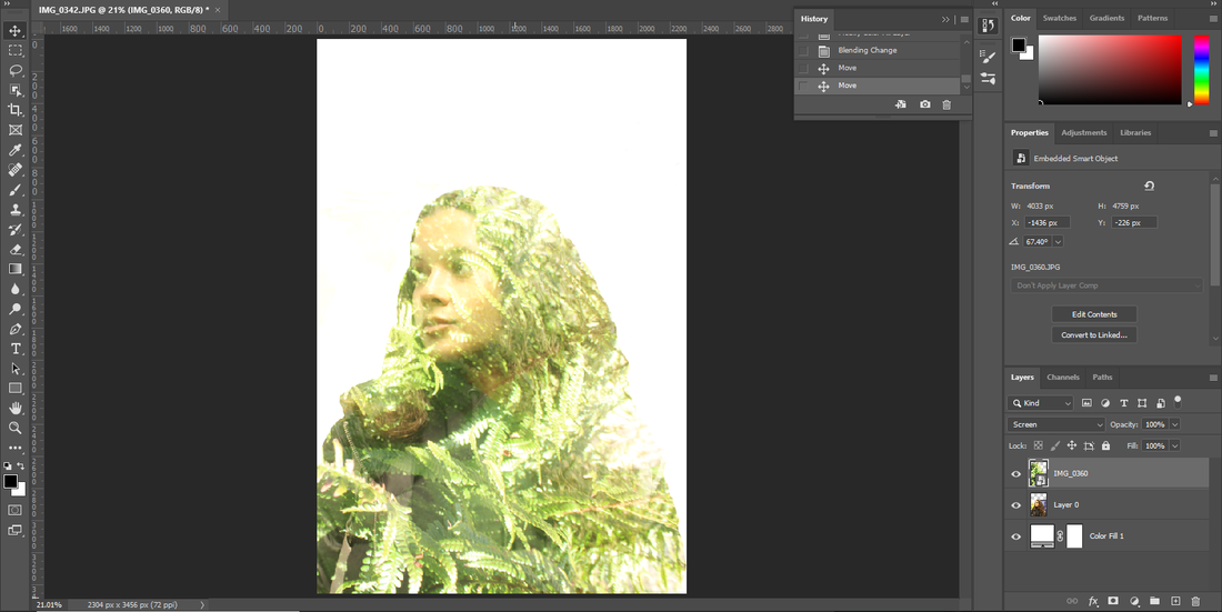
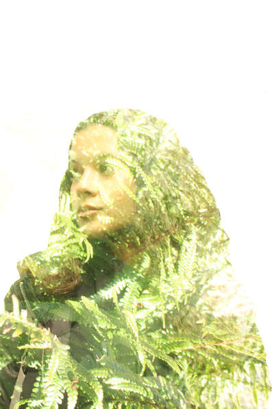
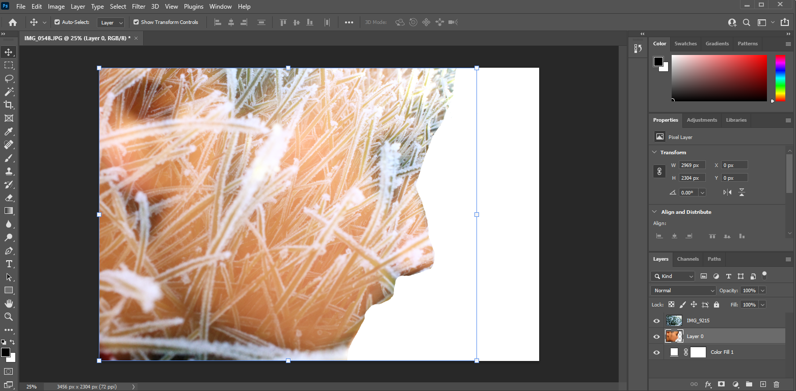
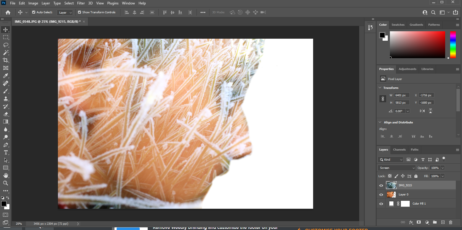
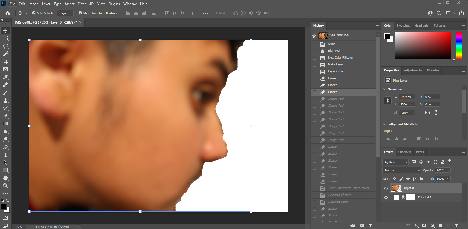
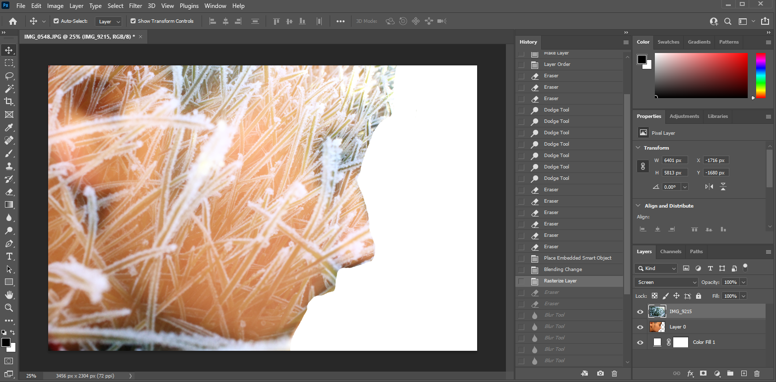
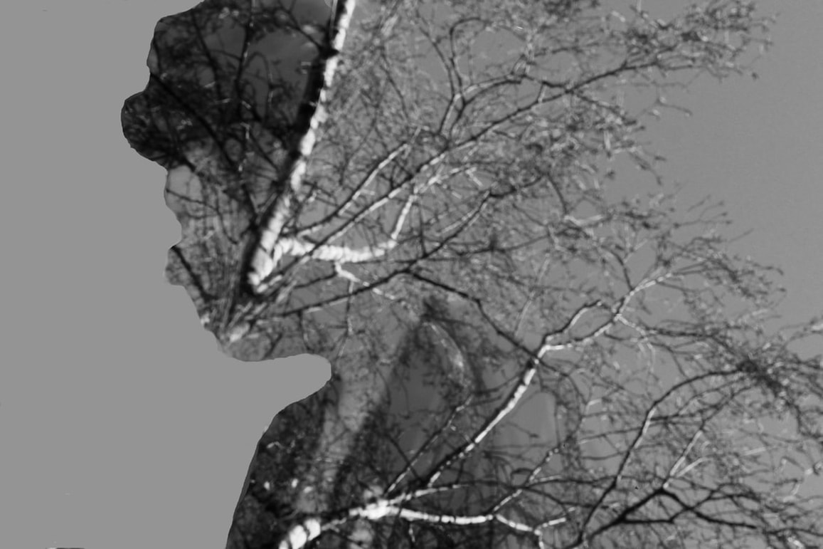
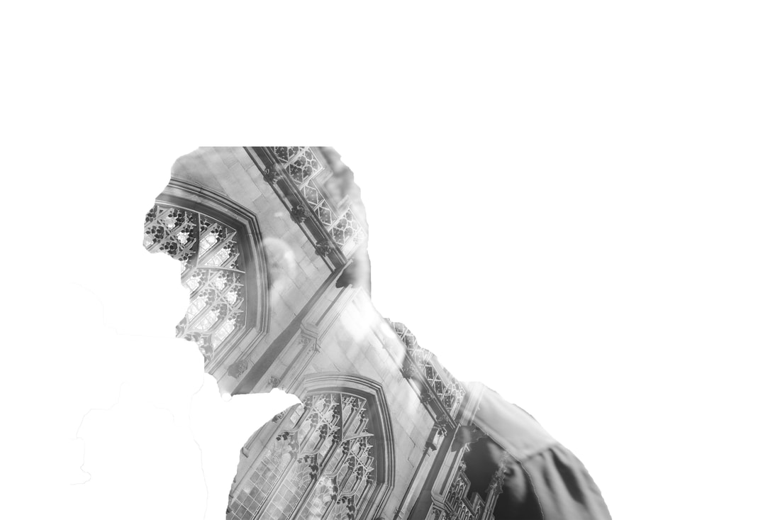
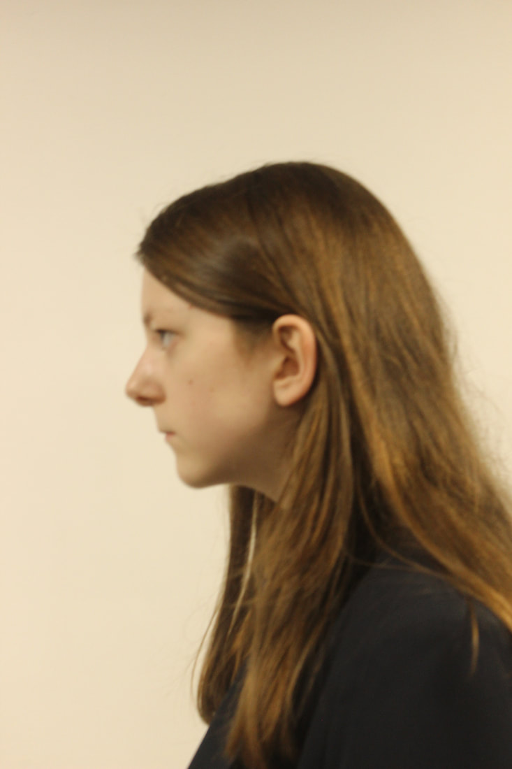
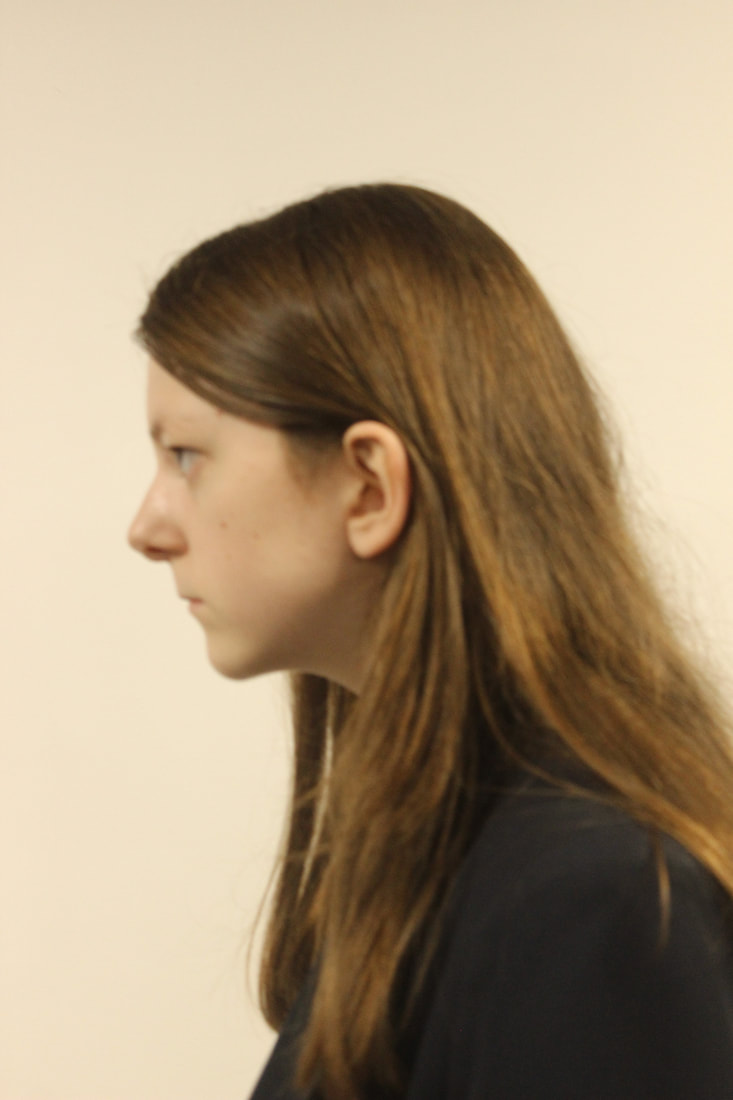
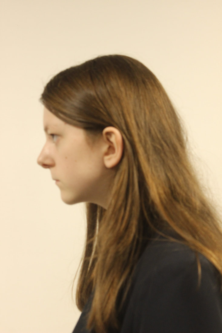
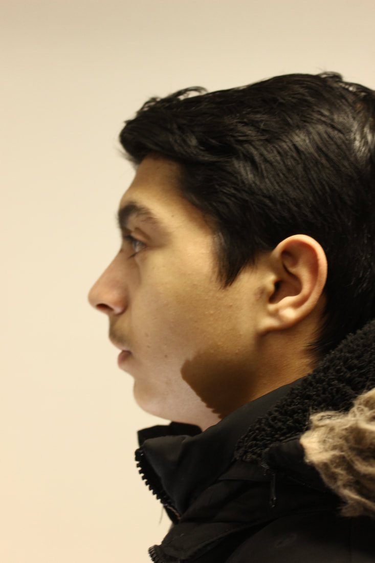
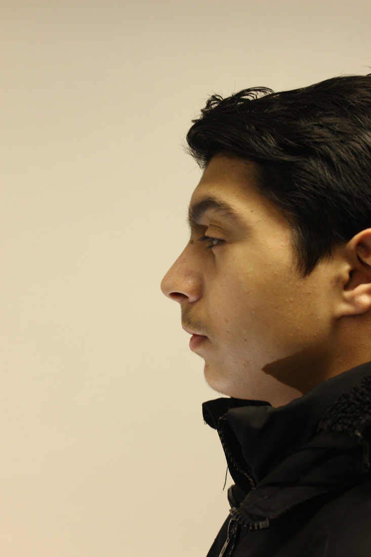
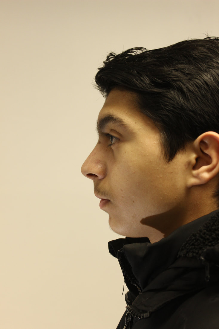
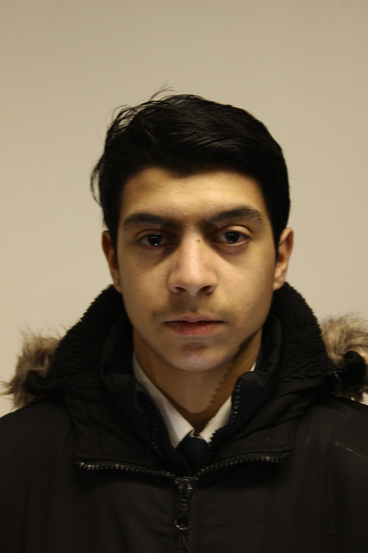
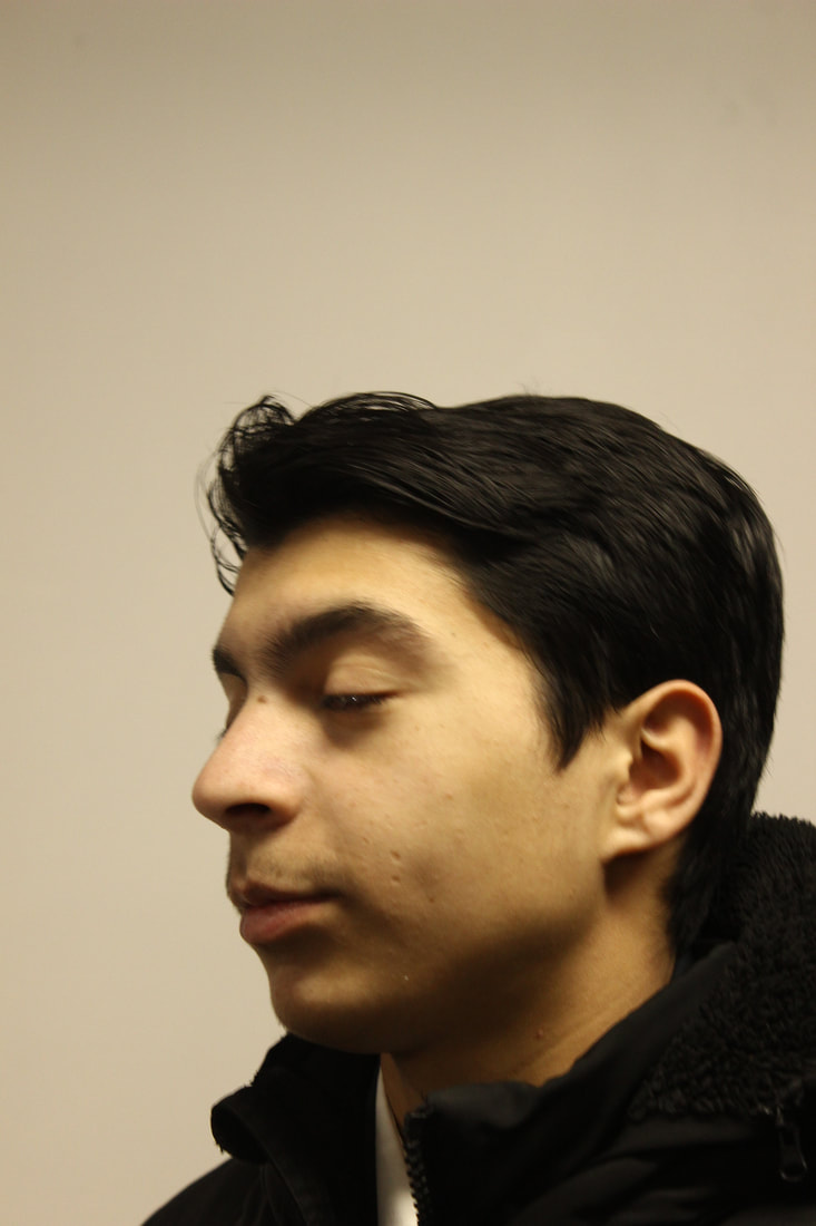
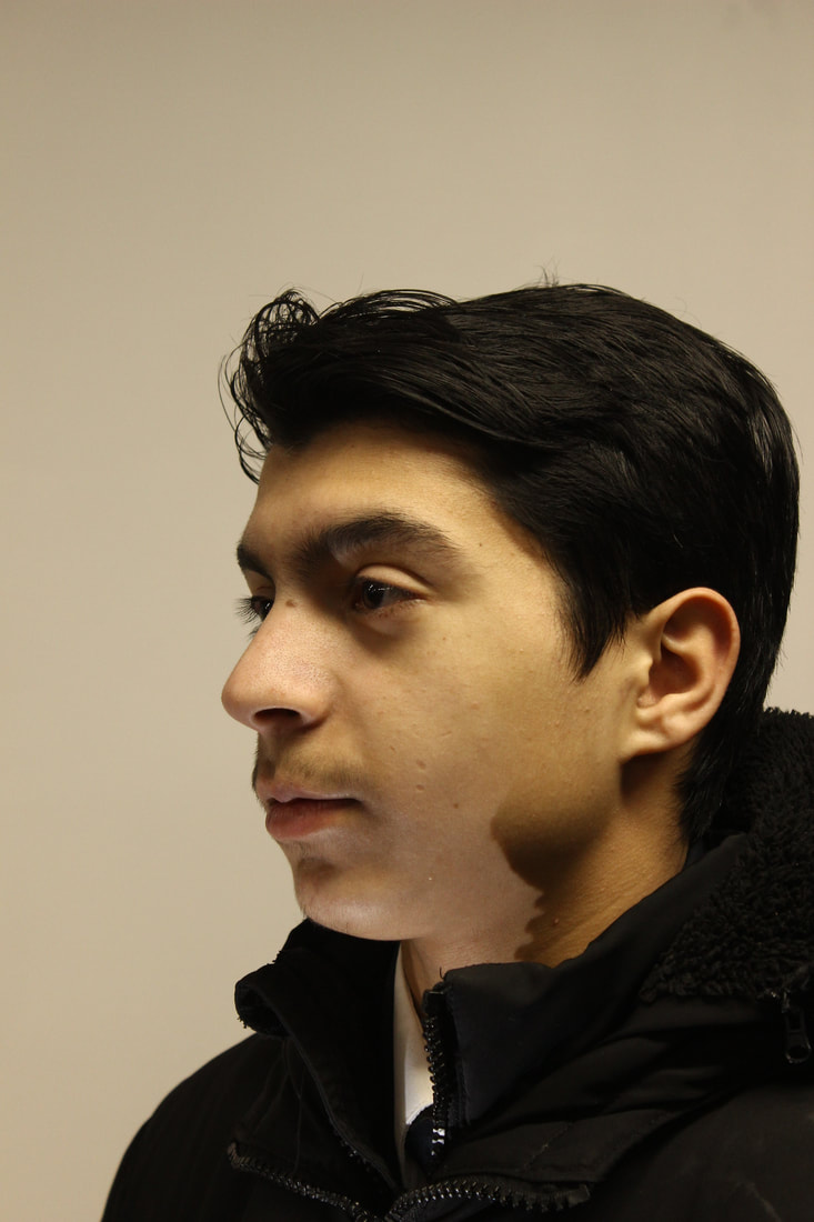
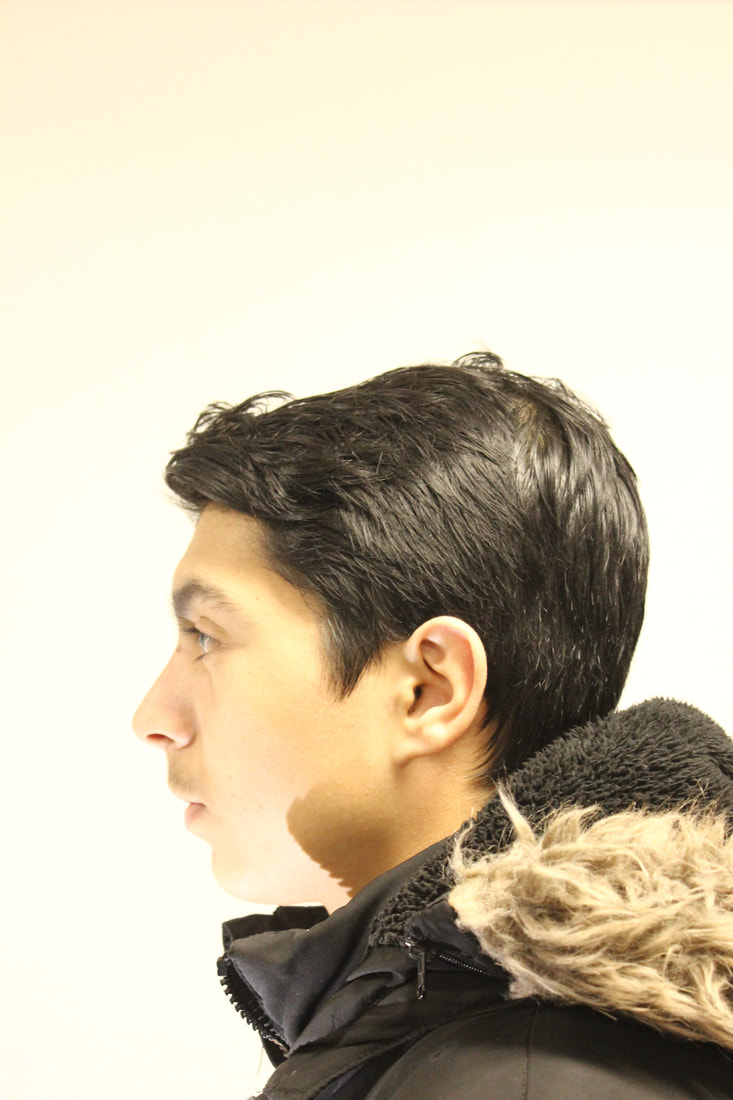
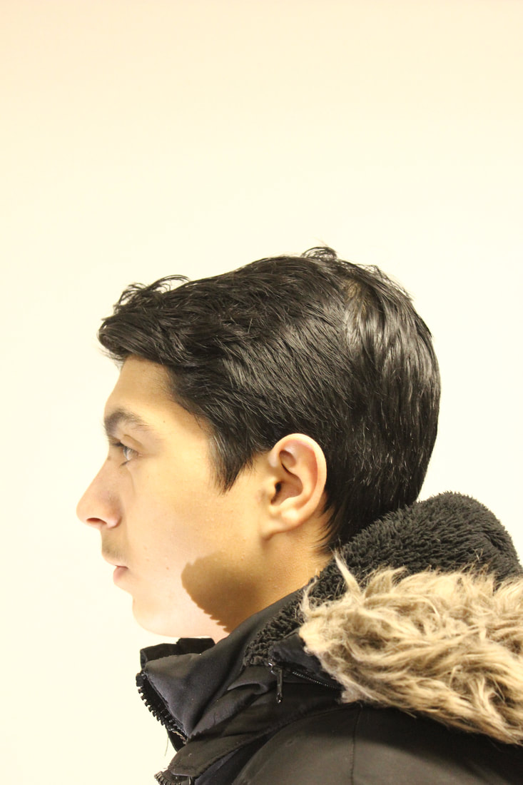
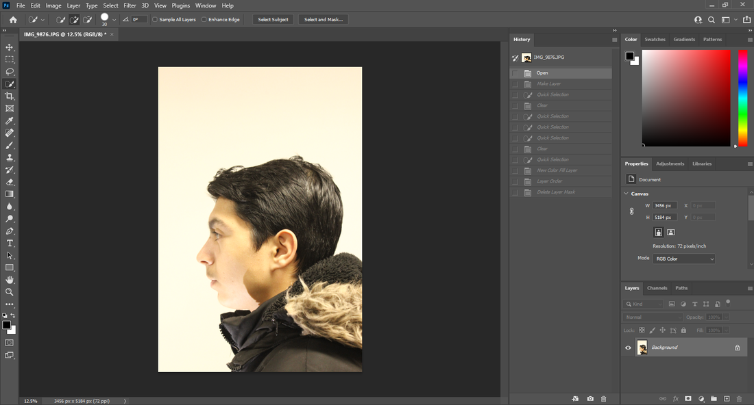
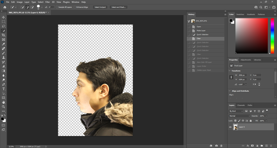
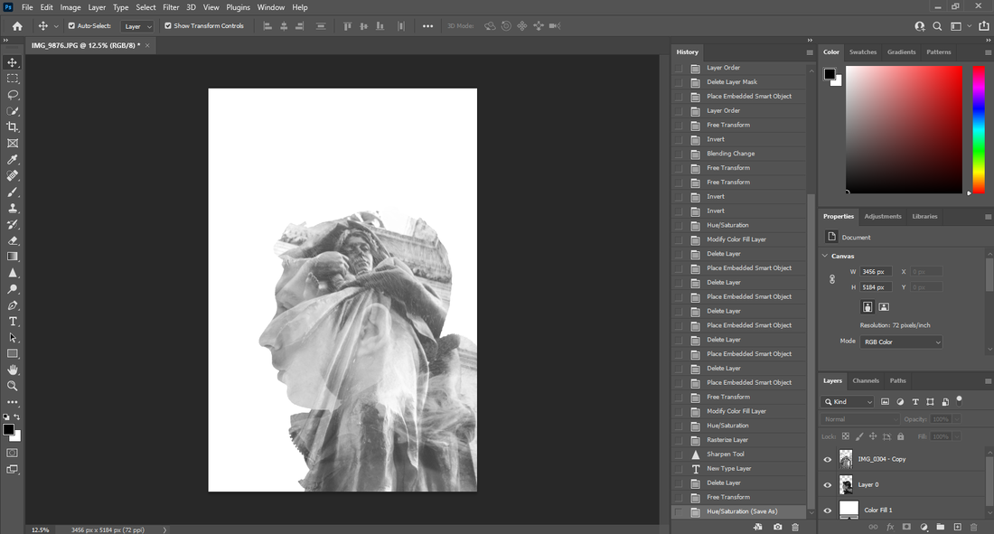
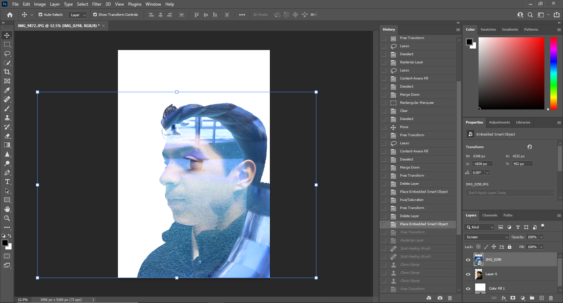
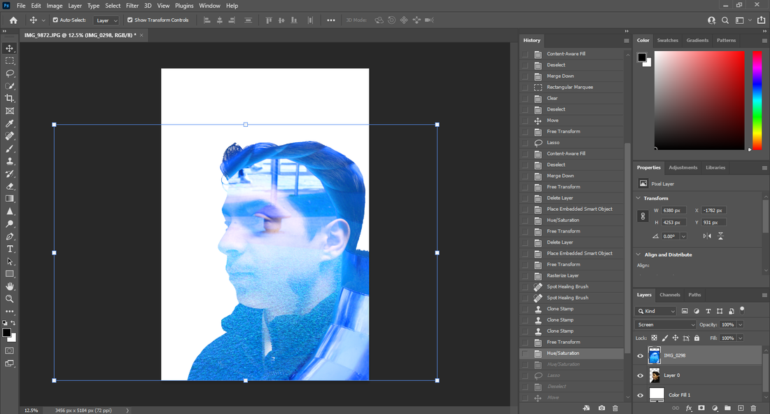
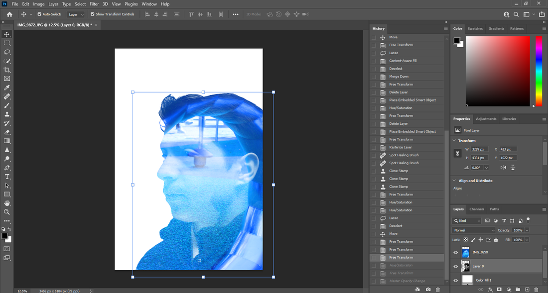
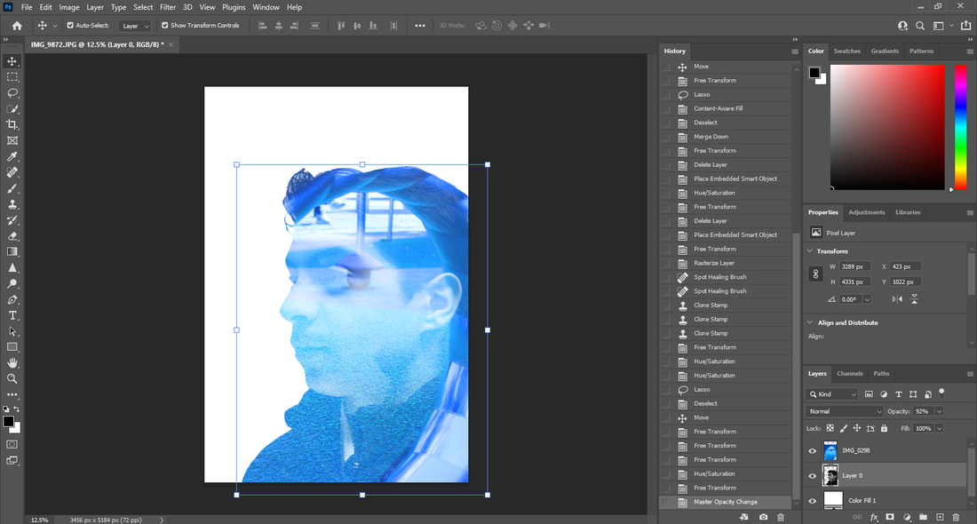
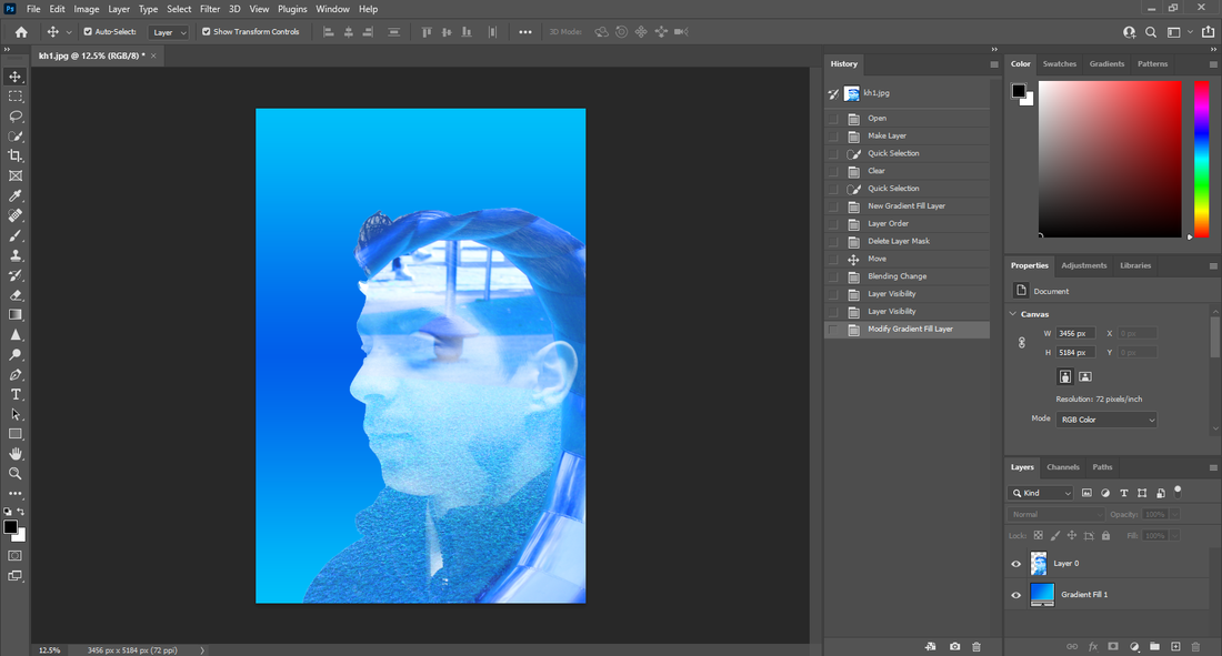
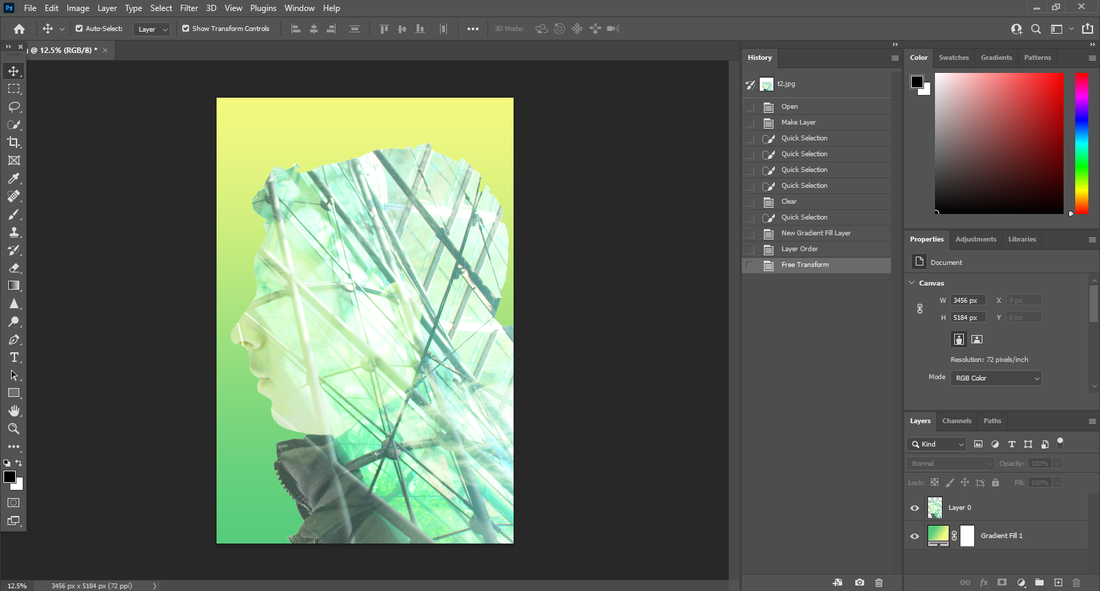
In this shoot I planned to use double exposure on my images so they have a better look on them and I can use my images of plants and more in the same photo. for these images I got a camera and a model and began to take photos to get a new person for double exposure. I planned this by preparing the background and getting the camera in the right settings. I then got lights and shined them on the person to make the background and the model more bright as the room was dark. Then I got different angles of the head to get a different perspective from just the side like I had before. The images were blurry and too close before, so that is the reason I did this shoot. I intend to use these images in my final gallery so they had to be good quality and not blurry and out of focus. I had to be careful with the lighting because if I used it too bright then it would be harder to cut out the background and separate from the model. I had to keep the camera still and make sure to not move when taking the photo because then it would be blurry and it would not have the same effect as a normal in focus image. I used the daylight white balance because the room was dark and this helped balance the lighting so you can see it well. I had the ISO in the middle because the white balance had already done the lighting I needed for this shoot. I used shutter speed of 1/125 because it is a good speed for indoors and a good speed to aim for these images. I did not use the flash on the camera because it would have been too bright. I did not use auto focus on the lens because when I tried it did not give me the same effect as when I manually changed the lens so I did not use auto focus. I had to get close up to the model but not too close because I needed the whole head in focus but it needed to be close enough to use in photoshop without struggle.
   |
                |

original |
       editing |
final image
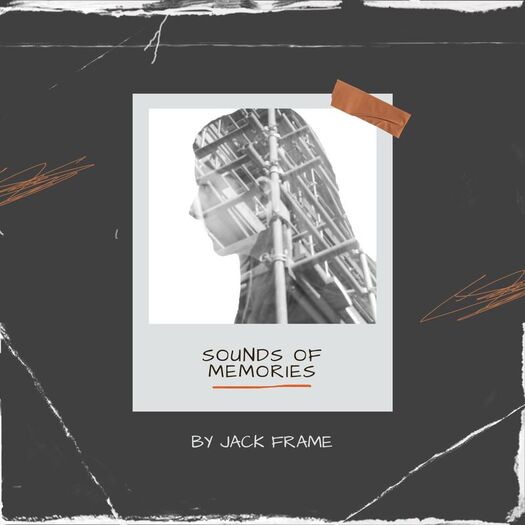
for this image I used the image I had made, then I put it into a template to get the album cover.
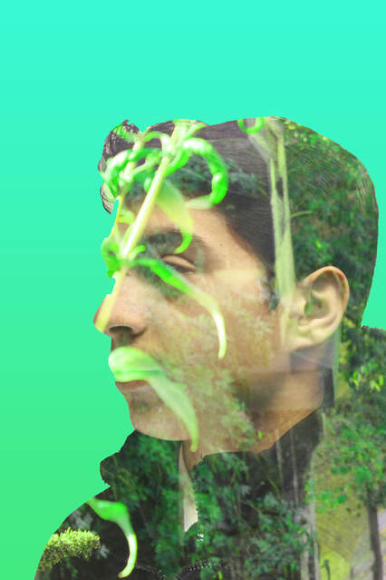
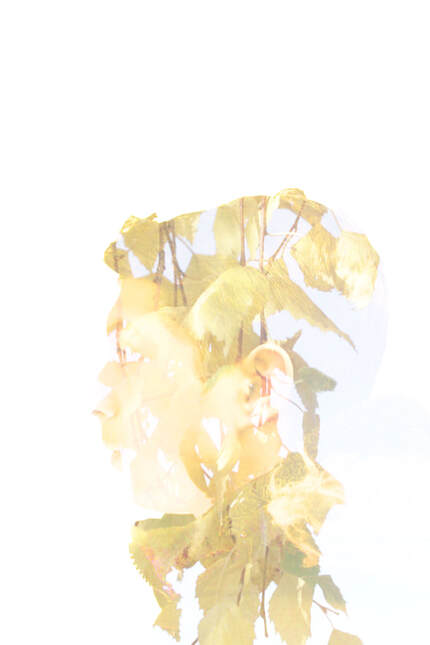
I have made this personal by using natural texture on a young persons face. By using a young person's face I have shown the potential of life and future. By putting natural texture on the young person I have shown that nature has life and a lot of potential which has comparisons to the young person. Nature at the moment is being destroyed at a rapid rate so I have taken images of nature to show how much life is left in it. The youth of this generation are the ones who should save the nature in the world so I have put the two together to have a personal statement on my images. There is a change in weather due to global warming so I have used different weathers in my images to show how fast it is changing from warm and sunny to cold and snowy. Emotions can show a change in weather so I have used darker colours on the snow pictures and brighter colours on the hot images.
original image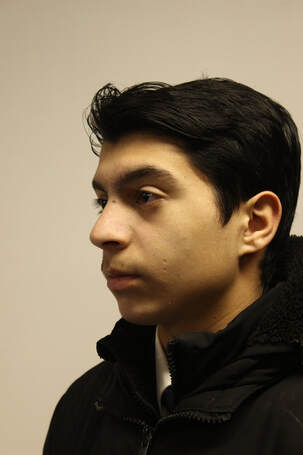
|
photoshop   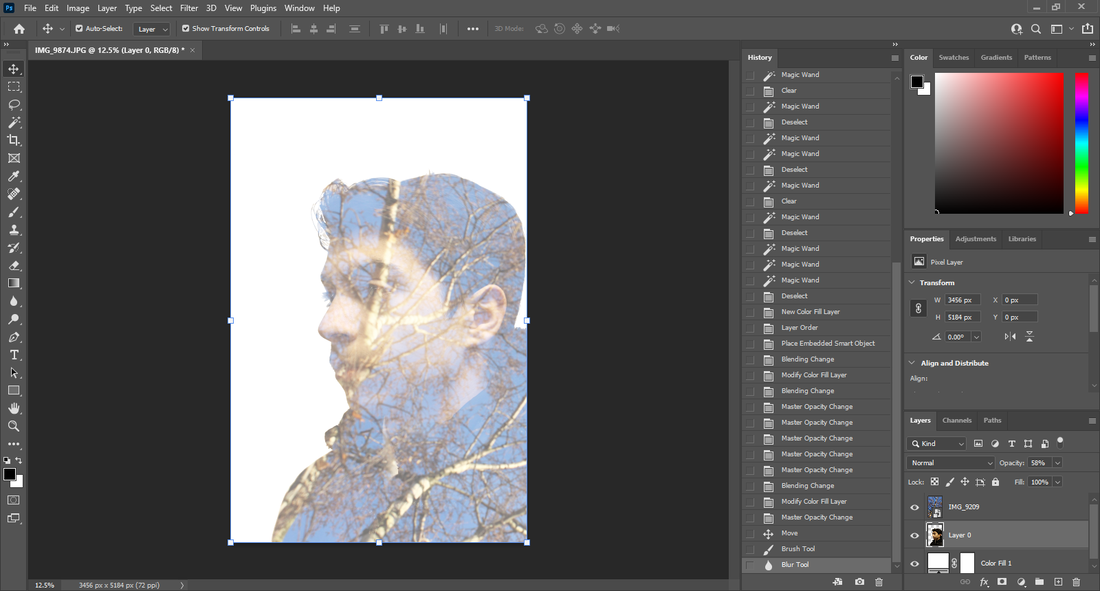 |
final image
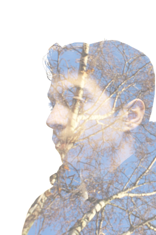
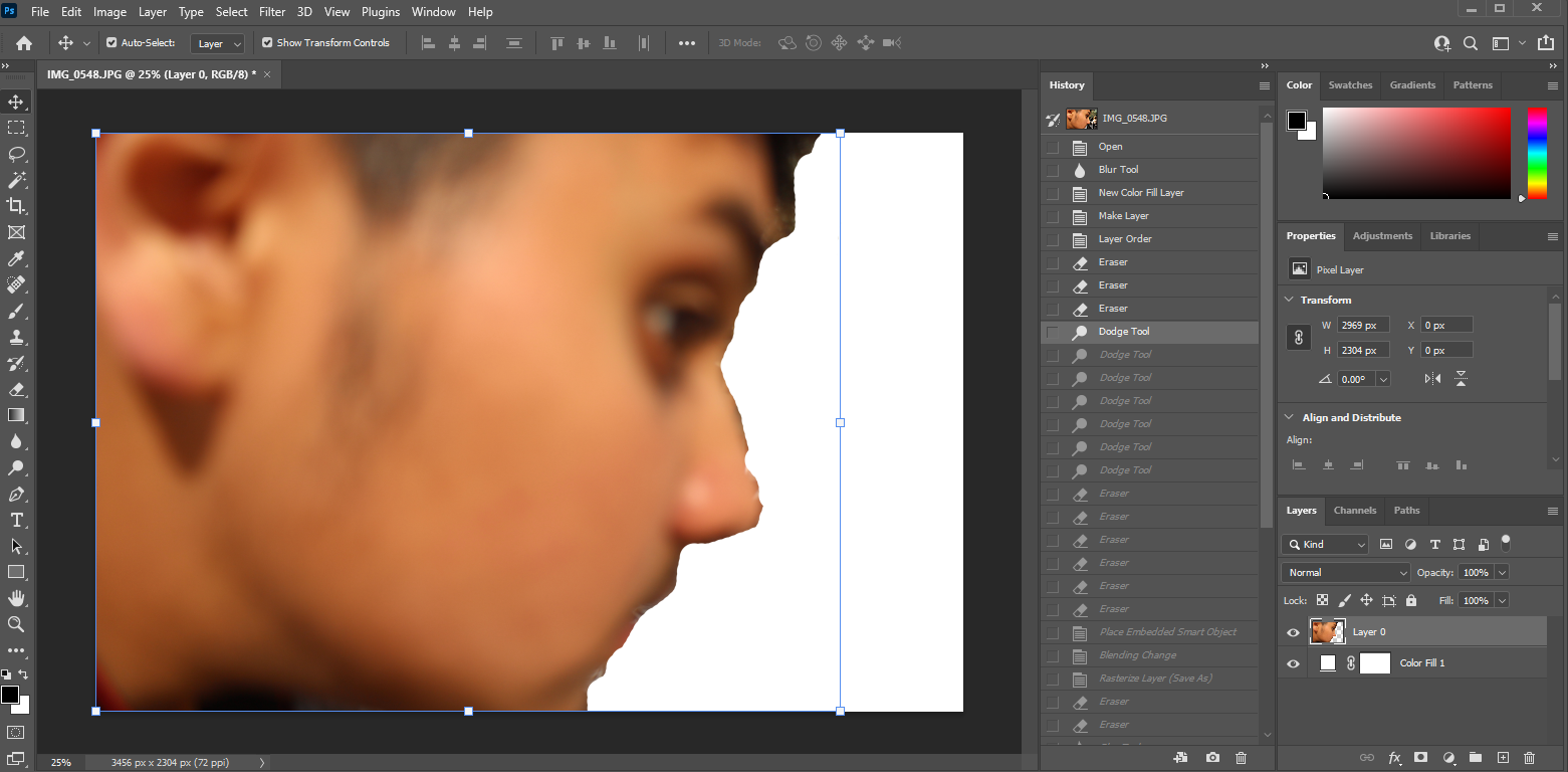
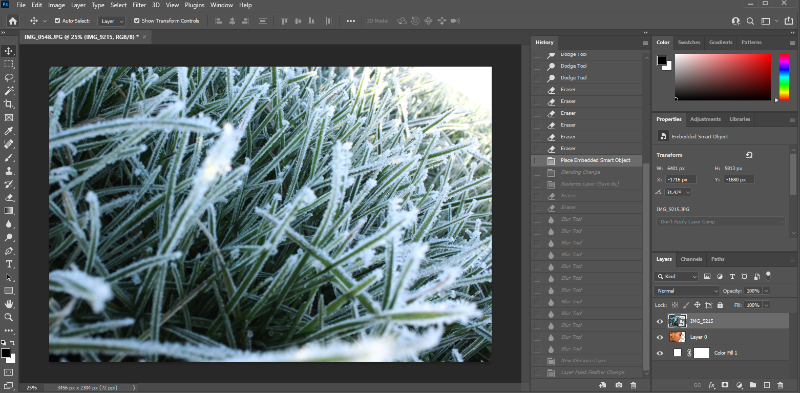
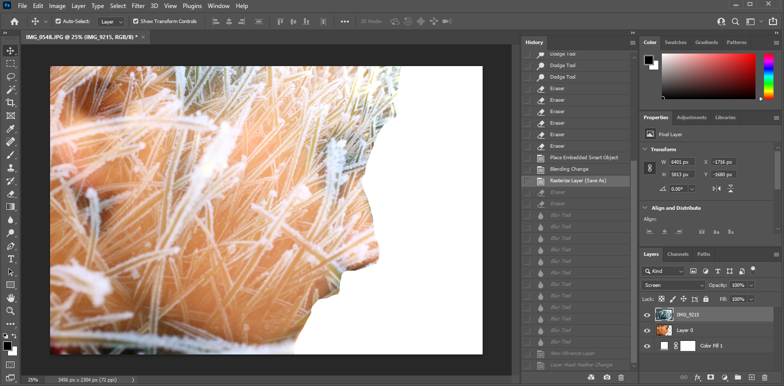
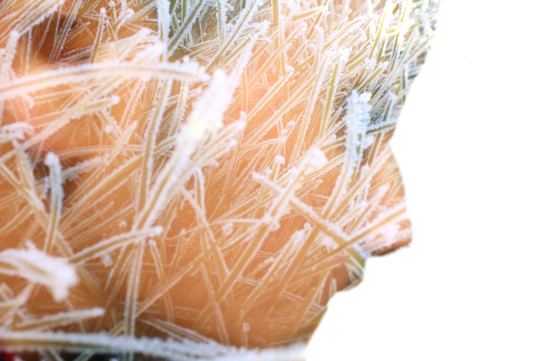
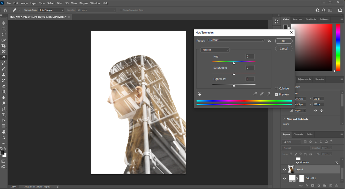
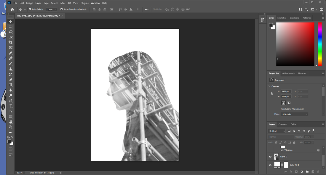
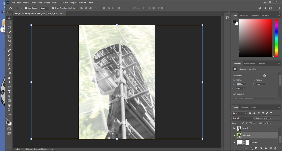
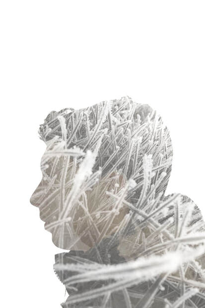
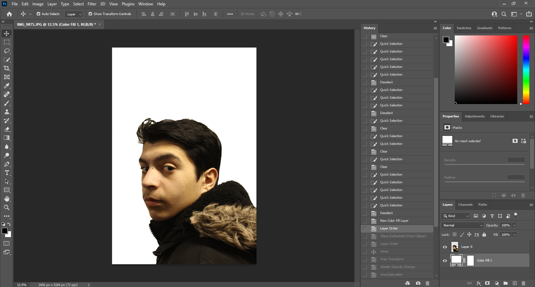
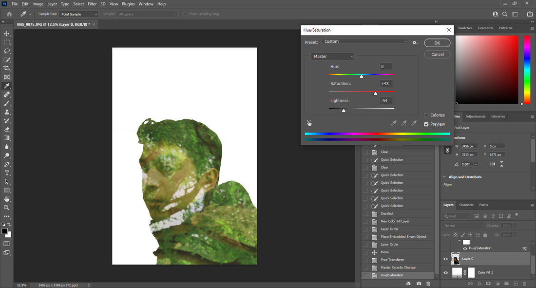
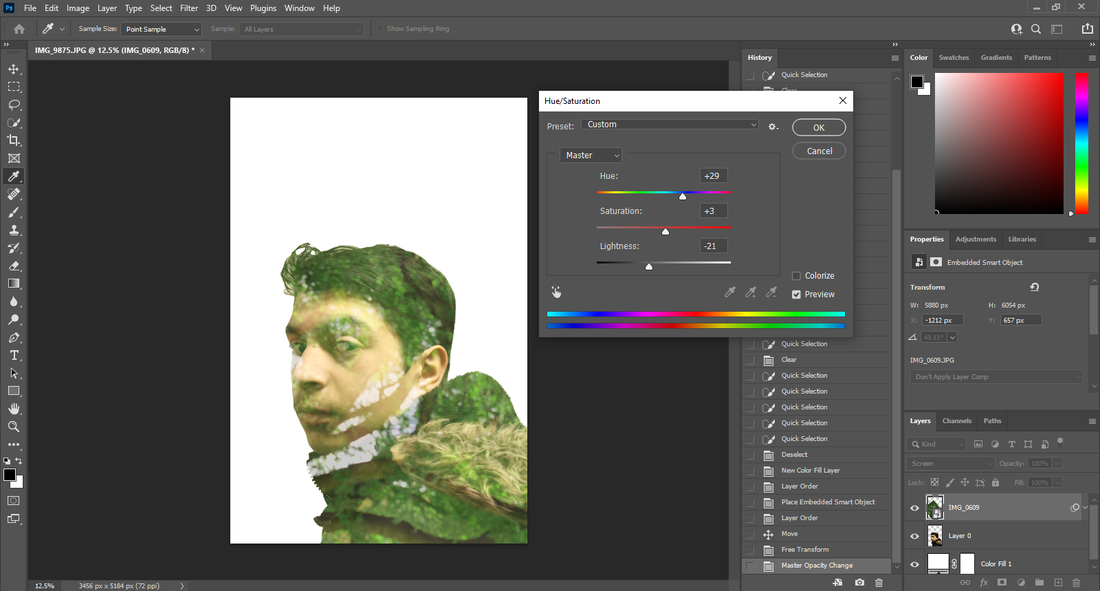
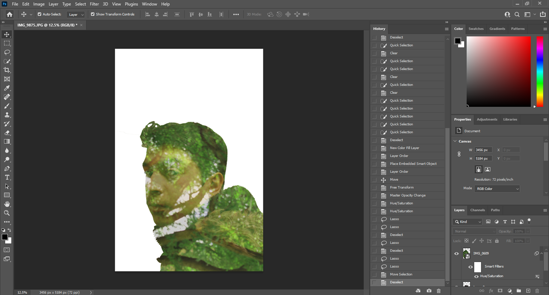
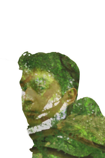
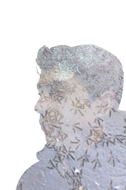
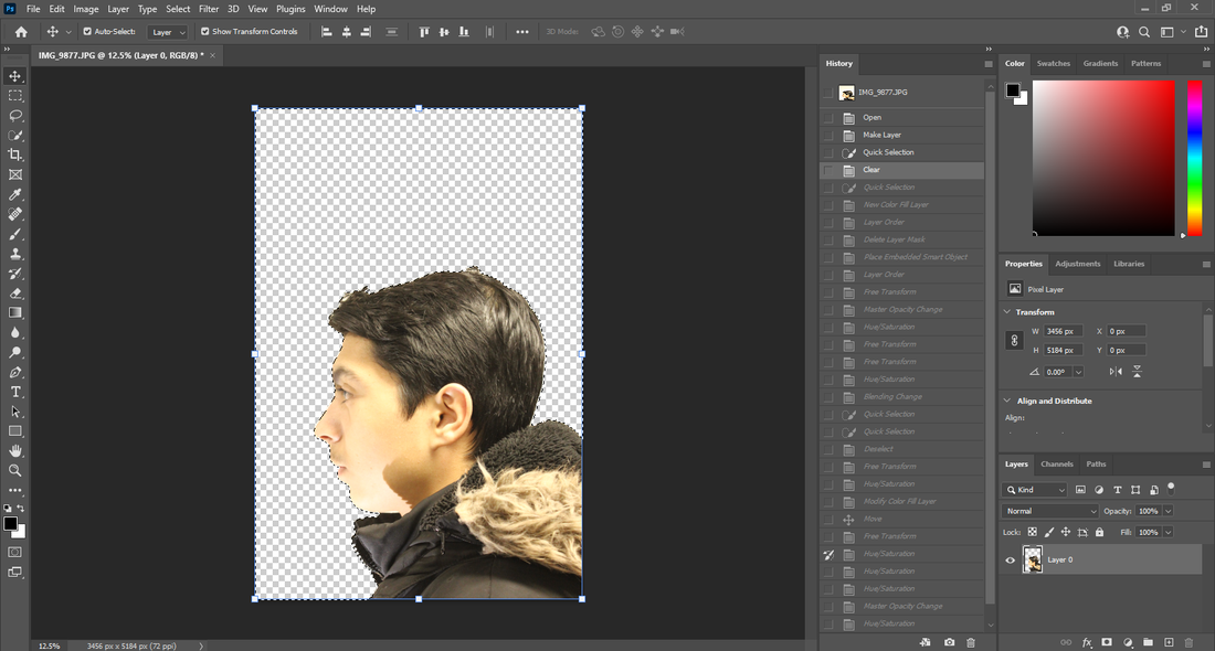
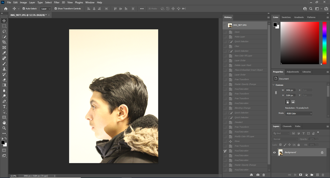
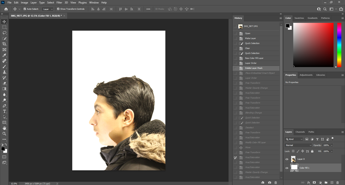
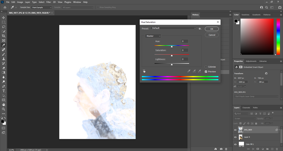
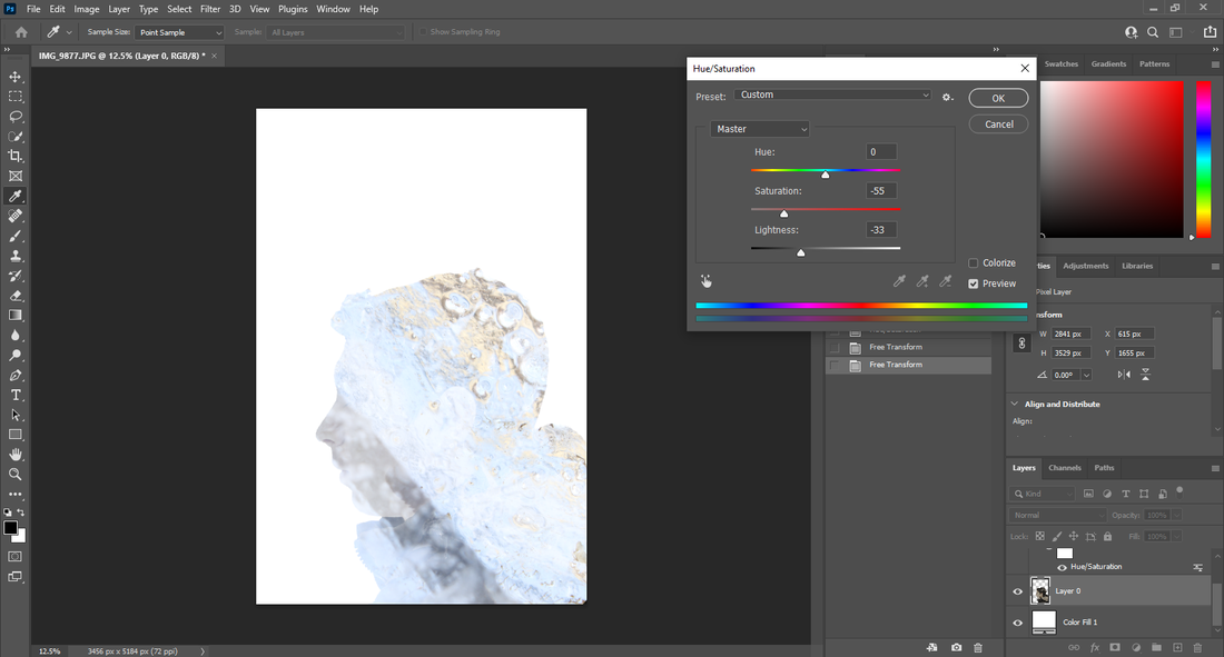
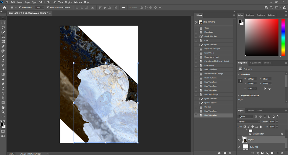
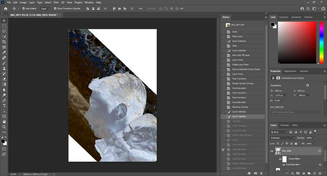
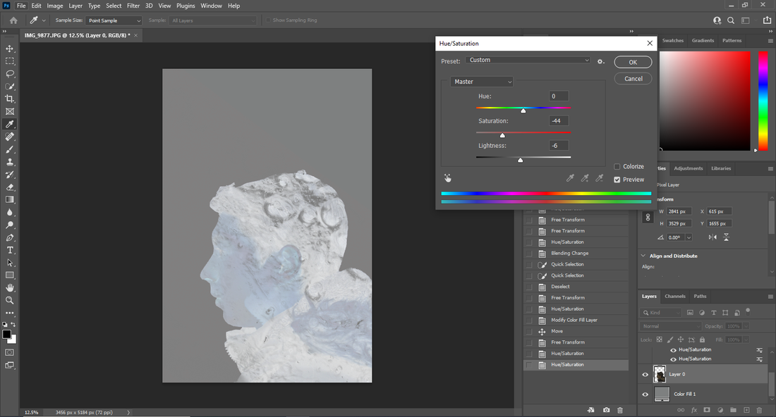
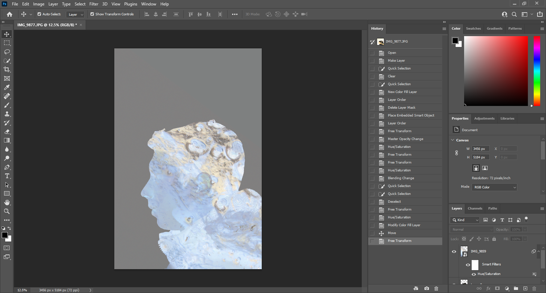
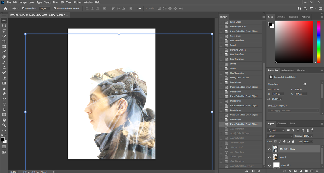
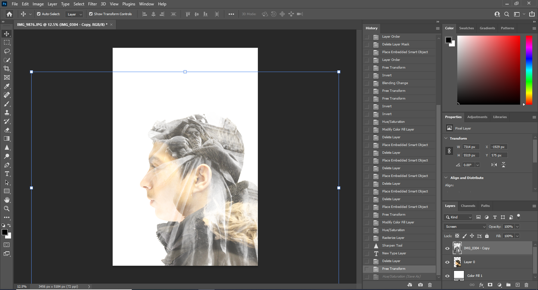
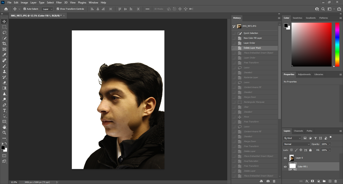
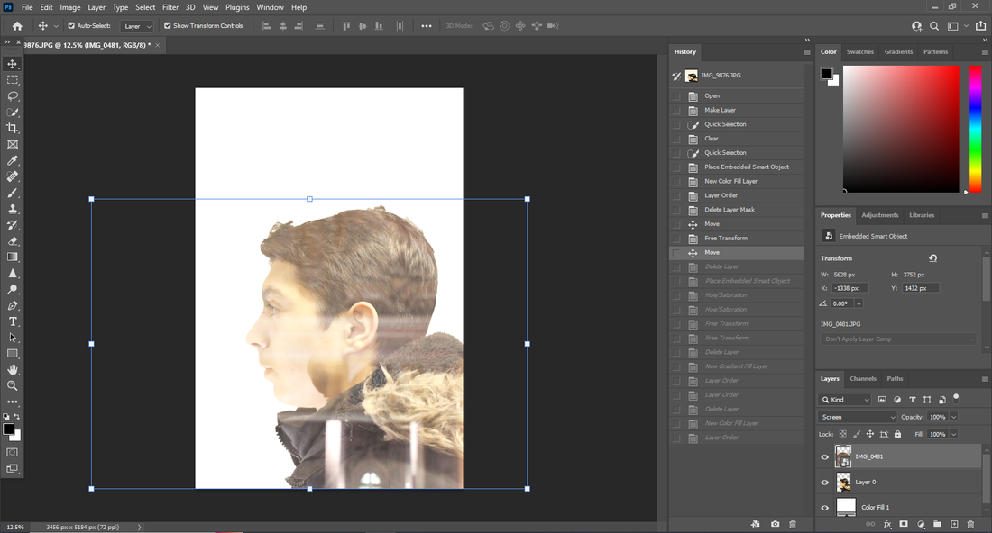
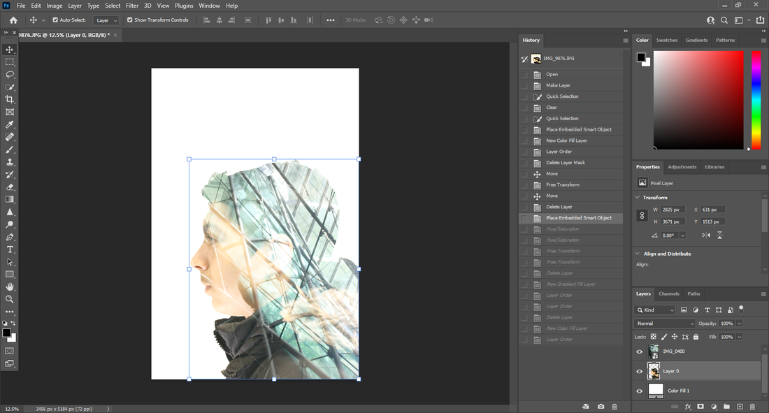
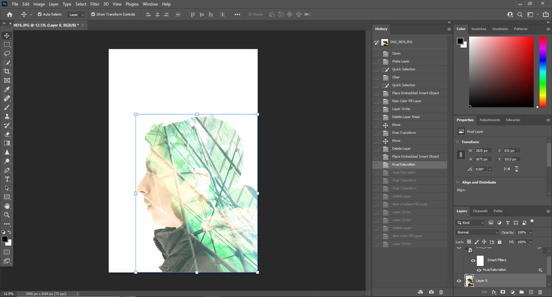
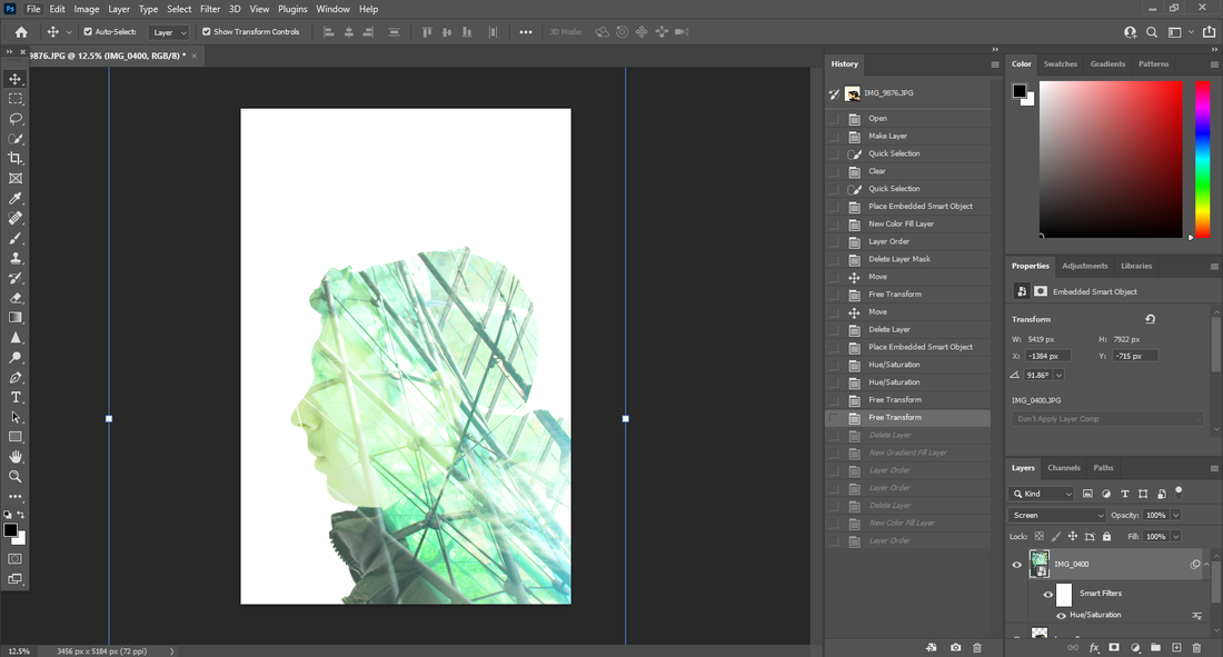
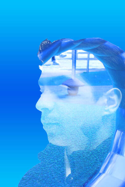
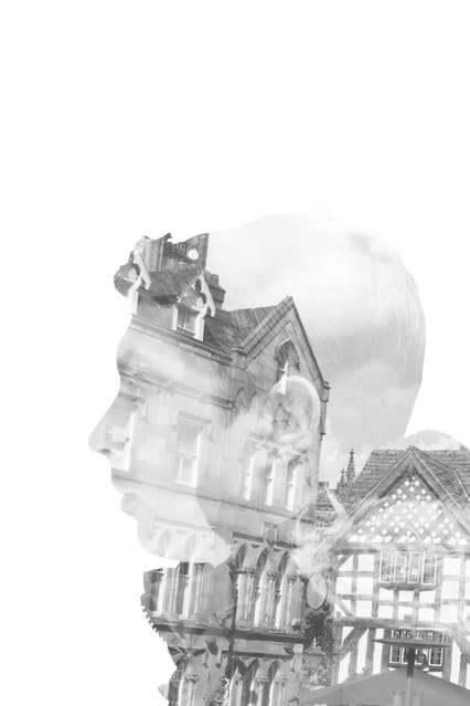
I put the image into photoshop, used the quick select tool to crop out the person, then I used the solid colour tool to have the background, I then dropped the image of the the tree branches into the software, then I put the image above the person and changed the opacity and cut around the person. I then changed the colours with the hue/saturation tool then saved the image as a JPEG.
original image
|
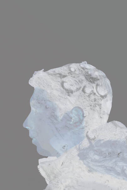
photoshop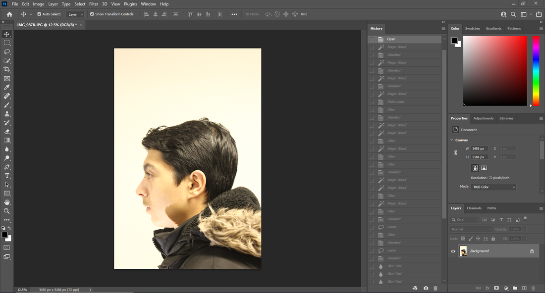 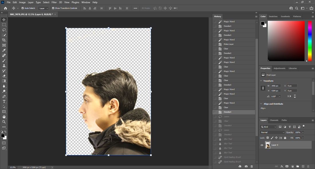 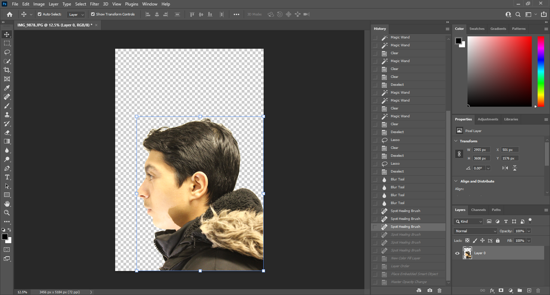 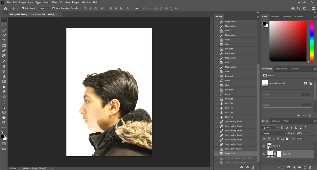 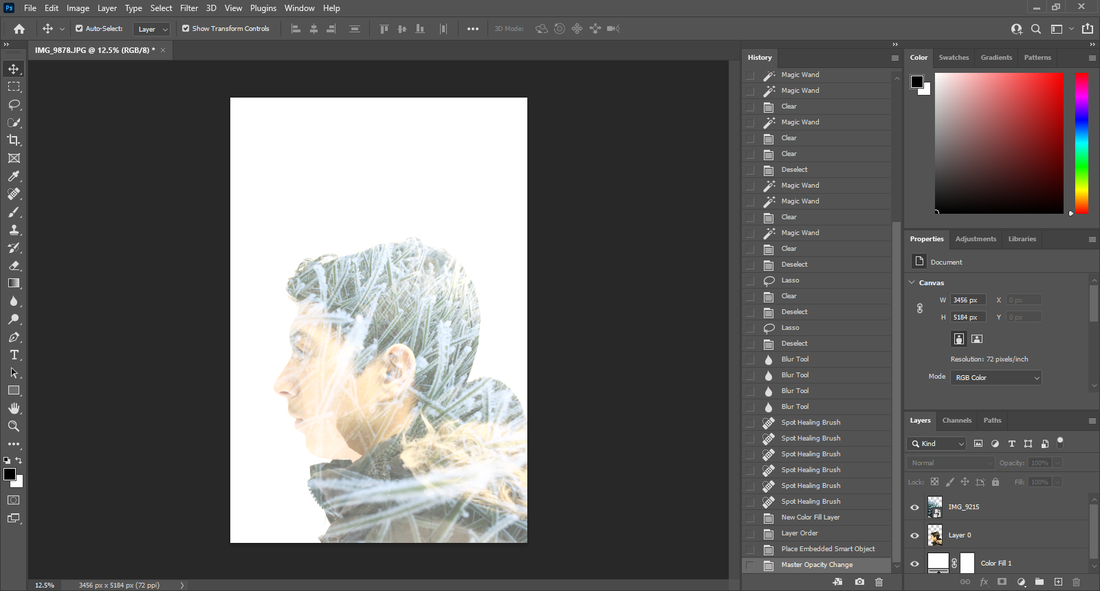 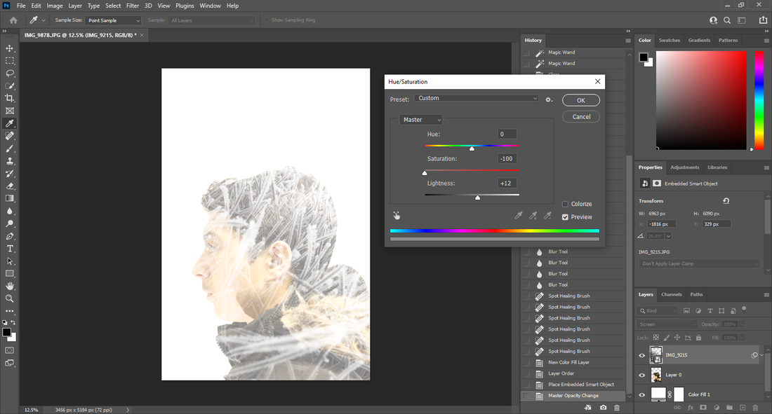 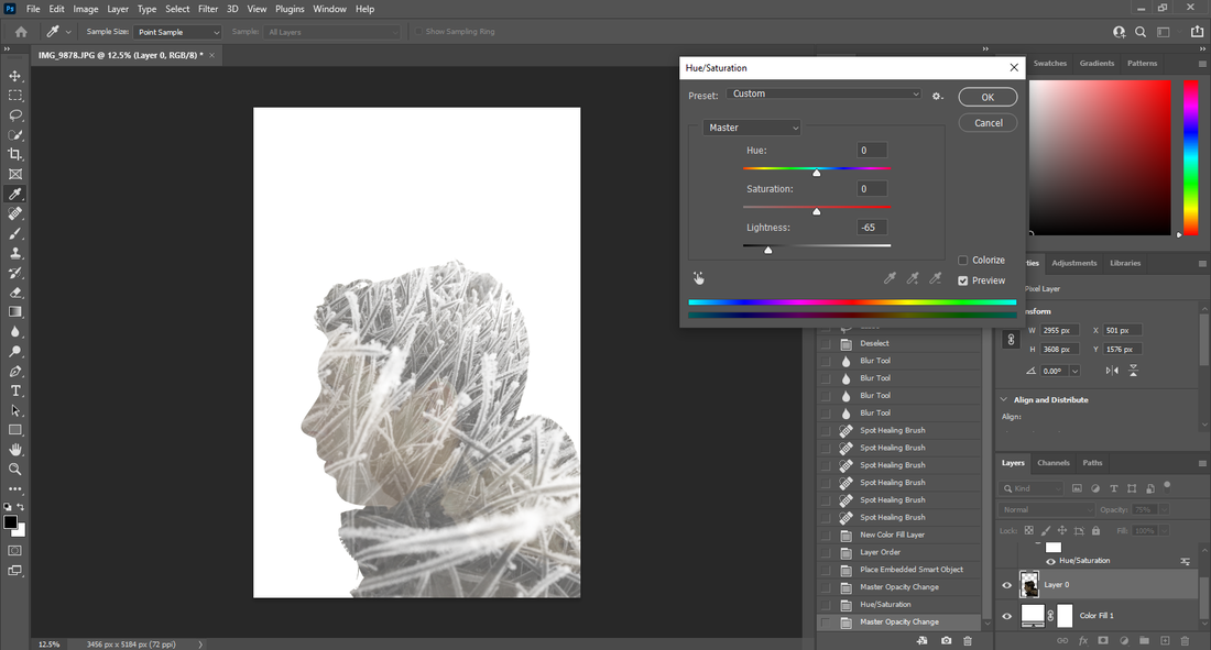 I have experimented with the saturation in this image because the ice looked nicer when it was white and the person blended nicely with the black filter.
|
final image
I put the image into photoshop, used the quick select tool to crop out the person, then I used the solid colour tool to have the background, I then dropped the image of the the snow into the software, then I put the image above the person and changed the opacity and cut around the person. I then changed the colours with the hue/saturation tool then saved the image as a JPEG.
original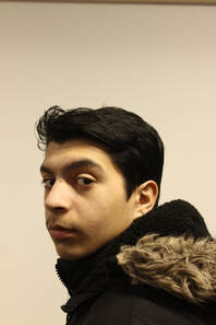
|
photoshop |

final image
I put the image into photoshop, used the quick select tool to crop out the person, then I used the solid colour tool to have the background, I then dropped the image of the the leaves into the software, then I put the image above the person and changed the opacity and cut around the person. I then changed the colours with the hue/saturation tool then saved the image as a JPEG.
original
|
photoshop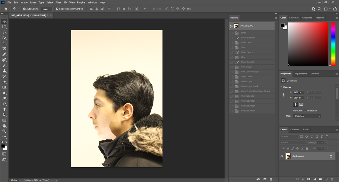   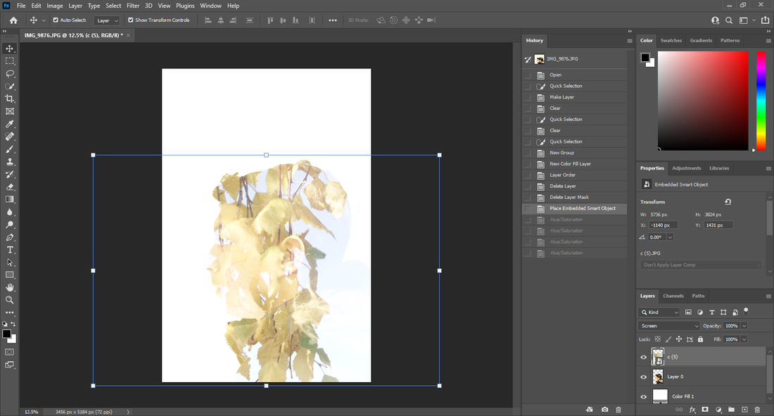 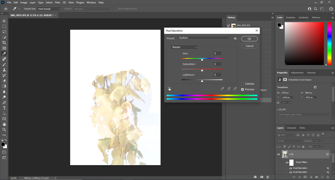 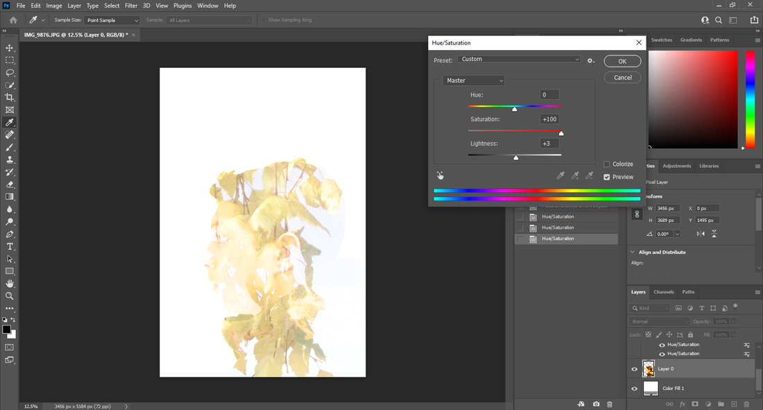 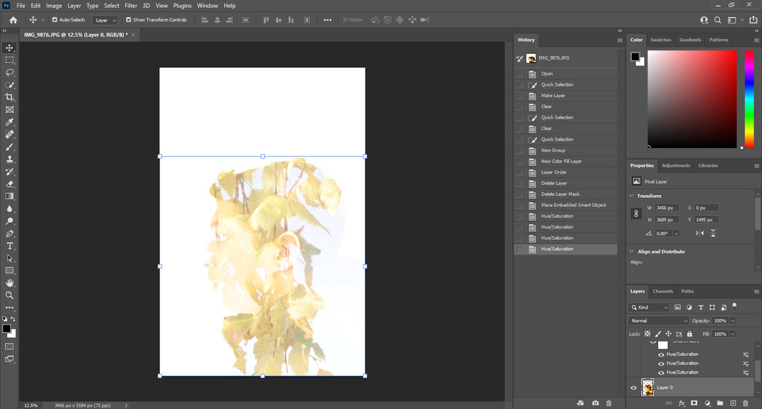 |
final image

I put the image into photoshop, used the quick select tool to crop out the person, then I used the solid colour tool to have the background, I then dropped the image of the the leaves into the software, then I put the image above the person and changed the opacity and cut around the person. I then changed the colours with the hue/saturation tool then saved the image as a JPEG.
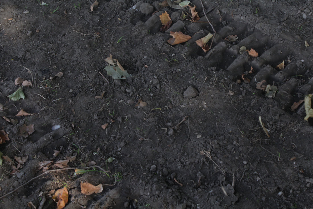
original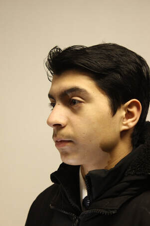
final image |
photoshop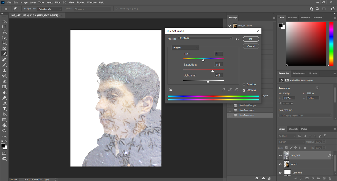 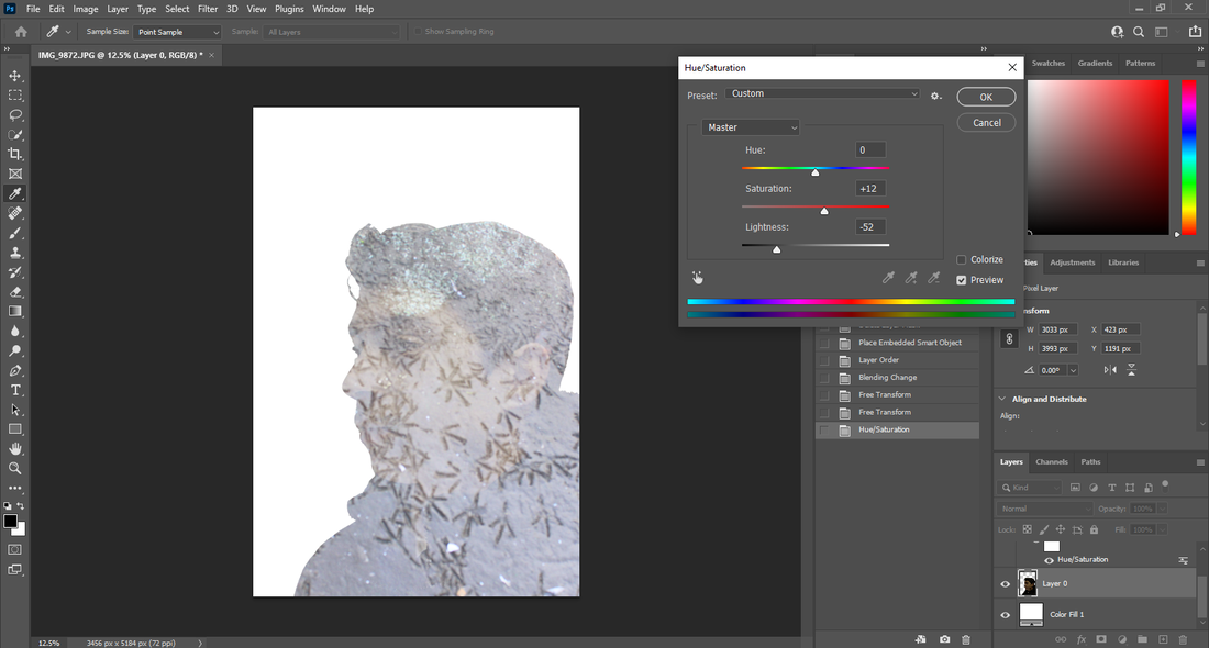 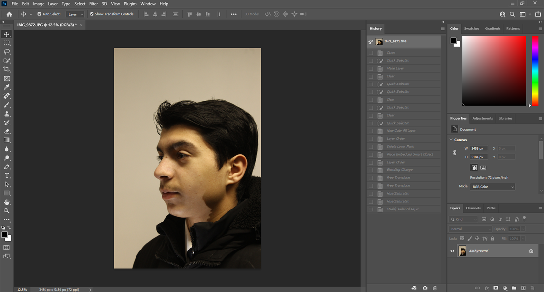 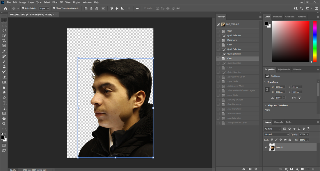  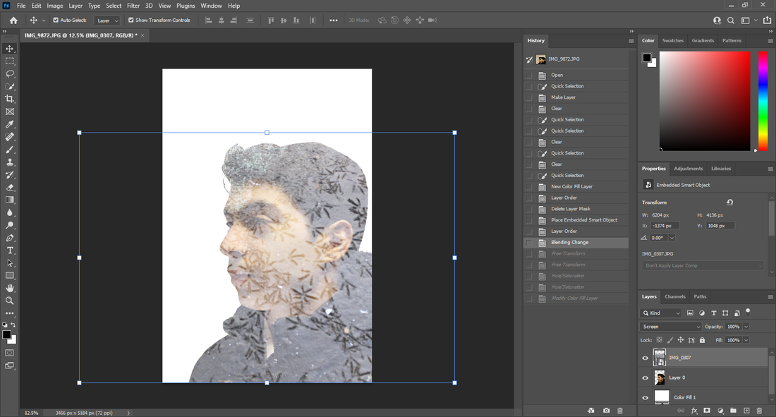 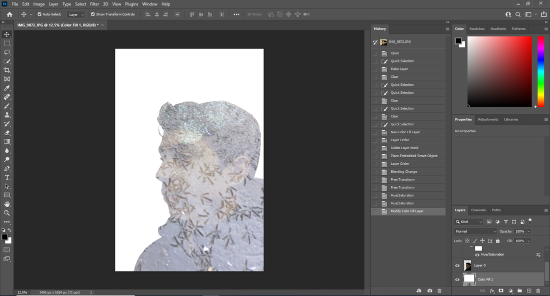 |
I put the image into photoshop, used the quick select tool to crop out the person, then I used the solid colour tool to have the background, I then dropped the image of the the tracks in the mud into the software, then I put the image above the person and changed the opacity and cut around the person. I then changed the colours with the hue/saturation tool then saved the image as a JPEG.
original
final image |
photoshop |
I put the image into photoshop, used the quick select tool to crop out the person, then I used the solid colour tool to have the background, I then dropped the image of the the ice through a macro lens into the software, then I put the image above the person and changed the opacity and cut around the person. I then changed the colours with the hue/saturation tool then saved the image as a JPEG. With this image I experimented with a setting of the photo called exclusion and it came out with this image. I feel like this worked well so I might try to do it again later.
original |
photoshop |

|
      |
final image
original |
photoshop |

|
      |
final image

original |
photoshop |

|
      |
final image

original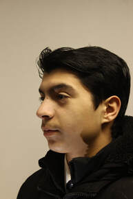
|
photoshop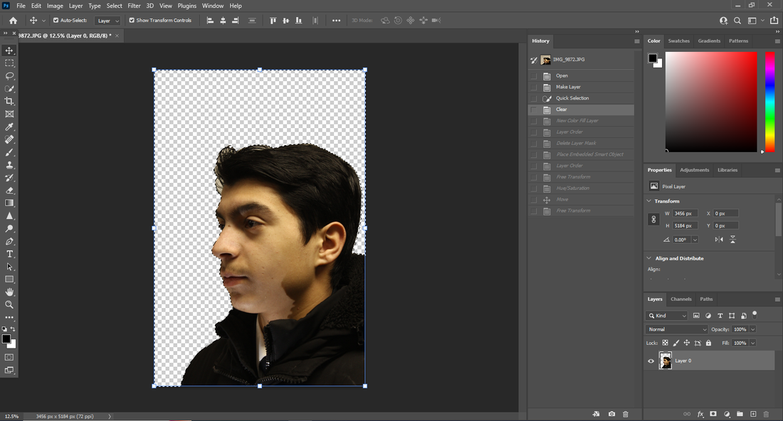  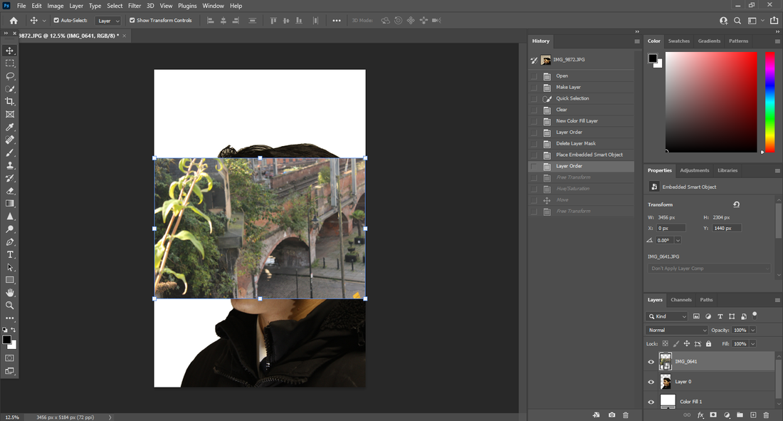 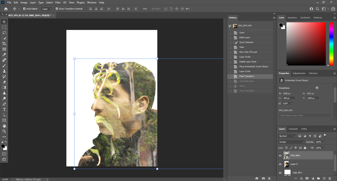 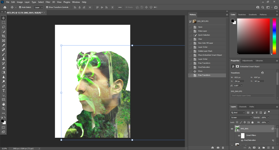 |
final image
original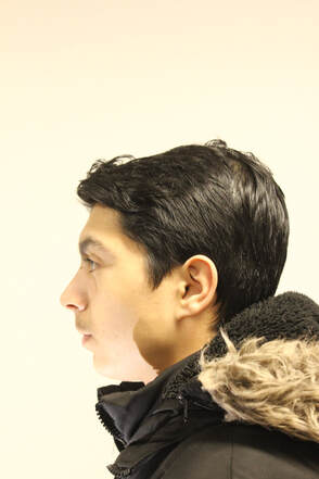
|
photoshop  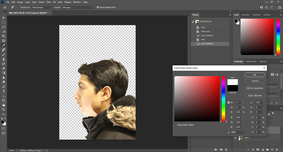  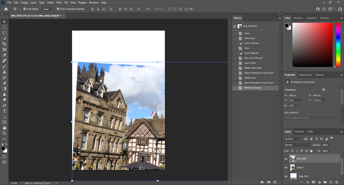 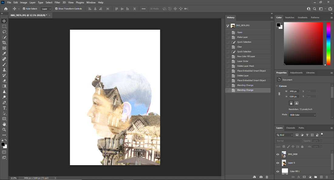 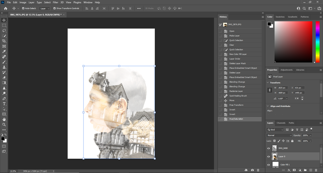 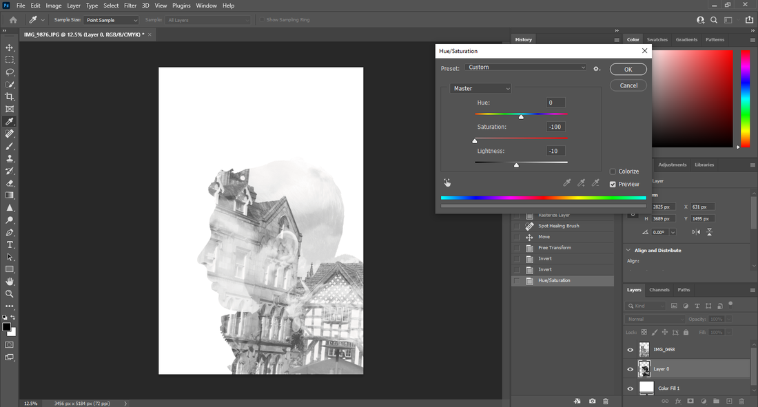 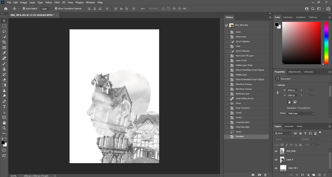 |
final image

final gallery

|

|

|
|

|
|
|

|
evaluation
My main theme was natural texture and exploring all of the places nature could be examined, such as nature with trees, leaves, plants and more. However I also examined man made texture with statues and buildings. I preferred the natural side of texture because I could get so many outcomes from the same thing. Nature allowed me to expand my images from fruit to ice through a macro lens. Once I had started the photoshop phase in my project, I was able to create images I could have never gotten through a camera. I had shown creative skills through double exposure and I had created what seemed to be a new texture for my images.
My photoshop skills started off bare and not much to them. I specifically had a problem with getting a smooth cut out but now I have gotten round that.
I found that getting out a camera and taking images was the most enjoyable part of this project. Finding new textures to capture was the best part about this project and I would have liked to spend more time doing it. I don't think that spending most of this project on a computer manipulating my images in photoshop is what photography is. I think I should have been outside developing my skills on a camera because that's what my photoshops are all from. Going out to Manchester really helped this project because there was so much nature in the open like trees, moss and plants. In Manchester there was more man made texture than natural texture so when you saw some nature it would stick out.
Building my weebly website to make my work look professional was not something I would have done if I did not take photography. On weebly I had to organize my photos with titles and text saying why I did this, This has helped me to use organizing skills more when doing my work in this project. I have learned that using double exposure lets me use the images of man made and natural in the same image which I like using. My knowledge of using a manual camera has improved throughout this project which is going to help me in future projects. I have learned about using white balance and ISO to change how the image comes out. I used tutorials provided by the school to learn about double exposure and master it. Everything I have learned I will carry out into future projects.
I would like to develop my photoshop skills. During this project, I had trouble with getting a smooth cutout of people for double exposure. It would look choppy and unprofessional, so I learned how to get smoother cutouts to improve my outcomes. I was going to stop double exposure to do something else, but I learned how to do it properly and now I have much better outcomes for my final gallery. In future projects I am hoping to stay on double exposure as it is a skill I have learned to use well and efficiently.
I have tried to add some black and white images into my work as some of the photographers I have researched used black and white well so I tried to do the same thing in my work. Weston liked to use shadows and the sweet spot to enhance his images which I have been trying to do in my work. He used a studio setup which I tried to recreate with my images. He would position the item in focus in the exact spot needed which I used in my images.
One of my favourite camera techniques to use was manual mode because it allowed me to make images more personal and I could control the outcome. When starting photography, I did not know what do with a camera or how to use one. Using a real cannon camera helped me learn how to make photography personal and creative. However when I used the camera more, I felt more confidant in my outcomes and I knew what to do without needing help. Learning how to use it properly made my work have a type of professionalism I would have never had if I didn't learn properly.
I think the most successful part of this project was using photoshop. When I started I had basic knowledge on it and didn't know how to do anything. After using the tutorials provided I was learning well and at a fast rate. After playing around with different ideas I had decided to focus on double exposure. I got to use all the images I took and put them into one image which I was creative about. The images with nature gave me the best outcomes in photoshop by changing the saturation and positioning of the image.
When I started using the camera, I had bad results I was not happy with. I was looking at why they were bad and it was because they were either positioned badly or out of focus. I then looked into how to fix this issue and applied it to my images. I was having better outcomes after fixing this and some are on my website. Beginning to use photoshop was a struggle because of all the tools to use and everything not making sense. After looking at my outcomes you can see how much development I have made from my first photoshoped image to my most recent image.
